


前言
今天是中秋,这里先祝大家节日快乐!🎆🎆🎆 在这篇博客中,我们将展示如何通过 HTML、CSS 和 JavaScript 结合 anime.js 库制作一个简单的中秋节祝福动画。我们将创建一个具有动态背景、月亮、灯笼和祝福文字的网页动画,帮助我们为节日增添一些氛围。
项目概述
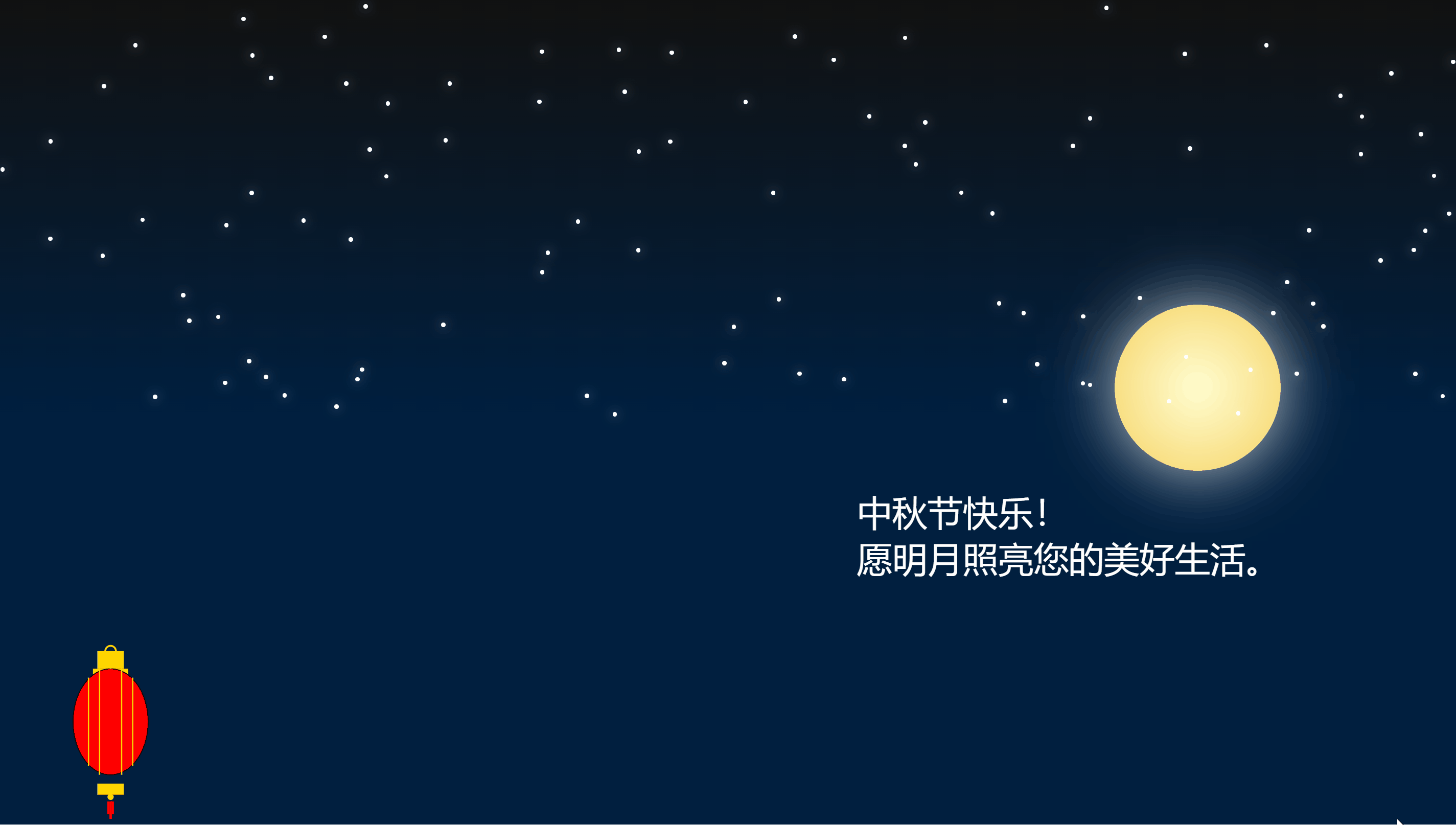
整个动画包含以下元素:
- 动态背景:由线性渐变组成的夜空。
- 月亮:使用
div和渐变模拟。 - 灯笼:通过 SVG 绘制,并通过动画实现动态效果。
- 星星:随机生成的星星,闪烁效果。
- 祝福文字:动态显示中秋祝福语。
实现步骤
我们使用简单的 HTML 结构来定义各个元素,并通过 CSS 控制它们的外观和位置。JavaScript 则用来为动画提供交互。
创建基础 HTML 结构
首先,我们需要在 HTML 中设置动画所需的基本结构:
<!DOCTYPE html>
<html lang="zh">
  <head>
    <meta charset="UTF-8">
    <meta name="viewport" content="width=device-width, initial-scale=1.0">
    <title>中秋节祝福动画</title>
  </head>
  <body>
    <div id="scene">
      <div id="moon"></div> <!-- 月亮 -->
      <div id="message">中秋节快乐!<br>愿明月照亮您的美好生活。</div> <!-- 中秋祝福文字 -->
      <div id="lantern"></div> <!-- 放大后的灯笼 -->
    </div>
  </body>
</html>
添加动态背景和月亮
接下来,我们为页面添加动态的背景以及一个月亮。背景通过线性渐变模拟夜空,月亮则使用 div 结合径向渐变来模拟。
body, html {
  margin: 0;
  padding: 0;
  overflow: hidden;
  font-family: 'Arial', sans-serif;
  background: linear-gradient(to top, #001f3f, #001f3f 50%, #111 100%);
}

/* 月亮样式 */
#moon {
  position: absolute;
  bottom: calc(30% + 100px);
  right: calc(20% - 100px);
  width: 15vw;
  height: 15vw;
  border-radius: 50%;
  background: radial-gradient(circle, #fffdd0, #f6d365);
  box-shadow: 0 0 60px rgba(255, 255, 255, 0.8);
}
创建 SVG 灯笼
我们使用 SVG 创建灯笼的结构,灯笼由顶部、主体和底部三部分组成,并添加了竖线来模拟灯笼的立体感。SVG 代码如下:
<div id="lantern">
  <svg xmlns="http://www.w3.org/2000/svg" viewBox="0 0 200 400" width="100%" height="100%">
    <!-- 灯笼顶部 -->
    <rect x="70" y="20" width="60" height="40" fill="#FFD700" />
    <rect x="60" y="60" width="80" height="15" fill="#FFD700" />
    <!-- 灯笼主部分,增加竖线 -->
    <ellipse cx="100" cy="180" rx="85" ry="120" fill="#FF0000" stroke="#000" stroke-width="2" />
    <!-- 增加竖线以增强立体感 -->
    <line x1="50" y1="80" x2="50" y2="280" stroke="#FFD700" stroke-width="3" />
    <line x1="75" y1="60" x2="75" y2="300" stroke="#FFD700" stroke-width="3" />
    <line x1="125" y1="60" x2="125" y2="300" stroke="#FFD700" stroke-width="3" />
    <line x1="150" y1="80" x2="150" y2="280" stroke="#FFD700" stroke-width="3" />
    <!-- 灯笼底部装饰 -->
    <rect x="70" y="320" width="60" height="25" fill="#FFD700" />
    <circle cx="100" cy="350" r="7" fill="#FFD700" />
    <!-- 灯笼吊穗 -->
    <line x1="100" y1="360" x2="100" y2="400" stroke="#FF0000" stroke-width="5" />
    <line x1="95" y1="360" x2="95" y2="390" stroke="#FF0000" stroke-width="5" />
    <line x1="105" y1="360" x2="105" y2="390" stroke="#FF0000" stroke-width="5" />
    <!-- 灯笼顶部环 -->
    <circle cx="100" cy="20" r="12" stroke="#FFD700" stroke-width="4" fill="none" />
    <line x1="100" y1="20" x2="100" y2="60" stroke="#FFD700" stroke-width="4" />
  </svg>
</div>
实现动态动画效果
我们使用 anime.js 实现月亮升起、文字渐现和灯笼轻微浮动的动画效果。通过 JavaScript 的 anime() 函数定义动画的目标、动画属性以及时间和效果曲线。
// 月亮升起动画
anime({
  targets: '#moon',
  translateY: ['200px', '0'], // 从底部的200px升起
  easing: 'easeOutElastic(1, 0.8)',
  duration: 4000,
  complete: function () {
    // 文字渐现动画
    anime({
      targets: '#message',
      opacity: [0, 1],
      translateX: [30, 0], // 从右侧缓缓出现
      easing: 'easeOutExpo',
      duration: 2000
    });
  }
});

// 灯笼轻微浮动动画
anime({
  targets: '#lantern svg',
  translateY: [-10, 10],
  easing: 'easeInOutSine',
  duration: 2000,
  direction: 'alternate',
  loop: true
});
闪烁的星星效果
为了增加夜空的动态效果,我们使用 JavaScript 动态生成星星,并让它们通过 anime.js 实现闪烁效果。
function createStar() {
  const star = document.createElement('div');
  star.classList.add('star');
  document.body.appendChild(star);
  const posX = Math.random() * window.innerWidth;
  const posY = Math.random() * window.innerHeight * 0.5;
  star.style.left = `${posX}px`;
  star.style.top = `${posY}px`;

  anime({
    targets: star,
    opacity: [0, 1],
    easing: 'easeInOutQuad',
    duration: 2000,
    loop: true,
    direction: 'alternate',
  });
}

// 生成多颗星星
for (let i = 0; i < 100; i++) {
  createStar();
}
调整灯笼和月亮尺寸
为了使动画在不同屏幕尺寸上都能保持良好的显示效果,我们使用 JavaScript 动态调整月亮和灯笼的大小和位置。
function adjustScene() {
  const moon = document.getElementById('moon');
  const lantern = document.getElementById('lantern');

  // 调整月亮的大小
  const moonSize = Math.min(window.innerHeight * 0.2, window.innerWidth * 0.15);
  moon.style.width = moonSize + 'px';
  moon.style.height = moonSize + 'px';

  // 重新定位灯笼位置
  lantern.style.left = window.innerWidth * 0.05 + 'px'; // 屏幕左侧 5%
}

window.onresize = adjustScene;
adjustScene(); // 初始化场景
完整代码
下面是项目的完整代码,感兴趣的小伙伴可以复制代码在浏览器中自行体验哦。
<!DOCTYPE html>
<html lang="zh">

<head>
    <meta charset="UTF-8">
    <meta name="viewport" content="width=device-width, initial-scale=1.0">
    <title>中秋节祝福动画</title>
    <style>
        body,
        html {
            margin: 0;
            padding: 0;
            overflow: hidden;
            font-family: 'Arial', sans-serif;
            background: linear-gradient(to top, #001f3f, #001f3f 50%, #111 100%);
        }

        /* 可视区域设置 */
        #scene {
            width: 100vw;
            height: 100vh;
            position: relative;
            overflow: hidden;
        }

        /* 月亮样式 */
        #moon {
            position: absolute;
            bottom: calc(30% + 100px);
            right: calc(20% - 100px);
            width: 15vw;
            height: 15vw;
            border-radius: 50%;
            background: radial-gradient(circle, #fffdd0, #f6d365);
            box-shadow: 0 0 60px rgba(255, 255, 255, 0.8);
        }

        /* 中秋祝福文字 */
        #message {
            position: absolute;
            bottom: 30%;
            right: calc(5% + 100px);
            color: white;
            font-size: 2rem;
            text-align: left;
            opacity: 0;
            max-width: 30%;
        }

        /* 星星样式 */
        .star {
            position: absolute;
            width: 4px;
            height: 4px;
            background: white;
            border-radius: 50%;
            box-shadow: 0 0 10px rgba(255, 255, 255, 0.6);
            opacity: 0;
        }

        /* SVG灯笼样式 */
        #lantern {
            position: absolute;
            bottom: 20px;
            left: 5%;
            width: 80px; /* 调整灯笼的宽度 */
            height: auto;
            max-height: 160px;
        }

        @media (max-width: 768px) {
            #moon {
                width: 25vw;
                height: 25vw;
            }

            #message {
                font-size: 1.5rem;
            }

            #lantern {
                width: 60px;
                max-height: 140px;
            }
        }

        @media (max-width: 480px) {
            #moon {
                width: 35vw;
                height: 35vw;
            }

            #message {
                font-size: 1rem;
            }

            #lantern {
                width: 50px;
                max-height: 100px;
            }
        }
    </style>
</head>

<body>

    <div id="scene">
        <div id="moon"></div>
        <div id="message">中秋节快乐!<br>愿明月照亮您的美好生活。</div>
        <!-- 放大后的SVG灯笼 -->
        <div id="lantern">
            <svg xmlns="http://www.w3.org/2000/svg" viewBox="0 0 200 400" width="100%" height="100%">
                <!-- 灯笼顶部 -->
                <rect x="70" y="20" width="60" height="40" fill="#FFD700" />
                <rect x="60" y="60" width="80" height="15" fill="#FFD700" />
                <!-- 灯笼主部分,增加竖线 -->
                <ellipse cx="100" cy="180" rx="85" ry="120" fill="#FF0000" stroke="#000" stroke-width="2" />
                <!-- 增加竖线以增强立体感 -->
                <line x1="50" y1="80" x2="50" y2="280" stroke="#FFD700" stroke-width="3" />
                <line x1="75" y1="60" x2="75" y2="300" stroke="#FFD700" stroke-width="3" />
                <line x1="125" y1="60" x2="125" y2="300" stroke="#FFD700" stroke-width="3" />
                <line x1="150" y1="80" x2="150" y2="280" stroke="#FFD700" stroke-width="3" />
                <!-- 灯笼底部装饰 -->
                <rect x="70" y="320" width="60" height="25" fill="#FFD700" />
                <circle cx="100" cy="350" r="7" fill="#FFD700" />
                <!-- 灯笼吊穗 -->
                <line x1="100" y1="360" x2="100" y2="400" stroke="#FF0000" stroke-width="5" />
                <line x1="95" y1="360" x2="95" y2="390" stroke="#FF0000" stroke-width="5" />
                <line x1="105" y1="360" x2="105" y2="390" stroke="#FF0000" stroke-width="5" />
                <!-- 灯笼顶部环 -->
                <circle cx="100" cy="20" r="12" stroke="#FFD700" stroke-width="4" fill="none" />
                <line x1="100" y1="20" x2="100" y2="60" stroke="#FFD700" stroke-width="4" />
            </svg>
        </div>
    </div>

    <script src="https://cdnjs.cloudflare.com/ajax/libs/animejs/3.2.1/anime.min.js"></script>
    <script>
        // 动态设置月亮尺寸和灯笼位置,适应不同屏幕大小
        function adjustScene() {
            const moon = document.getElementById('moon');
            const lantern = document.getElementById('lantern');

            // 调整月亮的大小
            const moonSize = Math.min(window.innerHeight * 0.2, window.innerWidth * 0.15);
            moon.style.width = moonSize + 'px';
            moon.style.height = moonSize + 'px';

            // 重新定位灯笼位置
            lantern.style.left = window.innerWidth * 0.05 + 'px'; // 屏幕左侧 5%
        }

        // 窗口调整大小时重新计算场景元素
        window.onresize = adjustScene;
        adjustScene(); // 初始化场景

        // 月亮升起动画
        anime({
            targets: '#moon',
            translateY: ['200px', '0'], // 从底部的200px升起
            easing: 'easeOutElastic(1, 0.8)',
            duration: 4000,
            complete: function () {
                // 文字渐现动画
                anime({
                    targets: '#message',
                    opacity: [0, 1],
                    translateX: [30, 0], // 从右侧缓缓出现
                    easing: 'easeOutExpo',
                    duration: 2000
                });
            }
        });

        // 星星闪烁函数
        function createStar() {
            const star = document.createElement('div');
            star.classList.add('star');
            document.body.appendChild(star);
            const posX = Math.random() * window.innerWidth;
            const posY = Math.random() * window.innerHeight * 0.5;
            star.style.left = `${posX}px`;
            star.style.top = `${posY}px`;

            anime({
                targets: star,
                opacity: [0, 1],
                easing: 'easeInOutQuad',
                duration: 2000,
                loop: true,
                direction: 'alternate',
            });
        }

        // 生成多颗星星
        for (let i = 0; i < 100; i++) {
            createStar();
        }

        // 灯笼动画效果
        anime({
            targets: '#lantern svg',
            translateY: [-10, 10],
            easing: 'easeInOutSine',
            duration: 2000,
            direction: 'alternate',
            loop: true
        });
    </script>

</body>

</html>
结语
通过简单的 HTML、CSS 和 anime.js,我们成功实现了一个具有中秋节气氛的动态动画效果。希望这篇博客能为你提供启发,让你在网页上制作出更多有趣的节日动画效果。


 扫一扫
扫一扫
 1720
1720

 被折叠的 条评论
为什么被折叠?
被折叠的 条评论
为什么被折叠?
 到【灌水乐园】发言


