


transform属性
2D
translate平移
语法:
—transform:translate(xpx,ypx);
<!DOCTYPE html>
<html lang="en">
<head>
    <meta charset="UTF-8">
    <meta name="viewport" content="width=device-width, initial-scale=1.0">
    <title>Document</title>
    <style>
        .d1{
            width: 100px;
            height: 100px;
            background-color: aquamarine;
        }
        .d1:hover{
            transform: translate(50px,50px);
        }
    </style>
</head>
<body>
    <div class="d1"></div>
</body>
</html>
效果如下(各网页版本不同显示会有差异)

-hover

scale缩放
语法:
transform:scale(num);
其中num>0为放大;num<0为缩小
<!DOCTYPE html>
<html lang="en">
<head>
    <meta charset="UTF-8">
    <meta name="viewport" content="width=device-width, initial-scale=1.0">
    <title>Document</title>
    <style>
        .d1{
            width: 100px;
            height: 100px;
            border: 1px solid aquamarine;
        }
        .d2{
            width: 100px;
            height: 100px;
            background-color: aquamarine;
        }
        .d2:hover{
            transform: scale(0.5);
        }
    </style>
</head>
<body>
    <div class="d1">
        <div class="d2"></div>
    </div>
</body>
</html>
效果如下(各网页版本不同显示会有差异)

-hover

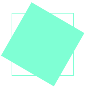
rotate旋转
语法:
transform:rotate( ** deg);
deg为角度的单位;其中 ** >0为顺时针,* *<0为逆时针。
<!DOCTYPE html>
<html lang="en">
<head>
    <meta charset="UTF-8">
    <meta name="viewport" content="width=device-width, initial-scale=1.0">
    <title>Document</title>
    <style>
        .d1{
            margin: 100px;
            width: 100px;
            height: 100px;
            border: 1px solid aquamarine;
        }
        .d2{
            width: 100px;
            height: 100px;
            background-color: aquamarine;
        }
        .d2:hover{
            transform:rotate(30deg);
        }
    </style>
</head>
<body>
    <div class="d1">
        <div class="d2"></div>
    </div>
</body>
</html>
效果如下(各网页版本不同显示会有差异)

-hover
skew倾斜
语法:
transform:skew(xdeg,ydeg);
x,y分别表示水平和垂直方向的倾斜角度。
<!DOCTYPE html>
<html lang="en">
<head>
    <meta charset="UTF-8">
    <meta name="viewport" content="width=device-width, initial-scale=1.0">
    <title>Document</title>
    <style>
        .d1{
            margin: 100px;
            width: 100px;
            height: 100px;
            border: 1px solid aquamarine;
        }
        .d2{
            width: 100px;
            height: 100px;
            background-color: aquamarine;
        }
        .d2:hover{
            transform:skew(30deg,-15deg);
        }
    </style>
</head>
<body>
    <div class="d1">
        <div class="d2"></div>
    </div>
</body>
</html>
效果如下(各网页版本不同显示会有差异)

-hover

3D
建立3D环境
transform-style:preserve-3d;
perspective:1000px;
设置3d效果
transform:***;
位移
transform:translateX();
transform:translateY();
transform:translateZ();
缩放
transform:scaleX();
transform:scaleY();
transform:scaleZ();
旋转
transform:rotateX();
transform:rotateY();
transform:rotateZ();
混用(连用时各效果均写在一个transform内,用空格隔开)
transform:translateX() rotateY();
用法同2d
今天的分享就是这些啦,欢迎正在学习web的伙伴们“挑毛病”“提意见”,当然了也欢迎各种表扬奥~(比心,比心)


 345
345


 被折叠的 条评论
为什么被折叠?
被折叠的 条评论
为什么被折叠?
 到【灌水乐园】发言


