


圆角
在 CSS2 中添加圆角棘手。我们不得不在每个角落使用不同的图像。
在 CSS3 中,很容易创建圆角。
在 CSS3 中 border-radius 属性被用于创建圆角:
div.radius {
    border: 2px solid red;
    border-radius: 25px;
}
盒阴影
CSS3 中的 box-shadow 属性被用来添加阴影:
div.shadow {
    border: 1px solid gray;
	box-shadow: 10px 10px 5px #888888;
}
界图片
有了 CSS3 的 border-image 属性,你可以使用图像创建一个边框。
用于创建边框的原始图像:

平铺
div.round {
	border: 15px solid transparent;
	border-image: url('img/border.png') 30 30 round;
	-webkit-border-image: url('img/border.png') 30 30 round;
	-o-border-image: url('img/border.png') 30 30 round;
}
拉伸
div.stretch {
	border: 15px solid transparent;
	border-image: url('img/border.png') 30 30 stretch;
	-webkit-border-image: url('img/border.png') 30 30 stretch;
	-o-border-image: url('img/border.png') 30 30 stretch;
}
圆角
3.1 border-radius 属性
使用 CSS3 border-radius 属性,你可以给任何元素制作“圆角”。
实例:
div {
	width: 200px;
	height: 150px;
	padding: 20px;
}
.radius1 {
	color: white;
	background: green;
	border-radius: 25px;
}
.radius2 {
	border-radius: 25px;
	border: 2px solid green;
}
.radius3 {
	border-radius: 25px;
	background: url('img/paper.gif');
	background-position: left top;
	background-repeat: repeat;
}
指定每个圆角
CSS 拥有用于为元素的每个角指定圆角的属性:
-
border-radius: 15px 50px 30px 5px;:左上角为15px,右上角为50px,右下角为30px,左下角为5px。 -
border-radius: 15px 50px 30px;:左上角为15px,右上角和左下角为50px,右下角为30px。 -
border-radius: 15px 50px;:左上角和右下角为15px,右上角和左下角为50px。 -
border-radius: 15px;:四个角都是15px。
实例:
.radius4 {
	color: white;
	background: green;
	border-radius: 15px 50px 30px 5px;
}
.radius5 {
	color: white;
	background: green;
	border-radius: 15px 50px 30px;
}
.radius6 {
	color: white;
	background: green;
	border-radius: 15px 50px;
}
.radius7 {
	color: white;
	background: green;
	border-radius: 15px;
}
椭圆边角
实例:
.radius8 {
	color: white;
	background: green;
	border-radius: 50px/15px;
}
.radius9 {
	color: white;
	background: green;
	border-radius: 15px/50px;
}
.radius10 {
	color: white;
	background: green;
	border-radius: 50%;
}
圆形边角
我们经常需要使用圆角来显示用户头像:
.avatar {
	width: 200px;
	height: 200px;
	display: inline-block;
	border-radius: 50%;
	background: url('img/avatar.jpg');
	background-size: contain;
}
背景
CSS3 中包含几个新的背景属性,提供更大背景元素控制。
4.1 background-image 属性
CSS3 中可以通过 background-image 属性添加背景图片。
不同的背景图像和图像用逗号隔开,所有的图片中显示在最顶端的为第一张。
实例:
.example1 {
	width: 700px;
	overflow: auto;
	padding: 5px 10px;
	background-image: url('img/flower.gif'), url('img/paper.gif');
	background-position: right bottom, left top;
	background-repeat: no-repeat, repeat;
}
background-size 属性
background-size 指定背景图像的大小。CSS3 以前,背景图像大小由图像的实际大小决定。
CSS3 中可以指定背景图片,让我们重新在不同的环境中指定背景图片的大小。你可以指定像素或百分比大小。
你指定的大小是相对于父元素的宽度和高度的百分比的大小。
实例:
.example2 {
	width: 400px;
	overflow: auto;
	padding: 5px 10px;
	background-image: url('img/flower.gif');
	background-size: 100% 100%;
	background-repeat: no-repeat;
}
background-origin 属性
background-origin 属性指定了背景图像的位置区域。
content-box、padding-box 和 border-box 区域内可以放置背景图像。
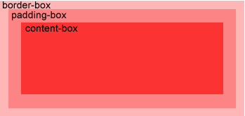
在 content-box 中定位背景图片:
.example3 {
	width: 400px;
	overflow: auto;
	padding: 10px;
	border: 10px solid rgba(255, 0, 0, 0.1);
	background-color: rgba(0, 120, 0, 0.1);
	background-image: url('img/flower_small.gif');
	background-repeat: no-repeat;
	background-position: left center;
}
.example3-padding {
	background-origin: padding-box; // 默认值
}
.example3-content {
	background-origin: content-box;
}
.example3-border {
	background-origin: border-box;
}
CSS3 中 background-clip 背景剪裁属性是从指定位置开始绘制。
实例:
.example4 {
	width: 400px;
	overflow: auto;
	padding: 15px;
	border: 10px dotted blue;
	background-color: lightskyblue;
}
.example4-border {
	background-clip: border-box; // 默认值
}
.example4-content {
	background-clip: content-box;
}
.example4-padding {
	background-clip: padding-box;
}
background-clip: border-box;(默认值):
background-clip: content-box;:
background-clip: padding-box;:


 549
549

 被折叠的 条评论
为什么被折叠?
被折叠的 条评论
为什么被折叠?
 到【灌水乐园】发言


