


scrollHeight和scrollWidth的详解
由于scrollHeight和scrollWidth只是Y轴和X轴方向上的差异,其大小是一模一样的算法也仅仅只是方向上的差异,我们可以通过类比得知,这里我们只对scrollHeight来讲解,因为scrollHeight比较常用
一、 内容块Y轴上没有超出的情况下
大小:scrollHeight = 当前对象 height + padding-top + padding-bottom - x轴滚动条高度
这时候scrollHeight = clientHeight
这时候我们无论有或者没有对overflow-y进行设置都是可以的,这里使用默认值overflow-y: visible;
具体clientHeight的大小可以参考: 上一篇内容.
CSS代码如下:
#wrap {
     width: 100px;
     height: 100px;
     /* 用于Width水平方向加的 */
     padding-left: 50px;
     padding-right: 40px;
     border: solid;
     border-left-width: 35px;
     border-right-width: 25px;
     /* 用于Height垂直方向加的 */
     padding-top: 30px;
     padding-bottom: 20px;
     border-top-width: 15px;
     border-bottom-width: 5px;
}
wrap图片:

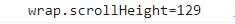
控制台打印结果:

另一种是存在滚动条的情况下
CSS代码如下:
#wrap {
    width: 100px;
    height: 100px;
    /* 用于Width水平方向加的 */
    padding-left: 50px;
    padding-right: 40px;
    border: solid;
    border-left-width: 35px;
    border-right-width: 25px;
    /* 用于Height垂直方向加的 */
    padding-top: 30px;
    padding-bottom: 20px;
    border-top-width: 15px;
    border-bottom-width: 5px;
    /* 设置了overflow */
    overflow-x: scroll;
}
wrap图片:
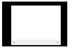
控制台打印结果:
通过观察可以发现,这个值和clientHeight相等,也是减去了21px(滚动条带来的差异)
且设置了①overflow-y: hidden 、②overflow-y: scroll 和③ overflow-y: auto 与未设置的情况下④overflow-y: visible(默认值)的这个值是相同的。
二、内容块Y轴上有超出的情况下
为了方便说明,我们设置了一个blk类,来填充计算其并计算scrollHeight的大小。
2.1 当 overflow-y: visible的情况
大小:scrollHeight = 父级的padding-top(不加 padding-bottom )+ 第一个子级的margin-top + ∑每个子级的offsetHeight + ∑每个子级之间的MAX(上一个子级的margin-bottom,下一个子级的margin-top)(一般这个间隔有n-1个,n为子级数)
注:这里为什么要取上一个子级的margin-bottom和下一个子级的margin-top的最大值,是因为,纵向上的margin会合并并取最大值。
注意事项:这里的border-bottom和border-top是需要solid、dashed、double等的,不可以是transparent或者unset,若为transparent或unset则不会算上。
HTML代码如下:
<!DOCTYPE html>
<html lang="en">
<head>
    <title>Document</title>
    <style>
        #wrap {
            position: relative;
            /* top: 200px; */
            width: 100px;
            height: 100px;
            /* 用于Width水平方向加的 */
            padding-left: 50px;
            padding-right: 40px;
            border: solid;
            border-left-width: 35px;
            border-right-width: 25px;
            /* 用于Height垂直方向加的 */
            padding-top: 30px;
            padding-bottom: 20px;
            border-top-width: 15px;
            border-bottom-width: 5px;
            overflow-y: visible;
        }
        .blk {
            position: relative;
            /* top: 300px; */
            display: block;
            width: 50px;
            height: 50px;
            background-color: red;

            /* 外边距 */
            margin-top: 7px;
            margin-bottom: 10px;

            /* 内边距 */
            padding-top: 9px;
            padding-bottom: 4px;

            /* 边缘线 */
            border: dashed;
            border-top-width: 8px;
            border-bottom-width: 5px;
        }
    </style>
</head>
<body>
    <div id="wrap">
        <div class="blk"></div>
        <div class="blk"></div>
        <div class="blk"></div>
    </div>

    <script>
        // 获取对象
        var oWrap = document.getElementById("wrap");

        console.log( "wrap.scrollHeight=" + oWrap.scrollHeight );

    </script>
</body>
</html>
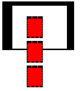
wrap图片:
控制台打印结果:
由图可以看出这个值等于 30 + 7+ 76 * 3 (3个) + 20 = 285,因为第三个也就是最后一个子级margin-bottom在最底部由于不可视和父级padding-bottom一样并没有被算上。
其中:
- 父级的padding-top:30px
- 第一个子级的margin-top:7px
- 每个子级的offsetHeight: (50+9+4+8+5)= 76px
- 每个子级间的距离:10+10 = 20px = ∑MAX(上一个子级的margin-bottom,下一个子级的margin-top)
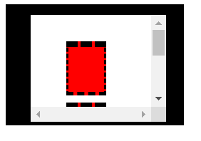
2.2 设置overflow-x: scroll、overflow-y: scroll、overflow-y: hidden 和overflow-y: auto的情况下
大小:scrollHeight = 父级的padding-top + 父级的padding-bottom + 第一个子级的margin-top + ∑每个子级的offsetHeight + ∑每个子级之间的MAX(上一个子级的margin-bottom,下一个子级的margin-top)(一般这个间隔有n-1个,n为子级数)+ 最后一个子级的margin-bottom
这里解释一下为什么会有overflow-x: scroll的原因:
因为:如果这时候为默认的overflow-y: visible, 我们给wrap添加一个overflow-x: scroll 浏览器会自行给其加一个y轴的滚动条(虽然我们这时候加的是y轴的滚动条,实际上是改变其值为overflow-y: auto; ),且经过测试这个y轴滚动条无论出现还是未出现都不会影响其scrollHeight的值,也就是说,只要你给这个标签添加了overflow-x: scroll,它的scrollHeight和后面的三者都是一样的。
注:给一个标签添加样式overflow-x: scroll 会自行强制将其overflow-y改变成auto,可以通过设置hidden或者scroll改变
HTML代码如下:
<!DOCTYPE html>
<html lang="en">
<head>
    <title>Document</title>
    <style>
        #wrap {
            position: relative;
            /* top: 200px; */
            width: 100px;
            height: 100px;
            /* 用于Width水平方向加的 */
            padding-left: 50px;
            padding-right: 40px;
            border: solid;
            border-left-width: 35px;
            border-right-width: 25px;
            /* 用于Height垂直方向加的 */
            padding-top: 30px;
            padding-bottom: 20px;
            border-top-width: 15px;
            border-bottom-width: 5px;
            overflow-x: scroll;
        }
        .blk {
            position: relative;
            /* top: 300px; */
            display: block;
            width: 50px;
            height: 50px;
            background-color: red;

            /* 外边距 */
            margin-top: 7px;
            margin-bottom: 10px;

            /* 内边距 */
            padding-top: 9px;
            padding-bottom: 4px;

            /* 边缘线 */
            border: dashed;
            border-top-width: 8px;
            border-bottom-width: 5px;
        }
    </style>
</head>
<body>
    <div id="wrap">
        <div class="blk"></div>
        <div class="blk"></div>
        <div class="blk"></div>
    </div>

    <script>
        // 获取对象
        var oWrap = document.getElementById("wrap");

        console.log( "wrap.scrollHeight=" + oWrap.scrollHeight );

    </script>
</body>
</html>
- 图:给overflow-y: visible(默认值)的标签添加overflow-x: scroll后,overflow-y将自动改变为atuo
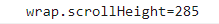
控制台打印结果:
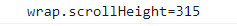
这个值就等于 30 + 7 + 76 * 3 + 20 + 10 + 20 = 315
其中:
- 父级的padding-top:30px
- 第一个子级的margin-top:7px
- 每个子级的offsetHeight: (50+9+4+8+5)= 76px
- 每个子级间的距离:10+10 = 20px = ∑MAX(上一个子级的margin-bottom,下一个子级的margin-top)
- 最后一个子级的margin-bottom:10px
- 父级的padding-bottom: 20px
注:上述的部分是建立在没有定位的情况下说明,
若子级加了定位后超出的部分的算法比较特殊,需要根据具体情况分析喔~
到这里大家应该对scrollHeight和scrollWidth有了深刻的了解啦,祝大家开开心心每一天,一起加油哦!!!


 1万+
1万+


 被折叠的 条评论
为什么被折叠?
被折叠的 条评论
为什么被折叠?
 到【灌水乐园】发言


