


以下内容是摘抄博客:https://www.runoob.com/css/css-navbar.html
设计导航窗口在左侧的显示如下:
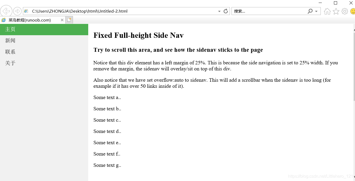
代码部分则如下:
<!DOCTYPE html>
<html>
<head>
<meta charset="utf-8">
<title>菜鸟教程(runoob.com)</title>
<style>
body {
    margin: 0;
}

ul {
    list-style-type: none;
    margin: 0;
    padding: 0;
    width: 25%;
    background-color: #f1f1f1;
    position: fixed;
    height: 100%;
    overflow: auto;
}

li a {
    display: block;
    color: #000;
    padding: 8px 16px;
    text-decoration: none;
}

li a.active {
    background-color: #4CAF50;
    color: white;
}

li a:hover:not(.active) {
    background-color: #555;
    color: white;
}
</style>
</head>
<body>

<ul>
  <li><a class="active" href="#home">主页</a></li>
  <li><a href="#news">新闻</a></li>
  <li><a href="#contact">联系</a></li>
  <li><a href="#about">关于</a></li>
</ul>

<div style="margin-left:25%;padding:1px 16px;height:1000px;">
  <h2>Fixed Full-height Side Nav</h2>
  <h3>Try to scroll this area, and see how the sidenav sticks to the page</h3>
  <p>Notice that this div element has a left margin of 25%. This is because the side navigation is set to 25% width. If you remove the margin, the sidenav will overlay/sit on top of this div.</p>
  <p>Also notice that we have set overflow:auto to sidenav. This will add a scrollbar when the sidenav is too long (for example if it has over 50 links inside of it).</p>
  <p>Some text a..</p>
  <p>Some text b..</p>
  <p>Some text c..</p>
  <p>Some text d..</p>
  <p>Some text e..</p>
  <p>Some text f..</p>
  <p>Some text g..</p>
</div>

</body>
</html>


 扫一扫
扫一扫


 1865
1865

 被折叠的 条评论
为什么被折叠?
被折叠的 条评论
为什么被折叠?
 到【灌水乐园】发言


