


直接上代码
function generateRainbowGradientArray(length, saturation) {
const colors = [];
const hueStep = 360 / length;
for (let i = 0; i < length; i++) {
const hue = i * hueStep;
const color = hslToHex(hue, saturation, 0.5);
colors.push(color);
}
return colors;
}
function hslToHex(h, s, l) {
h /= 360;
let r, g, b;
if (s === 0) {
r = g = b = l;
} else {
const hue2rgb = (p, q, t) => {
if (t < 0) t += 1;
if (t > 1) t -= 1;
if (t < 1 / 6) return p + (q - p) * 6 * t;
if (t < 1 / 2) return q;
if (t < 2 / 3) return p + (q - p) * (2 / 3 - t) * 6;
return p;
};
const q = l < 0.5 ? l * (1 + s) : l + s - l * s;
const p = 2 * l - q;
r = hue2rgb(p, q, h + 1 / 3);
g = hue2rgb(p, q, h);
b = hue2rgb(p, q, h - 1 / 3);
}
const toHex = (c) => {
const hex = Math.round(c * 255).toString(16);
return hex.length === 1 ? "0" + hex : hex;
};
return `#${toHex(r)}${toHex(g)}${toHex(b)}`;
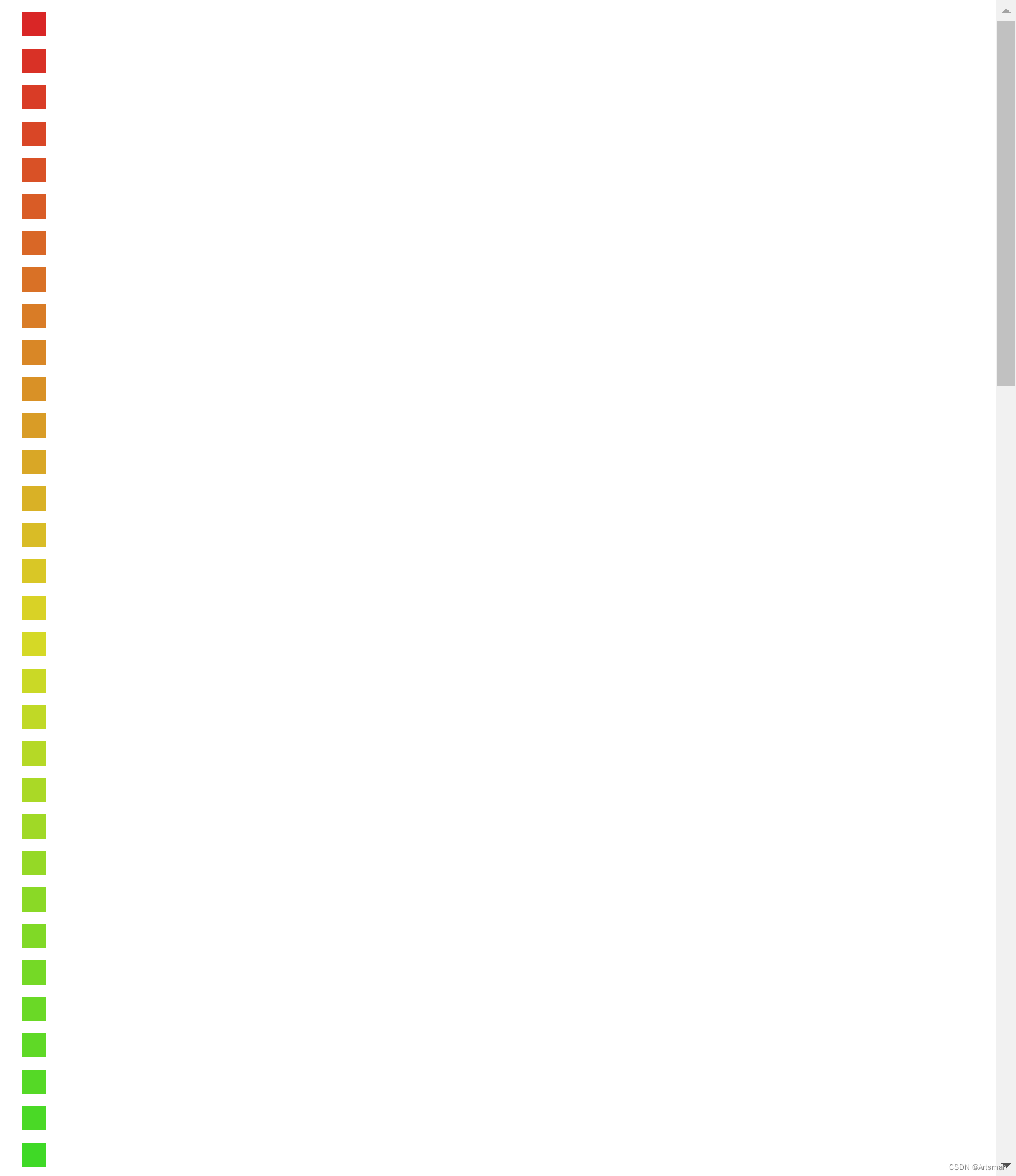
}调用看看效果(两个参数,第一个是生成的颗粒度,第二个是饱和度)
function setDom() {
        const gradientArray = generateRainbowGradientArray(100, 0.7);
        for (let i = 0; i < gradientArray.length; i++) {
          const gradient = gradientArray[i];
          const div = document.createElement("div");
          div.style.background = gradient;
          div.style.width = "20px";
          div.style.height = "20px";
          div.style.margin = "10px";
          document.body.appendChild(div);
        }
      }
      setDom();
效果如下还不错哦!(仅展示部分)


 5895
5895


 被折叠的 条评论
为什么被折叠?
被折叠的 条评论
为什么被折叠?
 到【灌水乐园】发言


