


几乎每个前端开发都应该用过这个滑动组件库吧?这就是大名鼎鼎的swiper.js
没想到已经出到 11 个大版本了 https://www.swiper.com.cn/
当然我也不例外,确实非常全面,也非常强大。
不过很多时候,我们可能只用到了它的10%不到的功能,显然是不划算的,也会有性能方面的顾虑。
随着CSS地不断发展,现在纯CSS也几乎能够实现这样一个swiper了,实现更加简单,更加轻量,性能也更好,完全足够日常使用,最近在项目中也碰到了一个swiper的需求,刚好练一下手,一起看看吧
一、CSS 滚动吸附
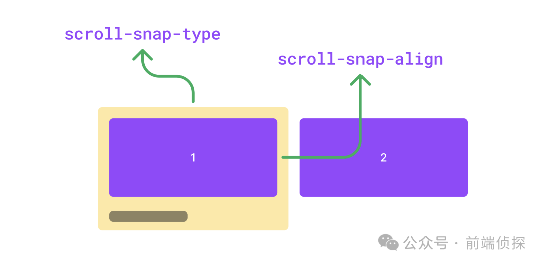
swiper有一个最大的特征就是滚动吸附。相信很多同学已经想到了,那就是CSS scroll snap,这里简单介绍一下。
看似属性非常多,其实CSS scroll snap最核心的概念有两个,一个是scroll-snap-type,还一个是scroll-snap-align,前者是用来定义吸附的方向和吸附程度的,设置在「滚动容器」上。后者是用来定义吸附点的对齐方式的,设置在「子元素」上。
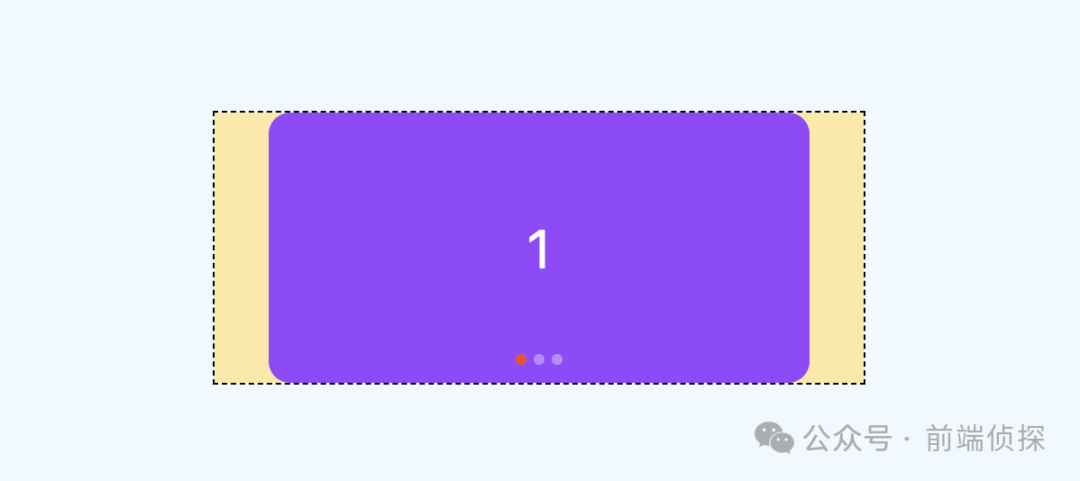
有了这两个属性,就可以很轻松的实现滚动吸附效果了,下面举个例子
<div class="swiper">
  <div class="swiper-item">
    <div class="card"></div>
  </div>
  <div class="swiper-item">
    <div class="card"></div>
  </div>
  <div class="swiper-item">
    <div class="card"></div>
  </div>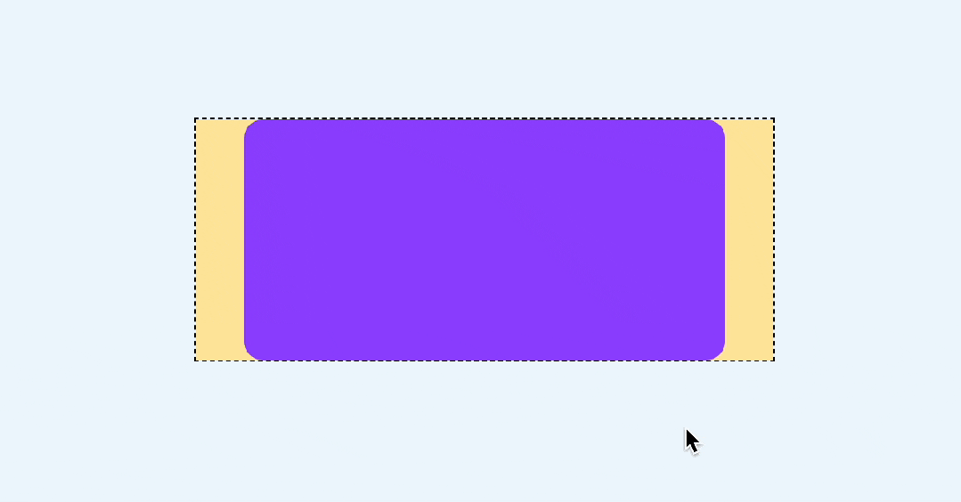
</div>简单修饰一下,让swiper可以横向滚动
.swiper {
display: flex;
overflow: auto;
}
.swiper-item {
width: 100%;
display: flex;
justify-content: center;
flex-shrink: 0;
}
.card {
width: 300px;
height: 150px;
border-radius: 12px;
background-color: #9747FF;
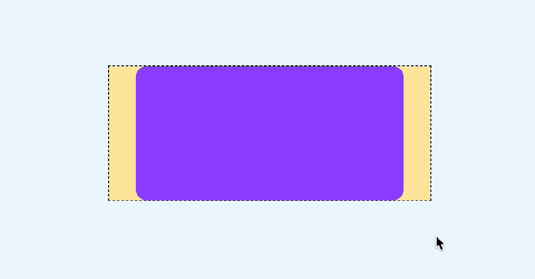
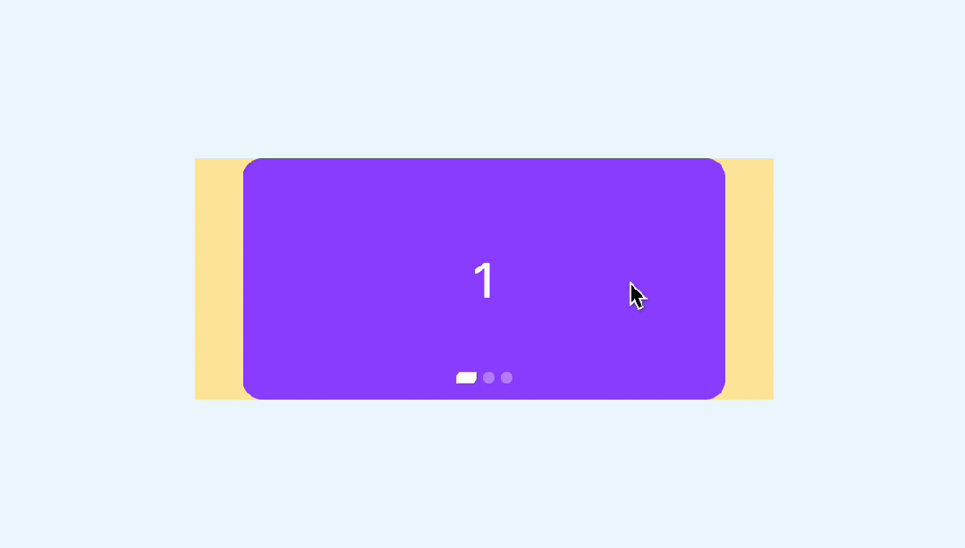
}效果如下
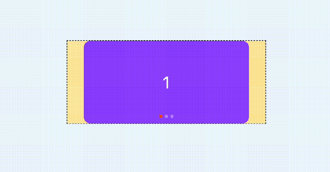
然后加上scroll-snap-type和scroll-snap-align
.swiper {
/**/
scroll-snap-type: x mandatory;
}
.swiper-item {
/**/
scroll-snap-align: center;
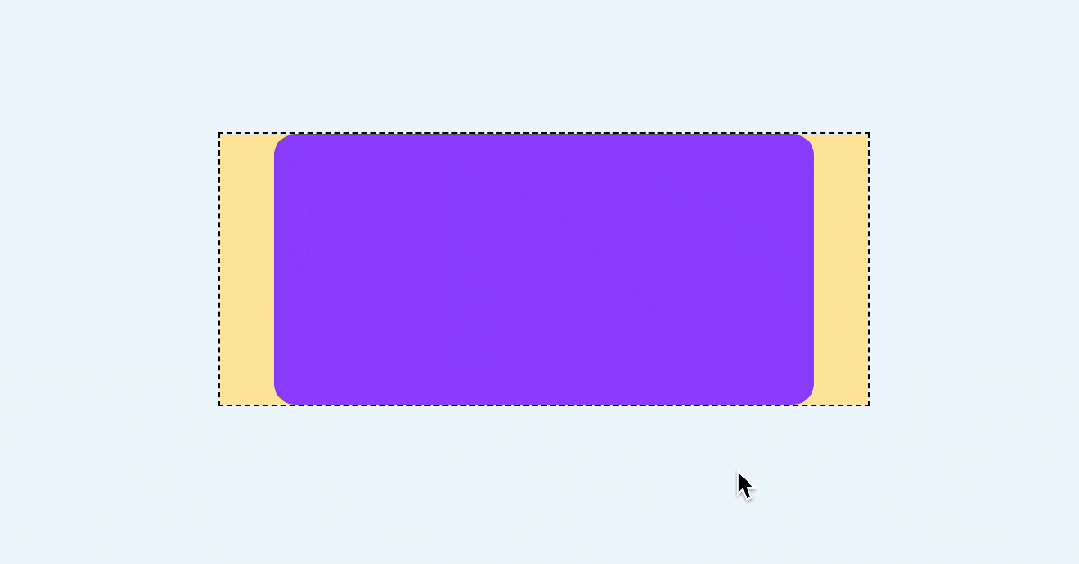
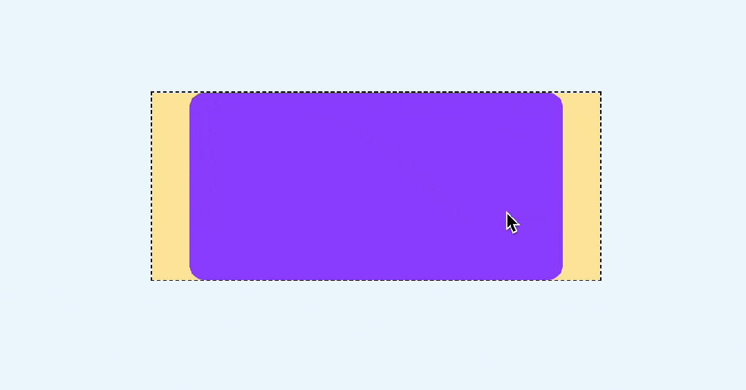
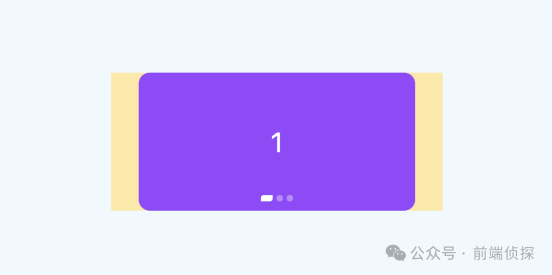
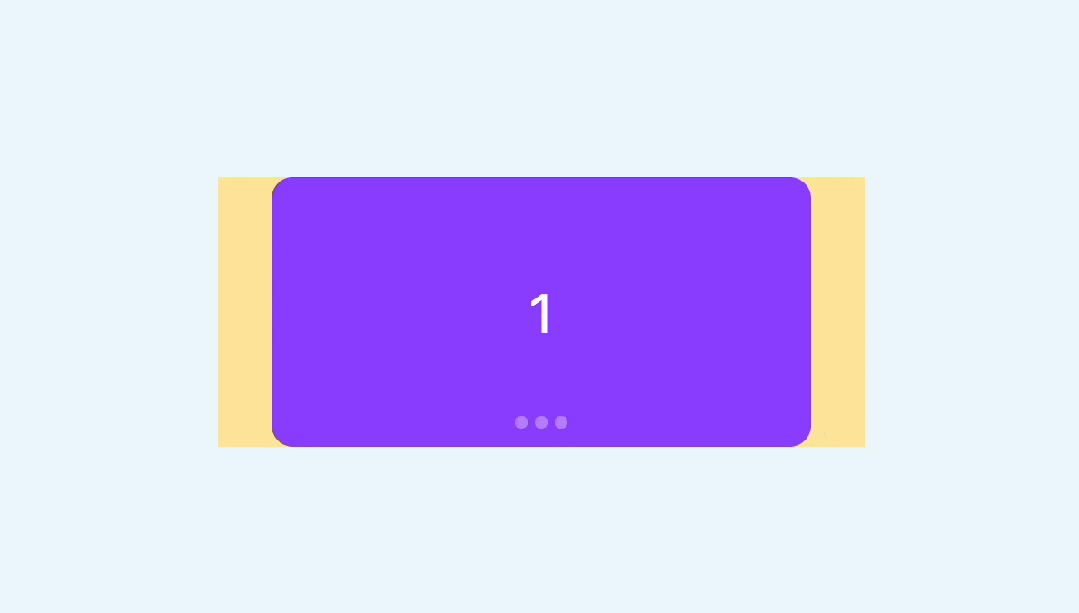
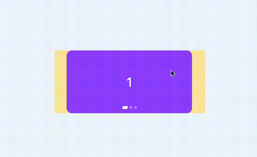
}这样就能实现滚动吸附了
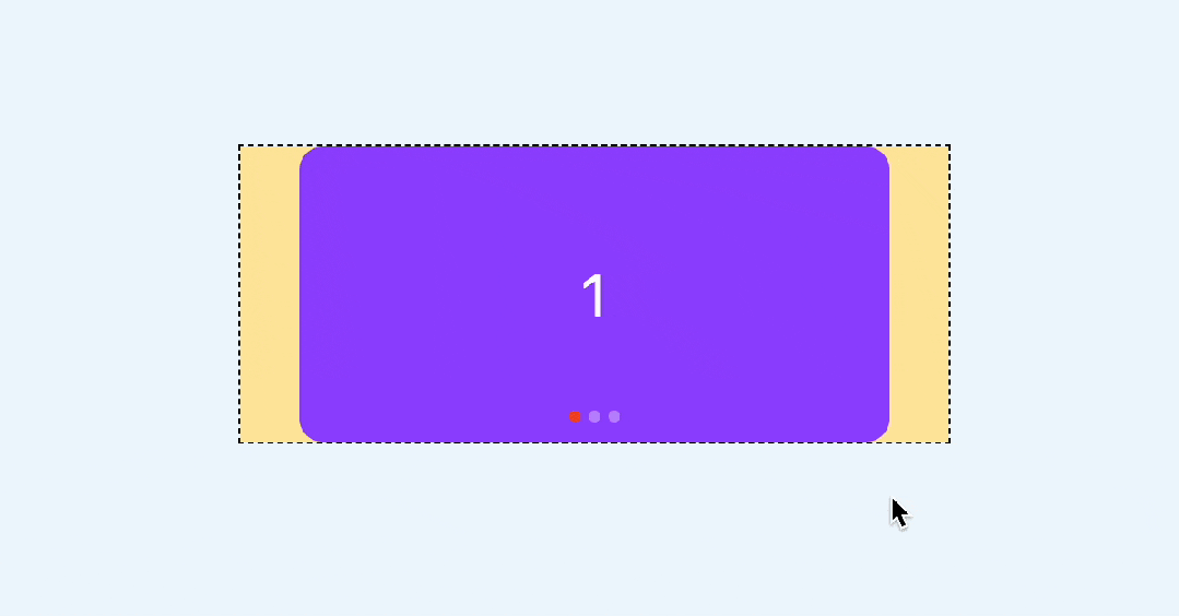
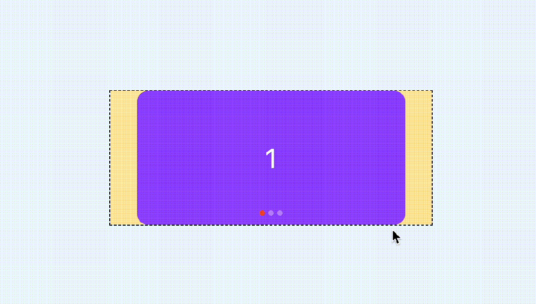
注意这里还有一个细节,如果滑动的非常快,是可以从第一个直接滚动到最后一个的,就像这样
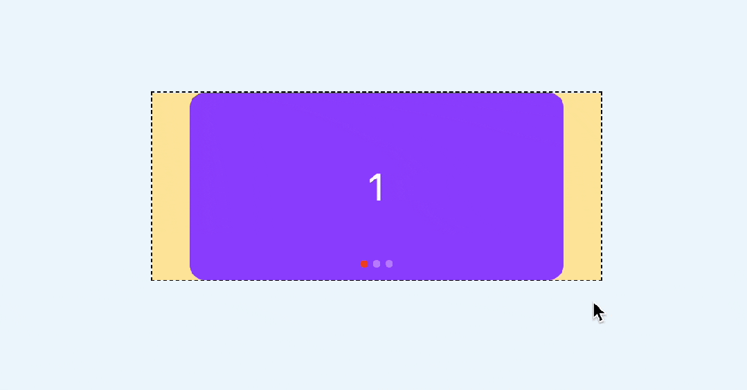
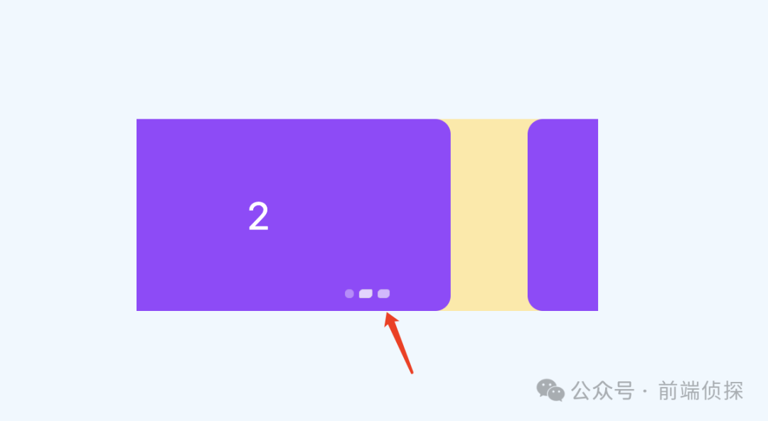
如果不想跳过,也就是每次滑动只会滚动一屏,可以设置scroll-snap-stop属性,他可以决定是否“跳过”吸附点,默认是normal,可以设置为always,表示每次滚动都会停止在最近的一个吸附点
.swiper-item {
  scroll-snap-align: center;
  scroll-snap-stop: always;
}
这样无论滚动有多快,都不会跳过任何一屏了
还有一点,现在是有滚动条的,显然是多余的
这里可以用::-webkit-scrollbar去除滚动条
::-webkit-scrollbar{
  width: 0;
  height: 0;
}
如果在某些移动端无效,可以参考之前这篇文章,有更多的解决办法
滑动基本上就这样了,下面来实现比较重要的指示器
二、CSS 滚动驱动动画
首先我们加几个圆形的指示器
<div class="swiper">
  <div class="swiper-item">
    <div class="card"></div>
  </div>
  <div class="swiper-item">
    <div class="card"></div>
  </div>
  <div class="swiper-item">
    <div class="card"></div>
  </div>
  <!--指示器-->
  <div class="pagination">
    <i class="dot"></i>
    <i class="dot"></i>
    <i class="dot"></i>
  </div>
</div>
用绝对定位定在下方
.pagination {
position: absolute;
display: inline-flex;
justify-content: center;
bottom: 10px;
left: 50%;
transform: translateX(-50%);
gap: 4px;
}
.dot {
width: 6px;
height: 6px;
border-radius: 3px;
background: rgba(255, 255, 255, 0.36);
transition: 0.3s;
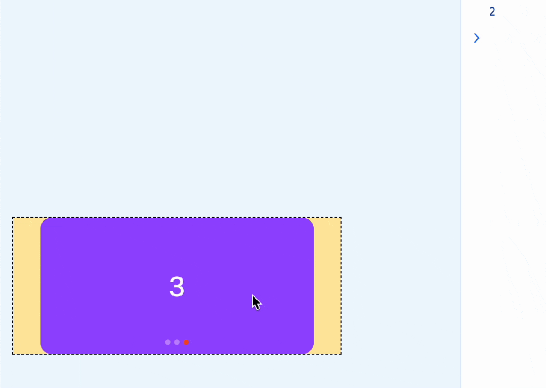
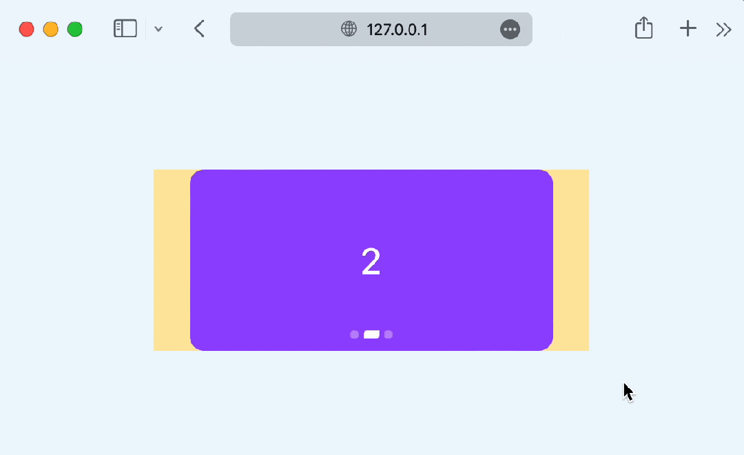
}效果如下
那么,如何让下方的指示器跟随滚动而变化呢?
这就需要用到 CSS 滚动驱动动画了,关于这个特性,可以参考之前这篇文章
CSS 滚动驱动动画终于正式支持了~
在这里,我们可以再单独绘制一个高亮的状态,刚好覆盖在现在的指示器上,就用伪元素来代替
.pagination::before{
  content: '';
  position: absolute;
  width: 6px;
  height: 6px;
  border-radius: 3px;
  background-color: #F24822;
  left: 0;
}
效果如下
然后给这个高亮状态一个动画,从第一个指示器位置移动到最后一个
.pagination::after{
  /**/
  animation: move 3s linear forwards;
}
@keyframes move {
  to {
    left: 100%;
    transform: translateX(-100%);
  }
}
现在这个红色的圆会自动从左到右运动,效果如下
最后,让这个动画和滚动关联起来,也就是滚动多少,这个红色的圆就运动多少
.swiper {
  /**/
  scroll-timeline: --scroller x;
}
.pagination::after{
	/**/
  animation: move 3s linear forwards;
  animation-timeline: --scroller;
}
这样就基本实现了指示器的联动
当然,你还可以换一种动画形式,比如steps
.pagination::after{
	/**/
  animation: move 3s steps(3, jump-none) forwards;
  animation-timeline: --scroller;
}
效果如下(可能会更常见)
你也可以访问以下在线demo
CSS swiper (juejin.cn)[1]
三、CSS 时间线范围
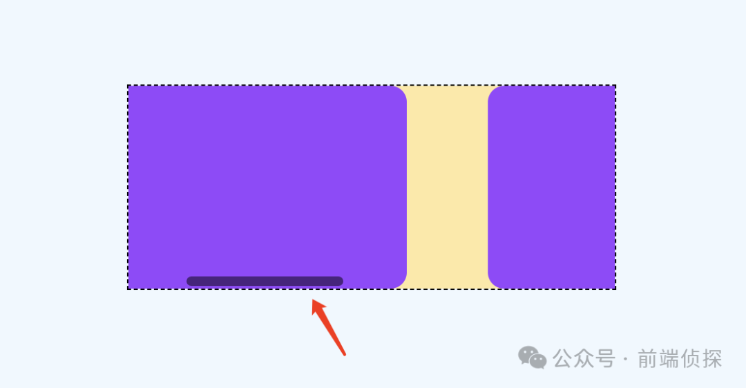
上面的指示器实现其实是通过覆盖的方式实现的,这就意味着无法实现这种有尺寸变化的效果,例如
这种情况下,每个指示器的变化是独立的,而且尺寸变化还会相互挤压。
那么,有没有办法实现这样的效果呢?当然也是有的,需要用到 CSS 时间线范围,也就是 timeline-scope
https://developer.mozilla.org/en-US/docs/Web/CSS/timeline-scope
这是什么意思呢?默认情况下,CSS 滚动驱动作用范围只能影响到子元素,但是通过timeline-scope,可以让任意元素都可以受到滚动驱动的影响。简单举个例子
<div class="content">
<div class="box animation"></div>
</div>
<div class="scroller">
<div class="long-element"></div>
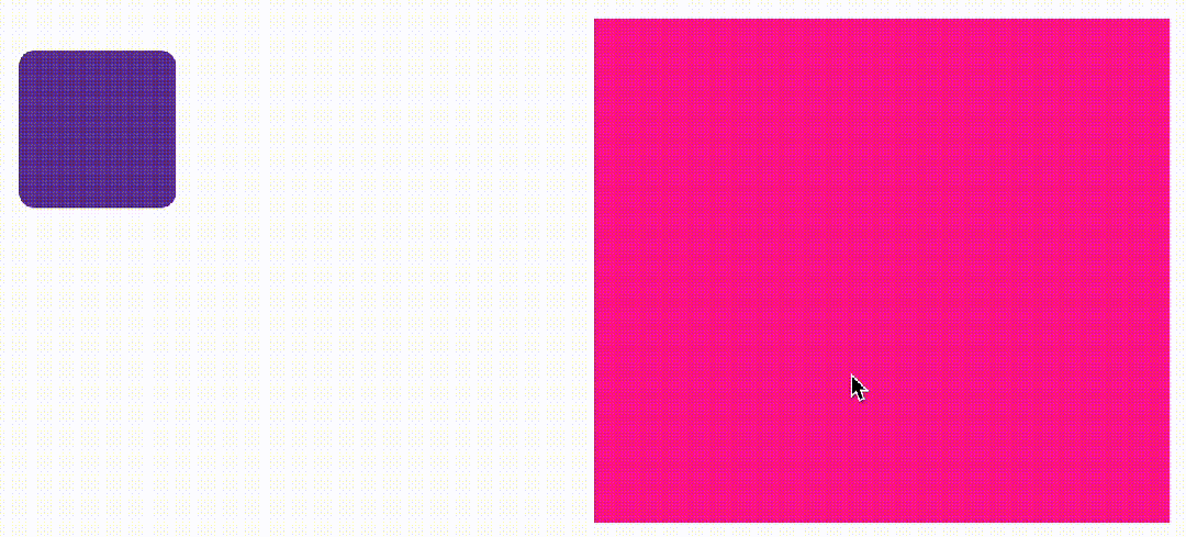
</div>这是两个元素,右边的是滚动容器,左边的是一个可以旋转的矩形
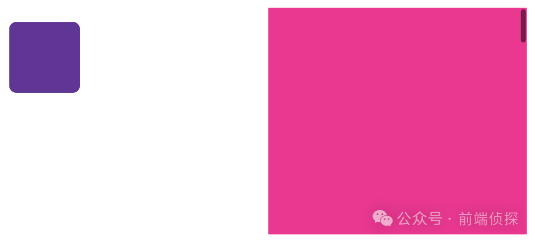
我们可以在他们共同的父级,比如body定义一个timeline-scope
body{
  timeline-scope: --myScroller;
}
然后,滚动容器的滚动和矩形的动画就可以通过这个变量关联起来了
.scroller {
  overflow: scroll;
  scroll-timeline-name: --myScroller;
  background: deeppink;
}
.animation {
  animation: rotate-appear;
  animation-timeline: --myScroller;
}
效果如下
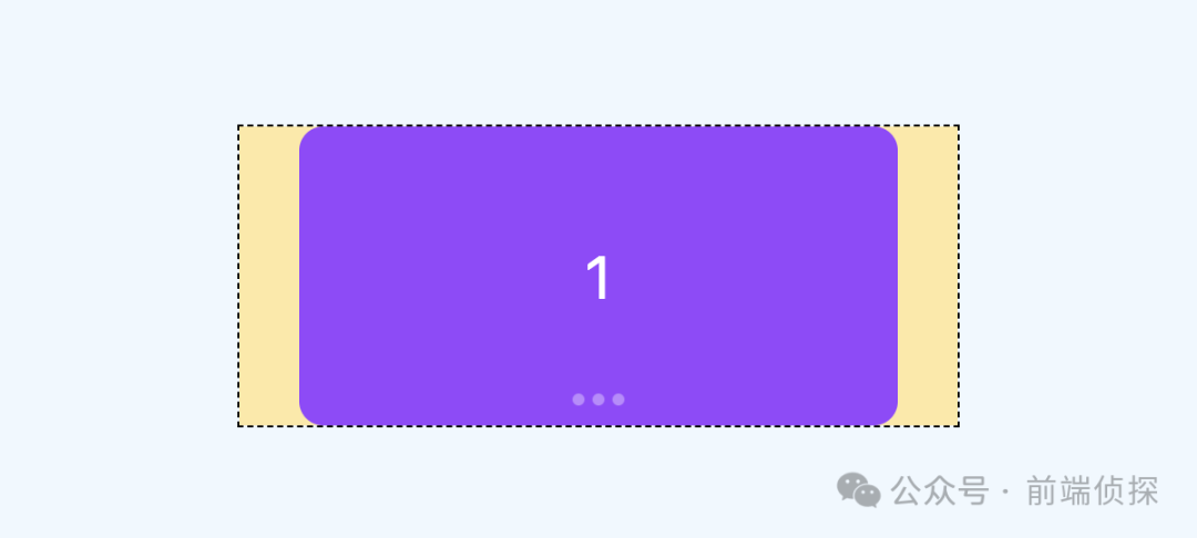
我们回到这个例子中来,很明显每个卡片对应一个指示器,但是他们从结构上又不是包含关系,所以这里也可以给每个卡片和指示器一个相关联的变量,具体实现如下
<div class="swiper-container" style="timeline-scope: --t1,--t2,--t3;">
  <div class="swiper" style="--t: --t1">
    <div class="swiper-item">
      <div class="card">1</div>
    </div>
    <div class="swiper-item" style="--t: --t2">
      <div class="card">2</div>
    </div>
    <div class="swiper-item"  style="--t: --t3">
      <div class="card">3</div>
    </div>
  </div>
  <div class="pagination">
    <i class="dot" style="--t: --t1"></i>
    <i class="dot" style="--t: --t2"></i>
    <i class="dot" style="--t: --t3"></i>
  </div>
</div>
然后,给每个指示器添加一个动画
@keyframes move {
  50% {
    width: 12px;
    border-radius: 3px 0px;
    border-color: rgba(0, 0, 0, 0.12);
    background: #fff;
  }
}
效果如下
然后我们需要将这个动画和卡片的滚动关联起来,由于是需要监听卡片的位置状态,比如只有第二个出现在视区范围内时,第二个指示器才会变化,所以这里要用到view-timeline,关键实现如下
.swiper-item {
  /**/
  view-timeline: var(--t) x;
}
.dot {
  /**/
  animation: move 3s;
  animation-timeline: var(--t);
}
这样就实现了我们想要的效果
你也可以访问以下在线demo
CSS swiper timeline scope (juejin.cn)[2]
四、CSS 自动播放
由于是页面滚动,CSS 无法直接控制,所以要换一种方式。通常我们会借助JS定时器实现,但是控制比较麻烦。
还记得之前这篇文章吗?
没错,我们这里也可以用这个原理实现。
给容器定义一个无关紧要的动画
.swiper {
  animation: scroll 3s infinite; /*每3s动画,无限循环*/
}
@keyframes scroll {
  to {
    transform: opacity: .99; /*无关紧要的样式*/
  }
}然后监听animationiteration事件,这个事件表示每次动画循环就触发一次,也就相当于每3秒执行一次
swiper.addEventListener("animationiteration", (ev) => {
  // 轮播逻辑
  if (ev.target.offsetWidth+ev.target.scrollLeft >= ev.target.scrollWidth) {
    // 滚动到最右边了直接回到0
    ev.target.scrollTo({
      left: 0,
      behavior: "smooth",
    })
  } else {
    // 每次滚动一屏
    ev.target.scrollBy({
      left: ev.target.offsetWidth,
      behavior: "smooth",
    });
  }
})相比定时器的好处就是,可以直接通过CSS控制播放和暂停,比如我们要实现当鼠标放在轮播上是自动暂停,可以这样来实现,副作用更小
swiper:hover, .swiper:active{
  animation-play-state: paused; /*hover暂停*/
}
最终效果如下
你也可以访问以下在线demo
CSS swiper autoplay (juejin.cn)[3]
五、回调事件
swiper很多时候不仅仅只是滑动,还需要有一个回调事件,以便于其他处理。这里由于是滚动实现,所以有必要监听scroll事件。
实现很简单,只需要监听滚动偏移和容器本身的尺寸就可以了,具体实现如下
swiper.addEventListener("scroll", (ev) => {
  const index =  Math.floor(swiper.scrollLeft / swiper.offsetWidth)
  console.log(index)
})
效果如下

你可能觉得触发次数太多了,我们可以限制一下,只有改变的时候才触发
swiper.addEventListener("scroll", (ev) => {
  const index =  Math.floor(swiper.scrollLeft / swiper.offsetWidth)
  // 和上次不相同的时候才打印
  if (swiper.index!== index) {
    swiper.index = index
    console.log(index)
  }
})
现在就好一些了

还可以继续优化,当滑动超过一半时,就认为已经滑到下一个卡片了,只需要在原有基础上加上0.5就行了
swiper.addEventListener("scroll", (ev) => {
  const index =  Math.floor(swiper.scrollLeft / swiper.offsetWidth + 0.5)
  if (swiper.index!== index) {
    swiper.index = index
    console.log(index)
  }
})
效果如下
如果在 vue这样的框架里,就可以直接这样实现了
const current = ref(0)
const scroll = (ev: Event) => {
  const swiper = ev.target as HTMLDivElement
  if (swiper) {
    current.value = Math.floor(swiper.scrollLeft / swiper.offsetWidth + 0.5)
  }
}
const emits = defineEmits(['change'])
watch(current, (v) => {
  emits('change', v)
})
六、兼容性处理
前面提到的CSS滚动驱动动画兼容性不是很好,需要Chrome 115+,所以对于不支持的浏览器,你也可以用监听回调事件的方式来实现指示器联动,就像这样
swiper.addEventListener("scroll", (ev) => {
  const index =  Math.floor(swiper.scrollLeft / swiper.offsetWidth + 0.5)
  if (swiper.index!== index) {
    swiper.index = index
    console.log(index)
    if (!CSS.supports("animation-timeline","scroll()")) {
      document.querySelector('.dot[data-current="true"]').dataset.current = false
      document.querySelectorAll('.dot')[index].dataset.current = true
    }
  }
})
对于 CSS部分,还需要用CSS support判断一下,这样一来,不支持浏览器就不会自动播放动画了
@supports (animation-timeline: scroll()) {
  .dot{
    animation: move 1s;
    animation-timeline: var(--t);
  }
}
@supports not (animation-timeline: scroll()) {
  .dot[data-current="true"]{
    width: 12px;
    border-radius: 3px 0px;
    border-color: rgba(0, 0, 0, 0.12);
    background: #fff;
  }
}这样既使用了最新的浏览器特性,又兼顾了不支持的浏览器,下面是Safari的效果
对比一下支持animation-timeline的浏览器(chrome 115+)
你会发现,这种效果更加细腻,指示器是完全跟随滚动进度变化的
也算一种体验增强吧,你也可以访问以下在线demo
CSS swiper support (juejin.cn)
七、总结一下
做好兼容,CSS 也是可以尝试最新特性的,下面总结一下要点
swiper非常强大,我们平时可能只用到了它的10%不到的功能,非常不划算CSS发展非常迅速,完全可以借助CSS代替部分swiper滚动吸附比较容易,需要借助
CSS scroll snap完成指示器联动可以用
CSS滚动驱动动画实现,让指示器唯一动画和滚动关联起来,也就是滚动多少,指示器就偏移多少默认情况下,CSS 滚动驱动作用范围只能影响到子元素,但是通过
timeline-scope,可以让任意元素都可以受到滚动驱动的影响。利用
timeline-scope,我们可以将每个卡片的位置状态和每个指示器的动画状态联动起来自动播放可以借助
animationiteration回调事件,相比JS定时器,控制更加方便,副作用更小回调事件需要监听
scroll实现,只需要监听滚动偏移和容器本身的尺寸的比值就行了对于不兼容的浏览器,也可以通过回调事件手动关联指示器的状态
兼容性判断,
JS可以使用CSS.supports,CSS可以使用@supports
当然,swiper的功能远不止上面这些,但是我们平时遇到的需求可能只是其中的一小部分,大可以通过CSS方式去实现,充分发挥浏览器的特性,量身定制才会有足够的性能和体验。

往期推荐


最后
欢迎加我微信,拉你进技术群,长期交流学习...
欢迎关注「前端Q」,认真学前端,做个专业的技术人...

前端Q
本公众号主要分享一些技术圈(前端圈为主)相关的技术文章、工具资源、学习资料、招聘信息及其他有趣的东西...
公众号


点个在看支持我吧
[1]CSS swiper (juejin.cn): https://code.juejin.cn/pen/7391010495207047205
[2]CSS swiper timeline scope (juejin.cn): https://code.juejin.cn/pen/7391018122460954636
[3]CSS swiper autoplay (juejin.cn): https://code.juejin.cn/pen/7391025055079890995


 112
112

 被折叠的 条评论
为什么被折叠?
被折叠的 条评论
为什么被折叠?
 到【灌水乐园】发言


