


<!DOCTYPE html>
<html lang="en">
<head>
<meta charset="UTF-8">
<meta name="viewport" content="width=device-width, initial-scale=1.0, minimum-scale=1.0, maximum-scale=1.0, user-scalable=no">
<meta name="author" content="helang.love@qq.com">
<script type="text/javascript" src="./rem.js"></script>
<title>移动端 1px(线条/边框) 解决方案</title>
<style type="text/css">
body{
margin: 0;
padding: 0;
font-size: 14px;
color: #333;
font-family: 'Microsoft YaHei', 'Times New Roman', Times, serif;
}
/* 线条 */
.list{
margin: 0 20px;
list-style: none;
line-height: 42px;
padding: 0;
}
.list>li{
padding: 0;
position: relative;
}
.list>li:not(:first-child):after{ /* CSS匹配非第一个直接子元素 */
content: "";
display: block;
height: 0;
border-top: #999 solid 1px;
width: 100%;
position: absolute;
top: 0;
right: 0;
transform: scaleY(0.5); /* 将 1px 的线条缩小为原来的 50% */
}
/* 边框 */
/*
其他作者可能会通过设置4个边的线条凑出边框线的效果,
这样做不仅代码不够精简,而且调整圆角问题也会非常麻烦
*/
.button{
line-height: 42px;
text-align: center;
margin: 20px;
background-color: #f8f8f8;
position: relative;
border-radius: 4px;
}
.button:after{
content: "";
position: absolute;
top: -50%;
right: -50%;
bottom: -50%;
left: -50%;
border: 1px solid #999;
transform: scale(0.5); /* 将 1px 的线条缩小为原来的 50% */
/*transform-origin: 50% 50% 0;*/
box-sizing: border-box;
border-radius: 8px; /* 尺寸缩小 50%,即圆角半径设置为按钮的2倍 */
}
</style>
</head>
<body>
<ul class="list">
<li>线条 1px</li>
<li>web前端 新浪</li>
<li>xinlang,cv@qq.com</li>
</ul>
<div class="button">边框 1px</div>
</body>
</html>
效果链接: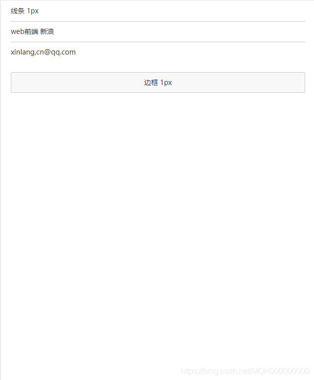


 扫一扫
扫一扫
08-09
 578
578
578
08-20
3846
3846

 被折叠的 条评论
为什么被折叠?
被折叠的 条评论
为什么被折叠?
 到【灌水乐园】发言


