


Material Design介绍
一、Toolbar
说到Toolbar,就要提到ActionBar了,每个活动最顶部的那个标题栏其实就是ActionBar。不过ActionBar由于其设计的原因,被限定只能位于活动的顶部,从而不能实现一些Material Design的效果,因此官方现在已经不再建议使用ActionBar了。
打开AndroidManifest.xml文件看一下,可以看到,这里使用android:theme属性指定了一个AppTheme的主题。那么这个AppTheme又是在哪里定义的呢?打开res/values/styles.xml文件,这里定义了一个叫AppTheme的主题,然后指定它的parent主题是 Theme.AppCompat.Light.DarkActionBar。这个DarkActionBar是一个深色的ActionBar主题,而现在准备使用Toolbar来替代ActionBar,因此需要指定一个不带ActionBar的主题,通常有 Theme.AppCompat.NoActionBar 和 Theme.AppCompat.Light.NoActionBar 这两种主题可选。
如下所示:
	<resources>
		<!-- Base application theme. -->
		<style name="AppTheme" parent="Theme.AppCompat.Light.NoActionBar">
			<!-- Customize your theme here. -->
			<item name="colorPrimary">@color/colorPrimary</item>
			<item name="colorPrimaryDark">@color/colorPrimaryDark</item>
			<item name="colorAccent">@color/colorAccent</item>
		</style>
	</resources>
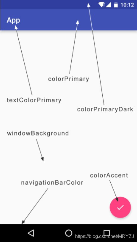
colorAccent这个属性不只是用来指定这样一个按钮的颜色,而是更多表达了一个强调的意思,比如一些控件的选中状态也会使用colorAccent的颜色。给activity增加了一个android:label属性,用于指定在Toolbar中显示的文字内容,如果没有指定的话,会默认使用application中指定的label内容,也就是我们的应用名称。现在右击res目录→New→Directory, 创建一个menu文件夹。然后右击menu文件夹→New→Menu resource file,创建一个toolbar.xml文件,并编写如下代码:
<?xml version="1.0" encoding="utf-8"?>
<menu xmlns:android="http://schemas.android.com/apk/res/android"
    xmlns:app="http://schemas.android.com/apk/res-auto">
    <item
        android:id="@+id/backup"
        android:icon="@mipmap/cloud_upload_white_48"
        android:title="Backup"
        app:showAsAction="always" />
    <item
        android:id="@+id/delete"
        android:icon="@mipmap/delete_white_48"
        android:title="Delete"
        app:showAsAction="ifRoom" />
    <item
        android:id="@+id/settings"
        android:icon="@mipmap/more_vert_white_48"
        android:title="Settings"
        app:showAsAction="never" >
        <item
            android:id="@+id/item1"
            android:title="item1"
            app:showAsAction="never" >
        </item>
        <item
            android:id="@+id/item2"
            android:title="item2"
            app:showAsAction="never" >
        </item>
        <item
            android:id="@+id/item3"
            android:title="item3"
            app:showAsAction="never" >
        </item>
        <item
            android:id="@+id/item4"
            android:title="item4"
            app:showAsAction="never" >
        </item>
    </item>
</menu>
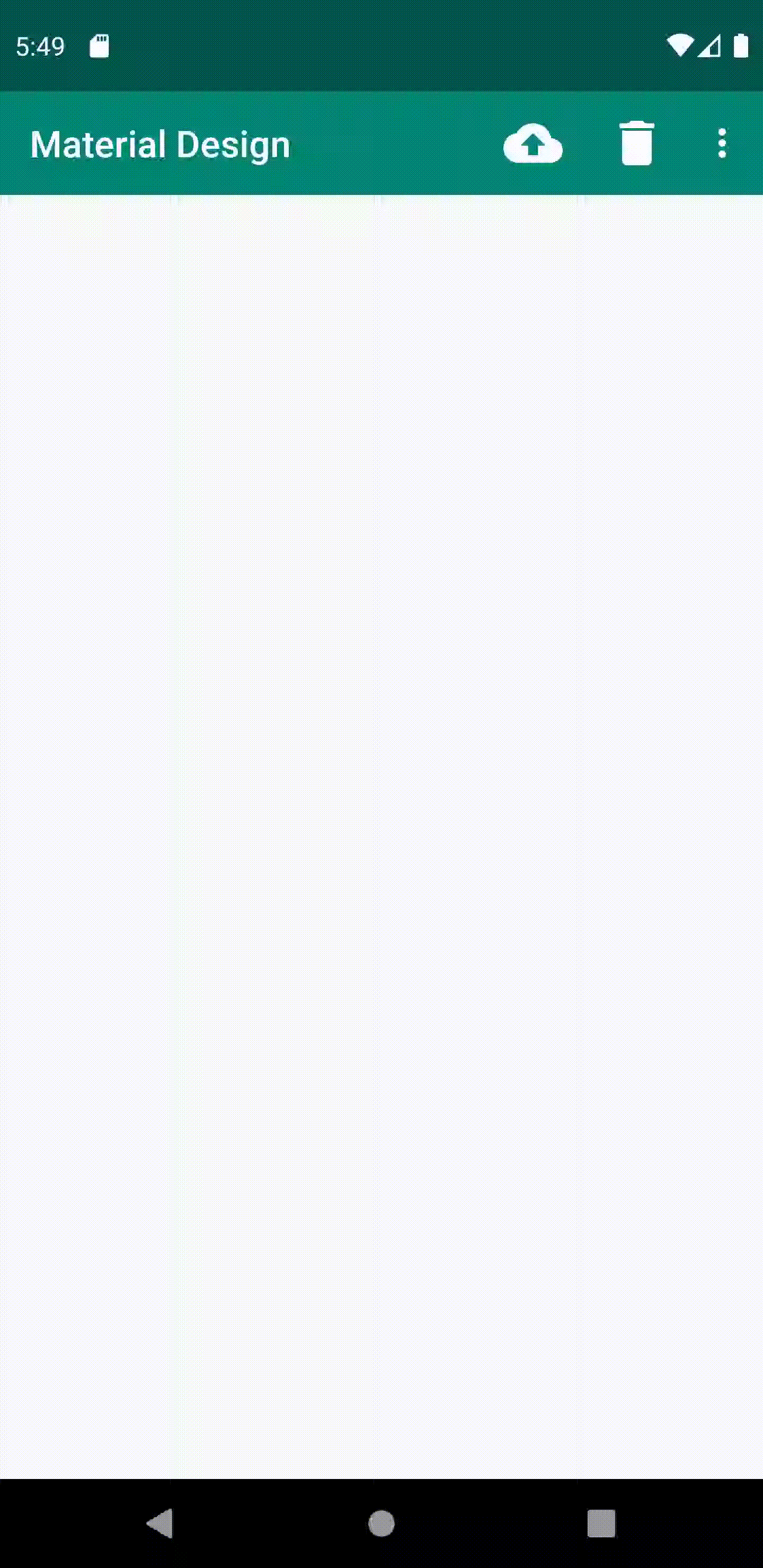
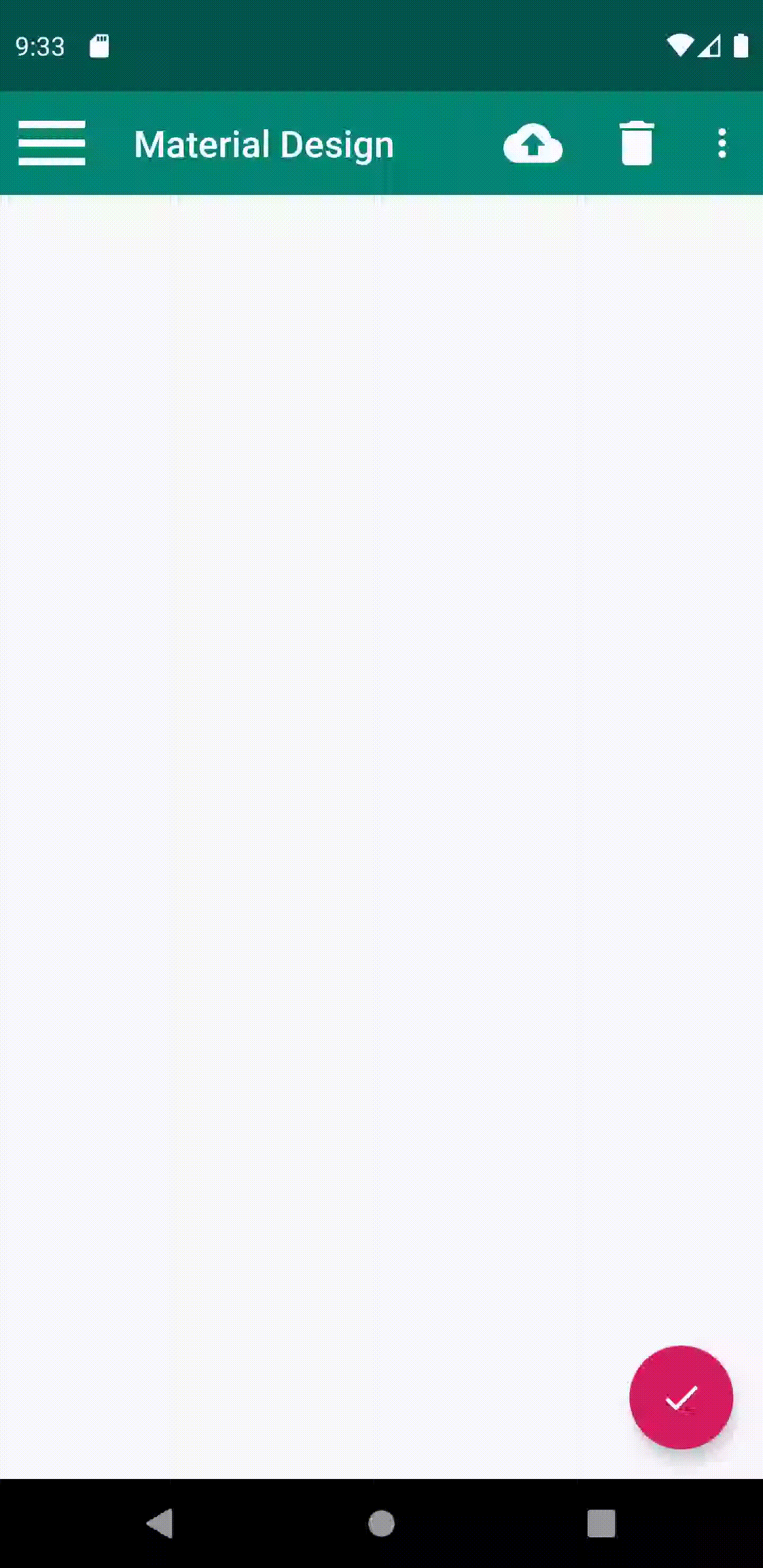
通过标签来定义action按钮,android:id用于指定按钮的id,android:icon用于指定按钮的图标,android:title用于指定按钮的文字。
接着使用app:showAsAction来指定按钮的显示位置,之所以这里再次使用了app命名空间,同样是为了能够兼容低版本
的系统。showAsAction主要有以下几种值可选:
- always表示永远显示在Toolbar中,如果屏幕空间不够则不显示;
- ifRoom表示屏幕空间足够的情况下显示在Toolbar中,不够的话就显示在菜单当中;
- never则表示永远显示在菜单当中。
- 注意,Toolbar中的action按钮只会显示图标,菜单中的 action按钮只会显示文字。
效果如下图:

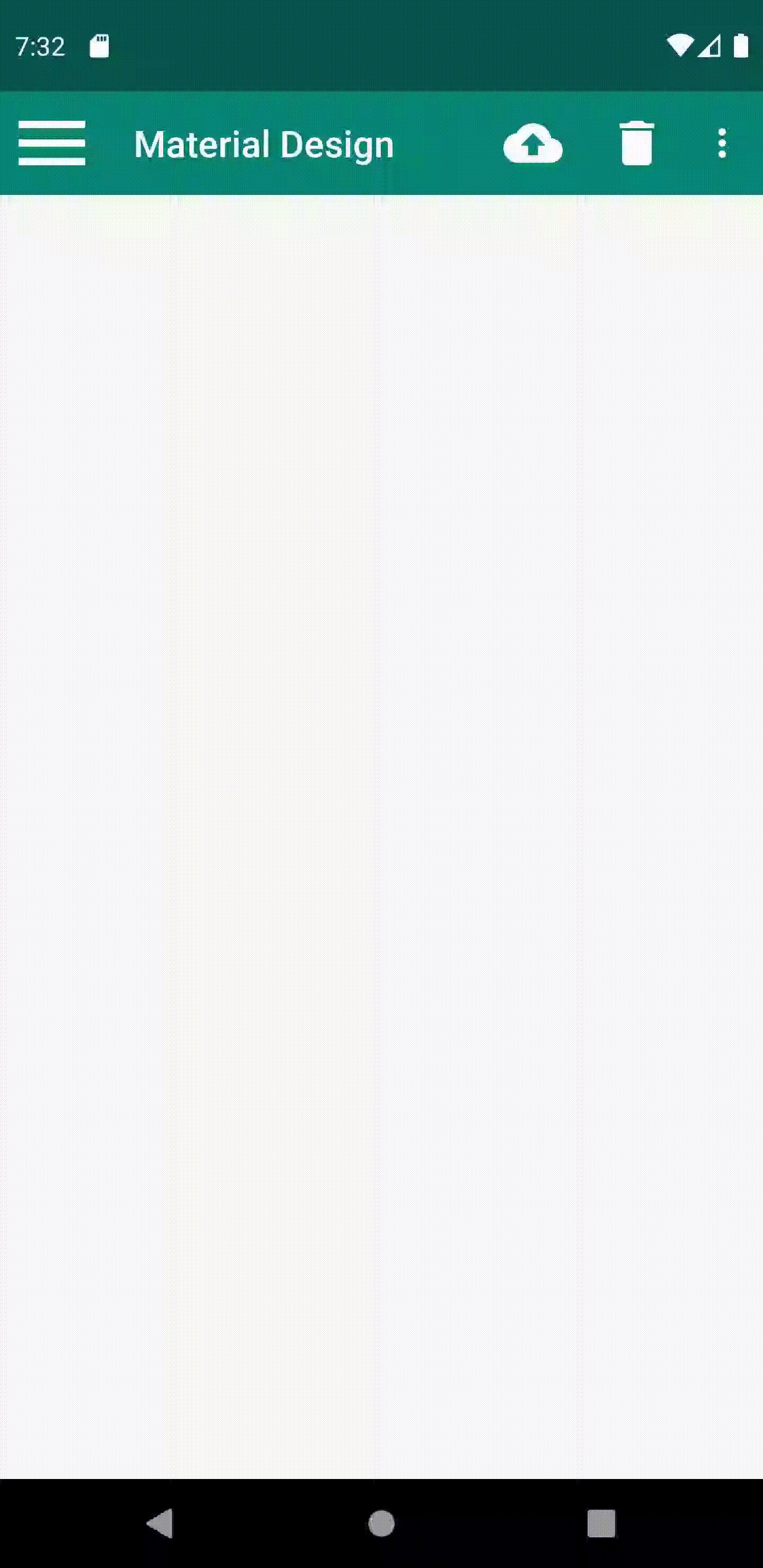
二、DrawerLayout
简单介绍一下DrawerLayout的用法吧。首先它是一个布局,在布局中允许放入两个直接子控件,第一个子控件是主屏幕中显示的内容,第二个子控件是滑动菜单中显示的内容,第三个子控件也是滑动菜单中显示的内容。因此,可以对activity_main.xml中的代码做如下修改:
<?xml version="1.0" encoding="utf-8"?>
<androidx.drawerlayout.widget.DrawerLayout
    xmlns:android="http://schemas.android.com/apk/res/android"
    xmlns:app="http://schemas.android.com/apk/res-auto"
    xmlns:tools="http://schemas.android.com/tools"
    android:layout_width="match_parent"
    android:layout_height="match_parent"
    tools:context=".MainActivity">

    <!--使用materialdesign必须要引用app这个命名空间-->
    <FrameLayout
        android:layout_width="match_parent"
        android:layout_height="match_parent">

        <androidx.appcompat.widget.Toolbar
            android:id="@+id/toolbar"
            android:layout_width="match_parent"
            android:layout_height="?attr/actionBarSize"
            android:background="?attr/colorPrimary"
            android:theme="@style/ThemeOverlay.AppCompat.Dark.ActionBar"
            app:popupTheme="@style/ThemeOverlay.AppCompat.Light"/>

    </FrameLayout>

    <TextView
        android:layout_width="match_parent"
        android:layout_height="match_parent"
        android:layout_gravity="start"
        android:text="This is start menu"
        android:textSize="30sp"
        android:background="#FFF" />
	<TextView
        android:layout_width="match_parent"
        android:layout_height="match_parent"
        android:layout_gravity="end"
        android:text="This is end menu"
        android:textSize="30sp"
        android:background="#FFF" />

</androidx.drawerlayout.widget.DrawerLayout>
第一个子控件是FrameLayout,用于作为主屏幕中显示的内容,当然里面还有我们刚刚定义的Toolbar。
第二个子控件这里使用了一个 TextView,用于作为滑动菜单中显示的内容,其实使用什么都可以,DrawerLayout并没有限制只能使用固定的控件。
第三个子控件和第二子控件一样,可以使用任何控件。
但是关于第二个子控件和地阿三哥控件有一点需要注意,layout_gravity这个属性是必须指定的,因为需要告诉DrawerLayout滑动菜单是在屏幕的左边还是右边,指定left表示滑动菜单在左边,指定right表示滑动菜单在右边。这里指定了 start,表示会根据系统语言进行判断,如果系统语言是从左往右的,比如英语、汉语,滑动菜单就在左边,如果系统语言是从右往左的,比如阿拉伯语,滑动 菜单就在右边。end与 start相反,比较好理解。
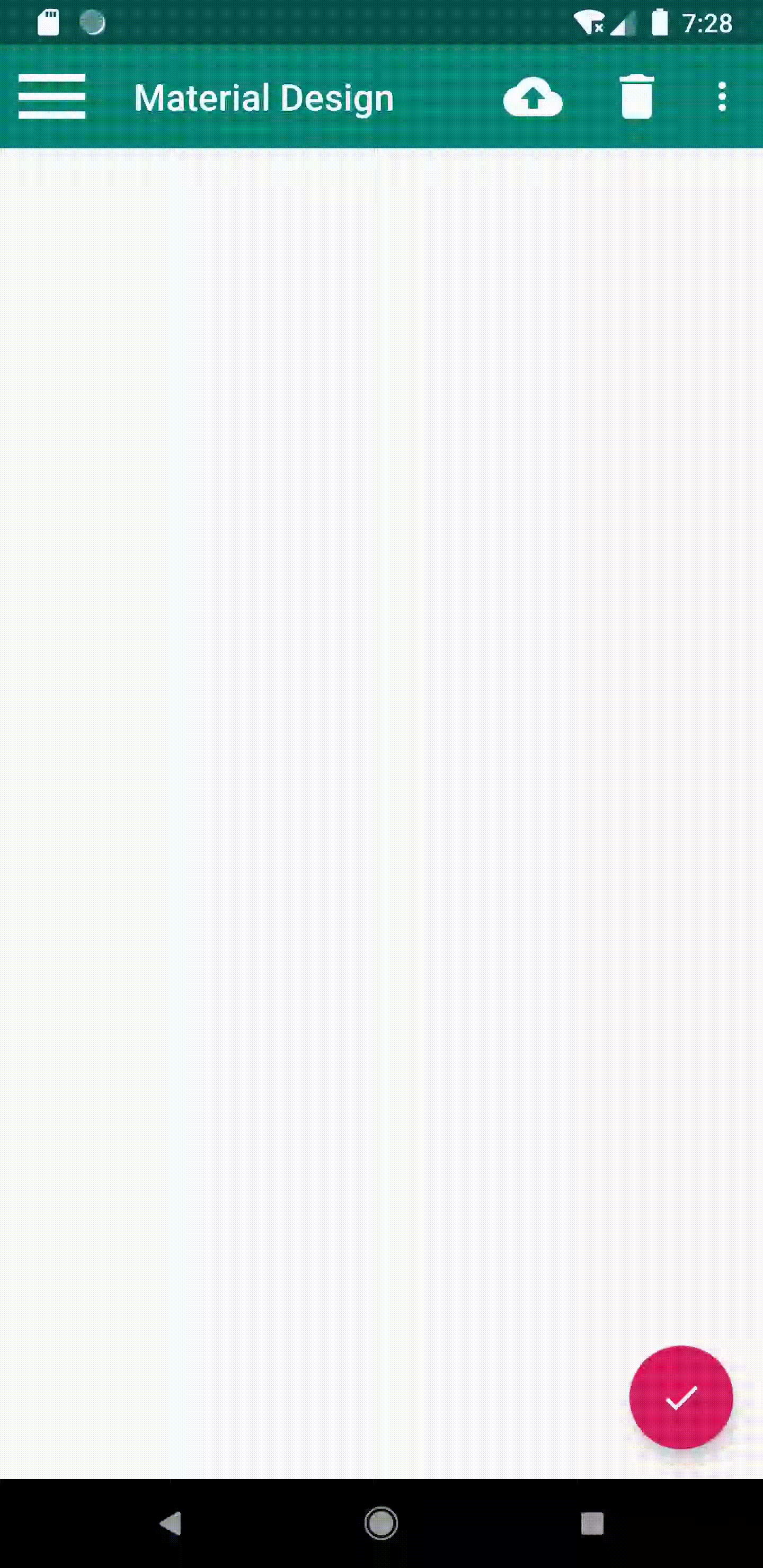
运行的效果如下:
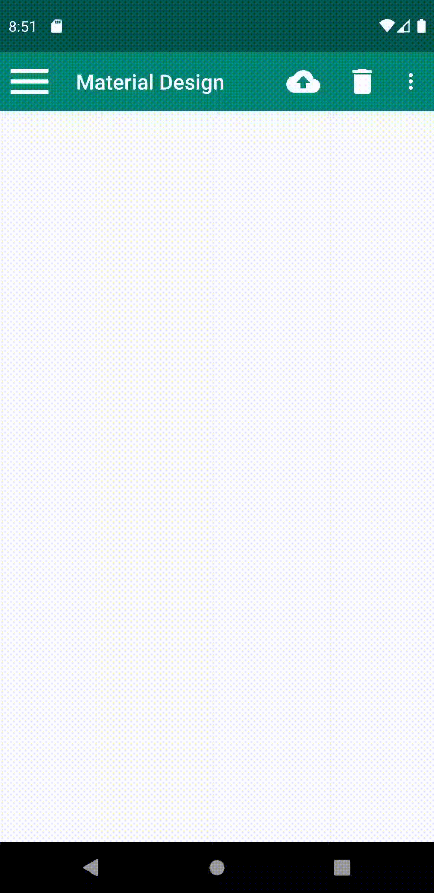
因为只有在屏幕的左侧或者右侧边缘进行拖动时才能将菜单拖出来,而很多用户可能根本就不知道有这个功能,Material Design建议的做法是在Toolbar的最左边加入一个导航按钮,点击了按钮也会将滑动菜单的内容展示出来。这样就相当于给用户提供了两种打开滑动菜单的方式,防止一些用户不知道屏幕的左侧边缘是可以拖动的。
public class MainActivity extends AppCompatActivity {
	private DrawerLayout mDrawerLayout;
	@Override
	protected void onCreate(Bundle savedInstanceState) {
		super.onCreate(savedInstanceState);
		setContentView(R.layout.activity_main);
		Toolbar toolbar = (Toolbar) findViewById(R.id.toolbar);
		setSupportActionBar(toolbar);
		mDrawerLayout = (DrawerLayout) findViewById(R.id.drawer_layout);
		ActionBar actionBar = getSupportActionBar();
		if (actionBar != null) {
			actionBar.setDisplayHomeAsUpEnabled(true);
			actionBar.setHomeAsUpIndicator(R.drawable.menu_white_48);
		}
	}
	...
	@Override
	public boolean onOptionsItemSelected(MenuItem item) {
		switch (item.getItemId()) {
			case android.R.id.home:
				mDrawerLayout.openDrawer(GravityCompat.START);
				break;
			...
			default:
				break;
		}
		return true;
	}
}
调用了setHomeAsUpIndicator()方法来设置一个导航按钮图标。实际上,Toolbar最左侧的这个按钮就叫作HomeAsUp按钮,它默认的图标是一个返回的箭头,含义是返回上一个活动。很明显,这里我们将它默认的样式和作用都进行了修改。
调用DrawerLayout的openDrawer()方法将滑动菜单展示出来,注意openDrawer()方法要求传入一个Gravity参数,为了保证这里的行为和XML中定义的一致,我们传入了GravityCompat.START。
效果如下:
三、NavigationView
NavigationView是Design Support库中提供的一个控件,它不仅是严格按照Material Design的要求来进行设计的,而且还可以将滑动菜单页面的实现变得非常简单。需要将这个库引入到项目中才行。打开app/build.gradle文件,在dependencies闭包中添加如下内容:
dependencies {
    implementation fileTree(dir: 'libs', include: ['*.jar'])
    implementation 'androidx.appcompat:appcompat:1.0.2'
    implementation 'androidx.constraintlayout:constraintlayout:1.1.3'
    testImplementation 'junit:junit:4.12'
    androidTestImplementation 'androidx.test:runner:1.2.0'
    androidTestImplementation 'androidx.test.espresso:espresso-core:3.2.0'
    implementation 'com.google.android.material:material:1.1.0-alpha09'
    implementation 'de.hdodenhof:circleimageview:2.1.0'
}
我这里使用的是 androidx, 至于androidx和support有什么区别这里就不做介绍,可以自己上网查。倒数第二行就是Design Support库,倒数第一行是一个开源项目CircleImageView,它可以用来轻松实现图片圆形化的功能,这是地址:https://github.com/hdodenhof/CircleImageView
右击layout文件夹→New→Layout resource file,创建一个nav_header.xml文件。
<?xml version="1.0" encoding="utf-8"?>
<RelativeLayout xmlns:android="http://schemas.android.com/apk/res/android"
android:layout_width="match_parent"
android:layout_height="180dp"
android:padding="10dp"
android:background="?attr/colorPrimary">
    <de.hdodenhof.circleimageview.CircleImageView
        android:id="@+id/icon_image"
        android:layout_width="70dp"
        android:layout_height="70dp"
        android:src="@drawable/user_img"
        android:layout_centerInParent="true" />
    <TextView
        android:id="@+id/mail"
        android:layout_width="wrap_content"
        android:layout_height="wrap_content"
        android:layout_alignParentBottom="true"
        android:text="mryzj0716@gmail.com"
        android:textColor="#FFF"
        android:textSize="14sp" />
    <TextView
        android:id="@+id/username"
        android:layout_width="wrap_content"
        android:layout_height="wrap_content"
        android:layout_above="@id/mail"
        android:text="MrYZJ"
        android:textColor="#FFF"
        android:textSize="14sp" />
</RelativeLayout>
然后右击menu文件夹→New→Menu resource file,创建一个nav_menu.xml文件,
<?xml version="1.0" encoding="utf-8"?>
<menu xmlns:android="http://schemas.android.com/apk/res/android">
    <group android:checkableBehavior="single">
        <item
            android:id="@+id/nav_call"
            android:icon="@drawable/phone_black_48"
            android:title="Call" />
        <item
            android:id="@+id/nav_friends"
            android:icon="@drawable/people_alt_black_48"
            android:title="Friends" />
        <item
            android:id="@+id/nav_location"
            android:icon="@drawable/location_searching_black_48"
            android:title="Location" />
        <item
            android:id="@+id/nav_mail"
            android:icon="@drawable/mail_black_48"
            android:title="Mail" />
        <item
            android:id="@+id/nav_task"
            android:icon="@drawable/today_black_48"
            android:title="Tasks" />
    </group>
</menu>
在<menu>中嵌套了一个<group>标签,然后将group的checkableBehavior属性指定为single。group表示一个组,checkableBehavior指定为single表示组中的所有菜单项只能单选。
现在menu和headerLayout都准备好了,终于可以使用NavigationView了。修改activity_main.xml中的代码::
<?xml version="1.0" encoding="utf-8"?>
<androidx.drawerlayout.widget.DrawerLayout
    xmlns:android="http://schemas.android.com/apk/res/android"
    xmlns:app="http://schemas.android.com/apk/res-auto"
    xmlns:tools="http://schemas.android.com/tools"
    android:id="@+id/drawer_layout"
    android:layout_width="match_parent"
    android:layout_height="match_parent"
    tools:context=".MainActivity">

    <!--使用materialdesign必须要引用app这个命名空间-->
    <FrameLayout
        android:layout_width="match_parent"
        android:layout_height="match_parent">

        <androidx.appcompat.widget.Toolbar
            android:id="@+id/toolbar"
            android:layout_width="match_parent"
            android:layout_height="?attr/actionBarSize"
            android:background="?attr/colorPrimary"
            android:theme="@style/ThemeOverlay.AppCompat.Dark.ActionBar"
            app:popupTheme="@style/ThemeOverlay.AppCompat.Light"/>

    </FrameLayout>

    <com.google.android.material.navigation.NavigationView
        android:id="@+id/nav_view"
        android:layout_width="match_parent"
        android:layout_height="match_parent"
        android:layout_gravity="start"
        app:menu="@menu/nav_menu"
        app:headerLayout="@layout/nav_header"/>

</androidx.drawerlayout.widget.DrawerLayout>
效果图如下:
四、悬浮按钮和可交互提示
FloatingActionButton
修改activity_main.xml中的代码:
<?xml version="1.0" encoding="utf-8"?>
<androidx.drawerlayout.widget.DrawerLayout
    xmlns:android="http://schemas.android.com/apk/res/android"
    xmlns:app="http://schemas.android.com/apk/res-auto"
    xmlns:tools="http://schemas.android.com/tools"
    android:id="@+id/drawer_layout"
    android:layout_width="match_parent"
    android:layout_height="match_parent"
    tools:context=".MainActivity">

    <!--使用materialdesign必须要引用app这个命名空间-->
    <FrameLayout
        android:layout_width="match_parent"
        android:layout_height="match_parent">

        <androidx.appcompat.widget.Toolbar
            android:id="@+id/toolbar"
            android:layout_width="match_parent"
            android:layout_height="?attr/actionBarSize"
            android:background="?attr/colorPrimary"
            android:theme="@style/ThemeOverlay.AppCompat.Dark.ActionBar"
            app:popupTheme="@style/ThemeOverlay.AppCompat.Light"/>

        <com.google.android.material.floatingactionbutton.FloatingActionButton
            android:id="@+id/fab"
            android:layout_width="wrap_content"
            android:layout_height="wrap_content"
            android:layout_gravity="bottom|end"
            android:layout_margin="16dp"
            android:src="@drawable/done_white_48" />

    </FrameLayout>

    <com.google.android.material.navigation.NavigationView
        android:id="@+id/nav_view"
        android:layout_width="match_parent"
        android:layout_height="match_parent"
        android:layout_gravity="start"
        app:menu="@menu/nav_menu"
        app:headerLayout="@layout/nav_header"/>

</androidx.drawerlayout.widget.DrawerLayout>
效果如图:

还可以指定FloatingActionButton的悬浮高度
<android.support.design.widget.FloatingActionButton
android:id="@+id/fab"
android:layout_width="wrap_content"
android:layout_height="wrap_content"
android:layout_gravity="bottom|end"
android:layout_margin="16dp"
android:src="@drawable/ic_done"
app:elevation="8dp" />
里使用app:elevation属性来给FloatingActionButton指定一个高度值,高度值越大,投影范围也越大,但是投影效果越淡,高度值越小,投影范围也越小,但是投影效果越浓。
添加点击事件:
public class MainActivity extends AppCompatActivity {
    private DrawerLayout mDrawerLayout;
    @Override
    protected void onCreate(Bundle savedInstanceState) {
	    super.onCreate(savedInstanceState);
	    setContentView(R.layout.activity_main);
	    ...
	   FloatingActionButton fab = findViewById(R.id.fab);
       fab.setOnClickListener(new View.OnClickListener() {
            @Override
            public void onClick(View v) {
                Toast.makeText(MainActivity.this, "FAB clicked", Toast.LENGTH_SHORT).show();
            }
        });
    }
    ...
}
从添加点击事件可以看出它和普通的按钮是一样的。
效果如下:

Snackbar
Snackbar并不是Toast的替代品,它们两者之间有着不同的应用场景。Toast的作用是告诉用户现在发生了什么事情,但同时用户只能被动接收这个事情,因为没有什么办法能让用户进行选择。而Snackbar则在这方面进行了扩展,它允许在提示当中加入一个可交互按钮,当用户点 击按钮的时候可以执行一些额外的逻辑操作。Snackbar的用法也非常简单,它和Toast是基本相似的,只不过可以额外增加一个按钮的点击事件。修改代码:
······
FloatingActionButton fab = findViewById(R.id.fab);
        fab.setOnClickListener(new View.OnClickListener() {
            @Override
            public void onClick(View view) {
                Snackbar.make(view, "Data deleted", Snackbar.LENGTH_SHORT)
                        .setAction("Undo", new View.OnClickListener() {
                            @Override
                            public void onClick(View v) {
                                Toast.makeText(MainActivity.this, "Data restored",
                                        Toast.LENGTH_SHORT).show();
                            }
                        }).show();
            }
        });
······
这里调用了Snackbar的make()方法来创建一个Snackbar对象,make()方法的参数:
- 第一个参数需要传入一个View,只要是当前界面布局的任意一个View都可以,Snackbar会使用这个View来自动查找最外层的布局,用于展示Snackbar。
- 第二个参数就是Snackbar中显示的内容,
- 第三个参数是Snackbar显示的时长。
这些和Toast都是类似的。接着这里又调用了一个setAction()方法来设置一个动作,调用show()方法展示出来。
效果如图:
CoordinatorLayout
CoordinatorLayout可以说是一个加强版的FrameLayout,这个布局也是由Design Support库提供的。它在普通情况下的作用和FrameLayout基本一致,不过,CoordinatorLayout可以监听其所有子控件的各种事件,然后自动帮助我们做出最为合理的响应。举个简单的例子,刚才弹出的 Snackbar提示将悬浮按钮遮挡住了,而如果我们能让CoordinatorLayout监听到Snackbar的弹出事件,那么它会自动将内部的 FloatingActionButton向上偏移,从而确保不会被Snackbar遮挡到。至于CoordinatorLayout的使用也非常简单,只需要将原来的FrameLayout替换一下就可以了。修改activity_main.xml
中的代码,如下所示:
<?xml version="1.0" encoding="utf-8"?>
<androidx.drawerlayout.widget.DrawerLayout
    xmlns:android="http://schemas.android.com/apk/res/android"
    xmlns:app="http://schemas.android.com/apk/res-auto"
    xmlns:tools="http://schemas.android.com/tools"
    android:id="@+id/drawer_layout"
    android:layout_width="match_parent"
    android:layout_height="match_parent"
    tools:context=".MainActivity">

    <androidx.coordinatorlayout.widget.CoordinatorLayout
        android:layout_width="match_parent"
        android:layout_height="match_parent">

        <androidx.appcompat.widget.Toolbar
            android:id="@+id/toolbar"
            android:layout_width="match_parent"
            android:layout_height="?attr/actionBarSize"
            android:background="?attr/colorPrimary"
            android:theme="@style/ThemeOverlay.AppCompat.Dark.ActionBar"
            app:popupTheme="@style/ThemeOverlay.AppCompat.Light"/>

        <com.google.android.material.floatingactionbutton.FloatingActionButton
            android:id="@+id/fab"
            android:layout_width="wrap_content"
            android:layout_height="wrap_content"
            android:layout_gravity="bottom|end"
            android:layout_margin="16dp"
            android:src="@drawable/done_white_48" />

    </androidx.coordinatorlayout.widget.CoordinatorLayout>

    <com.google.android.material.navigation.NavigationView
        android:id="@+id/nav_view"
        android:layout_width="match_parent"
        android:layout_height="match_parent"
        android:layout_gravity="start"
        app:menu="@menu/nav_menu"
        app:headerLayout="@layout/nav_header"/>
</androidx.drawerlayout.widget.DrawerLayout>
在重新运行一下程序,并点击悬浮按钮,效果如下图所示:
悬浮按钮自动向上偏移了Snackbar的同等高度,从而确保不会被遮挡住,当Snackbar消失的时候,悬浮按钮会自动向下偏移回到原来位置。另外悬浮按钮的向上和向下偏移也是伴随着动画效果的,且和Snackbar完全同步,整体效果看上去特别赏心悦目。刚才说的是CoordinatorLayout可以监听其所有子控件的各种事件,但是Snackbar好像并不是CoordinatorLayout的子控件吧,为什么它却可以被监听到呢?其实道理很简单,还记得在Snackbar的make()方法中传入的第一个参数吗?这个参数就是用来指定 Snackbar是基于哪个View来触发的,刚才传入的是FloatingActionButton本身,而FloatingActionButton是CoordinatorLayout中的子控件,因此这个事件就理所应当能被监听到了。可以再做个试 验,如果给Snackbar的make()方法传入一个DrawerLayout,那么Snackbar就会再次遮挡住悬浮按钮,因为DrawerLayout不是CoordinatorLayout的子控件,CoordinatorLayout也就无法监听到Snackbar的弹出和隐藏事件了。
五、卡片式布局
CardView
CardView是用于实现卡片式布局效果的重要控件,由appcompat-v7库提供。实际上,CardView也是一个FrameLayout,只是额外提供了圆角和阴影等效果,看上去会有立体的感觉。
先来看一下CardView的基本用法吧,其实非常简单:
<android.support.v7.widget.CardView
	android:layout_width="match_parent"
	android:layout_height="wrap_content"
	app:cardCornerRadius="4dp"
	app:elevation="5dp">
		<TextView
			android:id="@+id/info_text"
			android:layout_width="match_parent"
			android:layout_height="wrap_content"/>
</android.support.v7.widget.CardView>
通过app:cardCornerRadius属性指定卡片圆角的弧度,数值越大,圆角的弧度也越大。另外还可以通过app:elevation属性指定卡片的高度,高度值越大,投影范围也越大,但是投影效果越淡,高度值越小,投影范围也越小,但是投影效果越浓,这一点和FloatingActionButton是一致的。
以下使用recycleview做一个例子,后由于需要用到RecyclerView、CardView这几个控件,因此必须在app/build.gradle文件中声明这些库的依赖才行:
    implementation 'androidx.cardview:cardview:1.0.0'
    implementation 'androidx.recyclerview:recyclerview:1.0.0'
    implementation 'com.github.bumptech.glide:glide:3.7.0'
Glide是一个超级强大的图片加载库,它不仅可以用于加载本地图片,还可以加载网络 图片、GIF图片、甚至是本地视频。最重要的是,Glide的用法非常简单,只需一行代码就能轻松实现复杂的图片加载功能。Glide的项目主页地址是:https://github.com/bumptech/glide。
在改activity_main.xml中的CoordinatorLayout中添加了一个RecyclerView:
    <androidx.recyclerview.widget.RecyclerView
        android:id="@+id/recycler_view"
        android:layout_width="match_parent"
        android:layout_height="match_parent" />
着定义一个实体类Fruit,代码如下所示:
public class Fruit {
	private String name;
	private int imageId;
	public Fruit(String name, int imageId) {
		this.name = name;
		this.imageId = imageId;
	}
	public String getName() {
		return name;
	}
	public int getImageId() {
		return imageId;
	}
}
为RecyclerView的子项指定一个我们自定义的布局,在layout目录下新建fruit_item.xml,代码如下所示:
<?xml version="1.0" encoding="utf-8"?>
<androidx.cardview.widget.CardView
    xmlns:android="http://schemas.android.com/apk/res/android"
    xmlns:app="http://schemas.android.com/apk/res-auto"
    android:layout_width="match_parent"
    android:layout_height="wrap_content"
    android:layout_margin="5dp"
    app:cardCornerRadius="4dp">

    <LinearLayout
        android:orientation="vertical"
        android:layout_width="match_parent"
        android:layout_height="wrap_content">

        <ImageView
            android:id="@+id/fruit_image"
            android:layout_width="match_parent"
            android:layout_height="100dp"
            android:scaleType="centerCrop" />

        <TextView
            android:id="@+id/fruit_name"
            android:layout_width="wrap_content"
            android:layout_height="wrap_content"
            android:layout_gravity="center_horizontal"
            android:layout_margin="5dp"
            android:textSize="16sp" />
    </LinearLayout>

</androidx.cardview.widget.CardView>
这里使用了CardView来作为子项的最外层布局,从而使得RecyclerView中的每个元素都是在卡片当中的。CardView由于是一个 FrameLayout,因此它没有什么方便的定位方式,这里只好在CardView中再嵌套一个LinearLayout,然后在LinearLayout中放置具体的内容。
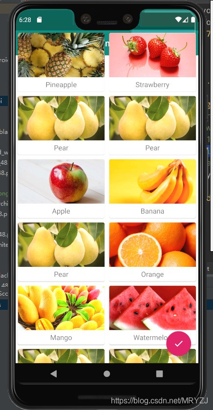
注意在ImageView中我们使用了一个scaleType属性,这个属性可以指定图片的缩放模式。由于各张水果图片的长宽比例可能都不一致,为了让所有的图片都能填充满整个ImageView,这里使用了centerCrop模式,它可以让图片保持原有比例填充满ImageView,并将超出屏幕的部分裁剪掉。
接下来需要为RecyclerView准备一个适配器,新建FruitAdapter类,让这个适配器继承自RecyclerView.Adapter,并将泛型指定为FruitAdapter.ViewHolder,代码如下所示:
import android.content.Context;
import android.content.Intent;
import android.view.LayoutInflater;
import android.view.View;
import android.view.ViewGroup;
import android.widget.ImageView;
import android.widget.TextView;
import androidx.cardview.widget.CardView;
import androidx.recyclerview.widget.RecyclerView;
import com.bumptech.glide.Glide;
import java.util.List;

public class FruitAdapter extends RecyclerView.Adapter<FruitAdapter.ViewHolder>{

    private static final String TAG = "FruitAdapter";

    private Context mContext;

    private List<Fruit> mFruitList;

    static class ViewHolder extends RecyclerView.ViewHolder {
        CardView cardView;
        ImageView fruitImage;
        TextView fruitName;

        public ViewHolder(View view) {
            super(view);
            cardView = (CardView) view;
            fruitImage = view.findViewById(R.id.fruit_image);
            fruitName = view.findViewById(R.id.fruit_name);
        }
    }

    public FruitAdapter(List<Fruit> fruitList) {
        mFruitList = fruitList;
    }

    @Override
    public ViewHolder onCreateViewHolder(ViewGroup parent, int viewType) {
        if (mContext == null) {
            mContext = parent.getContext();
        }
        View view = LayoutInflater.from(mContext).inflate(R.layout.fruit_item, parent, false);
        final ViewHolder holder = new ViewHolder(view);
        holder.cardView.setOnClickListener(new View.OnClickListener() {
            @Override
            public void onClick(View v) {
                int position = holder.getAdapterPosition();
                Fruit fruit = mFruitList.get(position);
                Intent intent = new Intent(mContext, FruitActivity.class);
                intent.putExtra(FruitActivity.FRUIT_NAME, fruit.getName());
                intent.putExtra(FruitActivity.FRUIT_IMAGE_ID, fruit.getImageId());
                mContext.startActivity(intent);
            }
        });
        return holder;
    }

    @Override
    public void onBindViewHolder(ViewHolder holder, int position) {
        Fruit fruit = mFruitList.get(position);
        holder.fruitName.setText(fruit.getName());
        Glide.with(mContext).load(fruit.getImageId()).into(holder.fruitImage);
    }

    @Override
    public int getItemCount() {
        return mFruitList.size();
    }
}
用Glide.with()方法并传入一个Context、Activity或Fragment参数,然后调用load()方法去加载图片,可以是一个URL地址,也可以是一个本地路径,或者是一个资源id,最后调用into()方法将图片设置到具体某一个ImageView中就可以了。
GridLayoutManager的用法也没有什么特别之处,它的构造函数接收两个参数,第一个是Context,第二个是列数
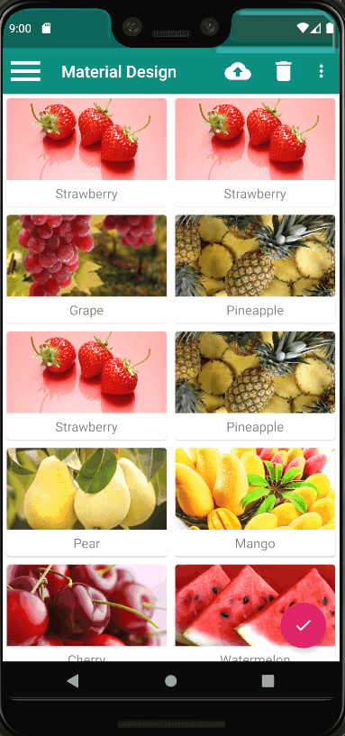
现在重新运行一下程序,效果如图:
AppBarLayout
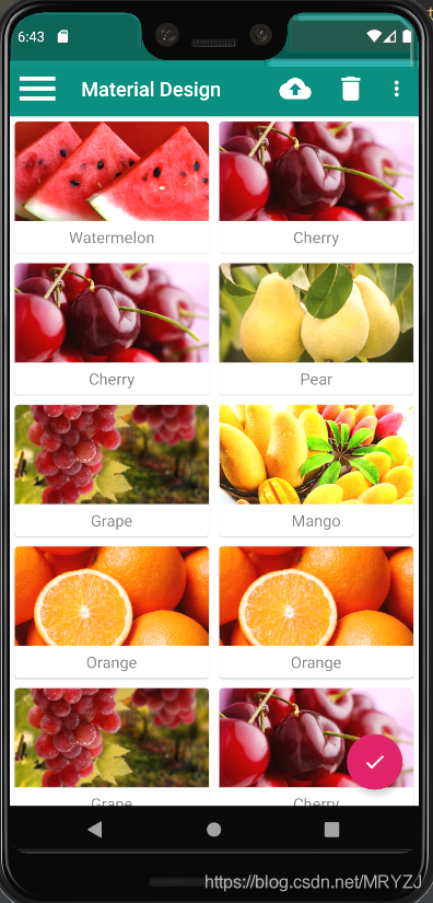
由于RecyclerView和Toolbar 都是放置在CoordinatorLayout中的,而前面已经说过,CoordinatorLayout就是一个加强版的FrameLayout,那么 FrameLayout中的所有控件在不进行明确定位的情况下,默认都会摆放在布局的左上角,从而也就产生了RecyclerView会把Toolbar给遮挡住遮挡的现象。使用Design Support库中提供的另外一个工具——AppBarLayout。AppBarLayout实际上是一个垂直方向的LinearLayout,它在内部做了很多滚动事件的封装,并应用了一些Material Design的设计理念。
使用AppBarLayout解决前面的覆盖问题,其实只需要两步就可以了 : 第一步将Toolbar嵌套到AppBarLayout中,第二步给RecyclerView指定一个布局行为。修改activity_main.xml中的代码,如下所示:
	 <com.google.android.material.appbar.AppBarLayout
	            android:layout_width="match_parent"
	            android:layout_height="wrap_content">

            <androidx.appcompat.widget.Toolbar
                android:id="@+id/toolbar"
                android:layout_width="match_parent"
                android:layout_height="?attr/actionBarSize"
                android:background="?attr/colorPrimary"
                android:theme="@style/ThemeOverlay.AppCompat.Dark.ActionBar"
                app:popupTheme="@style/ThemeOverlay.AppCompat.Light"/>

        </com.google.android.material.appbar.AppBarLayout>

        <androidx.recyclerview.widget.RecyclerView
            android:id="@+id/recycler_view"
            android:layout_width="match_parent"
            android:layout_height="match_parent"
            app:layout_behavior="@string/appbar_scrolling_view_behavior"/>
效果如下:
当AppBarLayout接收到滚动事件的时候,它内部的子控件其实是可以指定如何去影响这些事件的,通过app:layout_scrollFlags属性就能实现。修改activity_main.xml中的代码,如下所示:
<androidx.appcompat.widget.Toolbar
            android:id="@+id/toolbar"
            android:layout_width="match_parent"
            android:layout_height="?attr/actionBarSize"
            android:background="?attr/colorPrimary"
            android:theme="@style/ThemeOverlay.AppCompat.Dark.ActionBar"
            app:popupTheme="@style/ThemeOverlay.AppCompat.Light"
            app:layout_scrollFlags="scroll|enterAlways|snap"/>
效果如图:

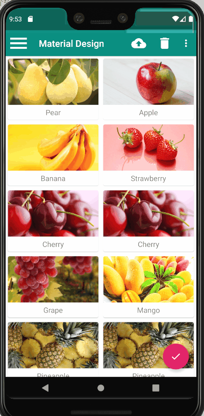
可以看到,随着我们向上滚动RecyclerView,Toolbar竟然消失了,而向下滚动RecyclerView,Toolbar又会重新出 现。这其实也是Material Design中的一项重要设计思想,因为当用户在向上滚动RecyclerView的时候,其注意力肯定是在RecyclerView的内容上面的,这个 时候如果Toolbar还占据着屏幕空间,就会在一定程度上影响用户的阅读体验,而将Toolbar隐藏则可以让阅读体验达到最佳状态。
六、下拉刷新
SwipeRefreshLayout就是用于实现下拉刷新功能的核心类,它是由support-v4库提供的。我们把想要实现下拉刷新功能的控件放置到SwipeRefreshLayout中,就可以迅速让这个控件支持下拉刷新。那么在项目中,应该支持下拉刷新功能的控件自然就是RecyclerView了。
	 	 <android.support.v4.widget.SwipeRefreshLayout
	            android:id="@+id/swipe_refresh"
	            android:layout_width="match_parent"
	            android:layout_height="match_parent"
	            app:layout_behavior="@string/appbar_scrolling_view_behavior">

           <androidx.recyclerview.widget.RecyclerView
                android:id="@+id/recycler_view"
                android:layout_width="match_parent"
                android:layout_height="match_parent" />
       	 </android.support.v4.widget.SwipeRefreshLayout>
由于RecyclerView现在变成了SwipeRefreshLayout的子控件,因此之前使用app:layout_behavior声明的布局行为现在也要移到SwipeRefreshLayout中才行。
虽然RecyclerView已经支持下拉刷新功能了,但是我们还要在代码中处理具体的刷新逻辑才行。修改MainActivity中的代码,如下所示:
	public class MainActivity extends AppCompatActivity {
		...
		private SwipeRefreshLayout swipeRefresh;
		@Override
		protected void onCreate(Bundle savedInstanceState) {
			super.onCreate(savedInstanceState);
			setContentView(R.layout.activity_main);
			...
			swipeRefresh = (SwipeRefreshLayout) findViewById(R.id.swipe_refresh);
			swipeRefresh.setColorSchemeResources(R.color.colorPrimary);
			swipeRefresh.setOnRefreshListener(new SwipeRefreshLayout.
			OnRefreshListener() {
				@Override
				public void onRefresh() {
					refreshFruits();
				}
			});
		}

		private void refreshFruits() {
			new Thread(new Runnable() {
				@Override
				public void run() {
					try {
						Thread.sleep(2000);
					} catch (InterruptedException e) {
						e.printStackTrace();
					}
					runOnUiThread(new Runnable() {
						@Override
						public void run() {
							initFruits();
							adapter.notifyDataSetChanged();
							swipeRefresh.setRefreshing(false);
						}
					});
				}
			}).start();
		}
		...
	}
首先通过findViewById()方法拿到SwipeRefreshLayout的实例,然后调用setColorSchemeResources()方法来设置下拉刷新进度条的颜色,这里我们就使用主题中的colorPrimary作为进度条的颜色了。接着调用setOnRefreshListener()方法来设置一个下拉刷新的监听器,当触发了下拉刷新操作的时候就会回调这个监听器的onRefresh()方法,然后我们在这里去处理具体的刷新逻辑就可以了。
通常情况下,onRefresh()方法中应该是去网络上请求最新的数据,然后再将这些数据展示出来。这里简单起见,我们就不和网络进行交互了,而是调用一个refreshFruits()方法进行本地刷新操作。refreshFruits()方法中先是开启了一个线程,然后将线程沉睡两秒钟。之所以这么做,是因为本地刷新操作速度非常快,如果不将线程沉睡的话,刷新立刻就结束了,从而看不到刷新的过程。沉睡结束之后,这里使用了runOnUiThread()方法将线程切换回主线程,然后调用initFruits()方法重新生成数据,接着再调用FruitAdapter的notifyDataSetChanged()方法通知数据发生了变化,最后调用SwipeRefreshLayout的setRefreshing()方法并传入false,用于表示刷新事件结束,并隐藏刷新进度条。
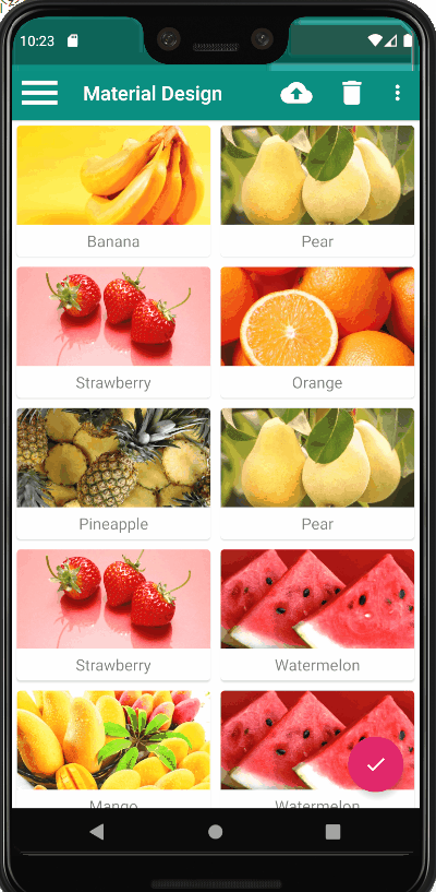
下拉刷新的进度条只会停留两秒钟,之后就会自动消失,界面上的水果数据也会随之更新。
七、可折叠式标题栏
虽说我们现在的标题栏是使用Toolbar来编写的,不过它看上去和传统的ActionBar其实没什么两样,只不过可以响应RecyclerView的滚动事件来进行隐藏和显示。而Material Design中并没有限定标题栏必须是长这个样子的,事实上,我们可以根据自己的喜好随意定制标题栏的样式。那么本节中我们就来实现一个可折叠式标题栏的效果,需要借助CollapsingToolbarLayout这个工具。
CollapsingToolbarLayout是一个作用于Toolbar基础之上的布局,它也是由Design Support库提供的。CollapsingToolbarLayout可以让Toolbar的效果变得更加丰富,不仅仅是展示一个标题栏,而是能够实现非常华丽的效果。
不过,
CollapsingToolbarLayout是不能独立存在的,它在设计的时候就被限定只能作为AppBarLayout的直接子布局来使用。而AppBarLayout又必须是CoordinatorLayout的子布局。
CollapsingToolbarLayout
创建一个FruitActivity,并将布局名指定成activity_fruit.xml,activity_fruit.xml中的内容主要分为两部分,一个是水果标
题栏,一个是水果内容详情。
首先实现标题栏部分,这里使用CoordinatorLayout来作为最外层布局:
	<androidx.coordinatorlayout.widget.CoordinatorLayout
	    xmlns:android="http://schemas.android.com/apk/res/android"
	    xmlns:app="http://schemas.android.com/apk/res-auto"
	    android:layout_width="match_parent"
	    android:layout_height="match_parent">

	</androidx.coordinatorlayout.widget.CoordinatorLayout>
接着我们在CoordinatorLayout中嵌套一个AppBarLayout:
	<?xml version="1.0" encoding="utf-8"?>
	<androidx.coordinatorlayout.widget.CoordinatorLayout
	    xmlns:android="http://schemas.android.com/apk/res/android"
	    xmlns:app="http://schemas.android.com/apk/res-auto"
	    android:layout_width="match_parent"
	    android:layout_height="match_parent">

	    <com.google.android.material.appbar.AppBarLayout
	        android:id="@+id/appBar"
	        android:layout_width="match_parent"
	        android:layout_height="250dp">
	   </com.google.android.material.appbar.AppBarLayout>

	</androidx.coordinatorlayout.widget.CoordinatorLayout>
接下来我们在AppBarLayout中再嵌套一个CollapsingToolbarLayout
	<androidx.coordinatorlayout.widget.CoordinatorLayout
	    xmlns:android="http://schemas.android.com/apk/res/android"
	    xmlns:app="http://schemas.android.com/apk/res-auto"
	    android:layout_width="match_parent"
	    android:layout_height="match_parent">

	    <com.google.android.material.appbar.AppBarLayout
	        android:id="@+id/appBar"
	        android:layout_width="match_parent"
	        android:layout_height="250dp">

	        <com.google.android.material.appbar.CollapsingToolbarLayout
	            android:id="@+id/collapsing_toolbar"
	            android:layout_width="match_parent"
	            android:layout_height="match_parent"
	            android:theme="@style/ThemeOverlay.AppCompat.Dark.ActionBar"
	            app:contentScrim="?attr/colorPrimary"
	            app:layout_scrollFlags="scroll|exitUntilCollapsed">

	        </com.google.android.material.appbar.CollapsingToolbarLayout>

	    </com.google.android.material.appbar.AppBarLayout>

	</androidx.coordinatorlayout.widget.CoordinatorLayout>
android:theme属性指定了一个ThemeOverlay.AppCompat.Dark.ActionBar的主题,其实对于这部分我们也并不陌生,因为之前在activity_main.xml中给Toolbar指定的也是这个主题,只不过这里要实现更加高级的Toolbar效果,因此需要将这个主题的指定提到上一层来。app:contentScrim属性用于指定CollapsingToolbarLayout在趋于折叠状态以及折叠之后的背景色,其实CollapsingToolbarLayout在折叠之后就是一个普通Toolbar,那么背景色肯定应该是colorPrimary了,具体的效果我们待会儿就能看到。app:layout_scrollFlags属性我们也是见过的,只不过之前是给Toolbar指定的,现在也移到外面来了。其中,scroll表示CollapsingToolbarLayout会随着水果内容详情的滚动一起滚动,exitUntilCollapsed表示当CollapsingToolbarLayout随着滚动完成折叠之后就保留在界面上,不再移出屏幕。
接下来,在CollapsingToolbarLayout中定义标题栏的具体内容:
	<?xml version="1.0" encoding="utf-8"?>
	<androidx.coordinatorlayout.widget.CoordinatorLayout
	    xmlns:android="http://schemas.android.com/apk/res/android"
	    xmlns:app="http://schemas.android.com/apk/res-auto"
	    android:layout_width="match_parent"
	    android:layout_height="match_parent"
	    android:fitsSystemWindows="true">

	    <com.google.android.material.appbar.AppBarLayout
	        android:id="@+id/appBar"
	        android:layout_width="match_parent"
	        android:layout_height="250dp">

	        <com.google.android.material.appbar.CollapsingToolbarLayout
	            android:id="@+id/collapsing_toolbar"
	            android:layout_width="match_parent"
	            android:layout_height="match_parent"
	            android:theme="@style/ThemeOverlay.AppCompat.Dark.ActionBar"
	            app:contentScrim="?attr/colorPrimary"
	            app:layout_scrollFlags="scroll|exitUntilCollapsed">

	            <ImageView
	                android:id="@+id/fruit_image_view"
	                android:layout_width="match_parent"
	                android:layout_height="match_parent"
	                android:scaleType="centerCrop"
	                app:layout_collapseMode="parallax" />

	            <androidx.appcompat.widget.Toolbar
	                android:id="@+id/toolbar"
	                android:layout_width="match_parent"
	                android:layout_height="?attr/actionBarSize"
	                app:layout_collapseMode="pin" />
	        </com.google.android.material.appbar.CollapsingToolbarLayout>

	    </com.google.android.material.appbar.AppBarLayout>

	</androidx.coordinatorlayout.widget.CoordinatorLayout>
在CollapsingToolbarLayout中定义了一个ImageView和一个Toolbar,也就意味着,这个高级版的标题栏将是由普通的标题栏加上图片组合而成的。app:layout_collapseMode用于指定当前控件在CollapsingToolbarLayout折叠过程中的折叠模式,其中Toolbar指定成pin,表示在折叠的过程 中位置始终保持不变,ImageView指定成parallax,表示会在折叠的过程中产生一定的错位偏移,这种模式的视觉效果会非常好。
水果标题栏的界面编写完成了,下面开始编写水果内容详情部分。继续修改activity_fruit.xml中的代码。
<?xml version="1.0" encoding="utf-8"?>
<androidx.coordinatorlayout.widget.CoordinatorLayout
    xmlns:android="http://schemas.android.com/apk/res/android"
    xmlns:app="http://schemas.android.com/apk/res-auto"
    android:layout_width="match_parent"
    android:layout_height="match_parent">
	······
    <androidx.core.widget.NestedScrollView
        android:layout_width="match_parent"
        android:layout_height="match_parent"
        app:layout_behavior="@string/appbar_scrolling_view_behavior">

        <LinearLayout
            android:orientation="vertical"
            android:layout_width="match_parent"
            android:layout_height="wrap_content">

            <androidx.cardview.widget.CardView
                android:layout_width="match_parent"
                android:layout_height="wrap_content"
                android:layout_marginBottom="15dp"
                android:layout_marginLeft="15dp"
                android:layout_marginRight="15dp"
                android:layout_marginTop="35dp"
                app:cardCornerRadius="4dp">

                <TextView
                    android:id="@+id/fruit_content_text"
                    android:layout_width="match_parent"
                    android:layout_height="wrap_content"
                    android:layout_margin="10dp" />
            </androidx.cardview.widget.CardView>

        </LinearLayout>

    </androidx.core.widget.NestedScrollView>

    <com.google.android.material.floatingactionbutton.FloatingActionButton
        android:layout_width="wrap_content"
        android:layout_height="wrap_content"
        android:layout_margin="16dp"
        android:src="@drawable/ic_comment"
        app:layout_anchor="@id/appBar"
        app:layout_anchorGravity="bottom|end" />

</androidx.coordinatorlayout.widget.CoordinatorLayout>
水果内容详情的最外层布局使用了一个NestedScrollView,注意它和AppBarLayout是平级的。ScrollView的用法允许使用滚动的方式来查看屏幕以外的数据,而NestedScrollView在此基础之上还增加了嵌套响应滚动事件的功能。由于CoordinatorLayout本身已经可以响应滚动事件了,因此我们在它的内部就需要使用NestedScrollView或 RecyclerView这样的布局。另外,这里还通过app:layout_behavior属性指定了一个布局行为,这和之前在RecyclerView中的用法是一模一样的。
不管是
ScrollView还是NestedScrollView,它们的内部都只允许存在一个直接子布局。因此,如果我们想要在里面放入很多东西的话,通常都会先嵌套一个LinearLayout,然后再在LinearLayout中放入具体的内容就可以了。
<androidx.core.widget.NestedScrollView
        android:layout_width="match_parent"
        android:layout_height="match_parent"
        app:layout_behavior="@string/appbar_scrolling_view_behavior">

        <LinearLayout
            android:orientation="vertical"
            android:layout_width="match_parent"
            android:layout_height="wrap_content">

            <androidx.cardview.widget.CardView
                android:layout_width="match_parent"
                android:layout_height="wrap_content"
                android:layout_marginBottom="15dp"
                android:layout_marginLeft="15dp"
                android:layout_marginRight="15dp"
                android:layout_marginTop="35dp"
                app:cardCornerRadius="4dp">

                <TextView
                    android:id="@+id/fruit_content_text"
                    android:layout_width="match_parent"
                    android:layout_height="wrap_content"
                    android:layout_margin="10dp" />
            </androidx.cardview.widget.CardView>

        </LinearLayout>

    </androidx.core.widget.NestedScrollView>
使用一个TextView来显示水果的内容详情,并将TextView放在一个卡片式布局当中这里为了让界面更加美观,我在CardView和TextView上都加了一些边距。以在界面上再添加一个悬浮按钮。这个悬浮按钮并不是必需的,根据具体的需求添加就可以了,如果加入的话,我们将免费获得一些额外的动画效果。
	<?xml version="1.0" encoding="utf-8"?>
	<androidx.coordinatorlayout.widget.CoordinatorLayout
	    xmlns:android="http://schemas.android.com/apk/res/android"
	    xmlns:app="http://schemas.android.com/apk/res-auto"
	    android:layout_width="match_parent"
	    android:layout_height="match_parent">
		······
	    <com.google.android.material.floatingactionbutton.FloatingActionButton
	        android:layout_width="wrap_content"
	        android:layout_height="wrap_content"
	        android:layout_margin="16dp"
	        android:src="@drawable/ic_comment"
	        app:layout_anchor="@id/appBar"
	        app:layout_anchorGravity="bottom|end" />

	</androidx.coordinatorlayout.widget.CoordinatorLayout>
这里加入了一个FloatingActionButton,它和AppBarLayout以及NestedScrollView是平级的。FloatingActionButton中使用app:layout_anchor属性指定了一个锚点,我们将锚点设置为AppBarLayout,这样悬浮按钮就会出现在水果标题栏的区域内,接着又使用app:layout_anchorGravity属性将悬浮按钮定位在标题栏区域的右下角。
修改FruitActivity中的代码:
	public class FruitActivity extends AppCompatActivity {

	    public static final String FRUIT_NAME = "fruit_name";

	    public static final String FRUIT_IMAGE_ID = "fruit_image_id";

	    @Override
	    protected void onCreate(Bundle savedInstanceState) {
	        super.onCreate(savedInstanceState);
	        setContentView(R.layout.activity_fruit);
	        Intent intent = getIntent();
	        String fruitName = intent.getStringExtra(FRUIT_NAME);
	        int fruitImageId = intent.getIntExtra(FRUIT_IMAGE_ID, 0);
	        Toolbar toolbar = (Toolbar) findViewById(R.id.toolbar);
	        CollapsingToolbarLayout collapsingToolbar = (CollapsingToolbarLayout) findViewById(R.id.collapsing_toolbar);
	        ImageView fruitImageView = (ImageView) findViewById(R.id.fruit_image_view);
	        TextView fruitContentText = (TextView) findViewById(R.id.fruit_content_text);
	        setSupportActionBar(toolbar);
	        ActionBar actionBar = getSupportActionBar();
	        if (actionBar != null) {
	            actionBar.setDisplayHomeAsUpEnabled(true);
	        }
	        collapsingToolbar.setTitle(fruitName);
	        Glide.with(this).load(fruitImageId).into(fruitImageView);
	        String fruitContent = generateFruitContent(fruitName);
	        fruitContentText.setText(fruitContent);
	    }

	    private String generateFruitContent(String fruitName) {
	        StringBuilder fruitContent = new StringBuilder();
	        for (int i = 0; i < 500; i++) {
	            fruitContent.append(fruitName);
	        }
	        return fruitContent.toString();
	    }

	    @Override
	    public boolean onOptionsItemSelected(MenuItem item) {
	        switch (item.getItemId()) {
	            case android.R.id.home:
	                finish();
	                return true;
	        }
	        return super.onOptionsItemSelected(item);
	    }
	}
在onCreate()方法中,我们通过Intent获取到传入的水果名和水果图片的资源id,然后通过findViewById()方法拿到刚才在布局文件中定义的各个控件的实例。接着就是使用了Toolbar的标准用法,将它作为ActionBar显示,并启用HomeAsUp按钮。由于HomeAsUp按钮的默认图标就是一个返回箭头,这正是我们所期望的,因此就不用再额外设置别的图标了。调用CollapsingToolbarLayout的setTitle()方法将水果名设置成当前界面的标题,然后使用Glide加载传入的水果图片,并设置到标题栏的ImageView上面。接着需要填充水果的内容详情,由于这只是一个示例程序,并不需要什么真实的数据,所以我使用了一个generateFruitContent()方法将水果名循环拼接500次,从而生成了一个比较长的字符串,将它设置到了TextView上面。在onOptionsItemSelected()方法中处理HomeAsUp按钮的点击事件,当点击了这个按钮时,就调用finish()方法关闭当前的活动,从而返回上一个活动。
还差最关键的一步,就是处理RecyclerView的点击事件,不然的话根本就无法打开FruitActivity。修改FruitAdapter中的代码。
	@Override
	    public ViewHolder onCreateViewHolder(ViewGroup parent, int viewType) {
	        if (mContext == null) {
	            mContext = parent.getContext();
	        }
	        View view = LayoutInflater.from(mContext).inflate(R.layout.fruit_item, parent, false);
	        final ViewHolder holder = new ViewHolder(view);
	        holder.cardView.setOnClickListener(new View.OnClickListener() {
	            @Override
	            public void onClick(View v) {
	                int position = holder.getAdapterPosition();
	                Fruit fruit = mFruitList.get(position);
	                Intent intent = new Intent(mContext, FruitActivity.class);
	                intent.putExtra(FruitActivity.FRUIT_NAME, fruit.getName());
	                intent.putExtra(FruitActivity.FRUIT_IMAGE_ID, fruit.getImageId());
	                mContext.startActivity(intent);
	            }
	        });
	        return holder;
	    }
给CardView注册了一个点击事件监听器,然后在点击事件中获取当前点击项的水果名和水果图片资源id,把它们传入到Intent中,最后调用startActivity()方法启动FruitActivity。
效果如图:
充分利用系统状态栏空间
虽然功能实现了,但是水果的背景图片和系统的状态栏总有一些不搭的感觉,将背景图和状态栏融合到一起,那这个视觉体验绝对能提升好几个档次。
想要让背景图能够和系统状态栏融合,需要借助android:fitsSystemWindows这个属性来实现。在CoordinatorLayout、AppBarLayout、CollapsingToolbarLayout这种嵌套结构的布局中,将控件的android:fitsSystemWindows属性指定成true, 就表示该控件会出现在系统状态栏里。
对应到我们的程序,那就是水果标题栏中的ImageView应该设置这个属性了。不过只给ImageView设置这个 属性是没有用的,我们必须将ImageView布局结构中的所有父布局都设置上这个属性才可以,修改activity_fruit.xml中的代码。
	<androidx.coordinatorlayout.widget.CoordinatorLayout
	    xmlns:android="http://schemas.android.com/apk/res/android"
	    xmlns:app="http://schemas.android.com/apk/res-auto"
	    android:layout_width="match_parent"
	    android:layout_height="match_parent"
	    android:fitsSystemWindows="true">

	    <com.google.android.material.appbar.AppBarLayout
	        android:id="@+id/appBar"
	        android:layout_width="match_parent"
	        android:layout_height="250dp"
	        android:fitsSystemWindows="true">

	        <com.google.android.material.appbar.CollapsingToolbarLayout
	            android:id="@+id/collapsing_toolbar"
	            android:layout_width="match_parent"
	            android:layout_height="match_parent"
	            android:theme="@style/ThemeOverlay.AppCompat.Dark.ActionBar"
	            android:fitsSystemWindows="true"
	            app:contentScrim="?attr/colorPrimary"
	            app:layout_scrollFlags="scroll|exitUntilCollapsed">

	            <ImageView
	                android:id="@+id/fruit_image_view"
	                android:layout_width="match_parent"
	                android:layout_height="match_parent"
	                android:scaleType="centerCrop"
	                android:fitsSystemWindows="true"
	                app:layout_collapseMode="parallax" />

	            <androidx.appcompat.widget.Toolbar
	                android:id="@+id/toolbar"
	                android:layout_width="match_parent"
	                android:layout_height="?attr/actionBarSize"
	                app:layout_collapseMode="pin" />
	        </com.google.android.material.appbar.CollapsingToolbarLayout>

	    </com.google.android.material.appbar.AppBarLayout>
		······
	</androidx.coordinatorlayout.widget.CoordinatorLayout>
但是,即使我们将android:fitsSystemWindows属性都设置好了还是没有用的,因为还必须在程序的主题中将状态栏颜色指定成透明色才行。指定成透明色的方法很简单,在主题中将android:statusBarColor属性的值指定成@android:color/transparent就可以了。但问题在于,android:statusBarColor这个属性是从API 21,也就是Android 5.0系统开始才有的,之前的系统无法指定这个属性。那么,系统差异型的功能实现就要从这里开始了。
右击res目录→New→Directory,创建一个values-v21目录,然后右击values-v21目录→New→Values resource file,创建一个styles.xml文件。
	<?xml version="1.0" encoding="utf-8"?>
	<resources>
	    <style name="FruitActivityTheme" parent="AppTheme">
	    <item name="android:statusBarColor">@android:color/transparent</item>
	    </style>
	</resources>
这里定义了一个FruitActivityTheme主题,它是专门给FruitActivity使用的。 FruitActivityTheme的parent主题是AppTheme,也就是说,它继承了AppTheme中的所有特性。然后我们在 FruitActivityTheme中将状态栏的颜色指定成透明色,由于values-v21目录是只有Android 5.0及以上的系统才会去读取的,因此这么声明是没有问题的。但是Android 5.0之前的系统却无法识别FruitActivityTheme这个主题,因此我们还需要对values/styles.xml文件进行修改,
	<resources>
	    <!-- Base application theme. -->
	    <style name="AppTheme" parent="Theme.AppCompat.Light.NoActionBar">
	        <!-- Customize your theme here. -->
	        <item name="colorPrimary">@color/colorPrimary</item>
	        <item name="colorPrimaryDark">@color/colorPrimaryDark</item>
	        <item name="colorAccent">@color/colorAccent</item>
	    </style>
	    <style name="FruitActivityTheme" parent="AppTheme">
	    </style>
	</resources>
这里也定义了一个FruitActivityTheme主题,并且parent主题也是AppTheme,但是它的内部是空的。因为Android 5.0之前的系统无法指定状态栏的颜色,因此这里什么都不用做就可以了。
最后,还需要让FruitActivity使用这个主题才可以,修改AndroidManifest.xml中的代码,
	<manifest xmlns:android="http://schemas.android.com/apk/res/android"
	    package="com.coship.android.materialdesign">

	    <application
	        android:allowBackup="true"
	        android:icon="@mipmap/ic_launcher"
	        android:label="@string/app_name"
	        android:roundIcon="@mipmap/ic_launcher_round"
	        android:supportsRtl="true"
	        android:theme="@style/AppTheme">
			······
	        <activity
	            android:name=".FruitActivity"
	            android:theme="@style/FruitActivityTheme">
	        </activity>
	    </application>

	</manifest>
这里使用android:theme属性单独给FruitActivity指定了FruitActivityTheme这个主题,这样我们就大功告成了。现在只要是在Android 5.0及以上的系统运行程序,水果详情展示界面的效果就会如下图所示。
Material Design的设计思维和设计理念才是更加重要的东西,当然这部分内容应该是UI设计人员去学习的,如果你也感兴趣的话,可以参考一下Material Design的官方文章:https://material.google.com。


 6792
6792


 被折叠的 条评论
为什么被折叠?
被折叠的 条评论
为什么被折叠?
 到【灌水乐园】发言


