


在Android程序开发中,一个应用,应该保持一套统一的样式,包括Button、EditText、ProgressBar、Toast、Checkbox等各种控件的样式,还包括控件间隔、文字大小和颜色、阴影等等。web的样式用css来定义,而android的样式主要则是通过shape、selector、layer-list、level-list、style、theme等组合实现。我将用一系列文章,循序渐进地讲解样式的每个方面该如何实现。第一个要讲的就是shape,最基础的形状定义工具。
一般用shape定义的xml文件存放在drawable目录下,若项目没有该目录则新建一个,而不要将它放到drawable-hdpi等目录中。
使用shape可以自定义形状,可以定义下面四种类型的形状,通过android:shape属性指定:
rectangle: 矩形,默认的形状,可以画出直角矩形、圆角矩形、弧形等
oval: 椭圆形,用得比较多的是画正圆
line: 线形,可以画实线和虚线
ring: 环形,可以画环形进度条
solid:填充
android:color指定填充的颜色
gradient:渐变
android:startColor和android:endColor分别为起始和结束颜色,
android:angle是渐变角度,必须为45的整数倍。
另外渐变默认的模式为android:type="linear",即线性渐变,
可以指定渐变为径向渐变,android:type="radial",径向渐变需要指定半径android:gradientRadius="50"。
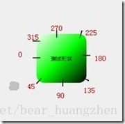
angle值对应的位置如图:
stroke:描边
android:width="2dp" 描边的宽度,android:color 描边的颜色。
我们还可以把描边弄成虚线的形式,设置方式为:
android:dashWidth="5dp"
android:dashGap="3dp"
其中android:dashWidth表示'-'这样一个横线的宽度,android:dashGap表示之间隔开的距离
corners:圆角
android:radius为角的弧度,值越大角越圆。
我们还可以把四个角设定成不同的角度,
同时设置五个属性,则Radius属性无效
android:Radius="20dp" 设置四个角的半径
android:topLeftRadius="20dp" 设置左上角的半径
android:topRightRadius="20dp" 设置右上角的半径
android:bottomLeftRadius="20dp" 设置右下角的半径
android:bottomRightRadius="20dp" 设置左下角的半径
padding:间隔
可以设置上下左右四个方向的间隔
在这里我们来看一个简单的小例子,ShapDemo,在drawable文件夹下面先定义两个xml文件:
button_bg.xml的内容如下:
button_pressed_bg.xml的内容如下:
这里说明一点,在描边里面设置了dash参数,使得图形的边变成了虚线
在drawable文件夹下添加一个button.xml文件,内容如下:
这个文件的意思以前讲过,normal(正常)情况下就显示button_bg,被press(按下)情况下就显示button_pressed_bg。
我们再来看一下layout目录下的activity_main.xml的内容:
直接将background指定为drawable文件夹下的button.xml。
二、shape各种定义形态
rectangle:
rectangle是默认的形状,也是用得最多的形状,一些文字背景、按钮背景、控件或布局背景等,以下是一些简单的例子:

实现上面的那些效果,都用到了以下这些特性:
1.solid: 设置形状填充的颜色,只有android:color一个属性
- android:color 填充的颜色
- padding: 设置内容与形状边界的内间距,可分别设置左右上下的距离
- android:left 左内间距
- android:right右内间距
- android:top 上内间距
- android:bottom 下内间距
- android:type 渐变的类型
- linear 线性渐变,默认的渐变类型
- radial 放射渐变,设置该项时,android:gradientRadius也必须设置
- sweep 扫描性渐变
- android:startColor 渐变开始的颜色
- android:endColor 渐变结束的颜色
- android:centerColor 渐变中间的颜色
- ndroid:angle 渐变的角度,线性渐变时才有效,必须是45的倍数,0表示从左到右,90表示从下到上
- android:centerX 渐变中心的相对X坐标,放射渐变时才有效,在0.0到1.0之间,默认为0.5,表示在正中间
- android:centerY 渐变中心的相对X坐标,放射渐变时才有效,在0.0到1.0之间,默认为0.5,表示在正中
- android:gradientRadius 渐变的半径,只有渐变类型为radial时才使用
- android:useLevel 如果为true,则可在LevelListDrawable中使用
- android:radius 圆角半径,会被下面每个特定的圆角属性重写
- android:topLeftRadius 左上角的半径
- android:topRightRadius 右上角的半径
- android:bottomLeftRadius 左下角的半径
- android:bottomRightRadius 右下角的半径
- android:color 描边的颜色
- android:width 描边的宽度
- android:dashWidth 设置虚线时的横线长度
- android:dashGap 设置虚线时的横线之间的距离
接下来说下实际怎么使用。以下是加了虚线描边的矩形的代码,文件命名为bg_rectangle_with_stroke_dash.xml,放在drawable目录下:
<?xml version="1.0" encoding="utf-8"?>
<!-- android:shape指定形状类型,默认为rectangle -->
<shape xmlns:android="http://schemas.android.com/apk/res/android"
    android:shape="rectangle">
    <!-- solid指定形状的填充色,只有android:color一个属性 -->
    <solid android:color="#2F90BD" />
    <!-- padding设置内容区域离边界的间距 -->
    <padding
        android:bottom="12dp"
        android:left="12dp"
        android:right="12dp"
        android:top="12dp" />
    <!-- corners设置圆角,只适用于rectangle -->
    <corners android:radius="200dp" />
    <!-- stroke设置描边 -->
    <stroke
        android:width="2dp"
        android:color="@android:color/darker_gray"
        android:dashGap="4dp"
        android:dashWidth="4dp" />
</shape>
<TextView
    android:layout_width="wrap_content"
    android:layout_height="wrap_content"
    android:layout_margin="8dp"
    android:text="加了虚线描边的矩形"
    android:textSize="16sp"
    android:textColor="@android:color/white"
    android:background="@drawable/bg_rectangle_with_stroke_dash" />
oval
oval用来画椭圆,而在实际应用中,更多是画正圆,比如消息提示,圆形按钮等,下图是一些例子:

上面的效果图应用了solid、padding、stroke、gradient、size几个特性。size是用来设置形状大小的,如下:
- size: 设置形状默认的大小,可设置宽度和高度
- android:width 宽度
- android:height 高度
以下是渐变的代码实现,文件为bg_oval_with_gradient.xml:
<?xml version="1.0" encoding="utf-8"?>
<!-- android:shape指定形状类型,默认为rectangle -->
<shape xmlns:android="http://schemas.android.com/apk/res/android"
    android:shape="oval">
    <!-- padding设置内间距 -->
    <padding
        android:bottom="4dp"
        android:left="4dp"
        android:right="4dp"
        android:top="4dp" />
    <!-- size设置形状的大小 -->
    <size
        android:width="40dp"
        android:height="40dp" />
    <!-- gradient设置渐变 -->
    <gradient
        android:endColor="#000000"
        android:gradientRadius="40dp"
        android:startColor="#FFFFFF"
        android:type="radial" />
</shape>
引用的代码:
<TextView
    android:layout_width="wrap_content"
    android:layout_height="wrap_content"
    android:gravity="center"
    android:layout_margin="8dp"
    android:text="6"
    android:textSize="20sp"
    android:textColor="@android:color/black"
    android:background="@drawable/bg_oval_with_gradient" />
line

line主要用于画分割线,是通过stroke和size特性组合来实现的,先看虚线的代码:
<?xml version="1.0" encoding="utf-8"?>
<shape xmlns:android="http://schemas.android.com/apk/res/android"
    android:shape="line">
    <!-- 实际显示的线 -->
    <stroke
        android:width="1dp"
        android:color="#2F90BD"
        android:dashGap="2dp"
        android:dashWidth="4dp" />
    <!-- 形状的高度 -->
    <size android:height="4dp" />
</shape>
画线时,有几点特性必须要知道的:
- 只能画水平线,画不了竖线;
- 线的高度是通过stroke的android:width属性设置的;
- size的android:height属性定义的是整个形状区域的高度;
- size的height必须大于stroke的width,否则,线无法显示;
- 线在整个形状区域中是居中显示的;
- 线左右两边会留有空白间距,线越粗,空白越大;
- 引用虚线的view需要添加属性android:layerType,值设为"software",否则显示不了虚线。
首先,shape根元素有些属性只适用于ring类型,先过目下这些属性吧:
- android:innerRadius 内环的半径
- android:innerRadiusRatio 浮点型,以环的宽度比率来表示内环的半径,默认为3,表示内环半径为环的宽度除以3,该值会被android:innerRadius覆盖
- android:thickness 环的厚度
- android:thicknessRatio 浮点型,以环的宽度比率来表示环的厚度,默认为9,表示环的厚度为环的宽度除以9,该值会被android:thickness覆盖
- android:useLevel 一般为false,否则可能环形无法显示,只有作为LevelListDrawable使用时才设为true

以下为第四个图的代码:
<?xml version="1.0" encoding="utf-8"?>
<shape xmlns:android="http://schemas.android.com/apk/res/android"
    android:innerRadiusRatio="3"
    android:shape="ring"
    android:thicknessRatio="9"
    android:useLevel="false">
    <gradient
        android:endColor="#2F90BD"
        android:startColor="#FFFFFF"
        android:type="sweep" />
    <stroke
        android:width="1dp"
        android:color="@android:color/black" />
</shape>
如果想让这个环形旋转起来,变成可用的进度条,则只要在shape外层包多一个rotate元素就可以了。
<?xml version="1.0" encoding="utf-8"?>
<rotate xmlns:android="http://schemas.android.com/apk/res/android"
    android:fromDegrees="0"
    android:pivotX="50%"
    android:pivotY="50%"
    android:toDegrees="1080.0">
    <shape
        android:innerRadiusRatio="3"
        android:shape="ring"
        android:thicknessRatio="8"
        android:useLevel="false">
        <gradient
            android:endColor="#2F90BD"
            android:startColor="#FFFFFF"
            android:type="sweep" />
    </shape>
</rotate>
到此shape的用法详解也告一段落。欢迎交流。


 扫一扫
扫一扫
 678
678

 被折叠的 条评论
为什么被折叠?
被折叠的 条评论
为什么被折叠?
 到【灌水乐园】发言


