


边框、边距、阴影
1.边框
边框由三部分组成:边框宽度、边框样式、边框颜色
(1)边框属性:
| border-width | 边框宽度 |
| border-style | 边框样式 |
| border-color | 边框颜色 |
可以直接使用border设置边框的样式效果:
border: 1px solid 2px;
(2)设置不同方向的边框:
| border-top | 上边框 |
| border-bottom | 下边框 |
| border-left | 左边框 |
| border-right | 右边框 |
可以通过 border-collapse 设置相邻单元格的边框
1、代码显示:
<style>
  table, td {
    border: 1px solid red;
  }
</style>
<body>
  <table>
    <tr>
      <td>姓名</td>
      <td>爱好</td>
    </tr>
    <tr>
      <td>耶啵</td>
      <td>街舞</td>
    </tr>
  </table>
</body>
2、效果显示:

3、添加属性border-collapse:
table, td {
    border: 1px solid red;
    border-collapse: collapse;
  }
4、显示效果:

(3)圆角边框:border-radius:
设置不同方向的圆角边框:
| border-top-left-radius | 左上角 |
| border-top-right-radius | 右上角 |
| border-bottom-right-radius | 右下角 |
| border-bottom-left-radius | 左下角 |
1、如果是正方形,可通过 设置border-radius:50%转换为圆形
2、如果是矩形,可通过 设置border-radius为高度的一半来转换为椭圆柱形
代码展示:
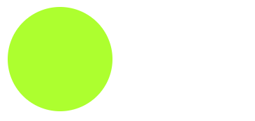
(1)圆形:
<style>
  .one {
    width: 100px;
    height: 100px;
    background-color: greenyellow;
    border-radius: 50%;
  }

</style>
<body>
  <div class="one"></div>
</body>
(2)椭圆形
<style>
  .one {
    width: 400px;
    height: 60px;
    background-color: skyblue;
    border-radius: 30px;
  }
</style>
<body>
  <div class="one"></div>
</body>
效果显示:
 |
 |
2.边距
边距由两部分组成:内边距和外边距
(1)内边距:padding
设置不同方向的内边距:
| padding-top | 上内边距 |
| padding-bottom | 下内边距 |
| padding-left | 左内边距 |
| padding-right | 右内边距 |
内边距设置值的个数不同显示不同的效果:
| 值的个数 | 意义 |
|---|---|
| padding: 1px; | 上下左右的内边距均为1px |
| padding: 1px 2px; | 上下内边距为1px,左右内边距为2px |
| padding: 1px 2px 3px; | 上内边距为1px,左右内边距为2px,下内边距为3px |
| padding: 1px 2px 3px 4px; | 上内边距为1px,右内边距为2px,下内边距为3px,左内边距为4px |
注意:padding会撑大盒子的大小
- 盒子设置了宽度或高度,设置padding会撑大盒子
设置高度或宽度,撑大盒子代码:
<style>
  div {
    width: 200px;
    height: 100px;
    background-color: indianred;
    padding: 10px;
  }
</style>
<body>
  <div></div>
</body>
显示效果:

(2)外边距:margin
外边距用来控制盒子与盒子之间的距离
设置不同方向的外边距:
| margin-top | 上外边距 |
| margin-bottom | 下外边距 |
| margin-left | 左外边距 |
| margin-right | 右外边距 |
使用margin来定义垂直外边距时,会出现垂直外边距的合并和塌陷问题:
- 相邻块元素定义垂直外边距时,会出现垂直外边距的合并问题
- 嵌套块元素定义垂直外边距时,会出现垂直外边距的塌陷问题
1、相邻块元素垂直外边距合并问题:
名词解释:当有两个相邻的块元素时,给上方的块元素定义了下外边距margin-bottom,给下方的块元素定义了上外边距margin-top,总的外边距并不是margin-bottom+margin-top,而是两个外边距中最大的那个值。
代码演示:
<style>
  .one {
    background-color: red;
    width: 200px;
    height: 100px;
    margin-bottom: 20px;
  }
  .two {
    background-color: green;
    width: 200px;
    height: 100px;
    margin-top: 30px;
  }
</style>
<body>
  <div class="one"></div>
  <div class="two"></div>
</body>
显示效果:

解决方案:
当有两个相邻的块元素时,只对其中一个设置magin值
2、嵌套块元素的塌陷问题
名词解释:两个嵌套块元素,对两个块元素都设置上外边距时,最终父盒子的上外边距以设置的两个上外边距的最大值为准,(且子盒子不是相对于父盒子设置的上外边距,而是对于整体设置的上外边距)。
代码演示:
<style>
  .father {
    background-color: tomato;
    width: 200px;
    height: 100px;
    margin-top: 20px;
  }
  .son {
    background-color: steelblue;
    width: 100px;
    height: 50px;
    margin-top: 30px;
  }
</style>
<body>
  <div class="father">
    <div class="son"></div>
  </div>
</body>
显示效果:

解决方案:
- 给父元素设置overflow:hidden;属性 (推荐,不会撑大盒子)
- 给父元素设置上边框:border-top: 1px solid transparent
- 给父元素设置上内边距:padding-top: 1px;
代码编写:
.father {
    background-color: tomato;
    width: 200px;
    height: 100px;
    margin-top: 20px;
    overflow: hidden;
  }
效果展示:

3.阴影
(1)盒子阴影:box-shadow
box-shadow的使用:
box-shadow: h-shadow v-shadow blur spread color inset
box-shadow的属性值:
| h-shadow | 水平方向的阴影,必填 |
| v-shadow | 垂直方向的阴影,必填 |
| blur | 模糊距离 |
| spread | 阴影的尺寸 |
| color | 阴影的颜色 |
| inset | 设置内部阴影 |
代码显示:
<style>
  .shadow {
    width: 200px;
    height: 100px;
    box-shadow: 4px 2px 3px 5px green;
  }
</style>
<body>
  <div class="shadow">
  </div>
</body>
</html>
显示效果:

注意:盒子阴影不占用盒子大小,不影响布局排列
(2)文本阴影:text-shadow:
text-shadow的使用:
text-shadow: h-shadow v-shadow blur color
text-shadow属性:
| h-shadow | 水平阴影(必填) |
| v-shadow | 垂直阴影(必填) |
| blur | 模糊距离 |
| color | 阴影颜色 |
代码编写:
<style>
  h1 {
    text-shadow: 5px 5px 4px;
  }
</style>
<body>
  <h1>hello</h1>
</body>
显示效果:


 102
102


 被折叠的 条评论
为什么被折叠?
被折叠的 条评论
为什么被折叠?
 到【灌水乐园】发言


