


在实际的项目开发中,针对图形资源,我想我们对drawable的使用并不陌生,Drawable很强大,能够帮助我们建立很多多彩的效果,比如我们常见的边框线,就可以通过drawable资源进行构建。
Drawable资源是一个图形的概念,可以被绘制到屏幕上,在开发中,我们通过getDrawable(int resourceId)来生成一个Drawable对象,或者通过android:drawable、android:icon等xml属性来使用Drawable对象。在Android系统中,Drawable资源的分类:
- BitmapDrawable:代表了图片资源,包括.png、.jpg、.gif图片资源。
- NinePatchDrawable:代表我们常见的.9.png资源
- LayerDrawable:代表图层资源,它由一些列的drawable组成,对应的节点layout-list
- State List:
- LevelListDrawable
- TransitionDrawable
- InsetDrawable
- ClipDrawable
- ScaleDrawable
- ShapeDrawable
一、BitmapDrawable
BitmapDrawable一个由图片生成的Drawable对象。比如我们常用的给控件设置背景图
- setBackground(Drawable background)
- setBackgroundDrawable(Drawable background)
这两个方法中,传递的都是Drawable对象,此时就需要我们将图片资源转换为Drawable为对应的BitmapDrawable。在XML文件中,我们通过节点进行配置:
<bitmap
    xmlns:android="http://schemas.android.com/apk/res/android"
        android:src="@[package:]drawable/drawable_resource"
        android:antialias=["true" | "false"]
        android:dither=["true" | "false"]
        android:filter=["true" | "false"]
        android:gravity=["top" | "bottom" | "left" | "right" | "center_vertical" |
                          "fill_vertical" | "center_horizontal" | "fill_horizontal" |
                          "center" | "fill" | "clip_vertical" | "clip_horizontal"]
        android:mipMap=["true" | "false"]
android:tileMode=["disabled" | "clamp" | "repeat" | "mirror"] />- android:src表示图片源,表示这个bitmap节点应该显示的图片
- android:antialias是否抗锯齿
- android:dither如果位图与屏幕的像素配置不同时,是否允许抖动
- android:filter是否允许对位图进行滤波。对位图进行收缩或者延展使用滤波可以获得平滑的外观效果。
- android:gravity重力指向参数
- android:mipMap
- android:tileMode定义tileMode,当tileMode属性可用时,位图是重复的,并且gravity属性会被忽略。它 有一下几个值:disabled不可用,clamp延伸边缘颜色,repeat:在竖直和水平方向上重复,mirror:以镜像的方式重复
问题:针对ImageView设置backgroud和src属性,对于bitmap的配置属性问题?
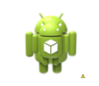
我们接下来测试下bitmap属性。首先我们创建一个bitmap_drawable.xml文件,
    <bitmap xmlns:android="http://schemas.android.com/apk/res/android"
        android:src="@drawable/ic_launcher"
        android:antialias="true"
        android:dither="true"
        />
设置在一个ImageView上进行显示。
<ImageView
android:id="@+id/tv_text"
android:layout_width="150dp"
android:layout_height="150dp"
android:layout_centerInParent="true"
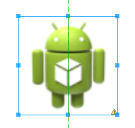
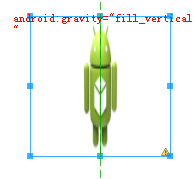
android:background="@drawable/bitmap_drawable"/>效果是:
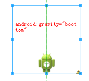
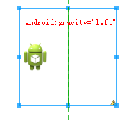
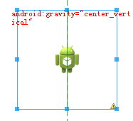
我们设置gravity属性:
    <bitmap xmlns:android="http://schemas.android.com/apk/res/android"
        android:src="@drawable/ic_launcher"
        android:antialias="true"
        android:dither="true"
        android:gravity="top"
        />
效果图:
![!(b2)[]](https://img-blog.csdn.net/20160328155349883)
我们分别修改gravity的属性进行测试:
我们接着测试android:tileMode属性,tileMode属性又可以细分为tileModeX和tileModeY两个属性。这两个属性是分别针对X、Y方向上进行变换。
    <bitmap xmlns:android="http://schemas.android.com/apk/res/android"
        android:src="@drawable/ic_launcher"
        android:antialias="true"
        android:dither="true"
        android:gravity="center_vertical"
        android:tileMode="repeat"
        />
![(b7)[]](https://img-blog.csdn.net/20160328155634964)
![(b8)[]](https://img-blog.csdn.net/20160328155650276)
其中有个android:tileMode=”clamp”属性,我没有弄出来效果,回头再想想吧!
二、NinePatchDrawable
这个就是我们常见的.9.png图片,这种格式的图片在android 环境下具有自适应调节大小的能力。.9.PNG是安卓开发里面的一种特殊的图片,这种格式的图片通过ADT自带的编辑工具生成,使用九宫格切分的方法,使图片支持在android 环境下的自适应展示。使用配置如下:
    <nine-patch
        xmlns:android="http://schemas.android.com/apk/res/android"
        android:src="@[package:]drawable/drawable_resource"
        android:dither=["true" | "false"] />
三、LayerDrawable
见名思意,这个就是针对图层而来的Drawable对象,它是由很多的drawable对象组成。里面的item根据在list-drawable中的顺序进行绘制。在XML文件中,对应的根节点是layer-list,对应的子节点是item。
    <layer-list
    xmlns:android="http://schemas.android.com/apk/res/android" >
        <item
            android:drawable="@[package:]drawable/drawable_resource"
            android:id="@[+][package:]id/resource_name"
            android:top="dimension"
            android:right="dimension"
            android:bottom="dimension"
            android:left="dimension" />
    </layer-list>
这节点中,layer-list是根节点,它可以包含一个或多个item节点。针对item节点的属性:
- android:drawable该item对应的drawable属性,可以是drawable资源文件,所以意味着它可以是其它几个drawable对象。
- android:id该drawable的区别唯一id
- android:top,right,bottom,left代表该item的内边距大小,即paddingTop,paddingRight,paddingBottom,paddingLeft。
当layer-list中包含多个item时,下面的效果会叠加在上面的效果之上。这点跟PS中的图层叠加的效果是相同的。
我们举个简单的例子:
    <layer-list xmlns:android="http://schemas.android.com/apk/res/android" >
        <item
            android:drawable="@drawable/ic_launcher"
            />
           <item
            android:drawable="@drawable/ic_launcher"
            android:top="20dp"
            android:left="20dp"
            android:bottom="20dp"
            android:right="20dp"
            />
    </layer-list>
在这个例子中,我们第一个图层item直接展示了一个drawable/ic_launcher资源,我们设置给一个ImageView它会填充这个背景,在第二个图层中,我们设置了内边距,所以这个item的效果会小于第一个item。二者叠加的效果就如下图:
四、StateListDrawable
这个就是我们经常用的状态列drawable,比如我们在实际开发中会有这样一个需求,按下一个按钮,让按钮编程灰色,正常情况下是白色。这样的需求就需要我们根据控件的状态来设置对应的背景色。这里就是使用StateListDrawable对象进行设置。在XML文件中,我们通过标签定义State的集合。每个状态对应一个item。
    <selector xmlns:android="http://schemas.android.com/apk/res/android"
        android:constantSize=["true" | "false"]
        android:dither=["true" | "false"]
        android:variablePadding=["true" | "false"] >
        <item
            android:drawable="@[package:]drawable/drawable_resource"
            android:state_pressed=["true" | "false"]
            android:state_focused=["true" | "false"]
            android:state_hovered=["true" | "false"]
            android:state_selected=["true" | "false"]
            android:state_checkable=["true" | "false"]
            android:state_checked=["true" | "false"]
            android:state_enabled=["true" | "false"]
            android:state_activated=["true" | "false"]
            android:state_window_focused=["true" | "false"] />
    </selector>
注意:在一个selector中可以包含多个item节点,android系统查找的顺序是从上往下查找状态,查找到满足条件的即停止向下查找对应的drawable。所以这就需要我们在放置item的位置时,进行考虑,防止item的覆盖,出现效果错乱。
    <selector xmlns:android="http://schemas.android.com/apk/res/android" >
        <item android:state_pressed="true" android:drawable="@drawable/btn_press"/>
        <item android:state_pressed="false" android:drawable="@drawable/btn_unpress"/>
        <item android:drawable="@drawable/btn_normal"/>
    </selector>
在上面的selector中,我们指定了按下的、非按钮、正常情况下的drawable效果,这里,我们就不能把后两个写反。我们先来看看这个的效果:
![(selector1)[]](https://img-blog.csdn.net/20160328155850811)
如果我们把item的顺序改变。
    <selector xmlns:android="http://schemas.android.com/apk/res/android" >
        <item android:state_pressed="true" android:drawable="@drawable/btn_press"/>
        <item android:drawable="@drawable/btn_normal"/>
        <item android:state_pressed="false" android:drawable="@drawable/btn_unpress"/>
    </selector>
此时系统会给我们一个警告:This item is unreachable because a previous item (item #2) is a more general match than this one,意思就是说第三个item到达不了,上一个item比这个item优先匹配到。对应的效果图:
![(selector2)[]](https://img-blog.csdn.net/20160328155910683)
效果就是这样,所以在我们使用时,一定要注意放置的item顺序。
五、LevelListDrawable
等级列表Drawable,就是根据我们设置的等级展现对应的drawable对象。我们通过Drawable的.setLevel()方法设置等级。
<level-list
    xmlns:android="http://schemas.android.com/apk/res/android" >
        <item
            android:drawable="@drawable/drawable_resource"
            android:maxLevel="integer"
            android:minLevel="integer" />
</level-list>- android:maxLevel:最大等级
- android:minLevel:最小等级
案例:
    <level-list xmlns:android="http://schemas.android.com/apk/res/android" >
        <item
            android:drawable="@drawable/btn_press"
            android:maxLevel="0" />
        <item
            android:drawable="@drawable/btn_normal"
            android:maxLevel="1" />
    </level-list>
我们利用按钮点击改变:
    btn_btn .setOnClickListener(new OnClickListener() {

            @Override
            public void onClick(View v) {
                if(index % 2 ==0){
                    btn_btn.setText("等级为0");
                    btn_btn.getBackground().setLevel(0);
                }else{
                    btn_btn.setText("等级为1");
                    btn_btn.getBackground().setLevel(1);
                }
                index++;
            }
        });
效果图:
![(level-list1)[]](https://img-blog.csdn.net/20160328155954984)
注意:在level-list中,同样是从上到下根据level处在的范围进行获取drawable。比如,我们对一个item设置的level在0——5之间,我们设置level=2,则处在该范围,所以取该drawable。
六、TransitionDrawable
android中的过渡动画。
    <transition
    xmlns:android="http://schemas.android.com/apk/res/android" >
        <item
            android:drawable="@[package:]drawable/drawable_resource"
            android:id="@[+][package:]id/resource_name"
            android:top="dimension"
            android:right="dimension"
            android:bottom="dimension"
            android:left="dimension" />
    </transition>
使用方法:
    ImageButton button = (ImageButton) findViewById(R.id.button);
    TransitionDrawable drawable = (TransitionDrawable) button.getDrawable();
    drawable.startTransition(500);
七、InsetDrawable
用于通过指定的间距把图片插入到XML中,它在View需要比自身小的背景时常用。有些像padding的作用。
    <inset
        xmlns:android="http://schemas.android.com/apk/res/android"
        android:drawable="@drawable/drawable_resource"
        android:insetTop="dimension"
        android:insetRight="dimension"
        android:insetBottom="dimension"
        android:insetLeft="dimension" />
例如:
    <inset xmlns:android="http://schemas.android.com/apk/res/android"
        android:drawable="@drawable/ic_launcher"
        android:insetLeft="20dp"
        android:insetRight="20dp"
        android:insetTop="20dp"
        android:insetBottom="20dp"
        >
    </inset>
效果图:
![(inset)[]](https://img-blog.csdn.net/20160328160035762)
八、ClipDrawable
可以剪载图片显示,根据当前drawable的level属性曲去裁剪drawable,通过gravity属性设置获取的位置。例如,可以通过它来做进度度。你可以选择是从水平或垂直方向剪载。其中的gravity设置从整个部件的哪里开始。
    <clip
    xmlns:android="http://schemas.android.com/apk/res/android"
    android:drawable="@drawable/drawable_resource"
    android:clipOrientation=["horizontal" | "vertical"]
    android:gravity=["top" | "bottom" | "left" | "right" | "center_vertical" |
                     "fill_vertical" | "center_horizontal" | "fill_horizontal" |
                     "center" | "fill" | "clip_vertical" | "clip_horizontal"] />
例如:
    <clip xmlns:android="http://schemas.android.com/apk/res/android"
        android:clipOrientation="horizontal"
        android:gravity="left"
        android:drawable="@drawable/btn_press"
        >
    </clip>
我们的使用:
    btn_btn .setOnClickListener(new OnClickListener() {

            @Override
            public void onClick(View v) {
                ClipDrawable drawable = (ClipDrawable) btn_btn.getBackground();
                drawable.setLevel(drawable.getLevel() + 1000);
            }
    });
我们看看效果图:
![(clip)[]](https://img-blog.csdn.net/20160328160114189)
是不是有一种进度条的效果。哈哈
九、ScaleDrawable
以drawable的level值为基础,进行大小的改变。
    <scale
    xmlns:android="http://schemas.android.com/apk/res/android"
    android:drawable="@drawable/drawable_resource"
    android:scaleGravity=["top" | "bottom" | "left" | "right" | "center_vertical" |
                          "fill_vertical" | "center_horizontal" | "fill_horizontal" |
                          "center" | "fill" | "clip_vertical" | "clip_horizontal"]
    android:scaleHeight="percentage"
android:scaleWidth="percentage" />- android:scaleHeight:缩放高度,缩放的百分比,比如10%,则最终的高度为原图的90%;
- android:scaleWidth:缩放宽度
使用如下:
ScaleDrawable drawable = (ScaleDrawable) btn_btn.getBackground();
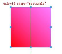
drawable.setLevel(3);十、Shape Drawable
这个是我们实际开发中使用最多的一个drawable,我们设置边框线,阴影。都是要使用这个进行设置。
<shape
    xmlns:android="http://schemas.android.com/apk/res/android"
        android:shape=["rectangle" | "oval" | "line" | "ring"] >
        <corners
            android:radius="integer"
            android:topLeftRadius="integer"
            android:topRightRadius="integer"
            android:bottomLeftRadius="integer"
            android:bottomRightRadius="integer" />
        <gradient
            android:angle="integer"
            android:centerX="integer"
            android:centerY="integer"
            android:centerColor="integer"
            android:endColor="color"
            android:gradientRadius="integer"
            android:startColor="color"
            android:type=["linear" | "radial" | "sweep"]
            android:useLevel=["true" | "false"] />
        <padding
            android:left="integer"
            android:top="integer"
            android:right="integer"
            android:bottom="integer" />
        <size
            android:width="integer"
            android:height="integer" />
        <solid
            android:color="color" />
        <stroke
            android:width="integer"
            android:color="color"
            android:dashWidth="integer"
            android:dashGap="integer" />
    </shape>
我们针对各个节点的属性进行说明:
corners圆角属性
- android:radius四个角的圆角大小
- android:topLeftRadius左上角的圆角大小
- android:topRightRadius右上角的圆角大小
- android:bottomLeftRadius左下角圆角的大小
- android:bottomRightRadius右下角圆角的大小
gradient渐变属性
- android:angle渐变起始角
- android:centerX中间点的X坐标
- android:centerY中间点的Y坐标
- android:startColor起始颜色
- android:centerColor中间控制颜色
- android:endColor中止颜色值
- android:gradientRadius渐变的圆角
- android:type渐变的类型,有线性、圆形、扇形
- android:useLevel是否使用level
padding内边距属性
- android:left左内边距
- android:top上内边距
Size大小
- android:width宽度
- android:height高度
solid绘制
- android:color绘制的颜色
stroke描边
- android:width描边的宽度
- android:color描边的颜色
- android:dashWidth间隔线宽度
- android:dashGap间隔线的距离
补充,当我们设置android:shape=”ring”时,有以下几个属性需要注意:
- android:innerRadius
- android:innerRadiusRatio
- android:thickness
- android:thicknessRatio
- android:useLevel
接着来演示一个demo
    <shape xmlns:android="http://schemas.android.com/apk/res/android"
        android:shape="oval">
        <gradient
            android:startColor="#FFFF0000"
            android:endColor="#80FF00FF"
            android:angle="45"/>
        <padding android:left="7dp"
            android:top="7dp"
            android:right="7dp"
            android:bottom="7dp" />
        <corners android:radius="8dp" />
</shape> 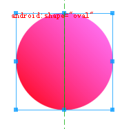
至此,针对各个大类的Drawable的基本属性已经介绍完毕,下篇我们就练习下几个实际案例。


 扫一扫
扫一扫
 953
953

 被折叠的 条评论
为什么被折叠?
被折叠的 条评论
为什么被折叠?
 到【灌水乐园】发言


