


在Android中,Drawable是一种用于绘制图形、颜色和位图的对象。它可以作为View的背景、前景或者作为ImageView的图片源。Drawable提供了一种可绘制的对象,可以通过XML或代码来创建、操作和显示,用于实现丰富多彩的界面效果。本文主要对项目中常用的drawable类型进行总结,并提供示例参考。
1.ShapeDrawable(形状Drawable)
ShapeDrawable可以绘制简单的几何图形,可以用来创建简单的形状作为背景,同时可以结合其他类型如LayearDrawable使用实现复杂的背景效果。
| 标签 | 作用 | 说明 |
|---|---|---|
| shape | 定义图形形状,包括rectangle(矩形)、oval(椭圆)、line(直线)、ring(圆环) | rectangle是默认值。若设置line必须设置stroke节点,否则报错 |
| solid | 填充颜色,一种颜色 | solid和gradient是相反的,若同时设置,后加的标签会覆盖前面的 |
| stroke | 设置边框的颜色,宽度等 | width:边框的宽度 color:边框颜色 dashGap:虚线间隔,像素类型 dashWidth:虚线宽度,像素类型 |
| corners | 设置圆角 | 如果四个角的圆角大小一样,只需设置radius;不一样可单独为四个角设置大小: - topLeftRadius左上角 - topRightRadius右上角 - bottomLeftRadius左下角 - bottomRightRadius右下角 |
| gradient | 设置渐变效果 | 三种渐变类型: - linear线性渐变,默认 - radial发射渐变,起始颜色是圆心颜色 - sweep滚动渐变,360度旋转渐变 |
2.StateListDrawable(状态列表Drawable)
StateListDrawable根据不同的状态可以切换不同的Drawable,比如按压,选中,获取焦点后显示不同状态图,常用来显示点击或选中item后显示不同的效果。
用于定义选择的状态,根标签是selector,定义item标签作为选择状态显示的drawable。
<selector xmlns:android="http://schemas.android.com/apk/res/android">
    <item android:drawable="@drawable/pressed_bg" android:state_pressed="true"/>
    <item android:drawable="@drawable/focused_bg" android:state_focused="true"/>
    <item android:drawable="@drawable/normal_bg"/>
</selector>
常用属性:
- android:state_pressed:当 View 被按下时(按钮或者列表项点击)显示的 Drawable。
- android:state_focused:当 View 获得焦点时(常用于android tv中视图元素获取焦点)显示的 Drawable。
- android:state_selected:当 View 被选中时(元素点击选择)显示的 Drawable。
- android:state_checked:当 View 处于选中状态(如 CheckBox、RadioButton)时显示的 Drawable。
- android:state_enabled:当 View 可用时显示的 Drawable。
- android:state_activated:当 View 处于激活状态时(通常用于 ListView 或 RecyclerView 中)显示的 Drawable。
- android:state_window_focused:当 View 所在窗口获得焦点时显示的 Drawable。
通过shapeDrawable和StateListDrawable绘制本图如下示例的按钮形状背景,获取焦点和点击按压时变色:
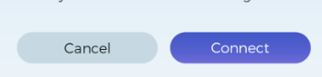
先设置默认状态和有焦点后的drawale:
默认状态drawable:btn_default_bg.xml
<shape xmlns:android="http://schemas.android.com/apk/res/android">
    <!--定义浅白色填充-->
    <solid android:color="#c6d8e1" />
    <!--设置圆角-->
    <corners android:radius="43dp" />
</shape>
变色效果drawable:btn_sel_bg.xml
<shape xmlns:android="http://schemas.android.com/apk/res/android">

    <!--设置渐变效果-->
    <gradient
        android:angle="90"
        android:endColor="#4559c8"
        android:startColor="#6d6bd8" />

    <corners android:radius="43dp" />
</shape>
状态设置drawable:btn_selector.xml
<?xml version="1.0" encoding="utf-8"?>
<selector xmlns:android="http://schemas.android.com/apk/res/android">
    <!--按压显示变色效果-->
    <item android:drawable="@drawable/btn_sel_bg" android:state_pressed="true"/>
    <!--有焦点显示变色效果-->
    <item android:drawable="@drawable/btn_sel_bg" android:state_focused="true"/>
    <!--默认效果要放最后-->
    <item android:drawable="@drawable/btn_default_bg"/>
</selector>
主布局文件
<?xml version="1.0" encoding="utf-8"?>
<androidx.constraintlayout.widget.ConstraintLayout xmlns:android="http://schemas.android.com/apk/res/android"
    xmlns:app="http://schemas.android.com/apk/res-auto"
    android:id="@+id/container"
    android:layout_width="match_parent"
    android:layout_height="match_parent"
    android:paddingTop="?attr/actionBarSize">

    <LinearLayout
        android:id="@+id/ll_btn"
        android:layout_width="match_parent"
        android:layout_height="wrap_content"
        android:layout_marginStart="23dp"
        android:orientation="horizontal"
        app:layout_constraintBottom_toBottomOf="parent"
        app:layout_constraintTop_toTopOf="parent">

        <Button
            android:layout_width="150dp"
            android:layout_height="40dp"
            android:background="@drawable/btn_selector"
            android:focusable="true"
            android:focusableInTouchMode="true"
            android:text="Cancel"
            android:textAllCaps="false" />

        <Button
            android:layout_width="150dp"
            android:layout_height="40dp"
            android:layout_marginStart="11dp"
            android:background="@drawable/btn_selector"
            android:focusable="true"
            android:focusableInTouchMode="true"
            android:text="Connect"
            android:textAllCaps="false" />
    </LinearLayout>

</androidx.constraintlayout.widget.ConstraintLayout>
3.LayerDrawable(层叠Drawable)
LayerDrawable可以将多个Drawable绘制在LayerDrawable的不同图层上,最后叠加图层形成一个丰富的图形效果。主要要与实现复杂的图形绘制,叠加背景图标等。列表元素从上到下,后面的drawable会叠加在上一个之上。
实现这个效果,有一个图标,图标外有一个蓝色圆形背景,有的时候设计师不给完整的图标背景,只给你单独的图标,那就需要自己组合成完整的效果。
设置圆形背景:wifi_bg.xml
<?xml version="1.0" encoding="utf-8"?>
<shape xmlns:android="http://schemas.android.com/apk/res/android"
    android:shape="oval">
    <solid android:color="#22ffff" />
</shape>
设置layerDrawable构成完整图形:wifi.xml
<?xml version="1.0" encoding="utf-8"?>
<layer-list xmlns:android="http://schemas.android.com/apk/res/android">
    <!--底层背景-->
    <item android:drawable="@drawable/wifi_bg" />
    <!--上层图标-->
    <item
        android:bottom="5dp"
        android:drawable="@drawable/home_wifi"
        android:end="5dp"
        android:start="5dp"
        android:top="5dp" />
</layer-list>
这里设置的top/bottom/start/end用于设置该item距离上下左右的距离,一般在安卓开发用start/end代替left/right,因为涉及到多语言的时候考虑到有的语言比如阿拉伯语言是从右边往左的,也就是RTL,显示效果左右相反,而默认的情况采用的是LTR布局。
4.LevelListDrawable(级别列表Drawable)
levelListDrawable是一个显示不同级别图像的Drawable,每一个级别对应一个Drawable。需要注意的是,系统从上到下匹配,如果找到符合设置的级别,就不会往下查找,匹配以maxLevel优先。
- maxLevel:最大级别
- minLevel:最小级别
设置LevelListDrawable:level_bar.xml
<level-list xmlns:android="http://schemas.android.com/apk/res/android">
    <!--0-10显示的效果-->
    <item
        android:drawable="@drawable/btn_default_bg"
        android:maxLevel="10"
        android:minLevel="0" />
    <!--10-100显示的效果-->
    <item
        android:drawable="@drawable/btn_sel_bg"
        android:maxLevel="100"
        android:minLevel="10" />
</level-list>
主布局
<?xml version="1.0" encoding="utf-8"?>
<androidx.constraintlayout.widget.ConstraintLayout xmlns:android="http://schemas.android.com/apk/res/android"
    xmlns:app="http://schemas.android.com/apk/res-auto"
    android:id="@+id/container"
    android:layout_width="match_parent"
    android:layout_height="match_parent"
    android:paddingTop="?attr/actionBarSize">

    <ImageView
        android:id="@+id/progress"
        android:layout_width="200dp"
        android:layout_height="30dp"
        android:src="@drawable/level_bar"
        app:layout_constraintBottom_toBottomOf="parent"
        app:layout_constraintEnd_toEndOf="parent"
        app:layout_constraintStart_toStartOf="parent"
        app:layout_constraintTop_toTopOf="parent" />
</androidx.constraintlayout.widget.ConstraintLayout>
//activity中设置该视图级别
val progress = findViewById<ImageView>(R.id.progress)
progress.setImageLevel(10)
5.BitmapDrawable(位图Drawable)
BitmapDrawable可以在应用程序中显示位图图像,可通过xml或java创建和操作。主要特点是比起普通的图像资源文(png,jpg,gif)更加灵活,可以对图像进行平铺,缩放,裁剪等功能。
| 属性 | 含义及作用 |
|---|---|
| src | 指定源位图,可以是资源文件、Bitmap对象或文件路径 |
| tileMode | 指定位图小于显示区域的平铺模式 - repeat:重复平铺 - mirror:镜像平铺 - clamp:大小不变,像素四周扩散 - disabled:关闭平铺 |
| antialias | 抗锯齿,开启后图片更加平滑 |
| dither | 抖动效果,开启后提高色彩过滤效果,让高质量图片在低质量的屏幕不失真 |
| filter | 过滤,提高图片拉伸/压缩后的显示效果 |
| gravity | 指定位图在显示区域的对齐方式 |
| alpha | 透明度,取值在0.0-1.0 |
示例镜像平铺的drawable
资源的bitmapdrawable:music_bitmap_xml
<?xml version="1.0" encoding="utf-8"?>
<bitmap xmlns:android="http://schemas.android.com/apk/res/android"
    android:alpha="0.6"
    android:antialias="true"
    android:dither="true"
    android:filter="true"
    android:gravity="bottom"
    android:src="@drawable/music"
    android:tileMode="mirror"/>
主布局
<?xml version="1.0" encoding="utf-8"?>
<androidx.constraintlayout.widget.ConstraintLayout xmlns:android="http://schemas.android.com/apk/res/android"
    android:id="@+id/container"
    android:layout_width="match_parent"
    android:layout_height="match_parent"
    android:paddingTop="?attr/actionBarSize">

    <ImageView
        android:id="@+id/progress"
        android:layout_width="match_parent"
        android:layout_height="match_parent"
        android:background="@drawable/music_bitmap" />
</androidx.constraintlayout.widget.ConstraintLayout>
6.InsertDrawable(内边距Drawable)
insertDrawable,顾名思义,就是可以插入drawable,把其他的drawable插入到自己的drawable中,类似于图层叠加,可以用LayerDrawable替代实现,使用率不高。
创建insertDrawabe:insert_drawable.xml
<?xml version="1.0" encoding="utf-8"?>
<inset xmlns:android="http://schemas.android.com/apk/res/android"
    android:insetTop="40dp"
    android:insetBottom="60dp">
<!--    insertTop/insertBottom/insertLeft/insertRight指定drawable在显示区域的距离-->
    <!--插入一个shape-->
    <shape xmlns:android="http://schemas.android.com/apk/res/android">
        <solid android:color="#FFFF" />
        <corners android:radius="43dp" />
    </shape>
    <!--再插入一个图片资源-->
    <bitmap android:src="@drawable/music" />
</inset>
主布局文件
<?xml version="1.0" encoding="utf-8"?>
<androidx.constraintlayout.widget.ConstraintLayout xmlns:android="http://schemas.android.com/apk/res/android"
    android:id="@+id/container"
    android:layout_width="match_parent"
    android:layout_height="match_parent"
    android:paddingTop="?attr/actionBarSize">

    <ImageView
        android:id="@+id/progress"
        android:layout_width="match_parent"
        android:layout_height="match_parent"
        android:background="@color/grey"
        android:src="@drawable/insert_drawable"/>

</androidx.constraintlayout.widget.ConstraintLayout>
最后是这个效果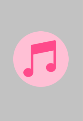
7.ClipDrawable(裁剪Drawable)
ClipDrawable可以将设置的Drawable的显示比例裁剪出另外一张Drawable,可以控制裁剪的方向,通过ClipDrawable的setLevel方法显示drawable的展示空间比例。
| 属性 | 含义及作用 |
|---|---|
| drawable | 设置需要裁剪的drawable资源 |
| clipOrientation | 裁剪方向:horizontal水平,vertical垂直 |
| gravity | 开始裁剪的地方 |
创建ClipDrawable:clip_drawable.xml
<?xml version="1.0" encoding="utf-8"?>
<clip xmlns:android="http://schemas.android.com/apk/res/android"
    android:drawable="@drawable/btn_sel_bg"
    android:clipOrientation="vertical"
    android:gravity="left">
</clip>
主布局
<?xml version="1.0" encoding="utf-8"?>
<androidx.constraintlayout.widget.ConstraintLayout xmlns:android="http://schemas.android.com/apk/res/android"
    xmlns:app="http://schemas.android.com/apk/res-auto"
    android:id="@+id/container"
    android:layout_width="match_parent"
    android:layout_height="match_parent"
    android:paddingTop="?attr/actionBarSize">

    <ImageView
        android:id="@+id/progress"
        android:layout_width="match_parent"
        android:layout_height="30dp"
        android:src="@drawable/clip_drawable"
        app:layout_constraintTop_toTopOf="parent"
        app:layout_constraintBottom_toBottomOf="parent"/>

</androidx.constraintlayout.widget.ConstraintLayout>
MainActivity
package com.tosmart.launcher.myfile

import android.graphics.drawable.ClipDrawable
import android.os.Bundle
import android.os.Handler
import android.os.Message
import androidx.appcompat.app.AppCompatActivity
import com.tosmart.launcher.myfile.databinding.ActivityMainBinding


class MainActivity : AppCompatActivity() {

    private lateinit var binding: ActivityMainBinding
    private lateinit var mClipDrawable: ClipDrawable

    private var mCurrentProgress = 0

    companion object {
        const val PROGRESS_INCREMENT = 100
        const val MAX_PROGRESS = 10000
    }

    private val handler = object : Handler() {
        override fun handleMessage(msg: Message) {
            if (msg.what == 0) {
                updateProgress()
            }
        }
    }

    override fun onCreate(savedInstanceState: Bundle?) {
        super.onCreate(savedInstanceState)

        binding = ActivityMainBinding.inflate(layoutInflater)
        setContentView(binding.root)

        val progress = binding.progress
        mClipDrawable = progress.drawable as ClipDrawable
        mClipDrawable.level = 0

        Thread {
            while (mCurrentProgress < MAX_PROGRESS) {
                try {
                    Thread.sleep(100)
                } catch (e: InterruptedException) {
                    e.printStackTrace()
                }
                mCurrentProgress += PROGRESS_INCREMENT
                handler.sendEmptyMessage(0)
            }
        }.start()

    }

    private fun updateProgress() {
        mClipDrawable.level = mCurrentProgress * 10000 / MAX_PROGRESS
    }
}


 919
919


 被折叠的 条评论
为什么被折叠?
被折叠的 条评论
为什么被折叠?
 到【灌水乐园】发言


