


一、简介
- 简介
ElementUI是基于Vue封装的UI框架,提供了大量可以直接使用的标签和样式效果。
- 官网:
Element - The world's most popular Vue UI framework
二、项目准备
(一) 安装依赖
- 安装elementui模块:在项目的ternimal命令行中执行
npm install element-ui@2.15.13
- 在项目中导入elementui并使用在main.js文件中加入如下代码
import ElementUI from 'element-ui'; //导入 ElementUI 组件
import 'element-ui/lib/theme-chalk/index.css'; // 导入ElementUI样式文件
Vue.use(ElementUI); //将elementui集成到Vue中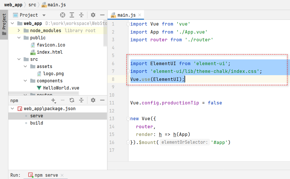
(二) 安装vscode插件
- VSCode搜索插件
vscode-element-helper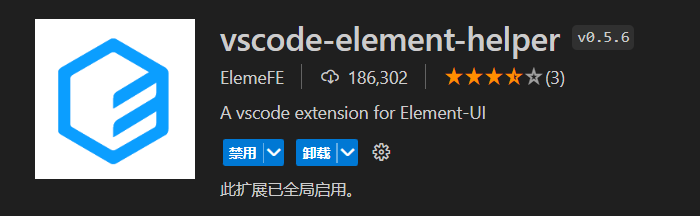
三、基础组件
(一) 按钮Button
- 效果

- 代码
<!--  按钮 -->
<el-button>默认按钮</el-button>
<el-button type="primary">主要按钮</el-button>
<el-button type="success">成功按钮</el-button>
<el-button type="info">信息按钮</el-button>
<el-button type="warning">警告按钮</el-button>
<el-button type="danger">危险按钮</el-button>
<el-button type="text">文字按钮</el-button>
<el-button type="primary" size="medium">中等按钮</el-button>
<el-button type="primary" size="small">小型按钮</el-button>
<el-button type="primary" size="mini">超小按钮</el-button>

<!-- 按钮组 -->
<el-button-group>
  <el-button type="primary" icon="el-icon-edit"></el-button>
  <el-button type="primary" icon="el-icon-share"></el-button>
  <el-button type="primary" icon="el-icon-delete"></el-button>
</el-button-group>- 说明
type:指定button的颜色
size:指定button的大小
plain:镂空
round:圆角
circle:圆
(二) 图标icon
- 效果
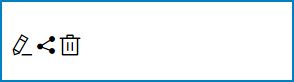
- 代码
<!--  图标  -->
<i class="el-icon-edit"></i>
<i class="el-icon-share"></i>
<i class="el-icon-delete"></i>- 说明
class:指定图标的名字,可以在 https://element.eleme.io/#/zh-CN/component/icon 进行查找。(三) 标签tag
- 效果
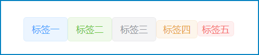
- 代码
<!-- 标签 -->
<el-tag>标签一</el-tag>
<el-tag type="success">标签二</el-tag>
<el-tag type="info">标签三</el-tag>
<el-tag type="warning" size="small">标签四</el-tag>
<el-tag type="danger" size="mini">标签五</el-tag>- 说明
type:表示标签背景色
size:指定标签大小。
(四) 卡片card
- 效果
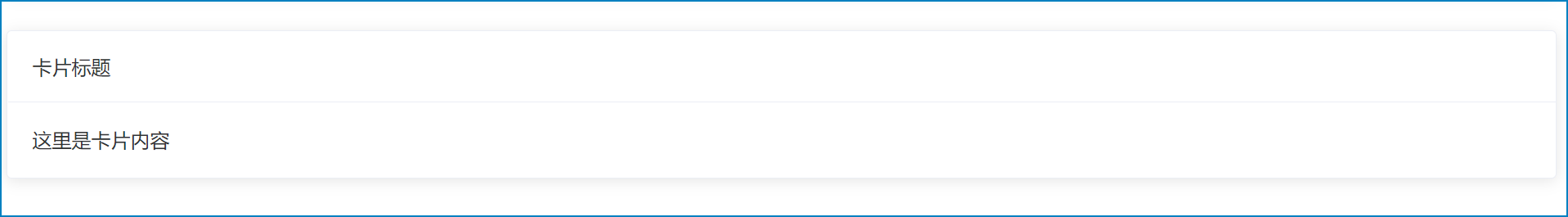
- 代码
<el-card header="卡片标题">
    这里是卡片内容
</el-card>- 说明
header:指定标题的文字(五) 容器container
- 效果
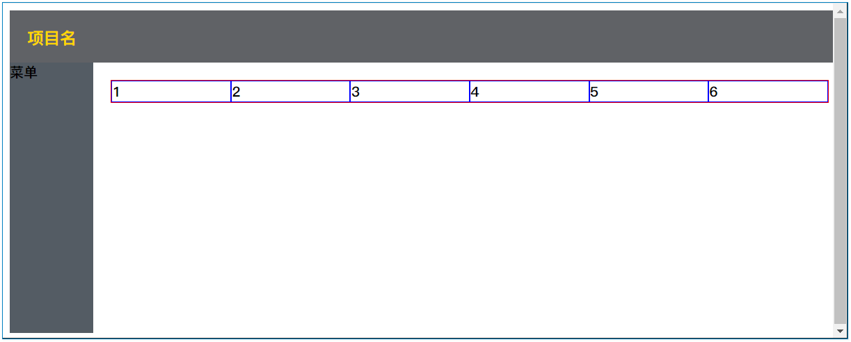
- 代码
<el-container style="width: 99vw; height: 96vh">
  <!-- 顶部 -->
  <el-header style="background-color: #606266; ">
    <h3 style="color: gold;">项目名</h3>
  </el-header>
  <!-- 中间 -->
  <el-container>
    <!-- 左侧 -->
    <el-aside style="background-color:#545c64;height: 100%;width:10%;">
    </el-aside>
    <!-- 主区域 -->
    <el-main>
    </el-main>
  </el-container>
</el-container>- 说明
<el-container>:
  外层容器。当子元素中包含 <el-header> 或 <el-footer> 时,全部子元素会垂直上下排列,否则会水平左右排列。
<el-header>:顶栏容器。
<el-aside>:侧边栏容器。
<el-main>:主要区域容器。
<el-footer>:底栏容器。
(六) 布局Layout
- 效果
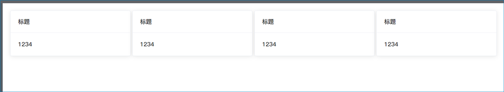
- 代码
<el-row :gutter="5" justify="space-between" align="middle" type="flex">
    <el-col :span="6"><el-card header="标题">1234</el-card></el-col>
    <el-col :span="6"><el-card header="标题">1234</el-card></el-col>
    <el-col :span="6"><el-card header="标题">1234</el-card></el-col>
    <el-col :span="6"><el-card header="标题">1234</el-card></el-col>
</el-row>- 说明
# el-row 表示行
  gutter 表示列的间隔宽度,数字是像素。
  type 布局方式,flex布局
  justify 子元素横向排列方式,可选 start/end/center/space-around/space-between
  align 垂直排列方式,可选 top/middle/bottom

# el-col 表示列
  span 列宽格数,一行总宽最多24格.
  offset 左侧间隔偏移多少格。
(七) 菜单Menu
- 效果
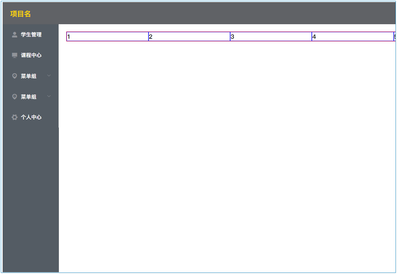
- 代码
<!-- 菜单 -->
<el-menu :router="true" background-color="#545c64" text-color="#fff" active-text-color="#ffd04b">
  <!--
    router:是否使用vue-router的link跳转,true则index的值可以作为path进行跳转。
    background-color:背景颜色
    text-color:字体颜色
    active-text-color:选中后的字体颜色
   -->
  <!-- 菜单项 -->
  <el-menu-item index="/student/list">
    <i class="el-icon-user-solid"></i>学生管理
  </el-menu-item>
  <el-menu-item index="/course/list">
    <i class="el-icon-s-platform"></i>课程中心
  </el-menu-item>
  <!-- 菜单组 -->
  <el-submenu index="2">
    <template slot="title">
      <i class="el-icon-location"></i>
      <span>菜单组</span>
    </template>
    <el-menu-item index="2-1">选项1</el-menu-item>
    <el-menu-item index="2-2">选项2</el-menu-item>
    <el-menu-item index="2-3">选项3</el-menu-item>
  </el-submenu>
  <el-submenu index="3">
    <template slot="title">
      <i class="el-icon-location"></i>
      <span>菜单组</span>
    </template>
    <el-menu-item index="3-1">选项1</el-menu-item>
    <el-menu-item index="3-2">选项2</el-menu-item>
    <el-menu-item index="3-3">选项3</el-menu-item>
  </el-submenu>
  <!-- 菜单项 -->
  <el-menu-item index="4">
    <i class="el-icon-s-tools"></i>个人中心
  </el-menu-item>
</el-menu>
(八) 通知消息notify
- 效果
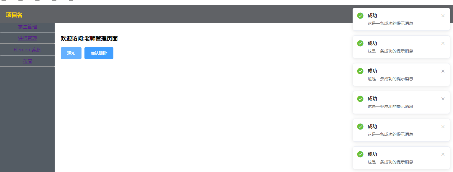
- 代码
this.$notify({
  title: '成功',
  message: '这是一条成功的提示消息',
  type: 'success'
});- 说明
# confirm确认
  参数1:内容
  参数2:标题
  参数3:type为类型,可选success, warning, info, error
(九) 确认框Confirm
- 效果
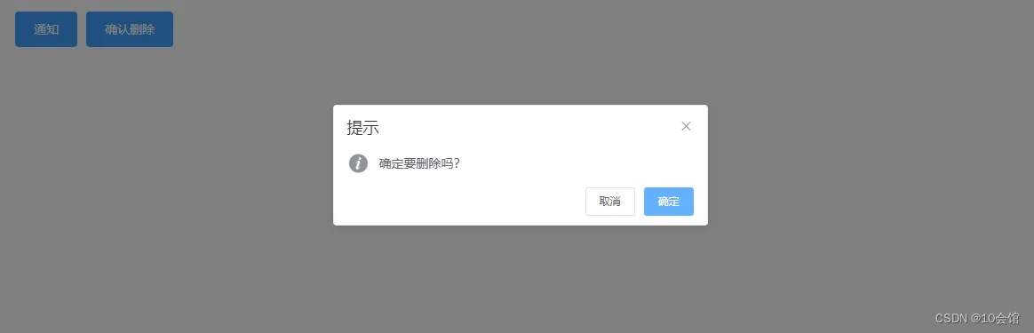
- 代码
this.$confirm('确定要删除吗?', '提示', {type: 'info'})
.then(() => {
  console.log('确定删除')
})
.catch(() => {
  console.log('取消删除')
});


 7902
7902


 被折叠的 条评论
为什么被折叠?
被折叠的 条评论
为什么被折叠?
 到【灌水乐园】发言


