


一、Material Symbols 是什么?

Material Symbols 是由 Google 设计,可免费商用的大型图标库,包含图标 3,000+ 个(仍在不断更新),提供 3 种图标样式以及 4 个维度的可调参数。
不用担心,中国大陆所有地区均可正常访问 Material Symbols 资源。如果仍然不放心,可以直接下载字体资源使用。

二、配置组件
在项目的任意位置创建 Vue 模板文件 GSymbol.vue ,然后复制下面的代码。
<template>
	<span :style="{
		color,
		fontStyle,
		position: alignText ? 'relative' : '',
		top: alignText ? '0.125em' : '',
		'--font-family': _family,
		'--font-fill': fill ? 1 : 0,
		'--font-wght': weight,
		'--font-grad': grade,
		'--font-opsz': size
	}" class="material-symbols">
		<slot></slot>
	</span>
</template>

<script>
function unsupportedWarning(prop, useValue, allowValues) {
	console.warn("[GSymbol] 可用的", prop, "值为", allowValues, ",填写的", JSON.stringify(useValue), "不受支持。");
}

export default {
	name: "GSymbol",
	props: {
		color: {
			type: String,
			default: ""
		},
		fontStyle: {
			type: String,
			enum: ["normal", "italic", "oblique"],
			default: "",
			validator: value => {
				if (["normal", "italic", "oblique", ""].includes(value)) {
					return true;
				}
				unsupportedWarning("fontStyle", value, ["normal", "italic", "oblique", ""]);
			}
		},
		family: {
			type: String,
			enum: ["outlined", "rounded", "sharp"],
			default: "rounded",
			validator: value => {
				if (["outlined", "rounded", "sharp"].includes(value?.toLowerCase())) {
					return true;
				}
				unsupportedWarning("family", value, ["outlined", "rounded", "sharp"]);
			}
		},
		alignText: {
			type: Boolean,
			default: false
		},
		fill: {
			type: Boolean,
			default: false
		},
		weight: {
			type: [Number, String],
			enum: [100, 200, 300, 400, 500, 600, 700],
			default: 400,
			validator: value => {
				if (typeof value === "string") {
					value = parseInt(value);
				}
				if ([100, 200, 300, 400, 500, 600, 700].includes(value)) {
					return true;
				}
				unsupportedWarning("weight", value, [100, 200, 300, 400, 500, 600, 700]);
			}
		},
		grade: {
			type: [Number, String],
			enum: [-25, 0, 200],
			default: 0,
			validator: value => {
				if (typeof value === "string") {
					value = parseInt(value);
				}
				if ([-25, 0, 200].includes(value)) {
					return true;
				}
				unsupportedWarning("grade", value, [-25, 0, 200]);
			}
		},
		size: {
			type: [Number, String],
			enum: [20, 24, 40, 48],
			default: 48,
			validator: (value) => {
				if (typeof value === "string") {
					value = parseInt(value);
				}
				if ([20, 24, 40, 48].includes(value)) {
					return true;
				}
				unsupportedWarning("size", value, [20, 24, 40, 48]);
			}
		}
	},
	computed: {
		_family() {
			return `material symbols ${this.family}`;
		}
	}
};
</script>

<style scoped>
@import "https://fonts.googleapis.cn/css2?family=Material+Symbols+Outlined:opsz,wght,FILL,GRAD@20..48,100..700,0..1,-50..200";
@import "https://fonts.googleapis.cn/css2?family=Material+Symbols+Rounded:opsz,wght,FILL,GRAD@20..48,100..700,0..1,-50..200";
@import "https://fonts.googleapis.cn/css2?family=Material+Symbols+Sharp:opsz,wght,FILL,GRAD@20..48,100..700,0..1,-50..200";

.material-symbols {
	--font-family: '';
	--font-fill: 0;
	--font-wght: 400;
	--font-grad: 0;
	--font-opsz: 48;
}

.material-symbols {
	font-family: var(--font-family);
	line-height: 1;
	user-select: none;
	font-variation-settings: 'FILL' var(--font-fill), 'wght' var(--font-wght), 'GRAD' var(--font-grad), 'opsz' var(--font-opsz);
}
</style>
三、使用组件
导入并注册组件。
import GSymbol from "@/components/templates/GSymbol.vue";export default {
name: "Example",
components: {
GSymbol // <- 注册组件
},
data() {
return {
// ...
};
},
methods: {
// ...
}
};在模板中使用组件。
<g-symbol color="red" fontStyle="italic" align-text family="rounded" fill weight="400" grade="0" size="48">home</g-symbol>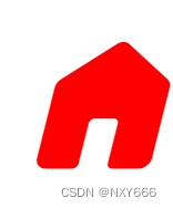
四、组件详解
1. 属性介绍
所有属性均为可选属性。
| 名称 | 类型 | 默认值 | 用途 |
| color | String | "" | 简便写法,对应 CSS 中的 color 。 |
| fontStyle | String | "" | 简便写法,对应 CSS 中的 font-style 。 |
| align-text | Boolean | false | 文本对齐。某些情况下可能出现图标与文本错位的情况。启用此功能将尝试对齐图标和文本。
|
| family | String | "outlined" | 字体样式。可用“Outlined”(轮廓)、“Rounded”(圆角)、“Sharp”(尖角),大小写不敏感。
|
| fill | Boolean | false | 是否填充。一个单独的图标可以呈现未填充和填充状态两种状态。
|
| weight | Number 或 String | 400 | 笔画粗细。其粗细范围从细(100)到粗(700),可能会影响符号的整体大小。
|
| grade | Number 或 String | 0 | 笔画等级。等级的调整比重量的调整更加精细,并且对符号的大小影响较小。某些文本字体提供了等级选项,您可以在文本和符号之间匹配等级水平,以获得更为协调的视觉效果。您可以根据需求使用不同的等级:
|
| size | Number 或 String | 24 | 光学尺寸。光学尺寸范围从20dp到48dp。为了使图标在不同大小下看起来相同,随着图标尺寸的缩放,描边的粗细会发生变化。光学尺寸提供了一种在增大或缩小图标尺寸时自动调整描边粗细的方式。
|


2. 图标获取和使用
GSymbol 组件使用默认插槽存放图标代码。
<g-symbol>
    ____
</g-symbol>
前往 Google Fonts 官网,可浏览、查找所有可用图标,并获取相应的图标代码。
 https://fonts.google.com/icons?hl=zh-cn&subset=chinese-simplified&icon.style=Rounded&icon.platform=android
打开 Filters 功能,可在左侧栏进行图标筛选和参数调试。参数的变动会实时反映在图标列表中。

点击你需要的图标,在右侧栏中选择 Android 选项卡,将得到的图标代码粘贴在 GSymbol 组件的默认插槽中即可。

五、在 Element Plus 中使用 GSymbol
如果你的项目正在使用 Element Plus ,那么你还可以将它用在 el-icon 可用的任何地方。
1. 在 el-icon 中使用
<el-icon>
    ___
</el-icon>
虽然没什么必要,但是 GSymbol 兼容 el-icon ,el-icon 的属性对 GSymbol 有效。
<el-icon color="var(--el-color-primary)" :size="256">
	<g-symbol align-text family="rounded" fill font-style="normal" weight="700">
		bolt
	</g-symbol>
</el-icon>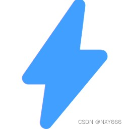
2. 在属性中使用
<el-button :icon="___">button</el-button>在任意位置创建文件 GSymbolUtil.js ,然后复制下面的代码。
import * as Vue from "vue"; // 实际未使用,但是如果不加IDEA会因为不认识Vue.Vode而误报Warning。
import GSymbol from "@/components/templates/GSymbol.vue";

/**
 * @param {string} code 图标代码
 * @param {string} color CSS图标颜色
 * @param {string} fontStyle CSS字体样式
 * @param {boolean} alignText 文本对齐
 * @param {string} family 字体家族
 * @param {boolean} fill 填充
 * @param {number} weight 粗细
 * @param {number} grade 等级
 * @param {number} size 大小
 * @return {Vue.VNode} 图标组件
 */
export function createGSymbol(
	code,
	{color = undefined, fontStyle = undefined, alignText = undefined} = {},
	{family = undefined, fill = undefined, weight = undefined, grade = undefined, size = undefined} = {}
) {
	return Vue.createVNode(GSymbol, {
		color: color ?? GSymbol.props.color.default,
		fontStyle: fontStyle ?? GSymbol.props.fontStyle.default,
		alignText: alignText ?? GSymbol.props.alignText.default,
		family: family ?? GSymbol.props.family.default,
		fill: fill ?? GSymbol.props.fill.default,
		weight: weight ?? GSymbol.props.weight.default,
		grade: grade ?? GSymbol.props.grade.default,
		size: size ?? GSymbol.props.size.default
	}, {
		default: () => code
	});
}
导入 GSymbolUtil 工具,在 setup 中创建 GSymbol 节点对象。
提示:Element Plus 会使用 <i> 标签包裹图标,这会导致 GSymbol 变为斜体。在创建对象时可使用 fontStyle: "normal" 来规避此问题。
import {createGSymbol} from "@/utils/GSymbolUtil";export default {
name: "Example",
setup() {
return {
FactCheck: createGSymbol("fact_check", {fontStyle: "normal"}, {weight: 600}) // <- GSymbol节点对象
};
},
data() {
return {
// ...
};
},
methods: {
// ...
}
}创建完成后直接在模板中使用即可。
<el-button :icon="FactCheck" round>审核</el-button>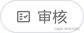


 6万+
6万+

 被折叠的 条评论
为什么被折叠?
被折叠的 条评论
为什么被折叠?
 到【灌水乐园】发言


