


这篇文章主要介绍了基于python的图表生成系统,具有一定借鉴价值,需要的朋友可以参考下。希望大家阅读完这篇文章后大有收获,下面让小编带着大家一起了解一下。

40张python图表
1. 条形图
# 库
import numpy as np
import matplotlib.pyplot as plt

# 创建数据集
height = [3, 12, 5, 18, 45]
bars = ('A', 'B', 'C', 'D', 'E')
x_pos = np.arange(len(bars))

# 创建条形图
plt.bar(x_pos, height)

# 在x轴上创建名称
plt.xticks(x_pos, bars)

# 显示图形
plt.show()

#水平条形图
import matplotlib.pyplot as plt
import numpy as np

height = [3, 12, 5, 18, 45]
bars = ('A', 'B', 'C', 'D', 'E')
y_pos = np.arange(len(bars))
#height后面加上代码color=(0.2, 0.4, 0.6, 0.6)可以改变颜色
plt.barh(y_pos, height)

plt.yticks(y_pos, bars)
plt.show()

# 堆垛条形图
# 库
import numpy as np
import matplotlib.pyplot as plt
from matplotlib import rc
import pandas as pd
rc('font', weight='bold')
bars1 = [12, 28, 1, 8, 22]
bars2 = [28, 7, 16, 4, 10]
bars3 = [25, 3, 23, 25, 17]
bars = np.add(bars1, bars2).tolist()
r = [0,1,2,3,4]
names = ['A','B','C','D','E']
barWidth = 1
plt.bar(r, bars1, color='#7f6d5f', edgecolor='white', width=barWidth)
plt.bar(r, bars2, bottom=bars1, color='#557f2d', edgecolor='white', width=barWidth)
plt.bar(r, bars3, bottom=bars, color='#2d7f5e', edgecolor='white', width=barWidth)
plt.xticks(r, names, fontweight='bold')
plt.xlabel("group")
plt.show()

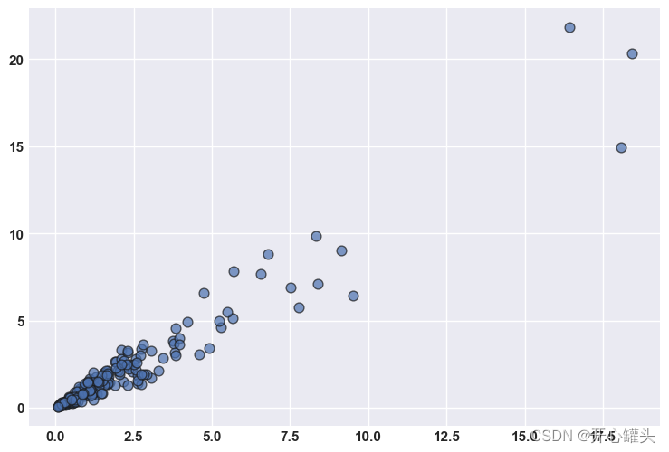
2.散点图
import matplotlib.pyplot as plt
import numpy as np

rng = np.random.default_rng(1234)

# Generate data
x = rng.lognormal(size=200)
y = x + rng.normal(scale=5 * (x / np.max(x)), size=200)

# Initialize layout
fig, ax = plt.subplots(figsize = (9, 6))

# Add scatterplot
ax.scatter(x, y, s=60, alpha=0.7, edgecolors="k");
3.折线图
# Libraries and data
import matplotlib.pyplot as plt
import numpy as np
import pandas as pd
df=pd.DataFrame({'x_values': range(1,11), 'y_values': np.random.randn(10) })

# Draw plot
plt.plot( 'x_values', 'y_values', data=df, color='skyblue')
plt.show()

# Draw line chart by modifiying transparency of the line
plt.plot( 'x_values', 'y_values', data=df, color='skyblue', alpha=0.3)

# Show plot
plt.show()


4.面积图和刻面
# libraries
import numpy as np
import seaborn as sns
import pandas as pd
import matplotlib.pyplot as plt

# Create a dataset
my_count=["France","Australia","Japan","USA","Germany","Congo","China","England","Spain","Greece","Marocco","South Africa","Indonesia","Peru","Chili","Brazil"]
df = pd.DataFrame({
"country":np.repeat(my_count, 10),
"years":list(range(2000, 2010)) * 16,
"value":np.random.rand(160)
})

# Create a grid : initialize it
g = sns.FacetGrid(df, col='country', hue='country', col_wrap=4, )

# Add the line over the area with the plot function
g = g.map(plt.plot, 'years', 'value')

# Fill the area with fill_between
g = g.map(plt.fill_between, 'years', 'value', alpha=0.2).set_titles("{col_name} country")

# Control the title of each facet
g = g.set_titles("{col_name}")

# Add a title for the whole plot
plt.subplots_adjust(top=0.92)
g = g.fig.suptitle('Evolution of the value of stuff in 16 countries')

# Show the graph
plt.show()

5.散点图
# libraries
import matplotlib.pyplot as plt
import numpy as np
import pandas as pd

# Create a dataset:
df=pd.DataFrame({'x_values': range(1,101), 'y_values': np.random.randn(100)*15+range(1,101) })

# plot
plt.plot( 'x_values', 'y_values', data=df, linestyle='none', marker='o')
plt.show()
![[外链图片转存失败,源站可能有防盗链机制,建议将图片保存下来直接上传(img-RyQuAWhB-1685956274523)(output_12_0.png)]](https://i-blog.csdnimg.cn/blog_migrate/d4dd24440a6f2d9585c087ce054e53d1.png)
6. 基本饼图
# library
import pandas as pd
import matplotlib.pyplot as plt

# --- dataset 1: just 4 values for 4 groups:
df = pd.DataFrame([8,8,1,2], index=['a', 'b', 'c', 'd'], columns=['x'])

# make the plot
df.plot(kind='pie', subplots=True, figsize=(8, 8))

# show the plot
plt.show()
![[外链图片转存失败,源站可能有防盗链机制,建议将图片保存下来直接上传(img-qbtqrHEZ-1685956274524)(output_14_0.png)]](https://i-blog.csdnimg.cn/blog_migrate/231cde3551a92153b1002e70f519eb57.png)
6.基本甜甜圈图
# library
import matplotlib.pyplot as plt

# create data
size_of_groups=[12,11,3,30]

# Create a pie plot
plt.pie(size_of_groups)
#plt.show()

# add a white circle at the center
my_circle=plt.Circle( (0,0), 0.7, color='white')
p=plt.gcf()
p.gca().add_artist(my_circle)

# show the graph
plt.show()
![[外链图片转存失败,源站可能有防盗链机制,建议将图片保存下来直接上传(img-EMUEG6Wq-1685956274524)(output_16_0.png)]](https://i-blog.csdnimg.cn/blog_migrate/40291a5898aae0a85240415584f466e8.png)
7.棒棒糖图
# libraries
import matplotlib.pyplot as plt
import numpy as np

# create data
x=range(1,41)
values=np.random.uniform(size=40)

# stem function
plt.stem(x, values)
plt.ylim(0, 1.2)
plt.show()

# stem function: If x is not provided, a sequence of numbers is created by python:
plt.stem(values)
plt.show()
![[外链图片转存失败,源站可能有防盗链机制,建议将图片保存下来直接上传(img-SreaDyDR-1685956274524)(output_18_0.png)]](https://i-blog.csdnimg.cn/blog_migrate/31f8c8ad2bb11cc351cb59732e0ac472.png)
![[外链图片转存失败,源站可能有防盗链机制,建议将图片保存下来直接上传(img-J97UbtMU-1685956274524)(output_18_1.png)]](https://i-blog.csdnimg.cn/blog_migrate/232a1562e07530b5c8b01605b419ba9d.png)
8. 2D马赛克
# libraries
import matplotlib.pyplot as plt
import numpy as np

# Data
x = np.random.normal(size=50000)
y = x * 3 + np.random.normal(size=50000)

# A histogram 2D
plt.hist2d(x, y, bins=(50, 50), cmap=plt.cm.Reds)

# Add a basic title
plt.title("A 2D histogram")

# Show the graph
plt.show()
![[外链图片转存失败,源站可能有防盗链机制,建议将图片保存下来直接上传(img-5WZnzhRd-1685956274525)(output_20_0.png)]](https://i-blog.csdnimg.cn/blog_migrate/87cf0d758d12cef6e669fb261ec8ea4a.png)
9.树形图
# libraries
import pandas as pd
import matplotlib.pyplot as plt
import squarify    # pip install squarify (algorithm for treemap)

# If you have 2 lists
squarify.plot(sizes=[13,22,35,5], label=["group A", "group B", "group C", "group D"], alpha=.7 )
plt.axis('off')
plt.show()

# If you have a data frame
df = pd.DataFrame({'nb_people':[8,3,4,2], 'group':["group A", "group B", "group C", "group D"] })
squarify.plot(sizes=df['nb_people'], label=df['group'], alpha=.8 )
plt.axis('off')
plt.show()
![[外链图片转存失败,源站可能有防盗链机制,建议将图片保存下来直接上传(img-gMNlFuHT-1685956274525)(output_22_0.png)]](https://i-blog.csdnimg.cn/blog_migrate/d669c4d6014044ab00d35d80951dceb2.png)
![[外链图片转存失败,源站可能有防盗链机制,建议将图片保存下来直接上传(img-STBoPWPb-1685956274525)(output_22_1.png)]](https://i-blog.csdnimg.cn/blog_migrate/3ee9e255a13533e8f784d5d04810f36f.png)
10.带有颜色映射值的树状图
#libraries
import matplotlib
import matplotlib.pyplot as plt
import squarify # pip install squarify (algorithm for treemap)</pre>

# Create a dataset:
my_values=[i**3 for i in range(1,100)]

# create a color palette, mapped to these values
cmap = matplotlib.cm.Blues
mini=min(my_values)
maxi=max(my_values)
norm = matplotlib.colors.Normalize(vmin=mini, vmax=maxi)
colors = [cmap(norm(value)) for value in my_values]

# Change color
squarify.plot(sizes=my_values, alpha=.8, color=colors )
plt.axis('off')
plt.show()
![[外链图片转存失败,源站可能有防盗链机制,建议将图片保存下来直接上传(img-nywBvW1W-1685956274526)(output_24_0.png)]](https://i-blog.csdnimg.cn/blog_migrate/00d5a8c17501a7ec62b4f4aa4201cc26.png)
11.基本面积图
# libraries
import numpy as np
import matplotlib.pyplot as plt

# Create data
x=range(1,6)
y=[1,4,6,8,4]

# Area plot
plt.fill_between(x, y)

# Show the graph
plt.show()

# Note that we could also use the stackplot function
# but fill_between is more convenient for future customization.
#plt.stackplot(x,y)
#plt.show()
![[外链图片转存失败,源站可能有防盗链机制,建议将图片保存下来直接上传(img-fzD5sPCs-1685956274526)(output_26_0.png)]](https://i-blog.csdnimg.cn/blog_migrate/81719f54f03c083bf5bb215eb6966056.png)
12.数据帧
# libraries
import pandas as pd
import numpy as np
import networkx as nx
import matplotlib.pyplot as plt

# Build a dataframe with 4 connections
df = pd.DataFrame({ 'from':['A', 'B', 'C','A'], 'to':['D', 'A', 'E','C']})

# Build your graph
G=nx.from_pandas_edgelist(df, 'from', 'to')

# Plot it
nx.draw(G, with_labels=True)
plt.show()
![[外链图片转存失败,源站可能有防盗链机制,建议将图片保存下来直接上传(img-nS7F6nSE-1685956274526)(output_28_0.png)]](https://i-blog.csdnimg.cn/blog_migrate/8bc567d9b1a41e563a6b39c50ae61d6e.png)
13.3D散点图
# libraries
from mpl_toolkits.mplot3d import Axes3D
import matplotlib.pyplot as plt
import numpy as np
import pandas as pd

# Dataset
df=pd.DataFrame({'X': range(1,101), 'Y': np.random.randn(100)*15+range(1,101), 'Z': (np.random.randn(100)*15+range(1,101))*2 })

# plot
fig = plt.figure()
ax = fig.add_subplot(111, projection='3d')
ax.scatter(df['X'], df['Y'], df['Z'], c='skyblue', s=60)
plt.show()
![[外链图片转存失败,源站可能有防盗链机制,建议将图片保存下来直接上传(img-FdyGfqg0-1685956274526)(output_30_0.png)]](https://i-blog.csdnimg.cn/blog_migrate/b9bb16f478bb1ca8e9c16541540fde68.png)
14.基本雷达图
# Libraries
import matplotlib.pyplot as plt
import pandas as pd
from math import pi

# Set data
df = pd.DataFrame({
'group': ['A','B','C','D'],
'var1': [38, 1.5, 30, 4],
'var2': [29, 10, 9, 34],
'var3': [8, 39, 23, 24],
'var4': [7, 31, 33, 14],
'var5': [28, 15, 32, 14]
})

# number of variable
categories=list(df)[1:]
N = len(categories)

# We are going to plot the first line of the data frame.
# But we need to repeat the first value to close the circular graph:
values=df.loc[0].drop('group').values.flatten().tolist()
values += values[:1]
values

# What will be the angle of each axis in the plot? (we divide the plot / number of variable)
angles = [n / float(N) * 2 * pi for n in range(N)]
angles += angles[:1]

# Initialise the spider plot
ax = plt.subplot(111, polar=True)

# Draw one axe per variable + add labels
plt.xticks(angles[:-1], categories, color='grey', size=8)

# Draw ylabels
ax.set_rlabel_position(0)
plt.yticks([10,20,30], ["10","20","30"], color="grey", size=7)
plt.ylim(0,40)

# Plot data
ax.plot(angles, values, linewidth=1, linestyle='solid')

# Fill area
ax.fill(angles, values, 'b', alpha=0.1)

# Show the graph
plt.show()
![[外链图片转存失败,源站可能有防盗链机制,建议将图片保存下来直接上传(img-kkSA0egI-1685956274527)(output_32_0.png)]](https://i-blog.csdnimg.cn/blog_migrate/a0be86bb273823dcc9727949ef79af33.png)
15.雷达分面图
# Libraries
import matplotlib.pyplot as plt
import pandas as pd
from math import pi

# Set data
df = pd.DataFrame({
'group': ['A','B','C','D'],
'var1': [38, 1.5, 30, 4],
'var2': [29, 10, 9, 34],
'var3': [8, 39, 23, 24],
'var4': [7, 31, 33, 14],
'var5': [28, 15, 32, 14]
})

# ------- PART 1: Define a function that do a plot for one line of the dataset!

def make_spider( row, title, color):

    # number of variable
    categories=list(df)[1:]
    N = len(categories)

    # What will be the angle of each axis in the plot? (we divide the plot / number of variable)
    angles = [n / float(N) * 2 * pi for n in range(N)]
    angles += angles[:1]

    # Initialise the spider plot
    ax = plt.subplot(2,2,row+1, polar=True, )

    # If you want the first axis to be on top:
    ax.set_theta_offset(pi / 2)
    ax.set_theta_direction(-1)

    # Draw one axe per variable + add labels labels yet
    plt.xticks(angles[:-1], categories, color='grey', size=8)

    # Draw ylabels
    ax.set_rlabel_position(0)
    plt.yticks([10,20,30], ["10","20","30"], color="grey", size=7)
    plt.ylim(0,40)

    # Ind1
    values=df.loc[row].drop('group').values.flatten().tolist()
    values += values[:1]
    ax.plot(angles, values, color=color, linewidth=2, linestyle='solid')
    ax.fill(angles, values, color=color, alpha=0.4)

    # Add a title
    plt.title(title, size=11, color=color, y=1.1)


# ------- PART 2: Apply the function to all individuals
# initialize the figure
my_dpi=96
plt.figure(figsize=(1000/my_dpi, 1000/my_dpi), dpi=my_dpi)

# Create a color palette:
my_palette = plt.cm.get_cmap("Set2", len(df.index))

# Loop to plot
for row in range(0, len(df.index)):
    make_spider( row=row, title='group '+df['group'][row], color=my_palette(row))
![[外链图片转存失败,源站可能有防盗链机制,建议将图片保存下来直接上传(img-IqIeQN0H-1685956274527)(output_34_0.png)]](https://i-blog.csdnimg.cn/blog_migrate/8793fe16e6aef13da3bb74f52ddd93e7.png)
16.基本箱线图
# libraries & dataset
import seaborn as sns
import matplotlib.pyplot as plt
# set a grey background (use sns.set_theme() if seaborn version 0.11.0 or above)
sns.set(style="darkgrid")
df = sns.load_dataset('iris',cache=True,data_home="../seaborn-data-master")

sns.boxplot(y=df["sepal_length"])
plt.show()
![[外链图片转存失败,源站可能有防盗链机制,建议将图片保存下来直接上传(img-MWOa7jcx-1685956274527)(output_36_0.png)]](https://i-blog.csdnimg.cn/blog_migrate/e9aeb18b89c43722b4c2797457d118f4.png)
17.水平箱线图
# libraries & dataset
import seaborn as sns
import matplotlib.pyplot as plt
# set a grey background (use sns.set_theme() if seaborn version 0.11.0 or above)
sns.set(style="darkgrid")
df = sns.load_dataset('iris',cache=True,data_home="../seaborn-data-master")

sns.boxplot(y=df["species"], x=df["sepal_length"])
plt.show()
![[外链图片转存失败,源站可能有防盗链机制,建议将图片保存下来直接上传(img-hl9XrrDz-1685956274528)(output_38_0.png)]](https://i-blog.csdnimg.cn/blog_migrate/0f0729ae7491f11531fc71ec6388b0b7.png)
18.组箱线图
# libraries & dataset
import seaborn as sns
import matplotlib.pyplot as plt
sns.set(style="darkgrid")
df = sns.load_dataset('tips',cache=True,data_home="../seaborn-data-master")

sns.boxplot(x="day", y="total_bill", hue="smoker", data=df, palette="Set1", width=0.5)
plt.show()
![[外链图片转存失败,源站可能有防盗链机制,建议将图片保存下来直接上传(img-jMlvL4iD-1685956274528)(output_40_0.png)]](https://i-blog.csdnimg.cn/blog_migrate/1190261030ac837f05ff8af10e479add.png)
19.散点图
# library & dataset
import seaborn as sns
import matplotlib.pyplot as plt
df = sns.load_dataset('iris',cache=True,data_home="../seaborn-data-master")

# plot
sns.regplot(x=df["sepal_length"], y=df["sepal_width"], line_kws={"color":"r","alpha":0.7,"lw":5})
plt.show()
![[外链图片转存失败,源站可能有防盗链机制,建议将图片保存下来直接上传(img-MiVOkeYC-1685956274528)(output_42_0.png)]](https://i-blog.csdnimg.cn/blog_migrate/c60c69e210b428029d518235341624c2.png)
20.小提琴绘图
# libraries & dataset
import seaborn as sns
import matplotlib.pyplot as plt
# set a grey background (use sns.set_theme() if seaborn version 0.11.0 or above)
sns.set(style="darkgrid")
df = sns.load_dataset('iris',cache=True,data_home="../seaborn-data-master")

# Make boxplot for one group only
sns.violinplot(y=df["sepal_length"])
plt.show()
![[外链图片转存失败,源站可能有防盗链机制,建议将图片保存下来直接上传(img-kzpC9Kwk-1685956274529)(output_44_0.png)]](https://i-blog.csdnimg.cn/blog_migrate/0bf3e36a3d586a187038f8be0e741fb8.png)
21.basic-density-plot-with-seaborn
# libraries & dataset
import seaborn as sns
import matplotlib.pyplot as plt
# set a grey background (use sns.set_theme() if seaborn version 0.11.0 or above)
sns.set(style="darkgrid")
df = sns.load_dataset('iris',cache=True,data_home="../seaborn-data-master")

# Large bandwidth
sns.kdeplot(df['sepal_width'], shade=True, bw=0.5, color="olive")
plt.show()
C:\ProgramData\Anaconda3\lib\site-packages\seaborn\distributions.py:1699: FutureWarning: The `bw` parameter is deprecated in favor of `bw_method` and `bw_adjust`. Using 0.5 for `bw_method`, but please see the docs for the new parameters and update your code.
  warnings.warn(msg, FutureWarning)
![[外链图片转存失败,源站可能有防盗链机制,建议将图片保存下来直接上传(img-KgGMX58N-1685956274529)(output_46_1.png)]](https://i-blog.csdnimg.cn/blog_migrate/67306771f959ac43daa52d77f8b0f7cf.png)
21.地形图
# libraries & dataset
import seaborn as sns
import matplotlib.pyplot as plt
df = sns.load_dataset('iris',cache=True,data_home="../seaborn-data-master")

# set seaborn style
sns.set_style("white")

# Basic 2D density plot
sns.kdeplot(x=df.sepal_width, y=df.sepal_length)
plt.show()

# Custom the color, add shade and bandwidth
sns.kdeplot(x=df.sepal_width, y=df.sepal_length, cmap="Reds", shade=True, bw_adjust=.5)
plt.show()

# Add thresh parameter
sns.kdeplot(x=df.sepal_width, y=df.sepal_length, cmap="Blues", shade=True, thresh=0)
plt.show()
![[外链图片转存失败,源站可能有防盗链机制,建议将图片保存下来直接上传(img-GYB5ZyDR-1685956274529)(output_48_0.png)]](https://i-blog.csdnimg.cn/blog_migrate/685fa98ffb09e86b890519c2a2e89324.png)
![[外链图片转存失败,源站可能有防盗链机制,建议将图片保存下来直接上传(img-Ch5YsRQs-1685956274529)(output_48_1.png)]](https://i-blog.csdnimg.cn/blog_migrate/84629c4eafd9ab37cbbc01594f1ed21b.png)

22.具有各种输入格式的 90 热图
# library
import seaborn as sns
import pandas as pd
import numpy as np

# Create a dataset
df = pd.DataFrame(np.random.random((5,5)), columns=["a","b","c","d","e"])

# Default heatmap: just a visualization of this square matrix
sns.heatmap(df)
<AxesSubplot:>
![[外链图片转存失败,源站可能有防盗链机制,建议将图片保存下来直接上传(img-eGO0Omrz-1685956274530)(output_50_1.png)]](https://i-blog.csdnimg.cn/blog_migrate/3aa0350df5d038e69cfa7ecea6d2d850.png)
23.控制颜色热图
# libraries
import seaborn as sns
import matplotlib.pyplot as plt
import pandas as pd
import numpy as np

# Create a dataset
df = pd.DataFrame(np.random.random((10,10)), columns=["a","b","c","d","e","f","g","h","i","j"])

# plot using a color palette
sns.heatmap(df, cmap="YlGnBu")
plt.show()

sns.heatmap(df, cmap="Blues")
plt.show()

sns.heatmap(df, cmap="BuPu")
plt.show()

sns.heatmap(df, cmap="Greens")
plt.show()
![[外链图片转存失败,源站可能有防盗链机制,建议将图片保存下来直接上传(img-mddGfePq-1685956274530)(output_52_0.png)]](https://i-blog.csdnimg.cn/blog_migrate/20170959e2b1338684ddd0ab607a30f2.png)
![[外链图片转存失败,源站可能有防盗链机制,建议将图片保存下来直接上传(img-9Rrqqm4V-1685956274530)(output_52_1.png)]](https://i-blog.csdnimg.cn/blog_migrate/1683618e804510bc69c488c5ba74de41.png)
![[外链图片转存失败,源站可能有防盗链机制,建议将图片保存下来直接上传(img-2uuHm7XT-1685956274531)(output_52_2.png)]](https://i-blog.csdnimg.cn/blog_migrate/161d20f6d4e00b7a19879aff6f142a92.png)
![[外链图片转存失败,源站可能有防盗链机制,建议将图片保存下来直接上传(img-6MwuZ6o2-1685956274531)(output_52_3.png)]](https://i-blog.csdnimg.cn/blog_migrate/3521dfb9702ce0839acf2ab69e3caa1c.png)
24.
# libraries
import seaborn as sns
import numpy as np
import matplotlib.pyplot as plt

# Data
data = np.random.normal(size=(20, 6)) + np.arange(6) / 2

# Proposed themes: darkgrid, whitegrid, dark, white, and ticks

sns.set_style("whitegrid")
sns.boxplot(data=data)
plt.title("whitegrid")
plt.show()

sns.set_style("darkgrid")
sns.boxplot(data=data);
plt.title("darkgrid")
plt.show()

sns.set_style("white")
sns.boxplot(data=data);
plt.title("white")
plt.show()

sns.set_style("dark")
sns.boxplot(data=data);
plt.title("dark")
plt.show()

sns.set_style("ticks")
sns.boxplot(data=data);
plt.title("ticks")
plt.show()
![[外链图片转存失败,源站可能有防盗链机制,建议将图片保存下来直接上传(img-vRu7ECLh-1685956274531)(output_54_0.png)]](https://i-blog.csdnimg.cn/blog_migrate/1a5a564f38f8c370f8c1b2767d27c9a3.png)
![[外链图片转存失败,源站可能有防盗链机制,建议将图片保存下来直接上传(img-pJd2jXLy-1685956274532)(output_54_1.png)]](https://i-blog.csdnimg.cn/blog_migrate/5a6292ef3b3d65510fd223c04586d3b2.png)
![[外链图片转存失败,源站可能有防盗链机制,建议将图片保存下来直接上传(img-tBvy6lfE-1685956274532)(output_54_2.png)]](https://i-blog.csdnimg.cn/blog_migrate/a70351ee9fbeb756763bee9652a666e2.png)
![[外链图片转存失败,源站可能有防盗链机制,建议将图片保存下来直接上传(img-mCnAWYiT-1685956274532)(output_54_3.png)]](https://i-blog.csdnimg.cn/blog_migrate/a2adb4c00365aa91ae3aecd358b859bb.png)
![[外链图片转存失败,源站可能有防盗链机制,建议将图片保存下来直接上传(img-Uzmw62o1-1685956274532)(output_54_4.png)]](https://i-blog.csdnimg.cn/blog_migrate/090befc51e81cc2c8a2b0a1595799ece.png)
25.seaborn-style-on-matplotlib-plot
# library and dataset
from matplotlib import pyplot as plt
import pandas as pd
import numpy as np

# Create data
df=pd.DataFrame({'x_axis': range(1,101), 'y_axis': np.random.randn(100)*15+range(1,101), 'z': (np.random.randn(100)*15+range(1,101))*2 })

# plot with matplotlib
plt.plot( 'x_axis', 'y_axis', data=df, marker='o', color='mediumvioletred')
plt.show()
![[外链图片转存失败,源站可能有防盗链机制,建议将图片保存下来直接上传(img-dV6iyjmj-1685956274533)(output_56_0.png)]](https://i-blog.csdnimg.cn/blog_migrate/6611644f9af100ddc9e188d20ee742da.png)
26.折线标点图
# Libraries
import matplotlib.pyplot as plt
import numpy as np
import pandas as pd

# Set figure default figure size
plt.rcParams["figure.figsize"] = (10, 6)
# Create a random number generator for reproducibility
rng = np.random.default_rng(1111)

# Get some random points!
x = np.array(range(10))
y = rng.integers(10, 100, 10)
z = y + rng.integers(5, 20, 10)
plt.plot(x, z, linestyle="-", marker="o", label="Income")
plt.plot(x, y, linestyle="-", marker="o", label="Expenses")
plt.legend()
plt.show()
![[外链图片转存失败,源站可能有防盗链机制,建议将图片保存下来直接上传(img-PLpSxxyw-1685956274533)(output_58_0.png)]](https://i-blog.csdnimg.cn/blog_migrate/99ae0f4c7bb79f1d0a1b23460e50b44f.png)
27.折折折线线线图
# libraries
import pandas
import matplotlib.pyplot as plt
import seaborn as sns
from pandas.plotting import parallel_coordinates

# Take the iris dataset
data = sns.load_dataset('iris',cache=True,data_home="../seaborn-data-master")

# Make the plot
parallel_coordinates(data, 'species', colormap=plt.get_cmap("Set2"))
plt.show()
![[外链图片转存失败,源站可能有防盗链机制,建议将图片保存下来直接上传(img-Qk3RaU55-1685956274533)(output_60_0.png)]](https://i-blog.csdnimg.cn/blog_migrate/f1c891796dc8c789f1d18f784fef1c43.png)
28.提琴图
# libraries & dataset
import seaborn as sns
import matplotlib.pyplot as plt
# set a grey background (use sns.set_theme() if seaborn version 0.11.0 or above)
sns.set(style="darkgrid")
df = sns.load_dataset('tips',cache=True,data_home="../seaborn-data-master")

# Grouped violinplot
sns.violinplot(x="day", y="total_bill", hue="smoker", data=df, palette="Pastel1")
plt.show()
![[外链图片转存失败,源站可能有防盗链机制,建议将图片保存下来直接上传(img-lN4gZPNL-1685956274533)(output_62_0.png)]](https://i-blog.csdnimg.cn/blog_migrate/4c0c1873a9c73d4e85be0ac5e6ed1746.png)
29.自定义热图
# libraries
import seaborn as sns
import pandas as pd
import numpy as np

# Create a dataset
df = pd.DataFrame(np.random.random((10,10)), columns=["a","b","c","d","e","f","g","h","i","j"])

# plot a heatmap with annotation
sns.heatmap(df, annot=True, annot_kws={"size": 7})
<AxesSubplot:>
![[外链图片转存失败,源站可能有防盗链机制,建议将图片保存下来直接上传(img-uTUDdVIo-1685956274534)(output_64_1.png)]](https://i-blog.csdnimg.cn/blog_migrate/9ef83c128ee6a8f865180db231b48ac0.png)
30.甜甜圈图与子图
# Libraries
import matplotlib.pyplot as plt

# Make data: I have 3 groups and 7 subgroups
group_names=['groupA', 'groupB', 'groupC']
group_size=[12,11,30]
subgroup_names=['A.1', 'A.2', 'A.3', 'B.1', 'B.2', 'C.1', 'C.2', 'C.3', 'C.4', 'C.5']
subgroup_size=[4,3,5,6,5,10,5,5,4,6]

# Create colors
a, b, c=[plt.cm.Blues, plt.cm.Reds, plt.cm.Greens]

# First Ring (outside)
fig, ax = plt.subplots()
ax.axis('equal')
mypie, _ = ax.pie(group_size, radius=1.3, labels=group_names, colors=[a(0.6), b(0.6), c(0.6)] )
plt.setp( mypie, width=0.3, edgecolor='white')

# Second Ring (Inside)
mypie2, _ = ax.pie(subgroup_size, radius=1.3-0.3, labels=subgroup_names, labeldistance=0.7, colors=[a(0.5), a(0.4), a(0.3), b(0.5), b(0.4), c(0.6), c(0.5), c(0.4), c(0.3), c(0.2)])
plt.setp( mypie2, width=0.4, edgecolor='white')
plt.margins(0,0)

# show it
plt.show()
![[外链图片转存失败,源站可能有防盗链机制,建议将图片保存下来直接上传(img-Sh8MpQul-1685956274534)(output_66_0.png)]](https://i-blog.csdnimg.cn/blog_migrate/e79c37ea5d8967f76b73f18f7e3b59b9.png)
31.区域图
# libraries
import numpy as np
import seaborn as sns
import matplotlib.pyplot as plt

# set the seaborn style
sns.set_style("whitegrid")

# Color palette
blue, = sns.color_palette("muted", 1)

# Create data
x = np.arange(23)
y = np.random.randint(8, 20, 23)

# Make the plot
fig, ax = plt.subplots()
ax.plot(x, y, color=blue, lw=3)
ax.fill_between(x, 0, y, alpha=.3)
ax.set(xlim=(0, len(x) - 1), ylim=(0, None), xticks=x)

# Show the graph
plt.show()
![[外链图片转存失败,源站可能有防盗链机制,建议将图片保存下来直接上传(img-thLVGozb-1685956274534)(output_68_0.png)]](https://i-blog.csdnimg.cn/blog_migrate/700a34a81b849b0ba6cb00099a3bd5c1.png)
32.堆积面积图
# libraries
import numpy as np
import matplotlib.pyplot as plt
import seaborn as sns

# Create data
X = np.arange(0, 10, 1)
Y = X + 5 * np.random.random((5, X.size))

# There are 4 types of baseline we can use:
baseline = ["zero", "sym", "wiggle", "weighted_wiggle"]

# Let's make 4 plots, 1 for each baseline
for n, v in enumerate(baseline):
    if n<3 :
        plt.tick_params(labelbottom='off')
    plt.subplot(2 ,2, n + 1)
    plt.stackplot(X, *Y, baseline=v)
    plt.title(v)
    plt.tight_layout()
![[外链图片转存失败,源站可能有防盗链机制,建议将图片保存下来直接上传(img-IrEL3moM-1685956274535)(output_70_0.png)]](https://i-blog.csdnimg.cn/blog_migrate/c0297f3270b31287f6e091c5fff393c8.png)
33.气泡图
# libraries
import matplotlib.pyplot as plt
import numpy as np
import seaborn as sns

# create data
x = np.random.rand(15)
y = x+np.random.rand(15)
z = x+np.random.rand(15)
z=z*z

# Change color with c and transparency with alpha.
# I map the color to the X axis value.
plt.scatter(x, y, s=z*2000, c=x, cmap="Blues", alpha=0.4, edgecolors="grey", linewidth=2)

# Add titles (main and on axis)
plt.xlabel("the X axis")
plt.ylabel("the Y axis")
plt.title("A colored bubble plot")

# Show the graph
plt.show()
![[外链图片转存失败,源站可能有防盗链机制,建议将图片保存下来直接上传(img-4uBDBORc-1685956274535)(output_72_0.png)]](https://i-blog.csdnimg.cn/blog_migrate/6410bd2fecf5df1c587bec33af2ab07c.png)
34.雷达图
# Libraries
import matplotlib.pyplot as plt
import pandas as pd
from math import pi

# Set data
df = pd.DataFrame({
'group': ['A','B','C','D'],
'var1': [38, 1.5, 30, 4],
'var2': [29, 10, 9, 34],
'var3': [8, 39, 23, 24],
'var4': [7, 31, 33, 14],
'var5': [28, 15, 32, 14]
})

# ------- PART 1: Create background

# number of variable
categories=list(df)[1:]
N = len(categories)

# What will be the angle of each axis in the plot? (we divide the plot / number of variable)
angles = [n / float(N) * 2 * pi for n in range(N)]
angles += angles[:1]

# Initialise the spider plot
ax = plt.subplot(111, polar=True)

# If you want the first axis to be on top:
ax.set_theta_offset(pi / 2)
ax.set_theta_direction(-1)

# Draw one axe per variable + add labels
plt.xticks(angles[:-1], categories)

# Draw ylabels
ax.set_rlabel_position(0)
plt.yticks([10,20,30], ["10","20","30"], color="grey", size=7)
plt.ylim(0,40)


# ------- PART 2: Add plots

# Plot each individual = each line of the data
# I don't make a loop, because plotting more than 3 groups makes the chart unreadable

# Ind1
values=df.loc[0].drop('group').values.flatten().tolist()
values += values[:1]
ax.plot(angles, values, linewidth=1, linestyle='solid', label="group A")
ax.fill(angles, values, 'b', alpha=0.1)

# Ind2
values=df.loc[1].drop('group').values.flatten().tolist()
values += values[:1]
ax.plot(angles, values, linewidth=1, linestyle='solid', label="group B")
ax.fill(angles, values, 'r', alpha=0.1)

# Add legend
plt.legend(loc='upper right', bbox_to_anchor=(0.1, 0.1))

# Show the graph
plt.show()
![[外链图片转存失败,源站可能有防盗链机制,建议将图片保存下来直接上传(img-z2HlhIPu-1685956274536)(output_74_0.png)]](https://i-blog.csdnimg.cn/blog_migrate/58a8cd58a01343ebd7f1ab933214d0fb.png)
35.密度镜图
# libraries
import numpy as np
from numpy import linspace
import pandas as pd
import seaborn as sns
import matplotlib.pyplot as plt
from scipy.stats import gaussian_kde

# dataframe
df = pd.DataFrame({
'var1': np.random.normal(size=1000),
'var2': np.random.normal(loc=2, size=1000) * -1
})

# Fig size
plt.rcParams["figure.figsize"]=12,8

# plot density chart for var1
sns.kdeplot(data=df, x="var1",  fill=True, alpha=1)

# plot density chart for var2
kde = gaussian_kde(df.var2)
x_range = linspace(min(df.var2), max(df.var2), len(df.var2))

# multiply by -1 to reverse axis (mirror plot)
sns.lineplot(x=x_range*-1, y=kde(x_range) * -1, color='orange')
plt.fill_between(x_range*-1, kde(x_range) * -1, color='orange')

# add axis names
plt.xlabel("value of x")
plt.axhline(y=0, linestyle='-',linewidth=1, color='black')


# show the graph
plt.show()
![[外链图片转存失败,源站可能有防盗链机制,建议将图片保存下来直接上传(img-iRqx8cuH-1685956274537)(output_76_0.png)]](https://i-blog.csdnimg.cn/blog_migrate/d954238d321f9410102c19c3460d899e.png)
36.避免重叠散点图
# Libraries
import numpy as np
import matplotlib.pyplot as plt
from scipy.stats import kde

# Create data: 200 points
data = np.random.multivariate_normal([0, 0], [[1, 0.5], [0.5, 3]], 200)
x, y = data.T

# Create a figure with 6 plot areas
fig, axes = plt.subplots(ncols=6, nrows=1, figsize=(21, 5))

# Everything starts with a Scatterplot
axes[0].set_title('Scatterplot')
axes[0].plot(x, y, 'ko')
# As you can see there is a lot of overlapping here!

# Thus we can cut the plotting window in several hexbins
nbins = 20
axes[1].set_title('Hexbin')
axes[1].hexbin(x, y, gridsize=nbins, cmap=plt.cm.BuGn_r)

# 2D Histogram
axes[2].set_title('2D Histogram')
axes[2].hist2d(x, y, bins=nbins, cmap=plt.cm.BuGn_r)

# Evaluate a gaussian kde on a regular grid of nbins x nbins over data extents
k = kde.gaussian_kde(data.T)
xi, yi = np.mgrid[x.min():x.max():nbins*1j, y.min():y.max():nbins*1j]
zi = k(np.vstack([xi.flatten(), yi.flatten()]))

# plot a density
axes[3].set_title('Calculate Gaussian KDE')
axes[3].pcolormesh(xi, yi, zi.reshape(xi.shape), shading='auto', cmap=plt.cm.BuGn_r)

# add shading
axes[4].set_title('2D Density with shading')
axes[4].pcolormesh(xi, yi, zi.reshape(xi.shape), shading='gouraud', cmap=plt.cm.BuGn_r)

# contour
axes[5].set_title('Contour')
axes[5].pcolormesh(xi, yi, zi.reshape(xi.shape), shading='gouraud', cmap=plt.cm.BuGn_r)
axes[5].contour(xi, yi, zi.reshape(xi.shape) )
C:\Users\Administrator\AppData\Local\Temp\ipykernel_10484\129967845.py:28: DeprecationWarning: Please use `gaussian_kde` from the `scipy.stats` namespace, the `scipy.stats.kde` namespace is deprecated.
  k = kde.gaussian_kde(data.T)


<matplotlib.contour.QuadContourSet at 0x2437b235790>
![[外链图片转存失败,源站可能有防盗链机制,建议将图片保存下来直接上传(img-xyQP4CrP-1685956274537)(output_78_2.png)]](https://i-blog.csdnimg.cn/blog_migrate/0148a6474035ef26f0e421c57a0c6117.png)
37.重点折线图
# libraries
import matplotlib.pyplot as plt
import numpy as np
import pandas as pd

# Make a data frame
df=pd.DataFrame({'x': range(1,11), 'y1': np.random.randn(10), 'y2': np.random.randn(10)+range(1,11), 'y3': np.random.randn(10)+range(11,21), 'y4': np.random.randn(10)+range(6,16), 'y5': np.random.randn(10)+range(4,14)+(0,0,0,0,0,0,0,-3,-8,-6), 'y6': np.random.randn(10)+range(2,12), 'y7': np.random.randn(10)+range(5,15), 'y8': np.random.randn(10)+range(4,14) })

# Change the style of plot
plt.style.use('seaborn-darkgrid')

# set figure size
my_dpi=96
plt.figure(figsize=(480/my_dpi, 480/my_dpi), dpi=my_dpi)

# plot multiple lines
for column in df.drop('x', axis=1):
    plt.plot(df['x'], df[column], marker='', color='grey', linewidth=1, alpha=0.4)

# Now re do the interesting curve, but biger with distinct color
plt.plot(df['x'], df['y5'], marker='', color='orange', linewidth=4, alpha=0.7)

# Change x axis limit
plt.xlim(0,12)

# Let's annotate the plot
num=0
for i in df.values[9][1:]:
    num+=1
    name=list(df)[num]
    if name != 'y5':
        plt.text(10.2, i, name, horizontalalignment='left', size='small', color='grey')

# And add a special annotation for the group we are interested in
plt.text(10.2, df.y5.tail(1), 'Mr Orange', horizontalalignment='left', size='small', color='orange')

# Add titles
plt.title("Evolution of Mr Orange vs other students", loc='left', fontsize=12, fontweight=0, color='orange')
plt.xlabel("Time")
plt.ylabel("Score")

# Show the graph
plt.show()
![[外链图片转存失败,源站可能有防盗链机制,建议将图片保存下来直接上传(img-fXVTjZNL-1685956274538)(output_80_0.png)]](https://i-blog.csdnimg.cn/blog_migrate/ef9c450d7fb9524d718876059534b1b3.png)
38.分散折线图
# libraries
import matplotlib.pyplot as plt
import numpy as np
import pandas as pd

# Make a data frame
df=pd.DataFrame({'x': range(1,11), 'y1': np.random.randn(10), 'y2': np.random.randn(10)+range(1,11), 'y3': np.random.randn(10)+range(11,21), 'y4': np.random.randn(10)+range(6,16), 'y5': np.random.randn(10)+range(4,14)+(0,0,0,0,0,0,0,-3,-8,-6), 'y6': np.random.randn(10)+range(2,12), 'y7': np.random.randn(10)+range(5,15), 'y8': np.random.randn(10)+range(4,14), 'y9': np.random.randn(10)+range(4,14) })

# Initialize the figure style
plt.style.use('seaborn-darkgrid')

# create a color palette
palette = plt.get_cmap('Set1')

# multiple line plot
num=0
for column in df.drop('x', axis=1):
    num+=1

    # Find the right spot on the plot
    plt.subplot(3,3, num)

    # Plot the lineplot
    plt.plot(df['x'], df[column], marker='', color=palette(num), linewidth=1.9, alpha=0.9, label=column)

    # Same limits for every chart
    plt.xlim(0,10)
    plt.ylim(-2,22)

    # Not ticks everywhere
    if num in range(7) :
        plt.tick_params(labelbottom='off')
    if num not in [1,4,7] :
        plt.tick_params(labelleft='off')

    # Add title
    plt.title(column, loc='left', fontsize=12, fontweight=0, color=palette(num) )

# general title
plt.suptitle("How the 9 students improved\nthese past few days?", fontsize=13, fontweight=0, color='black', style='italic', y=1.02)

# Axis titles
plt.text(0.5, 0.02, 'Time', ha='center', va='center')
plt.text(0.06, 0.5, 'Note', ha='center', va='center', rotation='vertical')

# Show the graph
plt.show()
![[外链图片转存失败,源站可能有防盗链机制,建议将图片保存下来直接上传(img-rHtFBwWq-1685956274538)(output_82_0.png)]](https://i-blog.csdnimg.cn/blog_migrate/9a458ca5c6ed3ba7bb27e84c9944519c.png)
39. 标记形状图
# libraries
import matplotlib.pyplot as plt
import numpy as np
import pandas as pd

# dataset
df=pd.DataFrame({'x_values': range(1,101), 'y_values': np.random.randn(100)*80+range(1,101) })

# === Left figure:
plt.plot( 'x_values', 'y_values', data=df, linestyle='none', marker='*')
plt.show()

# === Right figure:
all_poss=['.','o','v','^','>','<','s','p','*','h','H','D','d','1','','']

# to see all possibilities:
# markers.MarkerStyle.markers.keys()

# set the limit of x and y axis:
plt.xlim(0.5,4.5)
plt.ylim(0.5,4.5)

# remove ticks and values of axis:
plt.xticks([])
plt.yticks([])
#plt.set_xlabel(size=0)

# Make a loop to add markers one by one
num=0
for x in range(1,5):
    for y in range(1,5):
        num += 1
        plt.plot(x,y,marker=all_poss[num-1], markerfacecolor='orange', markersize=23, markeredgecolor="black")
        plt.text(x+0.2, y, all_poss[num-1], horizontalalignment='left', size='medium', color='black', weight='semibold')
![[外链图片转存失败,源站可能有防盗链机制,建议将图片保存下来直接上传(img-JNQNEBTF-1685956274538)(output_84_0.png)]](https://i-blog.csdnimg.cn/blog_migrate/d1b0c36515f2fcdd9a51263e2787e6f9.png)
![[外链图片转存失败,源站可能有防盗链机制,建议将图片保存下来直接上传(img-sXpmTNT2-1685956274539)(output_84_1.png)]](https://i-blog.csdnimg.cn/blog_migrate/8c8b6ae8ece20e0c005d7d97dfdea8b1.png)
40.基本堆积面积图
# libraries
import numpy as np
import matplotlib.pyplot as plt

# --- FORMAT 1

# Your x and y axis
x=range(1,6)
y=[ [1,4,6,8,9], [2,2,7,10,12], [2,8,5,10,6] ]

# Basic stacked area chart.
plt.stackplot(x,y, labels=['A','B','C'])
plt.legend(loc='upper left')
plt.show()

# --- FORMAT 2
x=range(1,6)
y1=[1,4,6,8,9]
y2=[2,2,7,10,12]
y3=[2,8,5,10,6]

# Basic stacked area chart.
plt.stackplot(x,y1, y2, y3, labels=['A','B','C'])
plt.legend(loc='upper left')
plt.show()
![[外链图片转存失败,源站可能有防盗链机制,建议将图片保存下来直接上传(img-mLOJuMgP-1685956274539)(output_86_0.png)]](https://i-blog.csdnimg.cn/blog_migrate/946869156eaebe52ae98289d70738a02.png)
![[外链图片转存失败,源站可能有防盗链机制,建议将图片保存下来直接上传(img-N5tnKwij-1685956274540)(output_86_1.png)]](https://i-blog.csdnimg.cn/blog_migrate/4a602a03ca03bcf18527e85f42015405.png)


 1万+
1万+

 被折叠的 条评论
为什么被折叠?
被折叠的 条评论
为什么被折叠?
 到【灌水乐园】发言


