


<!DOCTYPE html>
<html>
<head>
<meta charset="utf-8">
<title>酷炫按钮</title>
<style type="text/css">
div{
border: 1px dashed pink;
width: 80px;
height: 50px;
border-radius: 15px;
text-align: center;
line-height: 50px;
color: greenyellow;
transition: 2s;
}
div:hover{
background-color: lightpink;
box-shadow:5px 5px 30px paleturquoise,
5px -5px 30px paleturquoise,
-5px -5px 30px paleturquoise,
-5px 5px 30px paleturquoise;
}
</style>
</head>
<body>
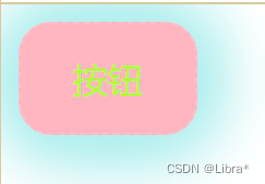
<div>
按钮
</div>
</body>
</html>鼠标移上去后,按钮出现背景颜色并且边框出现不同颜色的阴影
<!DOCTYPE html>
<html>
	<head>
		<meta charset="utf-8">
		<title>正方体</title>
		<link rel="stylesheet" href="../css/正方体.css">
	</head>
	<body>
		<div class="container">
			<img src="../pic/兔兔.jpg" alt="">
			<img src="../pic/郁金香.jpg" alt="">
			<img src="../pic/月亮.jpg" alt="">
			<img src="../pic/蝴蝶.jpg" alt="">
			<img src="../pic/长椅.jpg" alt="">
			<img src="../pic/大象.jpg" alt="">
		</div>
	</body>
</html>
CSS样式代码
body {
	perspective: 800px;
}

.container>img {
	width: 200px;
	height: 200px;
	position: absolute;
}

.container {
	width: 200px;
	height: 200px;
	margin: 200px auto;
	position: relative;
	border: 1px solid pink;
	transform-style: preserve-3d;
	/* 动画效果 */
	animation: myPic 8s infinite linear;
}

.container >img:nth-child(2){
	left: -200px;
	transform-origin: right;
	transform: rotateY(90deg);
}

.container >img:nth-child(3){
	right: -200px;
	transform-origin: left;
	transform: rotateY(-90deg);
}

.container >img:nth-child(4){
	top: -200px;
	transform-origin: bottom;
	transform: rotateX(-90deg);
}

.container >img:nth-child(5){
	bottom: -200px;
	transform-origin: top;
	transform: rotateX(90deg);
}

.container >img:last-child{
	transform: translateZ(200px);
	/* 按Z轴平移200px,即向上平移200px */
}

/* 动画效果 先效果是from 然后是to */
@keyframes myPic{
	from{
		transform: rotateX(0deg) rotateY(0deg) rotateZ(0deg);
	}
	to{
		transform: rotateX(360deg) rotateY(360deg) rotateZ(360deg);
	}

}
正方体不停360°旋转,动画效果


 193
193


 被折叠的 条评论
为什么被折叠?
被折叠的 条评论
为什么被折叠?
 到【灌水乐园】发言


