


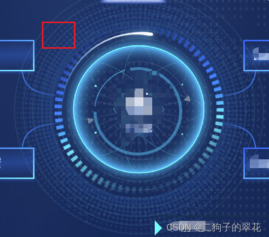
翻转动效
  /* 图片旋转一圈 */
    .img-pic {
      position: absolute;
      top: 20px;
      left: 20px;
      animation: trunFrames 8s infinite;
    }

    @keyframes trunFrames {
      0% {
        transform: rotateY("0deg");
      }

      20% {
        transform: rotateY(1turn);
      }

      100% {
        transform: rotateY(1turn);
      }
上下跳动
可以通过定位、margin等值的更改来达到效果
 /* 上下跳动 */
    .debounce-pic {
      position: absolute;
      top: 60px;
      left: 20px;
      animation: debounceFrame 2s infinite;
    }

    @keyframes debounceFrame {
      0% {
        top: 60px;
      }
      50% {
        top: 50px;
      }
      100% {
        top: 60px;
      }
    }
呼吸闪烁效果
  .cicle {
      width: 10px;
      height: 10px;
      background: red;
      border-radius: 50%;
      animation: twinkling 1s infinite ease-in-out;

      position: absolute;
      left: 100px;
      top: 20px;
    }

    @keyframes twinkling {
      0% {
        opacity: 0.2;

        transform: scale(1);
      }

      50% {
        opacity: 0.5;

        transform: scale(1.12);
      }

      100% {
        opacity: 0.2;

        transform: scale(1);
      }
    }
循环旋转
 .rotate {
      position: absolute;
      top: 100px;
      left: 100px;
      /*linear确保循环平滑  */
      animation: rotateFrames 2s linear infinite;
    }

    @keyframes rotateFrames {
      0% {
        transform: rotate(0deg);
      }
      100% {
        transform: rotate(1turn);
      }
    }
多元素围绕伪椭圆旋转
详细可见博客
 <div class="topcenterbigitembox">
                        <div class="topcenbox1">
                            <div class="topcenboxitem topcenboxitem1">
                                文字
                            </div>
                            <div class="topcenboxitem topcenboxitem2">
                                文字
                            </div>
                            <div class="topcenboxitem topcenboxitem3">
                                文字
                            </div>
                            <div class="topcenboxitem topcenboxitem4">
                                文字
                            </div>
                            <div class="topcenboxitem topcenboxitem5">
                                文字
                            </div>
                            <div class="topcenboxitem topcenboxitem6">
                               文字
                            </div>
                        </div>
   <div>

//css
<style>
.topcenbox1 {
    width: 100%;
    height: 2rem;
    position: relative;
}
.topcenboxitem {
    display: flex;
    align-items: center;
    justify-content: center;
    font-size: 0.18rem;
    font-family: YouShe;
    // background-image: -webkit-linear-gradient(bottom, #90e1ff, #d6eff8, #e5f6fd);
    // -webkit-background-clip: text;
    // -webkit-text-fill-color: transparent;
    color: #C0E7FF;
    background: rgba(0, 133, 247, 0.22);
    position: absolute;
    width: 1rem;
    z-index: 99;
}

.topcenboxitem1 {
    animation: animX0 10s cubic-bezier(0.36, 0, 0.64, 1) -5s infinite alternate,
        animY0 10s cubic-bezier(0.36, 0, 0.64, 1) 0s infinite alternate,
        scale 20s cubic-bezier(0.36, 0, 0.64, 1) 0s infinite alternate;
}

.topcenboxitem2 {
    animation: animX0 10s cubic-bezier(0.36, 0, 0.64, 1) -8.333s infinite alternate,
        animY0 10s cubic-bezier(0.36, 0, 0.64, 1) -3.333s infinite alternate,
        scale 20s cubic-bezier(0.36, 0, 0.64, 1) -3.333s infinite alternate;
}

.topcenboxitem3 {
    animation: animX0 10s cubic-bezier(0.36, 0, 0.64, 1) -11.666s infinite alternate,
        animY0 10s cubic-bezier(0.36, 0, 0.64, 1) -6.666s infinite alternate,
        scale 20s cubic-bezier(0.36, 0, 0.64, 1) -6.666s infinite alternate;
}

.topcenboxitem4 {
    animation: animX0 10s cubic-bezier(0.36, 0, 0.64, 1) -14.999s infinite alternate,
        animY0 10s cubic-bezier(0.36, 0, 0.64, 1) -9.999s infinite alternate,
        scale 20s cubic-bezier(0.36, 0, 0.64, 1) -9.999s infinite alternate;
}

.topcenboxitem5 {
    animation: animX0 10s cubic-bezier(0.36, 0, 0.64, 1) -18.332s infinite alternate,
        animY0 10s cubic-bezier(0.36, 0, 0.64, 1) -13.332s infinite alternate,
        scale 20s cubic-bezier(0.36, 0, 0.64, 1) -13.332s infinite alternate;
}

.topcenboxitem6 {
    animation: animX0 10s cubic-bezier(0.36, 0, 0.64, 1) -21.665s infinite alternate,
        animY0 10s cubic-bezier(0.36, 0, 0.64, 1) -16.665s infinite alternate,
        scale 20s cubic-bezier(0.36, 0, 0.64, 1) -16.665s infinite alternate;
}
//animX0 和animY0 控制运动的位置
@keyframes animX0 {
    0% {
        left: 0.05rem;//最左边的位置
    }

    100% {
        left: 8.3rem;//最右边的位置
    }
}

@keyframes animY0 {
    0% {
        top: 1rem;//最高
    }

    100% {
        top: 2.55rem;//最低
    }
}

@keyframes scale {
    0% {
        transform: scale(0.6);
        opacity: 0.7;
    }

    50% {
        transform: scale(1);
        opacity: 1;
    }

    100% {
        transform: scale(0.6);
        opacity: 0.7;
    }
}
</style>
@keyframes scale {
0% {
    height: 20vh;
    width: 20vh;
}
100% {
    height: 40vh;
    width: 40vh;
}
}
渐入动画
// 渐入动画
@keyframes fade-right-trans {
  from {
    opacity: 0;
    transform: translate3d(-100px, 0, 0);
  }
  to {
    opacity: 1;
    transform: translate3d(0, 0, 0);
  }
}
.am-fade-right-trans {
  opacity: 0;
  transform: translate3d(-100px, 0, 0);
  animation: fade-right-trans 1s cubic-bezier(0.68, -0.55, 0.265, 1.55) forwards;
}
@keyframes fade-right-pos {
  from {
    opacity: 0;
    left: -100px;
  }
  to {
    opacity: 1;
    left: 0;
  }
}
.am-fade-right-pos {
  position: relative;
  opacity: 0;
  left: -100px;
  animation: fade-right-pos 1s cubic-bezier(0.68, -0.55, 0.265, 1.55) forwards;
}
vue transition
appear属性:如果想要一刷新页面就展示动画,需加上 <transition name="run" mode="out-in" appear>
别人的博客介绍:链接
<transition name="run">
      <!-- 内部元素或组件的显示和隐藏,会触发transition效果 -->
      <div v-if="isShow">
        <span>123123123123</span>
      </div>
 </transition>
// 元素开始进入的状态 | 元素离开结束的状态
.run-enter-from,
.run-leave-to {
  opacity: 0;
}
// 元素进入结束的状态 | 元素开始离开的状态。
.run-enter-to,
.run-leave-from {
  opacity: 1;
}
// 元素进入 | 结束时,过渡的效果
.run-enter-active,
.run-leave-active {
  // 过渡动画的使用
  transition: opacity 2s linear 0s;
}
旋转动画
rotate3d 自定义轴旋转
//0, 0, 1, 说明这里只使用了 Z 轴作为旋转的轴 ,
 transform: rotate3d(0, 0, 1, 360deg);
.blue-crlie{
width: 40px;
display: inline-block;
height: 40px;
opacity: 1;
border-radius: 50%;
transform: rotate3d(0, 1, 0, 65deg); //rotate3d(x,y,z,angle)
animation: zhuan 2s infinite linear;
border: 1px solid rgba(0, 162, 255, 1);
box-shadow: 0px 0px 8px 1px rgba(0, 162, 255, 1);
}

@keyframes zhuan {
  0% {
    transform: rotate3d(0, 1, 0, 65deg) rotateZ(0deg);
  }
  100% {
    transform: rotate3d(0, 1, 0, 65deg) rotateZ(360deg);
  }
}
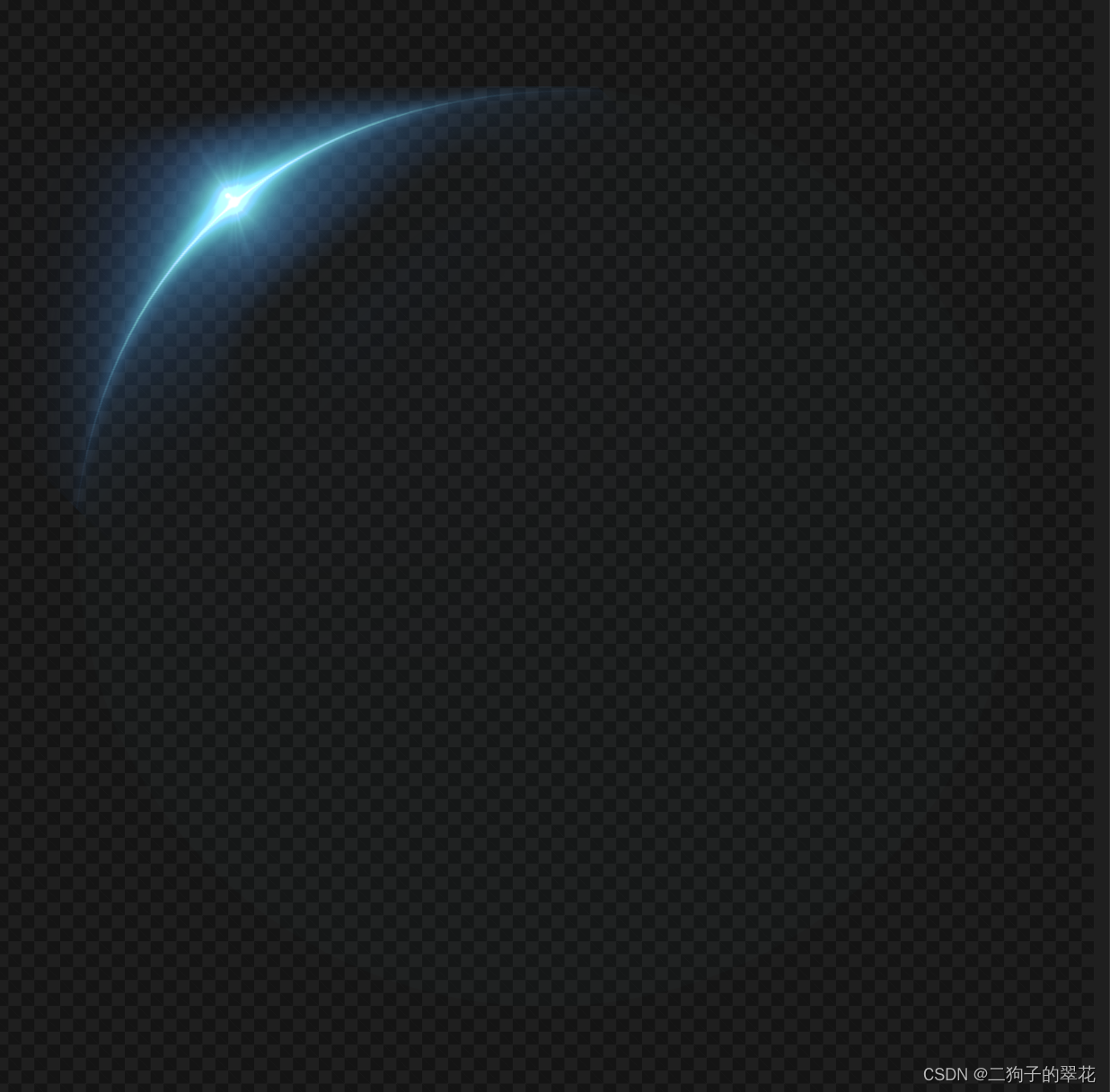
    .flat {
        position: absolute;
        left: 50%;
        top: 50%;
        width: 100%;
        height: 100%;
        transform: translate(-50%, -50%) scaleY(0.23);
        height: 6.73rem;

        &::after {
          display: inline-block;
          position: absolute;
		  top: 1.55rem;
		  width: 1.7rem;
		  height: 1.7rem;
		  background: url(~@/assets/images/screen/run-circle.png) no-repeat center;
		  background-size: 100% 100%;
		  animation: spinLight 3s infinite linear;
          content: ' ';
          top: 0;
          left: 0;
}
      }


  @keyframes spinLight {
        0% {
          transform: translate(-50%, -50%) rotate(360deg);
          opacity: 0.64;
        }

        50% {
          transform: translate(-50%, -50%) rotate(180deg);
          opacity: 1;
        }

        100% {
          transform: translate(-50%, -50%) rotate(0deg);
          opacity: 0.64;
        }
      }


 4680
4680


 被折叠的 条评论
为什么被折叠?
被折叠的 条评论
为什么被折叠?
 到【灌水乐园】发言


