


之前练习的都是pc端的页面,今天学习的是移动端的适配的一些内容,分享一下我写的移动端的案例。
football.html
<!DOCTYPE html>
<html>
<head>
<meta charset="utf-8" />
<meta name="viewport" content="width=device-width,initial-scale=1,minimum-scale=1,maximum-scale=1,user-scalable=no" />
<title></title>
<link rel="stylesheet" type="text/css" href="inconfont/iconfont.css"/>
<link rel="stylesheet" href="css/football.css" />
</head>
<body>
<!--header部分-->
<header>
<div>
<i class="iconfont tu"></i>
<p>
<span>热点</span>
<span>关注</span>
</p>
<i class="iconfont tu"></i>
</div>
</header>
<!--section部分-->
<section>
<nav>
<a href="#">足球现场</a>
<a href="#">足球生活</a>
<a href="#">足球美女</a>
</nav>
<ul class="list">
<li><img src="img/pic1.jpg" alt="" /><b>小丸子啊小丸子!</b></li>
<li><img src="img/pic2.jpg" alt="" /><b>小丸子啊小丸子!</b></li>
<li><img src="img/pic1.jpg" alt="" /><b>小丸子啊小丸子!</b></li>
<li><img src="img/pic2.jpg" alt="" /><b>小丸子啊小丸子!</b></li>
<li><img src="img/pic1.jpg" alt="" /><b>小丸子啊小丸子!</b></li>
<li><img src="img/pic2.jpg" alt="" /><b>小丸子啊小丸子!</b></li>
</ul>
</section>
<!--footer部分-->
<footer>
<ul class="list2">
<li>
<a href="#"><i class="iconfont"></i>首页</a></li>
<li>
<a href="#"><i class="iconfont"></i>发现</a></li>
<li>
<a href="#"><i class="iconfont"></i></a>
</li>
<li>
<a href="#"><i class="iconfont"></i>我的</a>
</li>
<li>
<a href="#"><i class="iconfont"></i>退出</a>
</li>
</ul>
</footer>
</body>
</html>
football.css
*{margin:0;padding:0;box-sizing:border-box;}
li{list-style:none;}
a{text-decoration: none;}

/*移动页面都要加*/
html,body{
	height:100%;
}
/*rem这个单位的显示大小只跟html的font-size有关*/
html{
	font-size:26.6666667vw;
}

/*用来定义默认文字显示大小,如果不定义,文字本身也没有字体大小,就会默认继承html的字体大小*/
body{
	font-size: 14px;
}
/*header部分*/
header{
	width:100%;
	height: 0.52rem;
	background:#0dc441 ;
	position:absolute;
	top: 0;
}
header div{
	height: 100%;
	display: flex;
	justify-content: space-between;
	align-items: center;
	padding: 0  0.19rem 0  0.19rem;
}
header .tu{
	font-size: 22px;
	color: #fff;
}
header div p{
	width: 1.38rem;
	height: 0.28rem;
	display: flex;
}
header div p span{
	width: 50%;
	color: #fff;
	background:rgba(255,255,255,.5);
	text-align: center;
	font-size: 14px;
	line-height: 0.28rem;
}
header span:nth-child(1){
	border-radius: 0.14rem 0 0 0.14rem;
}
header span:nth-child(2){
	border-radius:  0 0.14rem 0.14rem 0;
	opacity: .7;
}

/*section部分*/
section{
	height: 100%;
	padding:0.52rem 0 0.515rem;
	overflow: auto;
}
section nav{
	height: 0.41rem;
	border-bottom:0.01rem solid #aaa;
	display: flex;
	justify-content: space-between;
}
section nav a{
	width: 1.17rem;
	text-align: center;
	line-height: 0.4rem;
	color: #6a6a6a;
}
nav a:nth-child(1){
	color: #00bd2b;
	border-bottom: 0.03rem solid #05c33b;
}
.list{
	display: flex;
	flex-wrap: wrap;
	justify-content: space-between;
}
.list li{
	width: 1.845rem;
	border: 0.01rem solid #ebebeb;
	margin-top: 0.05rem;
}
.list li img{
	width: 100%;
	display: block;
}
.list li b{
	display: block;
	color: #474747;
	font-size: 14px;
	line-height: 0.34rem;
	font-weight: normal;
	border-top: 0.01rem solid #ebebeb;
	text-indent: 0.12rem;
}

/*footer部分*/
footer{
	width:100%;
	height: 0.515rem;
	background: #ffffff;
	position:absolute;
	bottom: 0;
	border-top: 0.01rem solid #e8e6e7;
}
.list2{
	display: flex;
	font-size: 14px;
	justify-content: space-between;
	align-items: center;
	height: 100%;
	padding: 0 0.14rem 0 0.18rem;
}
.list2 a{
	color: #cfcfcf;
}
.list2 i{
	display: block;
	text-align: center;
	font-size: 19px;
}
.list2 li:nth-child(3){
	width: 0.62rem;
	height: 0.62rem;
	line-height: 0.56rem;
	border: 0.01rem solid #dedede;
	border-radius: 50%;
	align-self: flex-end;
	background: #fff;
}
.list2 li:nth-child(3) i{
	font-size:34px;
}

@media screen and (min-width:480px) {
	body{
		font-size: 30px;
	}
	header .tu{
		font-size: 42px;
	}
	.list2 i{
		font-size: 39px;
	}
	.list2 li:nth-child(3){
		font-size: 54px;
	}
}
效果图如图所示:

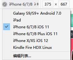
【注】pc端的项目直接在浏览器运行就能正常显示,移动端运行后要按F12或者鼠标右击,选择“检查元素”,点击旁边的小手机图标即可显示成手机的样子(不同的浏览器显示的位置不同)。里面可以选择手机型号,也可以添加手机型号。一般是按照iphone6/7/8的尺寸去写的。


 5321
5321


 被折叠的 条评论
为什么被折叠?
被折叠的 条评论
为什么被折叠?
 到【灌水乐园】发言


