


多个div进行排列布局
1、容器定宽,div定宽
示例:
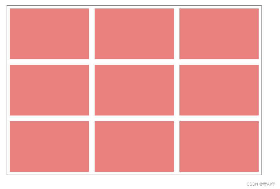
代码:
<template>
  <div class="container">
    <div class="item" v-for="item in 9" :key="item">
      <div class="inner"></div>
    </div>
  </div>
</template>
<style scoped lang="scss">
.container {
  display: flex;
  flex-wrap: wrap;
  width: 900px;
  box-sizing: border-box;
  outline: 1px solid gray;
  margin: 100px auto;
  .item {
    width: 300px;
    height: 200px;
    padding: 10px;
    .inner {
      height: 100%;
      background-color: lightcoral;
    }
  }
}
</style>
2、容器不定宽,div定宽
示例:
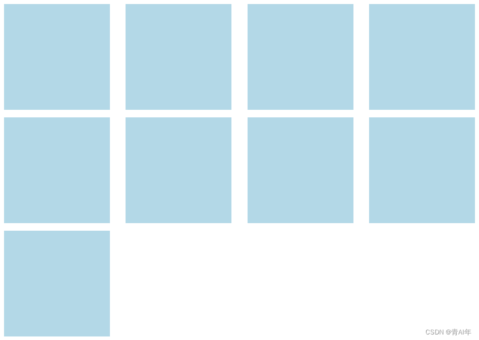
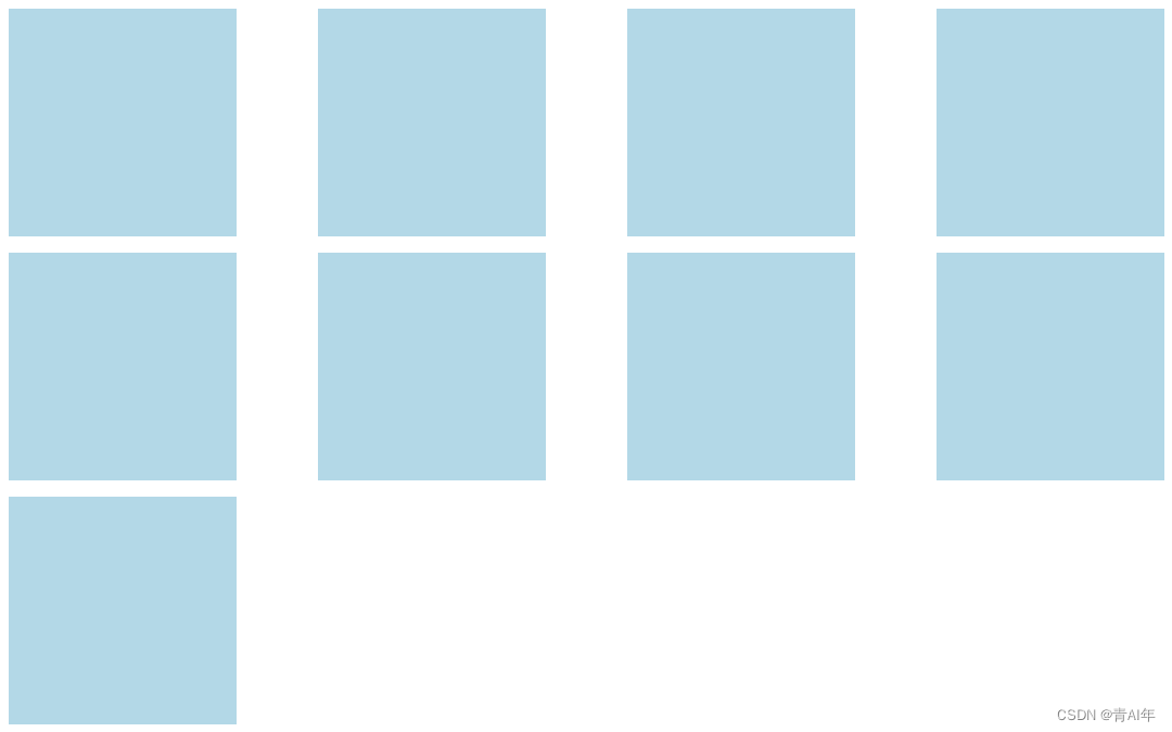
代码:
<template>
  <div class="container">
    <div class="item" v-for="item in 9" :key="item">
      <div class="inner"></div>
    </div>
    <i></i><i></i><i></i><i></i><i></i><i></i><i></i><i></i><i></i><i>
  </div>
</template>
<style scoped lang="scss">
.container {
  display: flex;
  justify-content: space-between;
  flex-flow: row wrap;
  .item {
    width: 300px;
    height: 300px;
    padding: 10px;
    box-sizing: border-box;
    flex: 0 0 auto;
    .inner {
      height: 100%;
      background-color: lightblue;
    }
  }
  i {
    width: 300px;
  }
}
</style>


 359
359


 被折叠的 条评论
为什么被折叠?
被折叠的 条评论
为什么被折叠?
 到【灌水乐园】发言


