


英文:http://1linelayouts.glitch.me/
译文:https://juejin.im/post/6847902221779238920

超级小中
在没有 flex 和 grid 之前,垂直居中一直不能很优雅的实现。而现在,我们可以结合 grid 和 place-items 优雅的同时实现水平居中和垂直居中。
class="parent blue" > <div class="box coral" contenteditable> :) div>
 .ex1 .parent {
          display: grid;    place-items: center;  }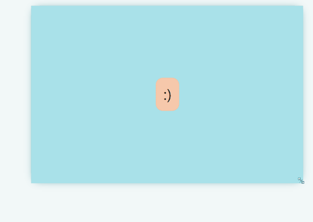
源码地址:
https://codepen.io/una/pen/YzyYbBx

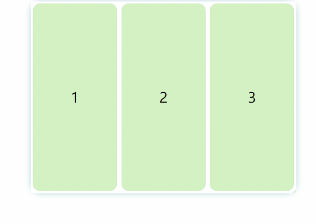
可解构的自适应布局(The Deconstructed Pancake)
flex: 0 1 <baseWidth>这种布局经常出现在电商网站:
在视口足够的时候,三个框固定宽度横放;
在视口不够的时候(宽度在移动上面),宽度仍然固定,但是自动解构(原谅我的中文水平),不在同一水平面上。
class="parent white"> class="box green">1 class="box green">2 class="box green">3 .ex2 .parent {
display: flex; flex-wrap: wrap; justify-content: center; } .ex2 .box {
flex: 1 1 150px; /* flex-grow: 1 ,表示自动延展到最大宽度 */ flex: 0 1 150px; /* No stretching: */ margin: 5px; }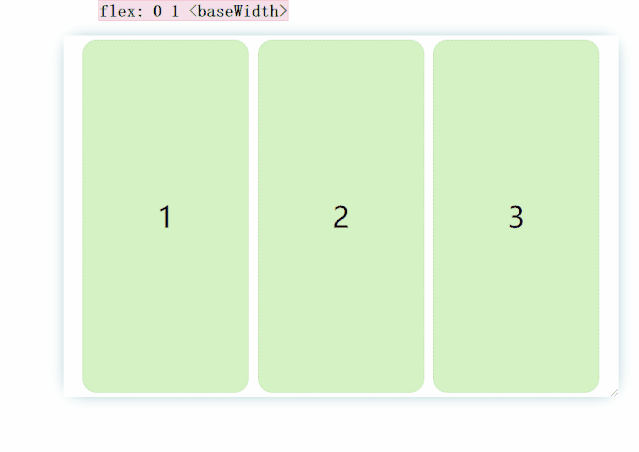
当我们设置flex: 1 1 150px;时候:
源码地址:
https://
 最低0.47元/天 解锁文章


 310
310


 被折叠的 条评论
为什么被折叠?
被折叠的 条评论
为什么被折叠?
 到【灌水乐园】发言


