


表单主要用来与用户沟通,好的表单就能更好的与用户进行沟通,而好的表单一定离不开表单的控件状态。
表单状态的作用:
每一种状态都能给用户传递不同的信息,比如表单有焦点的状态可以告诉用户可以输入或选择东西,禁用状态可以告诉用户不可以输入或选择东西,还有就是表单控件验证状态,可以告诉用户的操作是否正确等。那么在Bootstrap框架中的表单控件也具备这些状态。
一、焦点状态(form-control)
焦点状态是通过伪类“:focus”来实现。Bootstrap框架中表单控件的焦点状态删除了outline的默认样式,重新添加阴影效果。
源码请查阅bootstrap.css文件第1707行~第1712行:
.form-control:focus {
border-color: #66afe9;
outline: 0;
  -webkit-box-shadow: inset 0 1px 1pxrgba(0,0,0,.075), 0 0 8px rgba(102, 175, 233, .6);
box-shadow: inset 0 1px 1pxrgba(0,0,0,.075), 0 0 8px rgba(102, 175, 233, .6);
}
要让控件在焦点状态下有上面样式效果,需要给控件添加类名“form-control”
例如
<!doctype html>
<html lang="en">
<head>
    <meta charset="UTF-8">
	<title>表单控件状态——焦点状态</title>
	<link rel="stylesheet" href="//netdna.bootstrapcdn.com/bootstrap/3.1.1/css/bootstrap.min.css">
    <link rel="stylesheet" href="style.css">
</head>
<body>

<form role="form" class="form-horizontal">
  <div class="form-group">
    <div class="col-xs-6">
      <input class="form-control input-lg" type="text" placeholder="不是焦点状态下效果">
    </div>
    <div class="col-xs-6">
      <input class="form-control input-lg" type="text" placeholder="焦点点状态下效果">
    </div>
  </div>
</form>
</body>
</html>
效果

二、禁用状态(disabled)
Bootstrap框架的表单控件的禁用状态和普通的表单禁用状态实现方法是一样的,在相应的表单控件上添加属性“disabled”。和其他表单的禁用状态不同的是,Bootstrap框架做了一些样式风格的处理:
/*源码请查看bootstrap.css文件第1723行~第1729行*/
.form-control[disabled],
.form-control[readonly],
fieldset[disabled] .form-control {
cursor: not-allowed;
background-color: #eee;
opacity: 1;
}
例如
<input class="form-control" type="text" placeholder="表单已禁用,不能输入" disabled>效果
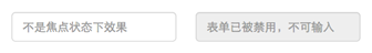
在使用了“form-control”的表单控件中,样式设置了禁用表单背景色为灰色,而且手型变成了不准输入的形状。如果控件中不使用类名“form-control”,禁用的控件只会有一个不准输入的手型出来。
/*源码请查阅bootstrap.css文件第1781行~第1794行*/
input[type="radio"][disabled],
input[type="checkbox"][disabled],
.radio[disabled],
.radio-inline[disabled],
.checkbox[disabled],
.checkbox-inline[disabled],
fieldset[disabled] input[type="radio"],
fieldset[disabled] input[type="checkbox"],
fieldset[disabled] .radio,
fieldset[disabled] .radio-inline,
fieldset[disabled] .checkbox,
fieldset[disabled] .checkbox-inline {
cursor: not-allowed;
}在Bootstrap框架中,如果fieldset设置了disabled属性,整个域都将处于被禁用状态。
例如
<form role="form">
<fieldset disabled>
  <div class="form-group">
  <label for="disabledTextInput">禁用的输入框</label>
    <input type="text" id="disabledTextInput" class="form-control" placeholder="禁止输入">
  </div>
  <div class="form-group">
  <label for="disabledSelect">禁用的下拉框</label>
    <select id="disabledSelect" class="form-control">
  <option>不可选择</option>
  </select>
  </div>
  <div class="checkbox">
  <label>
    <input type="checkbox">无法选择
  </label>
  </div>
  <button type="submit" class="btnbtn-primary">提交</button>
</fieldset>
</form>
效果

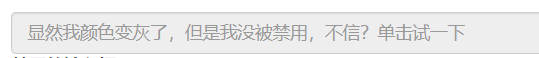
据说对于整个禁用的域中,如果legend中有输入框的话,这个输入框是无法被禁用的。
例如
<form role="form">
<fieldset disabled>
<legend><input type="text" class="form-control" placeholder="显然我颜色变灰了,但是我没被禁用,不信?单击试一下" /></legend>
    …
</fieldset>
</form>
效果
三、验证状态
在制作表单时,不免要做表单验证。同样也需要提供验证状态样式,在Bootstrap框架中同样提供这几种效果。
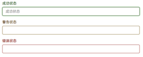
1、.has-warning:警告状态(黄色)
2、.has-error:错误状态(红色)
3、.has-success:成功状态(绿色)
使用的时候只需要在form-group容器上对应添加状态类名。
例如
<!doctype html>
<html lang="en">
<head>
    <meta charset="UTF-8">
	<title>表单控件状态——验证状态</title>
	<link rel="stylesheet" href="//netdna.bootstrapcdn.com/bootstrap/3.1.1/css/bootstrap.min.css">
    <link rel="stylesheet" href="style.css">
</head>
<body>
<h3>示例1</h3>
<form role="form">
  <div class="form-group has-success">
    <label class="control-label" for="inputSuccess1">成功状态</label>
    <input type="text" class="form-control" id="inputSuccess1" placeholder="成功状态" >
  </div>
  <div class="form-group has-warning">
    <label class="control-label" for="inputWarning1">警告状态</label>
    <input type="text" class="form-control" id="inputWarning1" placeholder="警告状态">
  </div>
  <div class="form-group has-error">
    <label class="control-label" for="inputError1">错误状态</label>
    <input type="text" class="form-control" id="inputError1" placeholder="错误状态">
  </div>
</form>
</body>
</html>
效果
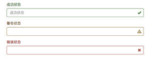
很多时候,在表单验证的时候,不同的状态会提供不同的 icon,比如成功是一个对号(√),错误是一个叉号(×)等。在Bootstrap框中也提供了这样的效果。如果你想让表单在对应的状态下显示 icon 出来,只需要在对应的状态下添加类名“has-feedback”。请注意,此类名要与“has-error”、“has-warning”和“has-success”在一起,而且必须在表单中添加了一个 span 元素
例如
<form role="form">
  <div class="form-group has-success has-feedback">
    <label class="control-label" for="inputSuccess1">成功状态</label>
    <input type="text" class="form-control" id="inputSuccess1" placeholder="成功状态" >
    <span class="glyphicon glyphicon-ok form-control-feedback"></span>
  </div>
  <div class="form-group has-warning has-feedback">
    <label class="control-label" for="inputWarning1">警告状态</label>
    <input type="text" class="form-control" id="inputWarning1" placeholder="警告状态">
    <span class="glyphicon glyphicon-warning-sign form-control-feedback"></span>
  </div>
  <div class="form-group has-error has-feedback">
    <label class="control-label" for="inputError1">错误状态</label>
    <input type="text" class="form-control" id="inputError1" placeholder="错误状态">
    <span class="glyphicon glyphicon-remove form-control-feedback"></span>
  </div>

</form>
效果


 扫一扫
扫一扫


 1247
1247

 被折叠的 条评论
为什么被折叠?
被折叠的 条评论
为什么被折叠?
 到【灌水乐园】发言


