


一、核心架构设计
-
组件化结构
@Entry
@Component
struct NoteApp {
  // 状态管理
  @State notes: Array<Note> = []
  @State newNoteContent: string = ''
  @State showAddDialog: boolean = false
  @State showDetailDialog: boolean = false
  @State selectedNote: Note | null = null

  // 数据模型
  interface Note {
    id: number;
    content: string;
    time: string;
  }
}采用@Component装饰器构建组件化架构,通过@State实现状态驱动UI更新。数据结构定义清晰,包含笔记ID、内容和时间戳三要素。
二、状态管理机制
-
响应式数据绑定
// 添加笔记
addNote() {
  if (this.newNoteContent.trim() !== '') {
    const currentTime = new Date()
    const formattedTime = `${currentTime.getFullYear()}-${currentTime.getMonth() + 1}-${currentTime.getDate()} ${currentTime.getHours()}:${currentTime.getMinutes().toString().padStart(2, '0')}`

    this.notes.push({
      id: this.nextId++,
      content: this.newNoteContent,
      time: formattedTime
    })
    // 状态更新自动触发UI刷新
    this.newNoteContent = ''
    this.showAddDialog = false
  }
}时间格式化使用padStart确保分钟数始终显示两位,通过状态变更自动触发UI重渲染,无需手动操作DOM。
三、UI布局实现
-
分层式结构设计
Column() {
  // 1. 标题栏
  Column() { ... }.shadow({ radius: 4, color: '#20000000' })

  // 2. 笔记列表
  List({ space: 12 }) {
    ForEach(this.notes, (note: Note) => {
      ListItem() { ... }
    })
  }.layoutWeight(1)

  // 3. 对话框
  if (this.showAddDialog) { ... }
  if (this.showDetailDialog) { ... }
}采用三层式结构:标题栏(固定高度)、滚动列表(自适应高度)、模态对话框(覆盖层)。layoutWeight(1)确保列表占据剩余空间。
四、交互功能实现
-
动态列表渲染
ForEach(this.notes, (note: Note) => {
  ListItem() {
    Column() {
      Row() {
        Text(note.time)  // 时间显示
        Blank()          // 弹性占位
        Text('新笔记')    // 状态标签
      }
      Text(note.content)
        .maxLines(2)
        .textOverflow({ overflow: TextOverflow.Ellipsis })
    }.onClick(() => this.showNoteDetail(note))
  }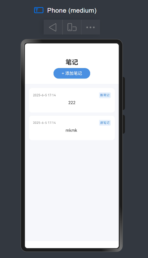
}, (note: Note) => note.id.toString()) 使用ForEach高效渲染动态列表,配合maxLines和textOverflow实现文字截断效果。通过note.id.toString()设置唯一键值优化渲染性能。
-
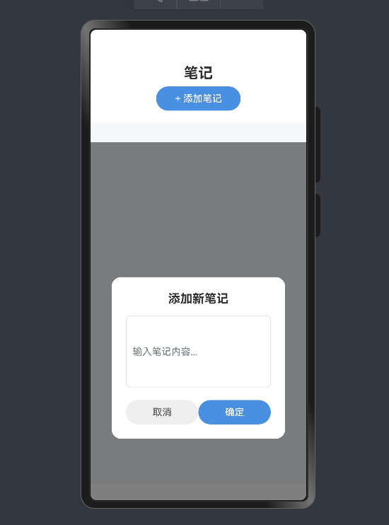
对话框交互控制
// 添加对话框
Column()
  .width('100%').height('100%')
  .backgroundColor('#80000000') // 半透明蒙层
  .onClick(() => this.showAddDialog = false) // 点击蒙层关闭

// 文本输入
TextInput({ placeholder: '输入笔记内容...' })
  .height(120)
  .border({ width: 1, color: '#E0E0E0' })
对话框使用80%透明黑色蒙层,点击任意位置可关闭。文本输入框设置固定高度和边框样式,优化输入体验。
五、视觉设计亮点
-
卡片式设计
Column()
  .padding(16)
  .borderRadius(12)          // 圆角设计
  .backgroundColor('#FFFFFF') // 纯白背景
  .shadow({ radius: 2, color: '#10000000' }) // 微妙阴影
笔记卡片采用12px圆角+轻微阴影的设计,营造层次感。标签使用蓝字白底设计:
Text('新笔记')
  .fontColor('#4A90E2')
  .backgroundColor('#E6F1FD') // 浅蓝背景
.borderRadius(4)-
按钮交互反馈
Button('确定')
  .width(120).height(40)
  .fontColor('#FFFFFF')
  .backgroundColor('#4A90E2') // 主色调
  .borderRadius(20)           // 胶囊形状
主要操作按钮采用蓝底白字+20px圆角的胶囊造型,取消按钮使用灰底设计形成视觉区分。
六、性能优化策略
-
条件渲染
if (this.showAddDialog) { /* 按需渲染 */ }
if (this.showDetailDialog) { /* 按需渲染 */ }
对话框使用条件渲染,仅在需要时加载DOM元素,减少不必要的资源消耗。
-
轻量级数据存储
private nextId: number = 1 // ID自增管理七、预览器效果
采用自增ID代替UUID等复杂方案,降低内存占用,提升数据操作效率。该ArkTS笔记应用通过精心的架构设计、高效的状态管理、流畅的交互体验和优雅的视觉呈现,实现了完整的笔记增删查功能。其核心价值在于展示了如何用声明式语法构建高性能的移动应用界面,为开发者提供了极佳的参考范例。


 扫一扫
扫一扫


 968
968

 被折叠的 条评论
为什么被折叠?
被折叠的 条评论
为什么被折叠?
 到【灌水乐园】发言


