


一、页面整体布局与UI设计
-
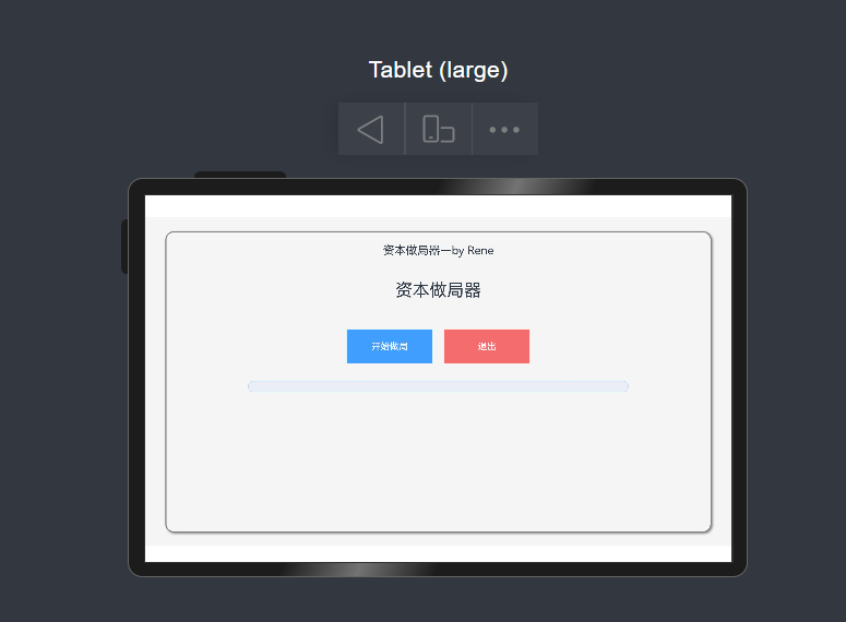
层级容器与背景样式
-
页面根布局采用
Stack组件,填充全屏(width: '100%', height: '100%'),并设置浅灰色背景(backgroundColor: '#F5F5F5'),整体界面简洁大气。 -
主内容容器为
Column,宽度和高度均占父容器的95%(width: '95%', height: '95%'),居中显示。 -
容器边框设计:灰色实线边框(
width: 2, color: Color.Gray),圆角半径15(borderRadius: 15),并添加灰色阴影(radius: 8, offsetX: 5, offsetY: 5),增强立体感。
-
-
标题与文字排版
-
顶部标题:文本“资本做局器—by Rene”居中显示,字号20,上边距20,宽度占满父容器,体现作者信息。
-
主标题:居中显示“资本做局器”,字号30,上下边距分别为40和50,突出核心功能。
-
所有文本对齐方式为居中(
textAlign: TextAlign.Center),保证视觉统一性。
-
二、核心功能:加载动画与进度条
-
按钮触发加载逻辑
-
“开始做局”按钮:尺寸150x60,蓝色背景(
#409EFF),绑定点击事件startLoading()。 -
“退出”按钮:尺寸相同,红色背景(
#F56C6C),左侧边距20,当前未绑定功能逻辑,仅作为占位。
-
-
加载动画实现细节
-
进度条组件:使用鸿蒙的
Progress组件,胶囊样式(style: ProgressStyle.Capsule),宽度70%,高度20,蓝色进度条(color: '#409EFF'),灰色背景(#EBEEF5),圆角10,视觉效果清晰。 -
定时器控制:
-
总时长4秒(
duration: 4000),每40毫秒更新一次进度(interval: 40),共计100步(totalSteps = duration / interval)。 -
通过
setInterval逐步更新progress状态值,范围0-100%,实现平滑动画效果。
-
-
状态管理:
-
@State修饰的isLoading控制加载状态,初始值为false;progress实时记录进度百分比。 -
加载完成后,清除定时器(
clearInterval),关闭加载状态(isLoading = false),并触发成功弹窗。
-
-
三、交互反馈:成功弹窗设计
-
弹窗配置参数
-
调用
AlertDialog.show()展示弹窗,标题为“信息”,内容提示“做局成功,您的时间被资本浪费了10秒!”,兼具功能性与幽默感。 -
弹窗样式:
-
尺寸350x250,圆角20,蓝色边框(
borderColor: Color.Blue),白色背景。 -
居中显示(
alignment: DialogAlignment.Center),垂直偏移-20(offset: { dy: -20 }),避免遮挡核心内容。 -
添加灰色阴影(
radius: 20, offsetX: 50),增强层次感。
-
-
交互按钮:
-
确认按钮“确定”,点击后输出日志“用户点击确定”。
-
支持点击外部或返回键关闭弹窗(
autoCancel: true),关闭时输出“弹窗关闭”。
-
-
-
弹窗关闭逻辑
-
通过
onWillDismiss监听关闭事件,区分关闭原因为返回键(PRESS_BACK)或点击外部(TOUCH_OUTSIDE),并执行dismiss()方法,确保弹窗行为符合用户预期。
-
四、样式与动效亮点
-
细节设计提升体验
-
按钮动效:未显式定义点击动效,但鸿蒙默认提供按钮按压反馈,增强交互感。
-
文字换行:弹窗内文本支持自动换行(
wordBreak: WordBreak.BREAK_ALL),避免内容溢出。 -
布局响应式:主容器使用百分比尺寸(如
width: '95%'),适配不同屏幕比例。
-
-
视觉一致性
-
色彩搭配:蓝色(
#409EFF)作为主色调,应用于按钮、进度条、弹窗边框,红色(#F56C6C)用于退出按钮,形成对比,引导用户操作。 -
阴影与边框:主容器、弹窗均添加阴影效果,配合实线边框,提升界面质感。
-
五、代码结构优化点
-
组件化与复用性
-
页面以
@Component修饰的struct CapitalTrap为核心,符合鸿蒙ArkUI组件化开发规范。 -
方法
startLoading()和showSuccessDialog()独立封装,逻辑清晰,便于维护。
-
-
状态驱动视图更新
-
使用
@State管理isLoading和progress,实现数据变化自动触发UI渲染,减少手动操作DOM的开销。
-
六、预览效果图
原代码
@Entry
@Component
struct CapitalTrap {
  @State isLoading: boolean = false
  @State progress: number = 0

  // 加载动画定时器
  private timer: number = 0

  // 开始加载
  startLoading() {
    this.isLoading = true
    this.progress = 0
    let count = 0
    const duration = 4000 // 4秒
    const interval = 40 // 更新间隔
    const totalSteps = duration / interval

    this.timer = setInterval(() => {
      count++
      this.progress = (count / totalSteps) * 100
      if (count >= totalSteps) {
        clearInterval(this.timer)
        this.isLoading = false
        this.showSuccessDialog()
      }
    }, interval)
  }

  // 显示成功弹窗
  showSuccessDialog() {
    AlertDialog.show(
      {
        title: '信息',
        message: '做局成功,您的时间被资本浪费了10秒!',
        autoCancel: true,
        alignment: DialogAlignment.Center,
        offset: { dx: 0, dy: -20 },
        gridCount: 3,
        width: 350,
        height: 250,
        cornerRadius: 20,
        borderWidth: 1,
        borderStyle: BorderStyle.Solid,
        borderColor: Color.Blue,
        backgroundColor: Color.White,
        shadow: {
          radius: 20,
          color: Color.Grey,
          offsetX: 50,
          offsetY: 0
        },
        textStyle: {
          wordBreak: WordBreak.BREAK_ALL
        },
        confirm: {
          value: '确定',
          action: () => {
            console.info('用户点击确定');
          }
        },
        cancel: () => {
          console.info('弹窗关闭');
        },
        onWillDismiss: (dismissDialogAction: DismissDialogAction) => {
          if (dismissDialogAction.reason === DismissReason.PRESS_BACK) {
            dismissDialogAction.dismiss();
          }
          if (dismissDialogAction.reason === DismissReason.TOUCH_OUTSIDE) {
            dismissDialogAction.dismiss();
          }
        }
      }
    )
  }

  build() {
    Stack() {
      // 主内容容器(带边框)
      Column() {
        // 顶部标题
        Text('资本做局器—by Rene')
          .fontSize(20)
          .margin({ top: 20 })
          .width('100%')
          .textAlign(TextAlign.Center)

        // 主内容区
        Column() {
          // 主标题
          Text('资本做局器')
            .fontSize(30)
            .margin({ top: 40, bottom: 50 })

          // 按钮容器
          Row() {
            // 开始按钮
            Button('开始做局', { type: ButtonType.Normal })
              .width(150)
              .height(60)
              .backgroundColor('#409EFF')
              .onClick(() => {
                this.startLoading()
              })

            // 退出按钮
            Button('退出', { type: ButtonType.Normal })
              .width(150)
              .height(60)
              .margin({ left: 20 })
              .backgroundColor('#F56C6C')
          }
          .justifyContent(FlexAlign.Center)
          .margin({ bottom: 30 })

          Progress({
            value: this.progress,
            total: 100,
            style: ProgressStyle.Capsule
          })
            .width('70%')
            .height(20)  // 加粗高度
            .color('#409EFF')
            .backgroundColor('#EBEEF5')
            .borderRadius(10)  // 圆角效果
        }
        .width('100%')
        .alignItems(HorizontalAlign.Center)
      }
      .width('95%')
      .height('95%')
      .border({
        width: 2,
        color: Color.Gray,
        style: BorderStyle.Solid
      })
      .borderRadius(15)
      .shadow({ radius: 8, color: Color.Grey, offsetX: 5, offsetY: 5 })
    }
    .width('100%')
    .height('100%')
    .padding(10)
    .backgroundColor('#F5F5F5')
  }
}
总结
该页面通过清晰的布局层级、流畅的加载动画、幽默的交互反馈,完整实现了“资本做局器”的核心功能。代码中充分利用鸿蒙ArkUI的响应式状态管理、组件化设计能力,同时注重细节样式(如阴影、圆角、色彩搭配),最终呈现出一个兼具实用性与美观性的应用界面。
注:这个是一个小案例,里面包括了弹窗和进度条设计,且带有一定娱乐性,适用于初学者探索增加兴趣,创作不易,点个赞和关注再走呗


 扫一扫
扫一扫


 1724
1724

 被折叠的 条评论
为什么被折叠?
被折叠的 条评论
为什么被折叠?
 到【灌水乐园】发言


