


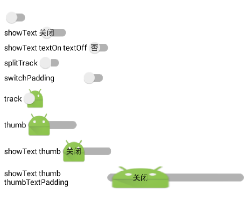
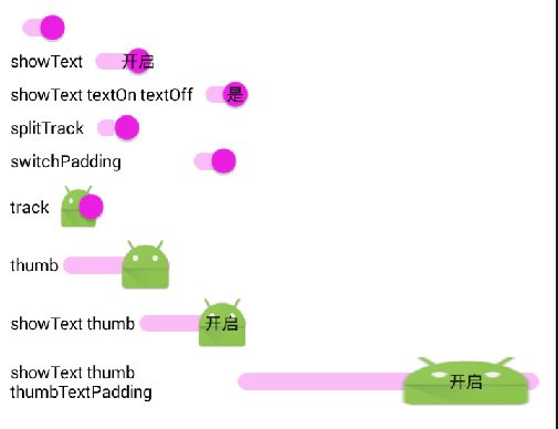
android.support.v7.appcompat:showText
Whether to draw on/off text.
是否显示开关状态的文字

android.support.v7.appcompat:splitTrack
Whether to split the track and leave a gap for the thumb drawable.
是否显示分割轨道的的竖线

android.support.v7.appcompat:switchMinWidth
Minimum width for the switch component
May be a dimension value, which is a floating point number appended with a unit such as "14.5sp".
开关的最小宽度

android.support.v7.appcompat:switchPadding
Minimum space between the switch and caption text
May be a dimension value, which is a floating point number appended with a unit such as "14.5sp".
开关和文字的最小距离

android.support.v7.appcompat:switchTextAppearance
TextAppearance style for text displayed on the switch thumb.
开关文字的样式

android.support.v7.appcompat:thumbTextPadding
Amount of padding on either side of text within the switch thumb.
滑块文字距两侧的距离

android.support.v7.appcompat:thumbTint
Tint to apply to the thumb drawable.
轨道颜色

android.support.v7.appcompat:thumbTintMode
Blending mode used to apply the thumb tint.
轨道颜色模式

android.support.v7.appcompat:track
Drawable to use as the "track" that the switch thumb slides within.
轨道

android.support.v7.appcompat:trackTint
Tint to apply to the track.
轨道颜色

android.support.v7.appcompat:trackTintMode
Blending mode used to apply the track tint.
轨道颜色模式

android:textOff
Text to use when the switch is in the unchecked/"off" state.
开关关的状态的文字

android:textOn
Text to use when the switch is in the checked/"on" state.
开关开的状态的文字

android:thumb
Drawable to use as the "thumb" that switches back and forth.
滑块
部分效果图


 扫一扫
扫一扫
 1688
1688

 被折叠的 条评论
为什么被折叠?
被折叠的 条评论
为什么被折叠?
 到【灌水乐园】发言


