


Android SwitchCompat开关按钮自定义颜色和样式
1、改变轨迹颜色
- 只改变原生的轨迹颜色,不改变样式
用trackTint属性,例:
 <android.support.v7.widget.SwitchCompat
            android:layout_width="wrap_content"
            android:layout_height="wrap_content"
app:trackTint="#464c57" />- 改变成自己想要的样式
用switch_track属性,例:
<android.support.v7.widget.SwitchCompat
            android:layout_width="wrap_content"
            android:layout_height="wrap_content"
            android:track="@drawable/switch_track" />
switch_track.xml内容:
<?xml version="1.0" encoding="utf-8"?>
<selector xmlns:android="http://schemas.android.com/apk/res/android">
    <item
        android:state_checked="true"
        android:drawable="@drawable/switch_track_on"/>
    <item
        android:state_checked="false"
        android:drawable="@drawable/switch_track_off"/>
</selector>
switch_track_on.xml内容
<?xml version="1.0" encoding="utf-8"?>
<shape xmlns:android="http://schemas.android.com/apk/res/android"
    android:shape="rectangle">

    <solid
        android:color="#464c57">
    </solid>

    <corners
        android:radius="10dp">
    </corners>


</shape>
switch_track_off.xml内容:
<?xml version="1.0" encoding="utf-8"?>
<shape xmlns:android="http://schemas.android.com/apk/res/android"
    android:shape="rectangle">
    <solid
        android:color="#464c57">
    </solid>
    <corners
        android:radius="10dp">
    </corners>

</shape>
2、改变按钮颜色
- 只改变原生的背景颜色,不改变样式
可以用thumbTint属性,代码同上,用这个属性无论状态“开”,“关”,颜色一样 - 改变成自己想要的样式
用thumb属性:
<android.support.v7.widget.SwitchCompat
            android:layout_width="wrap_content"
            android:layout_height="wrap_content"
            android:thumb="@drawable/switch_thum"
             />
switch_thum.xml
<?xml version="1.0" encoding="utf-8"?>
<selector xmlns:android="http://schemas.android.com/apk/res/android">
    <item
        android:state_checked="true"
        android:drawable="@drawable/switch_thum_on"/>
    <item
        android:state_checked="false"
        android:drawable="@drawable/switch_thum_off"/>
</selector>
switch_thum_on.xml
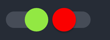
<?xml version="1.0" encoding="utf-8"?>
<shape xmlns:android="http://schemas.android.com/apk/res/android"
    android:shape="oval">
    <size
        android:width="20dp"
        android:height="20dp">
    </size>
    <solid
        android:color="#92e843">
    </solid>

</shape>
switch_thum_off.xml
<?xml version="1.0" encoding="utf-8"?>
<shape xmlns:android="http://schemas.android.com/apk/res/android"
    android:shape="oval">
    <size
        android:width="20dp"
        android:height="20dp">
    </size>
    <solid
        android:color="#818a95">
    </solid>

</shape>


 扫一扫
扫一扫


 345
345

 被折叠的 条评论
为什么被折叠?
被折叠的 条评论
为什么被折叠?
 到【灌水乐园】发言


