


文章声明⭐⭐⭐
- 该文章为我(有编程语言基础,非编程小白)的 HarmonyOS自学笔记,此类文章笔记我会默认大家都学过前端相关的知识,并常常以实现相关小案例的形式记录自己的学习过程
- 知识来源为 HarmonyOS官方文档/B站UP主筱筱知晓的HarmonyOS教学视频,归纳为自己的语言与理解记录于此
- 不出意外的话,我大抵会 持续更新
- 想要了解前端开发(技术栈大致有:Vue2/3、微信小程序、uniapp、HarmonyOS、NodeJS、Typescript)与Python的小伙伴,可以关注我!谢谢大家!
让我们开始今天的学习吧!
小案例
代码如下:
@Entry
@Component
struct Hello {
  // 推荐列表
  @State hotSearchList: string[] = ['女装', '鞋子', '军大衣', '花棉袄', 'Flutter教程', 'HarmonyOS', 'ArkTS', '高跟鞋', '电脑', '华为手机']
  // 控制按钮显示的布尔值
  @State isShow: boolean = false

  build() {
    // 堆叠布局
    Stack({ alignContent: Alignment.BottomEnd }) {
      // 标题与滑动列表
      Column() {
        // 标题
        Text('精品推荐')
          .width('100%')
          .height(60)
          .fontSize(40)
          .textAlign(TextAlign.Center)
        // 滑动列表
        List() {
          ForEach(this.hotSearchList, item => {
            ListItem() {
              Text(`${item}`) {
              }
              .width('100%')
              .height(60)
              .fontSize(25)
              .textAlign(TextAlign.Center)
              .backgroundColor('#eee')
              .margin({ top: 20 })
              .borderRadius(10)
            }
          }, (item, index) => item + `${index}`)
        }
        .layoutWeight(1)
      }
      .width('100%')
      .height('100%')
      // 相对定位容器
      RelativeContainer() {
        // 主按钮
        Button() {
          Text('A')
            .fontSize(26)
            .textAlign(TextAlign.Center)
            .fontColor(Color.White)
        }
        .id('mainButton')
        .width(60)
        .height(60)
        .backgroundColor('#4db8de')
        .alignRules({
          bottom: {
            anchor: '__container__',
            align: VerticalAlign.Bottom
          },
          right: {
            anchor: '__container__',
            align: HorizontalAlign.End
          }
        })
        .onClick(() => {
          // 控制是否显示多个副按钮
          this.isShow = !this.isShow
        })
        // 动态控制显示多个副按钮
        if (this.isShow) {
          Button() {
            Text('B')
              .fontSize(26)
              .textAlign(TextAlign.Center)
              .fontColor(Color.White)
          }
          .id('ButtonB')
          .width(60)
          .height(60)
          .backgroundColor(Color.Orange)
          .alignRules({
            bottom: {
              anchor: 'mainButton',
              align: VerticalAlign.Top
            },
            right: {
              anchor: '__container__',
              align: HorizontalAlign.End
            }
          })
          .offset({
            y: -25
          })

          Button() {
            Text('C')
              .fontSize(26)
              .textAlign(TextAlign.Center)
              .fontColor(Color.White)
          }
          .id('ButtonC')
          .width(60)
          .height(60)
          .backgroundColor(Color.Red)
          .alignRules({
            bottom: {
              anchor: 'mainButton',
              align: VerticalAlign.Top
            },
            right: {
              anchor: 'mainButton',
              align: HorizontalAlign.Start
            }
          })

          Button() {
            Text('D')
              .fontSize(26)
              .textAlign(TextAlign.Center)
              .fontColor(Color.White)
          }
          .id('ButtonD')
          .width(60)
          .height(60)
          .backgroundColor(Color.Green)
          .alignRules({
            bottom: {
              anchor: '__container__',
              align: VerticalAlign.Bottom
            },
            left: {
              anchor: '__container__',
              align: HorizontalAlign.Start
            }
          })
          .offset({
            x: 5
          })
        }
      }
      .width(150)
      .height(150)
    }
    .width('100%')
    .height('100%')
    .padding(15)
  }
}
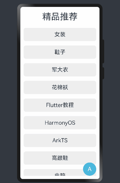
效果展示:


 1526
1526


 被折叠的 条评论
为什么被折叠?
被折叠的 条评论
为什么被折叠?
 到【灌水乐园】发言


