


3. 方法一 :Inline-block + text-align 属性配合使用
4. 方法二:Table(block) + margin 属性配合使用
5. 方法三: Absolute + transform属性配合使用
3. 方法一:Table-cell + vertical-align属性配合使用
4. 方法二:Absolute + transform属性配合使用
3. 方法一:Table-margin实现水平居中,table-cell + vertical-align实现垂直居中
4. 方法二:Absolute + transform 实现水平垂直居中
6. 方法二:float + margin 属性配合使用优化版本
7. 方法三:float + overflow 属性配合使用
4. 方法二:Display属性的值有关table实现等分效果
第一章 从概念讲起
1. 什么是布局?
简单来说就是HTML页面的整体结构或者骨架,类似于传统的报纸或者杂志中的排版
2. 什么是居中布局?
水平居中 + 垂直居中
3. 居中布局的分类
水平居中布局 ;垂直居中布局 ;水平+垂直居中
第二章 水平居中布局
1. 什么是水平居中布局?
当前元素在父级元素容器中水平方向是居中现实的
2. 水平居中布局实现方式
(1)Inline-block + text-algin 属性配合使用
(2)Table + margin 属性配合使用
(3)Absolute + transform属性配合使用
3. 方法一 :Inline-block + text-align 属性配合使用

(1)具体实现代码演示
   <style>
        #parent {
            width: 400px;
            height: 200px;
            background-color: aliceblue;
            /*
            text-align属性: 为文本内容设置对齐方式
            * left:左对齐
            * center:居中对齐
            * right: 右对齐
            */
            text-align: center;
        }
        #child {
            width: 300px;
            height: 100px;
            background: red;
            /*
            display属性:
            * block: 块级元素
            * inline: 内联元素(text-align属性有效)
              问题:当设置成inline后,width和height属性是无效的(只会为文字添加背景)
            * inline-block: 行内块级元素(块级+内联)
              整合了块级元素与内联元素的特点,width和height是有效的
            */
            display: inline-block;
        }
    </style>
(2)方法优缺点
优点:浏览器兼容性比较好
缺点:text-align属性有继承性,导致子级元素的文本也是居中显示的
4. 方法二:Table(block) + margin 属性配合使用

(1)具体实现代码演示
  <style>
        #parent {
            height: 100px;
            width: 300px;
            background: antiquewhite;
        }
        #child {
            height:50px;
            width: 200px;
            background: red;
            /* dispaly : table和block*/
            display: table;
            /*
                margin属性:外边距
                一个值:上下左右
                两个值:第一个表示上下,第二个表示左右
                三个值:第一个表示上,第二个值表示左右, 第三个表示下
                四个值:上右下左
                auto:表示根据浏览器自动分配
            */
            margin: 0 auto;
        }
</style>
(2)方法优缺点
优点:只需要对子级元素进行设置就可以实现水平方向居中布局效果
缺点:如果子级元素脱离文档流(设置浮动,绝对定位position:absolute,固定定位fixed),导致margin属性无效,这种方法就无法实现水平居中;
5. 方法三: Absolute + transform属性配合使用

(1)具体实现代码演示
   <style>
        #parent {
            height: 100px;
            width: 900px;
            background: antiquewhite;
            /*
            开启定位:
              * absolute 绝对定位
              * fixed 相对固定定位
              * relative 相对定位
            */
            position: relative;
        }
        #child {
            height:50px;
            width: 200px;
            background: red;
            /*
            当把当前元素设置为绝对定位之后:
            * 如果父级元素没有开启定位的话,当前元素是相对于页面定位的;
            * 如果父级元素开启了定位的话,当前元素是相对与父级元素定位的;
            */
            position: absolute;
            left: 50%;
            /* 如果只写left:50% 则显示的结果是子集元素的左端居中显示 */
            transform: translateX(-50%);
        }
    </style>
(2)方法优缺点
优点:无论父级元素是否脱离文档流,不影响子级元素水平居中效果
缺点:transform属性是CSS3中新增的属性,浏览器支持情况不好
第三章 垂直居中布局
1. 什么是垂直布局?
当前元素在父级元素容器中垂直方向是居中显示的
2. 垂直居中布局实现方式
(1)Table-cell + vertical-align属性配合使用
(2)Absolute + transform属性配合使用
3. 方法一:Table-cell + vertical-align属性配合使用

(1)具体实现代码演示
<style>
    #parent {
            height: 100px;
            width: 900px;
            background: antiquewhite;
            /* display属性:
              * table: 设置当前元素为<table>元素(表格)
              * table-cell: 设置当前元素为<td>元素(单元格)
            */
            display: table-cell;
            /* vertical-align属性: 用于设置文本内容的垂直方向对齐方式
              * top : 顶部对齐
              * middle : 居中对齐
              * bottom : 底部对齐
             */
            vertical-align: middle;
            /* 当设置table-cell相当于把父级元素变成表格中的单元格,而内容可以进行垂直方向的水平
            而子级元素就相当于单元格中的内容 */
        }
        #child {
            height:50px;
            width: 200px;
            background: red;
        }
</style>
(2)方法优缺点
优点:父级元素是否脱离文档流,不影响子级元素垂直居中效果
缺点:transform属性是CSS3中新增属性,浏览器支持情况不好
4. 方法二:Absolute + transform属性配合使用

(1)具体实现代码演示
<style>
     #parent {
            height: 200px;
            width: 900px;
            background: antiquewhite;
           position: relative;
        }
     #child {
            height:50px;
            width: 200px;
            background: red;
            position: absolute;
            top: 50%;
            transform: translateY(-50%);
        }
</style>
(2)方法优缺点
优点:父级元素是否脱离文档流,不影响子级元素垂直居中效果
缺点:transform属性是CSS3中新增属性,浏览器支持情况不好
第四章 居中布局
1. 什么是居中布局?
既要水平方向居中,也要垂直方向居中
2. 居中布局的实现方法
(1)Table-margin实现水平居中,table-cell + vertical-align实现垂直居中
(2)Absolute + transform 实现水平垂直居中
3. 方法一:Table-margin实现水平居中,table-cell + vertical-align实现垂直居中
<style>
    #parent {
            height: 200px;
            width: 400px;
            background: antiquewhite;
            /* 垂直 */
            display: table-cell;
            vertical-align: middle;

        }
    #child {
            height:100px;
            width: 200px;
            background: red;
            /* 水平 */
            display: block;
            margin: 0 auto;
        }
</style>
4. 方法二:Absolute + transform 实现水平垂直居中

<style>
    #parent {
            height: 200px;
            width: 400px;
            background: antiquewhite;
            position: relative;
        }
    #child {
            height:100px;
            width: 200px;
            background: red;
            position: absolute;
            left: 50%;
            top: 50%;
            transform: translate(-50%,-50%);
        }
</style>
第五章 两列布局
1. 什么是多列布局?
简单来说就是几个元素呈现水平方式排列的效果
2. 多列布局的分类
(1)两列布局(定宽+自适应)
(2)三列布局
(3)圣杯布局与双飞翼布局
(4)等分布局
(5)等高布局
(6)CSS3多列布局
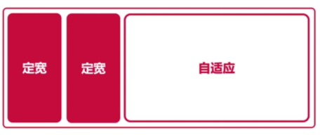
3. 什么是两列布局?
两列布局一般情况下是指定宽与自适应布局,两列中左列是确定的宽度,右列是自动填满剩余所有空间的一种布局效果。
4. 两列布局的实现方式(4)
(1)float + margin 属性配合使用
(2)float + overflow 属性配合使用
(3)display属性的table相关值使用
5. 方法一:float + margin 属性配合使用

(1)具体代码演示
<style>
    #left,#right {
        /* 定宽 */
        height: 100px;
    }
    #left {
        width: 200px;
        background-color: red;
        /* 当前元素脱离文档流 */
        float: left;
    }
    #right {
        background-color: grey;
        /* 去掉左列覆盖 */
        margin-left: 200px;
    }
</style>
(2)代码优缺点
优点:实现方式简单
缺点:自适应元素margin属性值必须与定宽元素的width属性保持一致(需要手动修改)。定宽元素浮动(脱离文档流)与自适应元素不浮动导致浏览器兼容性不好(可能会存在空白区域)。如果左列元素有子级元素,且设置了clear:both可能存在显示问题。
6. 方法二:float + margin 属性配合使用优化版本

(1)具体代码演示
<style>
    #left,#right {
        /* 定宽 */
        height: 100px;
    }
    #left {
        width: 200px;
        background-color: red;
        /* 当前元素脱离文档流 */
        float: left;
        /* 提高显示层级 */
        position: relative;
    }
    #right-fix {
        /* 设置为浮动,导致默认宽度值为0 */
        float: right;
        width: 100%;
        margin-left: -200px;
        background-color: yellow;
    }
    #right {
        background-color: grey;
    }
</style>
(2)代码优缺点
解决了第一种方法的两个问题:浮动与不浮动的问题;子级元素设置clear清除浮动的问题;
但是没有解决值耦合度高的问题。
7. 方法三:float + overflow 属性配合使用

(1)具体代码演示
<style>
   #left,#right {
        /* 定宽 */
        height: 100px;
    }
    #left {
        width: 200px;
        background-color: red;
        /* 当前元素脱离文档流 */
        float: left;
    }
    #right {
        background-color: grey;
        /* 开启BFC模式 - 当前元素的内部环境与外界完全隔离 */
        overflow: hidden;
    }
</style>
(2)代码优缺点
优点:第一种解决方法的问题都没有出现
缺点:overflow属性(开启了BFC模式,有副作用)不仅解决了两列布局问题,同时设置了内容溢出的情况。
8. 方法四 display属性的table相关值使用

(1)具体代码演示
<style>
    #parent {
        /* 表格的单元格的宽度会自动分配 */
        display: table;
        width: 100%;
        table-layout: fixed;
    }
    #left,
    #right {
        /* 定宽 */
        height: 100px;
        display: table-cell;
    }
    #left {
        width: 200px;
        background-color: red;
    }
    #right {
        background-color: grey;
    }
</style>
(2)代码优缺点
优点:浏览器兼容性比较好
缺点:将所有元素的display属性设置为table相关值,受到相应制约。
第六章 三列布局
1. 什么是三列布局?
三列中左边两列是确定的宽度,右边一列是自动填满剩余所有空间的一种布局
2. 三列布局实现方式
(1)float + margin属性配合使用
(2)Float + overflow属性配合使用
(3)Display属性的table相关值使用
3. 方法一实现
<style>
#left,#center,#right {
height: 100px;
}
#left {
width: 200px;
background-color: red;
float: left;
}
#center{
width: 200px;
background-color: rgb(42, 165, 155);
float: left;
}
#right {
background-color: grey;
margin-left: 400px;
}
</style>
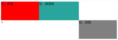
<body>
<div id="left">左1:定宽</div>
<div id="center">左2:定宽</div>
<div id="right">右:自适应</div>
</body>
4. 对于定宽+自适应+定宽的三列布局

<body>
    <div id="left">左:定宽</div>
    <div id="right">右:定宽</div>
    <div id="center">自适应</div>
</body>
<style>
    #left,#center,#right {
        height: 100px;
    }
    #left,#right {
        width: 200px;
    }
    #left {
        background-color: red;
        float: left;
    }
    #center{
        background-color: rgb(42, 165, 155);
        margin-left: 200px;
        margin-right: 200px;
    }
    #right {
        background-color: grey;
        float: right;
    }
</style>
问题:需要把HTML 的center元素放在后面,不然会出现显示错误。
第七章 圣杯布局
1. 什么是圣杯布局?
简单来说就是三行三列布局
圣杯布局的核心:实现主体部分左右定宽+中间自适应的布局效果

2. 解决方案
(也是三列布局最后一种情况的提升 使用父级结构)
<style>
    #parent {
        height: 100px;
        margin-left: 200px;
        margin-right: 200px;
    }
    #left, #center, #right {
        height: 100px;
        float: left;
    }
    #left,#right {
        width: 200px;
    }
    #left {
        background-color: red;
        margin-left: -100%;
        position: relative;
        left: -200px;
    }
    #center{
        background-color: rgb(42, 165, 155);
        /* 为父级元素的100% */
        width: 100%;
    }
    #right {
        background-color: grey;
        margin-left: -200px;
        position: relative;
        right: -200px;
    }
    </style>
</head>
<body>
    <div id="parent">
        <div id="center">自适应</div>
        <div id="left">左:定宽</div>
        <div id="right">右:定宽</div>
    </div>
</body>
第八章 双飞翼布局
1. 什么是双飞翼布局?
最早由淘宝团队提出,是针对圣杯局部的优化解决方案。主要是优化了圣杯布局中开启定位的问题。
2. 解决方案
增加一个子级元素inner,主要解决问题就是重合问题。
<style>
    #parent {
        height: 100px;
    }
    #left,#center,#right {
        height: 100px;
        float: left;
    }
    #left,#right {
        width: 200px;
    }
    #left {
        background-color: red;
        margin-left: -100%;
    }
    #center{
        background-color: rgb(42, 165, 155);
        /* 父级元素宽度的100% */
        width: 100%;

    }
    #right {
        background-color: grey;
        margin-left: -200px;
    }
    #inner {
        height: 100px;
        background-color: green;
        margin-left: 200px;
        margin-right: 200px;
    }
</style>
<body>
    <div id="parent">
        <div id="center">
            <div id="inner"></div>
        </div>
        <div id="left">左:定宽</div>
        <div id="right">右:定宽</div>
    </div>
</body>
第九章 等分布局
1. 什么是等分布局?
一行被分为若干列,每一列的宽度是相同的值
2. 解决方案
(1)float属性实现等分布局效果
(2)Display属性的值有关table实现等分布局效果
3. 方法一:float属性实现等分布局效果

(1)具体代码实现
<style>
        .col1,.col2,.col3,.col4 {
            float: left;
            height: 200px;
            width: 25%;
        }
        .col1 {
            background-color: red;
        }
        .col2 {
            background-color: yellow;
        }
        .col3 {
            background-color: blue;
        }
        .col4 {
            background-color: green;
        }
</style>
<body>
    <div id="parent">
        <div class="col1"></div>
        <div class="col2"></div>
        <div class="col3"></div>
        <div class="col4"></div>
    </div>
</body>
4. 方法二:Display属性的值有关table实现等分效果

(1)具体代码实现
<style>
        #parent {
            display: table;
            width: 100%;
        }
        .col1,.col2,.col3,.col4 {
            height: 200px;
            display: table-cell;
        }
        .col1 {
            background-color: red;
        }
        .col2 {
            background-color: yellow;
        }
        .col3 {
            background-color: blue;
        }
        .col4 {
            background-color: green;
        }
</style>
<body>
    <div id="parent">
        <div class="col1"></div>
        <div class="col2"></div>
        <div class="col3"></div>
        <div class="col4"></div>
    </div>
</body>
5. 等分布局有间距的情况

实现等分布局时,如果需要每列之间实现空白间隔,如图:
设置margin或者padding时会多出一个边界
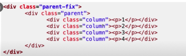
解决方法:在原有的HTML页面代码基础上再加一个父级容器
6. 对第一种方法的修改
<style>
        .parent-fix {
            overflow: hidden;
        }
        #parent {
            height: 200px;
            margin-left: -10px;
        }
        .col1,.col2,.col3,.col4 {
            width: 25%;
            float: left;
            /* 盒子模型 */
            box-sizing: border-box;
            height: 200px;
            padding-left: 10px;
        }
        .inner {
            height: 200px;
        }
        .col1 .inner {
            background-color: red;
        }
        .col2 .inner {
            background-color: yellow;
        }
        .col3 .inner {
            background-color: blue;
        }
        .col4 .inner {
            background-color: green;
        }
</style>
<body>
    <div id="parent-fix">
        <div id="parent">
            <div class="col1">
                <div class="inner"></div>
            </div>
            <div class="col2">
                <div class="inner"></div>
            </div>
            <div class="col3">
                <div class="inner"></div>
            </div>
            <div class="col4">
                <div class="inner"></div>
            </div>
        </div>
    </div>
</body>
7. 对第二种方法的修改
其中有个小问题就是:解决了消除左边距但是右边也会多出来一个margin,需要手动修改parent的宽度
<style>
        .parent-fix {
            overflow: hidden;
        }
        #parent {
            width: 808px;
            display: table;
            margin-left: -10px;
        }
        .col1,.col2,.col3,.col4 {
            height: 200px;
            display: table-cell;
            box-sizing: border-box;
            padding-left: 10px;
        }
        .inner {
            height: 200px;
        }
        .col1 .inner {
            background-color: red;
        }
        .col2 .inner {
            background-color: yellow;
        }
        .col3 .inner {
            background-color: blue;
        }
        .col4 .inner {
            background-color: green;
        }
</style>
第十章 等高布局
1. 什么是等高布局?
一行被分成若干列,每一列的高度是相同的值
2. 实现方法
(1)display属性的值有关table实现
(2)Padding+margin属性实现
3. 方法一:display属性的值有关table实现

(1)具体代码实现
<style>
       #parent {
            display: table;
        }
        #left, #right {
            width: 200px;
            /* 表格中的单元格默认是等高的 */
            display: table-cell;
        }
        #left {
            background-color: red;
        }
        #right {
            background-color: yellow;
        }
</style>
(2) 实现效果
4. 方法二:Padding+margin属性实现

(1)具体代码实现
 <style>
        #parent {
            overflow: hidden;
        }
        #left, #right {
            width: 200px;
            float: left;
            padding-bottom: 999px;
            margin-bottom: -999px;

        }
        #left {
            background-color: red;
        }
        #right {
            background-color: yellow;
        }
</style>
这种方法是伪等高布局(不是真正的登高布局,只是视觉上等高的伪造等高布局)
第十一章 CSS3多列布局
1. Columns属性
Columns是一个简写属性
(1)Columns-count属性:定义列的数量(设置列的数量或者允许的最大列数)
Auto:默认值,用于表示列的数量由其他CSS属性决定
Number:必须是正整数,用于定义列的数量
(2)Columns-width属性:定义列的宽度(设置列的宽度或者列的最小宽度)
Auto:默认值,用于表示列的宽度由其他CSS属性决定
Length:必须是正整数,用于定义列的宽度
<style>
       #parent {
        /*  实现的布局有间隙
        column-count: 4;
        column-width: 200px;*/
        columns: 4 300px;
       }
        .col1,.col2,.col3,.col4 { height: 100px;}
        .col1 {background-color: red;}
        .col2 {background-color: yellow;}
        .col3 {background-color: blue;}
        .col4 {background-color: green;}
</style>
2. 列的间隙
Column-gap属性用于设置列与列之间的间距,该属性需要为多列显示时的元素设置
Normal:用于表示使用浏览器定义列的默认间距,默认值为1em
Length:必须是正整数,用于表示定义列之间的间距
3. 列的边框
Columns-rule属性用于定义列与列之间的边框,其中包括边框的宽度(columns-rule-width),颜色(columns-rule-color),边距样式(columns-rule-style)
column-rule: 5px tomato double;4. 横跨多列
Columns-span属性用于定义一个列元素是否跨列
None:用于表示不跨列
All:表示横跨所有列
5. 列的填充
(等高布局)
Column-fill属性用于定义列的高度是由内容决定的,还是统一高度
Auto:默认值,用于表示列的高度由内容决定
Balance:用于表示列的高度根据内容最多的一列高度决定
使用CSS3实现的问题就是兼容性不够好
第十二章 全屏布局
1. 什么是全屏布局?
HTML页面铺满整个浏览器窗口,并且没有滚动条。而且还可以跟随浏览器的大小变化而变化。(宽高都为自适应,第二行元素包含两列,高度也是自适应,且有一列宽度自适应)

2. 解决方法
<style>
    html, body {
        margin: 0;
        overflow: hidden;
    }
    header,footer {
        height: 100px;
        position: fixed;
        left: 0;
        right: 0;
        background-color: lightgrey;
    }
    header {
        top: 0;

    }
    .content {
        position: fixed;
        left: 0;
        right: 0;
        top: 100px;
        bottom: 100px;
        background-color: lightsteelblue;
        overflow: auto;
    }
    .content .let {
        width: 300px;
        height: 100%;
        position: fixed;
        left: 0;
        top: 100px;
        bottom: 100px;
        background-color: lightpink;
    }
    .content .right {
        margin-left: 300px;
        height: 100%;
        background-color: lightsalmon;
    }
    footer {
        bottom: 0;
    }
</style>
<body>
    <header></header>
    <div class="content">
        <div class="let"></div>
        <div class="right"></div>
    </div>
    <footer></footer>
</body>
第十二章 总结
已经讲过的CSS布局:居中布局,多列布局,全屏布局
其他布局:网格布局,弹性盒子布局


 346
346


 被折叠的 条评论
为什么被折叠?
被折叠的 条评论
为什么被折叠?
 到【灌水乐园】发言


