


python绘图脚本
import matplotlib.pyplot as plt
import numpy as np

# 假设一些数据点以模拟IA-UG2K曲线
# 实际上,这些数据应该来自实验测量。
ug2k_values = np.arange(0, 77.5 + 0.5, 0.5)  # UG2K电压范围从0到77.5,步长为0.5
ia_values = [2]*35 + [3,3,4,4,5,5,5] + [6]*9 + [5,5,4,4,4,3,3,4,4,5,6,7,9,10,10,11,11,11,10,10,9,8,7,6,5,4,4,3,3,2,3,3,5,7,9,11,13,14,15,15,15,14,14,13,12,10,8,7,6,4,3,3,2,2,2,4,9,14,17,19,21,21,21,21,20,18,16,14,13,11,9,7,5,4,3,3,3,4,7,10,14,17,20,22,24,26,26,26,26,25,23,25,27,30,27,25,20,17,15,12,9,8,7,8,11]

# 标注VF、UG1K和UG2A的位置
vf = 1.5  # VF电压
ug1k = 1.8  # UG1K电压
ug2a = 8.7  # UG2A电压

# 绘制曲线
plt.figure(figsize=(10, 6))
plt.plot(ug2k_values, ia_values, label='IA-UG2K Curve')

# 创建用于图例的假线条
from matplotlib.lines import Line2D
legend_elements = [
    Line2D([0], [0], color='r', linestyle='--', label=f'VF={vf}V'),
    Line2D([0], [0], color='g', linestyle='--', label=f'UG1K={ug1k}V'),
    Line2D([0], [0], color='b', linestyle='--', label=f'UG2A={ug2a}V')
]

# 手动选定的高峰位置(可以根据实际数据调整)
peak_positions = [(22.0, 6), (33.5, 11), (45.0, 15), (57, 21), (69.5, 26), (72.0, 30)]

# 在图表中标记高峰并标出坐标
for x, y in peak_positions:
    plt.scatter(x, y, color='red')  # 红色点标记高峰
    plt.annotate(f'({x}, {y})', xy=(x, y), xytext=(5, 5), textcoords='offset points', fontsize=9, color='red')
# 添加标题和标签
plt.title('IA vs UG2K in Franck-Hertz Experiment')
plt.xlabel('UG2K Voltage (V)')
plt.ylabel('Current IA (A)')
plt.legend()

# 使用自定义图例元素添加图例
plt.legend(handles=legend_elements)

# 显示网格
plt.grid(True)

# 显示图表
plt.show()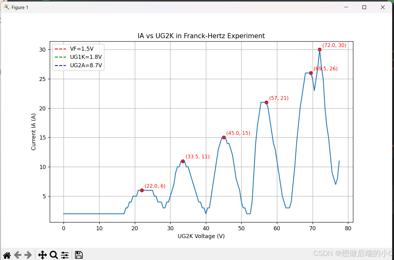


 952
952

 被折叠的 条评论
为什么被折叠?
被折叠的 条评论
为什么被折叠?
 到【灌水乐园】发言


