


泰坦尼克事故生存预测–分类问题
泰坦尼克
数据预览
导入包,和数据,观察数据情况
!pip install statsmodels==0.9.0
import numpy as np
import random as rnd
import warnings
warnings.filterwarnings("ignore")

import pandas as pd
df = pd.read_csv(
    'https://labfile.oss.aliyuncs.com/courses/1363/Titanic.csv')  # 读取数据
df.head()
df.info() #显示数据的整体信息,每列的空值情况,类型
df.describe()  #数值列的特征
df.describe(include=['O'])  #类别列的各种特征,中间是大写字母O
各特征列中:
数值型: Age, Fare. Discrete: SibSp, Parch;
类别型: Survived, Sex, and Embarked. Ordinal: Pclass
数据清洗
空值填充
df.isnull().sum()   #先查看空值情况
#三个列存在缺失值,分别是年龄(Age)、客舱(Cabin)、登船港(Embarked)
df['Age'].fillna(df['Age'].median(), inplace=True)
df['Embarked'].fillna(df['Embarked'].mode()[0], inplace=True)
#年龄用均值填充,登船港用众数
#inplace=True是指是否用新生成列表替换原列表

#从直观上来判断,船舱号跟是否存活没有多大的关系,因此这直接删除掉该列。
#同样的道理,也删除乘客编号(PassengerId)和船票号列(Ticket)
drop_column = ['PassengerId', 'Cabin', 'Ticket']
df_drop = df.drop(drop_column, axis=1)

df_drop.isnull().sum()
#再检查空值情况
数据挖掘
通过对原始数据挖掘,挖掘出可能与存活率相关的信息。
创造FamilySize列:统计每个乘客所在家庭总人数
创造IsAlone列:判断每位乘客是否是单身汉
创造Title列:提取name列中的 类似Mr、Miss、Mrs 等称呼的部分
原始数据集的 SibSp 列表示的是家庭人数,即一个乘客含有多少个兄弟姐妹或配偶,在Parch 列中,记录的是一个乘客含有多少个父母或孩子。将这两者相加,再加上他自己就可以得到一个家庭的总人数。提取这个特征的原因是,有可能获救的人都是一个家庭的。
df_drop['FamilySize'] = df_drop['SibSp'] + df_drop['Parch'] + 1
df_drop['FamilySize'].value_counts()

df_drop['IsAlone'] = 1
df_drop['IsAlone'].loc[df_drop['FamilySize'] > 1] = 0
df_drop['IsAlone'].value_counts()

df_drop['Title'] = df_drop['Name'].str.split(
    ", ", expand=True)[1].str.split(".", expand=True)[0]
#name列存储,类似Braund, Mr. Owen Harris
df_drop['Title'].value_counts()  #分组查看

#Mr、Miss、Mrs、Master 等出现的次数最多,而像 Jonkheer 等都只出现一次。
#将出现少于 10 次的选项都合并为一个 Misc 选项
stat_min = 10
# 找到少于 10 个的列名
title_names = (df_drop['Title'].value_counts() < stat_min)
# 替换列名
df_drop['Title'] = df_drop['Title'].apply(
    lambda x: 'Misc' if title_names.loc[x] == True else x)
print(df_drop['Title'].value_counts())
将年龄与票价划分区间,数值型特征变成类别型特征
等距划分 cut
数据出现频率百分比划分 qcut
#年龄(Age)列是一个连续的特征值,现在将其切分为五个等级,分别儿童、少年、青年、中年、老年。这样就将 Age 划分为了类别型特征。
df_drop['AgeBin'] = pd.cut(df_drop['Age'].astype(int), 5)
df_drop['AgeBin'].value_counts()
#等距划分 cut

#数据出现频率百分比划分 qcut 方法,比如要把数据分为四份,则四段分别是数据的0-25%,25%-50%,50%-75%,75%-100%
df_drop['FareBin'] = pd.qcut(df_drop['Fare'], 4)
df_drop['FareBin'].value_counts()

df_drop.head()  #再次查看数据
数据可视化
为了进一步了解数据,进行可视化分析
先初步分析各变量是否与存活有关,查看每种类别下的存活率是否有较大差异,有,即该类别变量与存活情况有关
#性别与是否存活
df_drop[['Sex', 'Survived']].groupby('Sex', as_index=False).mean()
#在数据集中中,女性能够获救的人占女性人数的 74.2% ,而男性只有 18.89% 获救。
#这说明,如果给定一个乘客,如果该乘客是一个女性,那么该乘客有很大的概率存活下来。

#船舱等级与是否存活
df_drop[['Pclass', 'Survived']].groupby('Pclass', as_index=False).mean()

#登船的港口与是否存活
df_drop[['Embarked', 'Survived']].groupby('Embarked', as_index=False).mean()

#名字前缀特征(Title)与是否存活
df_drop[['Title', 'Survived']].groupby('Title', as_index=False).mean()

#兄弟姐妹或配偶个数、父母和孩子与是否存活
df_drop[['SibSp', 'Survived']].groupby('SibSp', as_index=False).mean()
df_drop[['Parch', 'Survived']].groupby('Parch', as_index=False).mean()

#是否是单身汉与是否存活
df_drop[['IsAlone', 'Survived']].groupby('IsAlone', as_index=False).mean()
由分析,上述这几列都与存活情况有关,即不同类别下的存活率不相似
可视化做进一步分析
import seaborn as sns
import matplotlib.pyplot as plt
%matplotlib inline

#先来对票价列(Fare)进行可视化,主要画出其箱线图,和其与存活率的关系。

# 定义画布大小
plt.figure(figsize=[16, 4])
# 画第一个图
plt.subplot(121)#表示将整个图像窗口分为1行2列, 当前位置为第一个
plt.boxplot(x=df_drop['Fare'], showmeans=True, meanline=True)
# 设置标题和 y 轴的标签
plt.title('Fare Boxplot')
plt.ylabel('Fare ($)')
# 画第二个图
plt.subplot(122)
#hist柱状图,stacked=True指输出的图为多个数据集堆叠累计的结果
plt.hist(x=[df_drop[df_drop['Survived'] == 1]['Fare'], df_drop[df_drop['Survived'] == 0]['Fare']],
         stacked=True, color=['g', 'r'], label=['Survived', 'Dead'])
# 设置标题和坐标轴的标签
plt.title('Fare Histogram by Survival')
plt.xlabel('Fare ($)')
plt.ylabel('# of Passengers')
plt.legend()
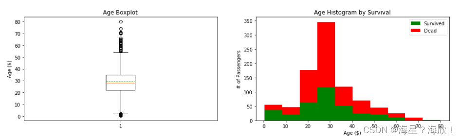
同样的,对年龄(Age)列可视化
# 定义画布大小
plt.figure(figsize=[16, 4])
# 画第一个图
plt.subplot(121)
plt.boxplot(x=df_drop['Age'], showmeans=True, meanline=True)
plt.title('Age Boxplot')
plt.ylabel('Age ($)')
# 画第二个图
plt.subplot(122)
plt.hist(x=[df_drop[df_drop['Survived'] == 1]['Age'], df_drop[df_drop['Survived'] == 0]['Age']],
         stacked=True, color=['g', 'r'], label=['Survived', 'Dead'])
plt.title('Age Histogram by Survival')
plt.xlabel('Age ($)')
plt.ylabel('# of Passengers')
plt.legend()
对家庭人数列可视化
plt.figure(figsize=[16, 4])
# 画第一个图
plt.subplot(121)
plt.boxplot(x=df_drop['FamilySize'], showmeans=True, meanline=True)
plt.title('FamilySize Boxplot')
plt.ylabel('FamilySize ($)')
# 画第二个图
plt.subplot(122)
plt.hist(x=[df_drop[df_drop['Survived'] == 1]['FamilySize'], df_drop[df_drop['Survived'] == 0]['FamilySize']],
         stacked=True, color=['g', 'r'], label=['Survived', 'Dead'])
plt.title('FamilySize Histogram by Survival')
plt.xlabel('FamilySize ($)')
plt.ylabel('# of Passengers')
plt.legend()
港口(Embarked)、船舱等级(Pclass)、是否单身(IsAlone)用柱状图来查看与存活之间的关系
fig, saxis = plt.subplots(1, 3, figsize=(16, 4))
# 画柱状图sns.barplot
#其中order=[1, 2, 3]是用来指导类别变量的顺序,ax=saxis[0]是用来指定该图在整个1行3列窗口中的第一个位置
sns.barplot(x='Embarked', y='Survived', data=df_drop, ax=saxis[0])
sns.barplot(x='Pclass', y='Survived', order=[
            1, 2, 3], data=df_drop, ax=saxis[1])
sns.barplot(x='IsAlone', y='Survived', order=[1, 0], data=df_drop, ax=saxis[2])
票价等级列(FareBin)、年龄等级列(AgeBin)、家庭人数列(FamilySize)使用点图,便于观察趋势
fig, saxis = plt.subplots(1, 3, figsize=(16, 4))
sns.pointplot(x='FareBin', y='Survived',  data=df_drop, ax=saxis[0])
sns.pointplot(x='AgeBin', y='Survived',  data=df_drop, ax=saxis[1])
sns.pointplot(x='FamilySize', y='Survived', data=df_drop, ax=saxis[2])
考察船舱等级特征和其他特征进行组合与‘是否存活’的关系
fig, (axis1, axis2, axis3) = plt.subplots(1, 3, figsize=(16, 5))

sns.boxplot(x='Pclass', y='Fare', hue='Survived', data=df_drop, ax=axis1)
axis1.set_title('Pclass vs Fare Survival Comparison')

sns.violinplot(x='Pclass', y='Age', hue='Survived',
               data=df_drop, split=True, ax=axis2)
axis2.set_title('Pclass vs Age Survival Comparison')

sns.boxplot(x='Pclass', y='FamilySize', hue='Survived', data=df_drop, ax=axis3)
axis3.set_title('Pclass vs Family Size Survival Comparison')
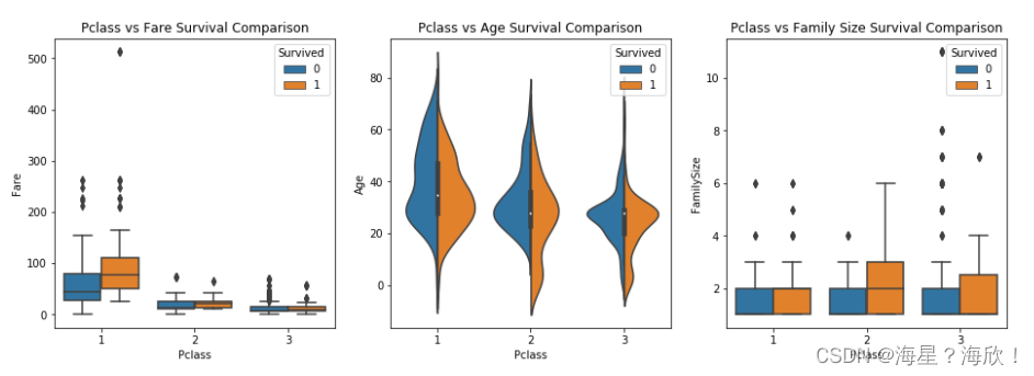
由上图可知,船舱等级为 1 时的票价要高一些,同时存活率也要高一些。
使用柱状图来画出性别特征和其他特征组合及其与是否存活的关系。
fig, qaxis = plt.subplots(1, 3, figsize=(16, 5))

sns.barplot(x='Sex', y='Survived', hue='Embarked', data=df_drop, ax=qaxis[0])
qaxis[0].set_title('Sex vs Embarked Survival Comparison')

sns.barplot(x='Sex', y='Survived', hue='Pclass', data=df_drop, ax=qaxis[1])
qaxis[1].set_title('Sex vs Pclass Survival Comparison')

sns.barplot(x='Sex', y='Survived', hue='IsAlone', data=df_drop, ax=qaxis[2])
qaxis[2].set_title('Sex vs IsAlone Survival Comparison')
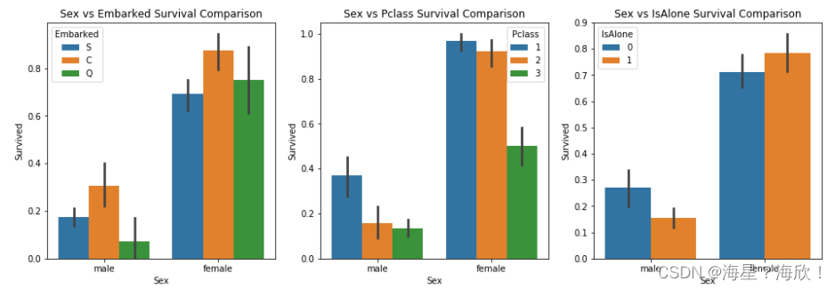
从上图中可以看到,女性的存活率普遍都高于男性的存活率。但在最右边的图中,男性单身汉死亡率高一点,而非单身汉死亡率要低一些。对于女性正好相反,单身女性的死亡率要低一些。非单身女性死亡率要高一些
接下来再来看家庭人数与性别组合下是否存活的概率,船舱等级与性别组合下是否存活的概率。
fig, (maxis1, maxis2) = plt.subplots(1, 2, figsize=(16, 5))
sns.pointplot(x="FamilySize", y="Survived", hue="Sex", data=df_drop,
              palette={"male": "blue", "female": "g"},
              markers=["*", "o"], linestyles=["-", "--"], ax=maxis1)
sns.pointplot(x="Pclass", y="Survived", hue="Sex", data=df_drop,
              palette={"male": "blue", "female": "g"},
              markers=["*", "o"], linestyles=["-", "--"], ax=maxis2)
查看登船港、船舱等级、乘客性别以及是否存活的关系
e = sns.FacetGrid(df_drop, col='Embarked')
e.map(sns.pointplot, 'Pclass', 'Survived', 'Sex', ci=9.0, hue_order=['female','male'], palette='deep')
e.add_legend()
#女性的存活率要整体高于男性的存活率

a = sns.FacetGrid(df_drop, hue='Survived', aspect=4)
a.map(sns.kdeplot, 'Age', shade=True)
a.set(xlim=(0, df_drop['Age'].max()))
a.add_legend()
#从上图可以看出,登船乘客的年龄大部分为年轻人,死亡人数超过存活人数的群体也都是在 20 岁到 33 岁区间。

h = sns.FacetGrid(df_drop, row='Sex', col='Pclass', hue='Survived')
h.map(plt.hist, 'Age', alpha=.75)
h.add_legend()
#从上图可以看到,年龄在 20 岁到 40 之间,船舱等级为 3 的男性死亡率最高
下面找特征之间的关系
pp = sns.pairplot(df_drop, hue='Survived', palette='deep', height=1.5,
                  diag_kind='kde', diag_kws=dict(shade=True), plot_kws=dict(s=10))
pp.set(xticklabels=[])
#sns.pairplot用来展示两两特征之间的关系
#对角线上是各个属性的直方图(分布图),而非对角线上是两个不同属性之间的相关图
#data--要绘制的数据,为DataFrame类型;
#hue--取值为data中的列索引,为分组变量,根据不同颜色来区分各个变量;
#palette--为seaborn库颜色面板取值或者给出hue中各个类别对应颜色的字典;
#height--每个图的高度,单位为英寸;
#diag_kws--对角线处统计图的属性设置;
#plot_kws--非对角线处统计图的属性设置;
除了上面画图的方法,我们还可以求出特征之间的相关系数,然后通过热图的方法画出。
def correlation_heatmap(df):
    a,ax = plt.subplots(figsize=(10,8))
    colormap = sns.diverging_palette(220,10,as_cmap=True)
    a = sns.heatmap(df.corr(),cmap=colormap,square=True,cbar_kws={'shrink': .9},ax=ax,annot=True,linewidths=0.1, vmax=1.0, linecolor='white',annot_kws={'fontsize': 12})
    plt.title('Pearson Correlation of Features', y=1.05, size=15)

correlation_heatmap(df_drop)
有些作图函数里参数超多,没法直接背下来,用到啥的时候去搜一下就好了
数据转换
前面已经完成了数据清洗和数据分析。接下来准备构建预测模型。由于经过上面的数据预处理之后,数据中还是存在一些用字符串来表示的类别型特征,因此在构建模型之前先将这些字符串转化为数值。这里之间使用 sklearn 提供的接口来完成。
from sklearn.preprocessing import LabelEncoder
label = LabelEncoder()
df_drop['Sex_Code'] = label.fit_transform(df_drop['Sex'])
df_drop['Embarked_Code'] = label.fit_transform(df_drop['Embarked'])
df_drop['Title_Code'] = label.fit_transform(df_drop['Title'])
df_drop['AgeBin_Code'] = label.fit_transform(df_drop['AgeBin'])
df_drop['FareBin_Code'] = label.fit_transform(df_drop['FareBin'])
#用label.fit_transform可以把类别变量变成数值

df_drop.shape
df_drop.columns
#仅选择使用一部分的特征列来训练模型
feat_cols = ['Sex_Code', 'Pclass', 'Embarked_Code',
             'Title_Code', 'FamilySize', 'AgeBin_Code', 'FareBin_Code']
target = 'Survived'
#提取训练集
data_X = df_drop[feat_cols]
data_X.head()
#提取要训练的目标值
data_y = df_drop[target]
data_y.head()
构建预测模型
#在构建模型之前,先划分训练集和测试集。
from sklearn import model_selection
train_x, test_x, train_y, test_y = model_selection.train_test_split(data_X.values,data_y.values,random_state=0)

#使用逻辑回归
from sklearn.linear_model import LogisticRegression
model = LogisticRegression(solver='lbfgs')
model.fit(train_x, train_y)

#在训练好模型之后,使用测试集来对模型进行测试。
from sklearn import metrics
y_pred = model.predict(test_x)
metrics.accuracy_score(y_pred, test_y)
#从测试集的结果来看,使用逻辑回归得到的准确率没有达到 80%

#下面我们换一种常用的分类方法:支持向量机
from sklearn.svm import SVC
model = SVC(probability=True, gamma='auto')
model.fit(train_x, train_y)
y_pred = model.predict(test_x)
metrics.accuracy_score(y_pred, test_y)
#结果为0.816

#支持向量机比逻辑回归的结果稍微好一点点。再换另一种方法:随机森林
from sklearn.ensemble import RandomForestClassifier
model = RandomForestClassifier(n_estimators=100)
model.fit(train_x, train_y)
y_pred = model.predict(test_x)
metrics.accuracy_score(y_pred, test_y)
#结果为0.834
采用了三种分类方法,分别是逻辑回归、支持向量机、随机森林。直接调用的包


 被折叠的 条评论
为什么被折叠?
被折叠的 条评论
为什么被折叠?
 到【灌水乐园】发言


