【Android学习】进度条ProgressBar

1,原始进度条

1)概念

还有一个次要的进度条,用来显示中间进度,如流媒体播放的缓冲区的进度。
应用程序使用任务的长度是未知的情况下,进度可以显示循环动画。

2)实现

①xml

<ProgressBar  
        android:id="@+id/bar"  
        android:layout_width="match_parent"  
        android:layout_height="wrap_content"  
        android:max="100"  
        style="@android:style/Widget.ProgressBar.Horizontal"  
        /> 

②java
setProgress(int):设置进度完成的百分比;
incrementProgressBy(int):设置进度条的进度的增加或减少,具体取决于参数的正负;

2,自定义进度条

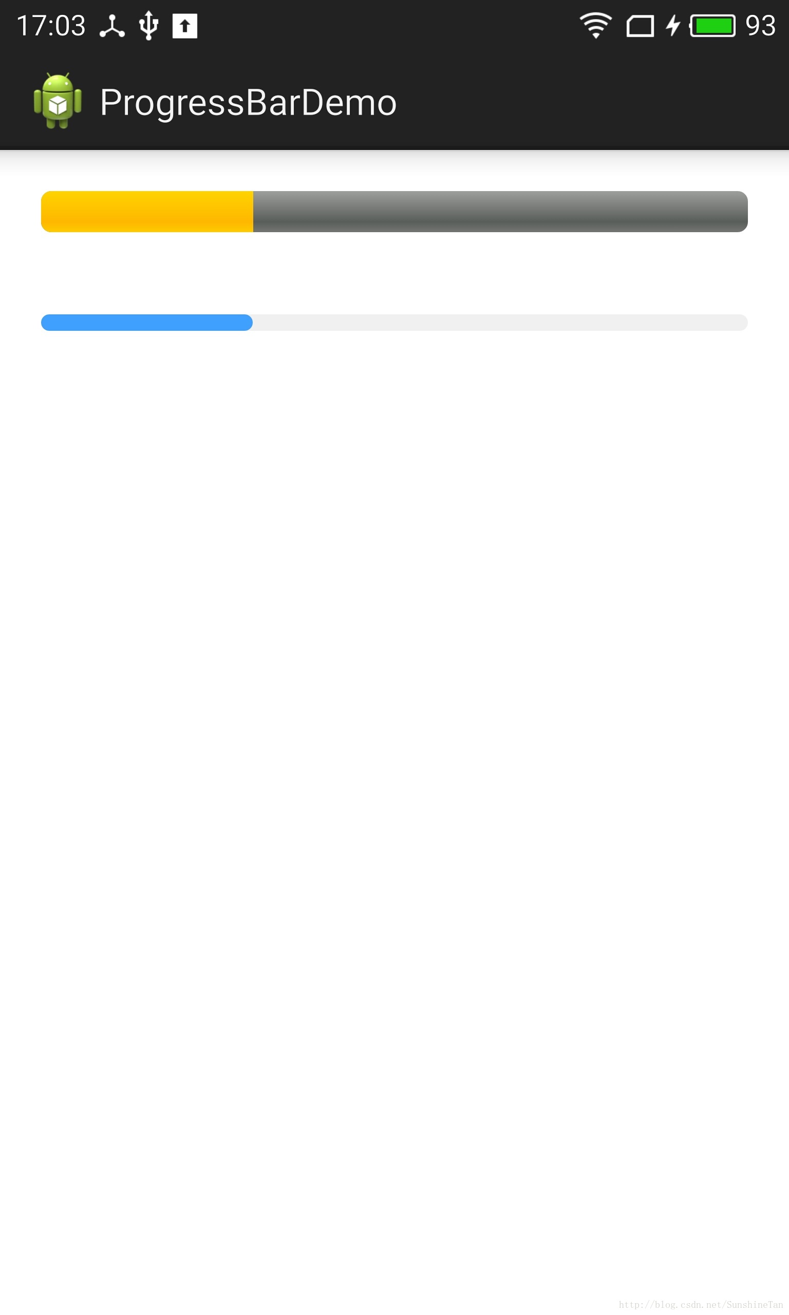
如图所示,第一条为系统默认进度条,第二条为自定义进度条,可以设置颜色。
自定义进度条
写一个继承LinearLayout的BaseRoundCornerProgressBar类。
RoundCornerProgressBar继承了BaseRoundCornerProgressBar类。
点击下载

3,SeekBar(拖动条)

1)概念

SeekBar是ProgressBar的扩展,在其基础上增加了可滑动的滑片,用户触摸滑片(或使用方向键)可左右拖动,设置当前的进度等级。

2)属性

android:thumb="@drawable/icon" //拖动图标
android:thumbOffset="10px"     //图标偏移量
android:max="100"              //最大值
android:progress="20"          //第一进度值
android:secondaryProgress="40"
android:indeterminate="false"   //设置不定性
android:indeterminateOnly="true"    //只有不定性不要和前一个同时使用
android:indeterminateDuration="500" //要求前面两项之一为true,时间段

4,RatingBar(星级评分条)

1)概念

是SeekBar和ProgressBar的扩展,用星型来显示等级评定。
使用RatingBar的默认大小时,用户可以触摸/拖动或使用按键来设置评分。

2)样式

①小风格ratingBarStyleSmall
②大风格ratingBarStyleIndicator
只适合指示,不适合用户交互。

3)实现

①设置星星数量
通过函数setNumStars(int)或者在XML的布局文件中定义。

只有当布局的宽度被设置为wrap_content时,设置的星星数量将显示出来。
②次级进度
一般不应该被修改,因为它仅仅是被当作星星部分内部的填充背景。
③属性

android:numStars="5"  //星星的个数
android:rating="1"      //初级星级为1
android:stepSize="1"    //每一级层为1个
android:isIndicator="false"     //如果值为true,则不可改变
android:max="50"
  • 0
    点赞
  • 0
    收藏
    觉得还不错? 一键收藏
  • 0
    评论
实现圆弧进度条自定义ProgressBar,可以使用Canvas和Paint来绘制。 首先,创建一个自定义ProgressBar类,继承自ProgressBar类,并实现构造方法和onDraw方法: ``` public class CircleProgressBar extends ProgressBar { private Paint paint; // 画笔 private int roundColor; // 圆环颜色 private int progressColor; // 进度条颜色 private int textColor; // 文字颜色 private float textSize; // 文字大小 private float roundWidth; // 圆环宽度 private int max; // 最大进度 private boolean textIsDisplayable; // 是否显示进度文字 private int style; // 进度条样式 public static final int STROKE = 0; public static final int FILL = 1; public CircleProgressBar(Context context) { this(context, null); } public CircleProgressBar(Context context, AttributeSet attrs) { this(context, attrs, 0); } public CircleProgressBar(Context context, AttributeSet attrs, int defStyle) { super(context, attrs, defStyle); // 获取自定义属性的值 TypedArray mTypedArray = context.obtainStyledAttributes(attrs, R.styleable.CircleProgressBar); roundColor = mTypedArray.getColor(R.styleable.CircleProgressBar_roundColor, Color.RED); progressColor = mTypedArray.getColor(R.styleable.CircleProgressBar_progressColor, Color.GREEN); textColor = mTypedArray.getColor(R.styleable.CircleProgressBar_textColor, Color.GREEN); textSize = mTypedArray.getDimension(R.styleable.CircleProgressBar_textSize, 15); roundWidth = mTypedArray.getDimension(R.styleable.CircleProgressBar_roundWidth, 5); max = mTypedArray.getInteger(R.styleable.CircleProgressBar_max, 100); textIsDisplayable = mTypedArray.getBoolean(R.styleable.CircleProgressBar_textIsDisplayable, true); style = mTypedArray.getInt(R.styleable.CircleProgressBar_style, 0); mTypedArray.recycle(); // 初始化画笔 paint = new Paint(); } @Override protected synchronized void onDraw(Canvas canvas) { super.onDraw(canvas); // 获取圆心坐标和半径 int centerX = getWidth() / 2; int centerY = getHeight() / 2; int radius = (int) (centerX - roundWidth / 2); // 绘制圆环 paint.setColor(roundColor); paint.setStyle(Paint.Style.STROKE); paint.setStrokeWidth(roundWidth); paint.setAntiAlias(true); canvas.drawCircle(centerX, centerY, radius, paint); // 绘制进度条 paint.setStrokeWidth(roundWidth); paint.setColor(progressColor); RectF oval = new RectF(centerX - radius, centerY - radius, centerX + radius, centerY + radius); switch (style) { case STROKE: paint.setStyle(Paint.Style.STROKE); canvas.drawArc(oval, 0, 360 * getProgress() / getMax(), false, paint); break; case FILL: paint.setStyle(Paint.Style.FILL_AND_STROKE); if (getProgress() != 0) canvas.drawArc(oval, 0, 360 * getProgress() / getMax(), true, paint); break; } // 绘制文字 paint.setStrokeWidth(0); paint.setColor(textColor); paint.setTextSize(textSize); paint.setTypeface(Typeface.DEFAULT_BOLD); int percent = (int) (((float) getProgress() / (float) getMax()) * 100); if (textIsDisplayable && percent >= 0) { String text = percent + "%"; float textWidth = paint.measureText(text); canvas.drawText(text, centerX - textWidth / 2, centerY + textSize / 2, paint); } } } ``` 在这个类中,我们定义了几个自定义属性,包括圆环颜色、进度条颜色、文字颜色、文字大小、圆环宽度、最大进度、是否显示进度文字、进度条样式等。在构造方法中,我们获取了这些属性的值,并初始化了画笔。在onDraw方法中,我们首先获取了圆心坐标和半径,然后使用画笔绘制了圆环和进度条,最后绘制了进度文字。 接下来,在布局文件中使用这个自定义ProgressBar: ``` <com.example.circleprogressbar.CircleProgressBar android:id="@+id/circle_progressbar" android:layout_width="wrap_content" android:layout_height="wrap_content" android:layout_centerInParent="true" app:roundColor="#cccccc" app:roundWidth="5dp" app:progressColor="#FF4081" app:textColor="#FF4081" app:textSize="20sp" app:textIsDisplayable="true" app:style="STROKE" /> ``` 最后,在Java代码中设置进度值即可: ``` CircleProgressBar circleProgressBar = findViewById(R.id.circle_progressbar); circleProgressBar.setProgress(50); // 设置进度为50% ``` 这样就完成了自定义的圆弧进度条的实现。

“相关推荐”对你有帮助么?

  • 非常没帮助
  • 没帮助
  • 一般
  • 有帮助
  • 非常有帮助
提交
评论
添加红包

请填写红包祝福语或标题

红包个数最小为10个

红包金额最低5元

当前余额3.43前往充值 >
需支付:10.00
成就一亿技术人!
领取后你会自动成为博主和红包主的粉丝 规则
hope_wisdom
发出的红包
实付
使用余额支付
点击重新获取
扫码支付
钱包余额 0

抵扣说明:

1.余额是钱包充值的虚拟货币,按照1:1的比例进行支付金额的抵扣。
2.余额无法直接购买下载,可以购买VIP、付费专栏及课程。

余额充值