


写在前面:
从Javaee 转android 开发到今天已经7个月了,在这7个月中,深深的感觉到了做Android开发的心酸。首先是Android版本适配问题,然后是屏幕适配问题,再然后是组合控件的问题....等等,可能因为自己学疏才浅才感觉到很多坑。今天为我入门Android遇到的第一个问题作出解答---------怎么实现TabBar?
文章正文:
我没有经过系统的学习Android,上公司直接做项目,我也不知道老板哪来的信息,给我这么重大的任务。拿到项目,第一件事怎么实现我的TabBar?
最初的那个项目使用的TabBar 并不是我自己写的,而是在网上下载别人的代码,经过修改实现的。后来发现用起来很不方便,想要实现自己想要的效果需要经过很长时间。上个月在网上看到有人用RadioButton 实现的一款TabBar,于是按照他的思路也采用RadioButton实现了,但是后来在不同的手机上运行发现,RadioButton的drawableTob 图片的设置很麻烦,会出现大小改变的情况。于是想到使用线性布局实现,并且可定制化。
首先我将最后要实现的效果图贴上,让大家在心中有个整体概念:
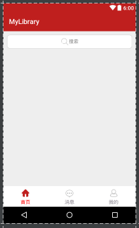
这里实现的是三个item选项,这个是可以定制的。
要实现这样一个TabBar,道理很简单,整个TabBar是一个LinearLayout(称为linearLayoutRoot),而每一个可点击选项也是LinearLayout(称为linearLayoutChild),设置每个选项的item 的权重weight为1,自然平分整个父布局。每个Item 里面包含一个ImageView 和一个TextView ,实现图片和文字上下布局只要设置item 的Orientation属性,代码设置为:linearLayoutChild.setOrientation(LinearLayout.VERTICAL)。
实现的思想如上所述,直接上代码,代码注释写的很清楚:
package com.widget;

import android.content.Context;
import android.graphics.Color;
import android.util.AttributeSet;
import android.view.Gravity;
import android.view.View;
import android.view.ViewGroup;
import android.widget.ImageView;
import android.widget.LinearLayout;
import android.widget.RelativeLayout;
import android.widget.TextView;
import com.iftech.mylibrary.R;
import com.utils.MyUtils;

/***
 * created by TangHuoSong 2017/5/27
 * description: 自定义TabBar
 * how to use:
 *      在需要使用tabBar 的布局文件XML中,加入
 *      <com.ths.widget.MyTabBar
 *          android:id="@+id/tabBar"
 *          android:layout_width="match_parent"
 *          android:layout_height="60dp"/>
 *       即可正常使用,在Activity 中监听 OnItemMenuClick 即可。
 *       tabBar的item 可以单独设置image和text,请注意:image有两种状态(iconNormal非选中状态,iconSelect选中状态)
 *          并且image 和 text 的Id 数组长度必须相同。
 *       设置文字选中和非选中状态颜色只需要分别设置selectColor 和 defaultColor即可。
 ***/
public class MyTabBar extends RelativeLayout{

    /* TabBar 的显示的标题 ,请更换成自己的*/
    private int[] textMenu = {R.string.index,R.string.message,R.string.user};

    /* TabBar 正常情况下的图标,请更换成自己的 */
    private int[] iconNormal = { R.drawable.icon_tab_index_nomal, R.drawable.icon_tab_message_nomal, R.drawable.icon_tab_user_nomal };

    /* TabBar 选中状态下的图标,请更换成自己的 */
    private int[] iconSelect = { R.drawable.icon_tab_index_selected, R.drawable.icon_tab_message_selected, R.drawable.icon_tab_user_selected };

    /* 默认情况下的字体颜色 */
    private int defaultColor = R.color.colorPrimaryDark;

    /* 选中时的文字颜色 */
    private int selectColor = R.color.colorPrimary;

    /* 全局变量,记录当前选中的Item */
    private LinearLayout selectLineLayout;
    /* 全局变量,记录当前选中Item的Tag值 */
    private int selectTag = 0;

    private OnItemMenuClickListener onItemMenuClickListener;

    public void setOnItemMenuClick(OnItemMenuClickListener onItemMenuClickListener) {
        this.onItemMenuClickListener = onItemMenuClickListener;
    }

    public MyTabBar(Context context, AttributeSet attributeSet){
        super(context,attributeSet);

        LinearLayout linearLayoutRoot = new LinearLayout(context);
        linearLayoutRoot.setLayoutParams(new ViewGroup.LayoutParams(ViewGroup.LayoutParams.MATCH_PARENT, ViewGroup.LayoutParams.MATCH_PARENT));
        linearLayoutRoot.setBackgroundColor(Color.WHITE);
        addView(linearLayoutRoot);

        /* 根据text 数组长度实例化Item 个数*/
        for(int i=0 ; i <textMenu.length;i++) {

        /* 实例化子布局 */
            final LinearLayout linearLayoutChild = new LinearLayout(context);
            linearLayoutChild.setLayoutParams(new LinearLayout.LayoutParams(ViewGroup.LayoutParams.WRAP_CONTENT, ViewGroup.LayoutParams.MATCH_PARENT,1));
            linearLayoutChild.setGravity(Gravity.CENTER);
            linearLayoutChild.setOrientation(LinearLayout.VERTICAL);
            linearLayoutChild.setWeightSum(1);
            linearLayoutChild.setTag(i);

        /* 实例化图标 */
            LinearLayout.LayoutParams lp = new LinearLayout.LayoutParams(MyUtils.dip2px(context,26),MyUtils.dip2px(context,26));
            lp.setMargins(0, 5, 0, 0);
            ImageView imageView = new ImageView(context);
            imageView.setLayoutParams(lp);
            imageView.setImageResource(iconNormal[i]);
            imageView.setTag("image_"+i);
            linearLayoutChild.addView(imageView);

        /* 实例化文字 */
            lp = new LinearLayout.LayoutParams(LinearLayout.LayoutParams.WRAP_CONTENT, LinearLayout.LayoutParams.WRAP_CONTENT);
            lp.setMargins(0, 10, 0, 0);
            TextView textView = new TextView(context);
            textView.setText(textMenu[i]);
            textView.setTextSize(14);
            textView.setTextColor(defaultColor);
            textView.setGravity(Gravity.CENTER);
            textView.setLayoutParams(lp);
            textView.setTag("text_"+i);
            linearLayoutChild.addView(textView);

        /* 点击事件监听 */
            linearLayoutChild.setOnClickListener(new OnClickListener() {
                @Override
                public void onClick(View v) {
                    setSelect(v);
                    if(onItemMenuClickListener != null){
                        onItemMenuClickListener.onThisClick((int)v.getTag());
                    }
                }
            });

            /* 将该布局添加到根布局中 */
            linearLayoutRoot.addView(linearLayoutChild);
        }

        /* 设置默认选中项,即第一项 */
        selectLineLayout = (LinearLayout) (linearLayoutRoot.findViewWithTag(selectTag));

        /* 设置选中的图片 */
        ImageView imageView = (ImageView)(selectLineLayout.findViewWithTag("image_"+selectLineLayout.getTag()));
        imageView.setImageResource(iconSelect[(int)selectLineLayout.getTag()]);

        /* 设置选中的字体颜色 */
        TextView textView = (TextView)(selectLineLayout.findViewWithTag("text_"+selectLineLayout.getTag()));
        textView.setTextColor(Color.RED);

    }

    /***
     *  设置选中和未选中状态的颜色
     * */
    private void setSelect(View view){
        if(selectTag != (int) view.getTag()){

            /* 将上一次选中的图片颜色回复为未选中状态
               设置选中的图片 */
                ImageView imageView1 = (ImageView)(selectLineLayout.findViewWithTag("image_"+selectTag));
                imageView1.setImageResource(iconNormal[selectTag]);

            /* 设置选中的字体颜色 */
                TextView textView1 = (TextView)(selectLineLayout.findViewWithTag("text_"+selectTag));
                textView1.setTextColor(getContext().getResources().getColor(defaultColor));

            /* 重置选中的Tag */
                selectTag = (int) view.getTag();

            /* 设置选中的图片 */
                ImageView imageView = (ImageView)(view.findViewWithTag("image_"+view.getTag()));
                imageView.setImageResource(iconSelect[(int)view.getTag()]);

            /* 设置选中的字体颜色 */
                TextView textView = (TextView)(view.findViewWithTag("text_"+view.getTag()));
                textView.setTextColor(getContext().getResources().getColor(selectColor));

            /* 将选择的项存入全局变量,用于下一次点击更新控件*/
                selectLineLayout = (LinearLayout) view;
        }
    }

    public interface OnItemMenuClickListener{
        void onThisClick(int eachItem);
    }
}
使用方法和一般的TextView 一样,只需要在xml中添加即可
 <com.widget.MyTabBar
        android:id="@+id/tabBar"
        android:layout_width="match_parent"
android:layout_height="60dp"/>图片中的搜索框效果在这就不做详解,下篇博客继续。最后,我将我所有自定义的控件都放入我的git 库中,欢迎大家clone。


 扫一扫
扫一扫
 880
880

 被折叠的 条评论
为什么被折叠?
被折叠的 条评论
为什么被折叠?
 到【灌水乐园】发言


