


文章目录
- text-align 属性控制文本的对齐方式
- strong 标签加粗文本
- u 标签给文本添加下划线
- em 标签强调文本
- s 标签给文本添加删除线
- hr 标签创建水平线
- background-color 背景色
- 字体设置
- box-shadow给卡片元素添加阴影
- opacity 设置元素的透明度
- text-transform 设置文本大写效果
- line-height 设置行间距(行高)
- 锚点的悬停状态
- relative相对位置
- absolute绝对定位
- fixed固定定位
- float 元素浮动
- z-index 更改重叠元素的位置
- margin 将元素水平居中
- hsl() 色相、饱和度、亮度来定义颜色
- CSS 线性渐变
- 设置背景图纹理
- 更改元素的大小
- 悬停时缩放元素
- 沿X轴倾斜元素
- 沿Y轴倾斜元素
- 新月形
- 爱心
- 动画
- 悬停动画
- 制作心跳
- 动画速度
- 动画变速曲线移动
- main 元素包裹主题内容
- article 元素包裹文章内容(section 内容组)
- header 元素
- nav 元素导航
- footer 元素底部导航
- figure 元素提高图表的可访问性
- label 元素提高表单的可访问性
- 添加日期选择器
- datetime 属性标准化时间
- accesskey 设置快捷键
- 图片自适应设备尺寸
- 高分辨率屏幕应使用图片
- 用视窗单位来做响应式排版
text-align 属性控制文本的对齐方式
text-align: justify; 可以让除最后一行之外的文字两端对齐,即每行的左右两端都紧贴行的边缘。

text-align: center; 可以让文本居中对齐。

text-align: right; 可以让文本右对齐。

text-align: left; 是默认值,它可以让文本左对齐。
strong 标签加粗文本
添加 strong 标签后,浏览器会自动给元素添加这段样式:font-weight:bold;。(粗体)
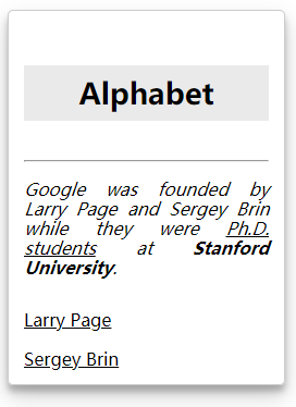
<p>Google was founded by Larry Page and Sergey Brin while they were Ph.D. students at <strong>Stanford University</strong>.</p>
使用strong标签将需要加粗的文字括起来
u 标签给文本添加下划线
添加 u 标签后,浏览器会自动给元素添加这段样式:text-decoration: underline;。
<u>Ph.D. students</u>
em 标签强调文本
使用 em 标签后。 浏览器会自动给元素应用 font-style: italic;
<em>......</em>
s 标签给文本添加删除线
添加了 s 标签后,浏览器会自动给元素添加这段样式:text-decoration: line-through;。
<s>Google</s>
hr 标签创建水平线
用 hr 标签来创建一条宽度撑满父元素的水平线。 这种水平分割线一般用来表示内容主题的改变,或在视觉上将文档分隔成几个部分。
<hr> 自闭合标签**加粗样式**
background-color 背景色
rgba 代表:
r = red 红色
g = green 绿色
b = blue 蓝色
a = alpha 透明度
alpha 值可取在 0 到 1 之间,其中 0 代表完全透明,1 代表完全不透明
字体设置
字体大小
font-size :27px
字体粗细
font-weight:800;
box-shadow给卡片元素添加阴影
由逗号分隔的一个或多个阴影列表
box-shadow 属性的阴影依次由下面这些值描述:
offset-x 阴影的水平偏移量;
offset-y 阴影的垂直偏移量;
blur-radius 模糊半径;
spread-radius 阴影扩展半径;
color
其中blur-radius 和 spread-radius 可选
box-shadow: 0 10px 20px rgba(0,0,0,0.19), 0 6px 6px rgba(0,0,0,0.23);
opacity 设置元素的透明度
属性值为 1 代表完全不透明。
属性值为 0.5 代表半透明。
属性值为 0 代表完全透明
透明度会应用到元素内的所有内容,不论是图片,还是文本,或是背景色。
opacity:0.7;
text-transform 设置文本大写效果
| 值 | 结果 |
|---|---|
| lowercase | “transform me” |
| uppercase | “TRANSFORM ME” |
| capitalize | “Transform Me” |
| initial | 使用默认值 |
| inherit | 使用父元素的 text-transform 值。 |
| none | Default:不改变文字。 |
line-height 设置行间距(行高)
line-height :25px;
锚点的悬停状态
a:hover {
  color: red;
}
鼠标悬停在a标签上时将其 color 变成红色
<a href="https://freecatphotoapp.com/" target="_blank">CatPhotoApp</a>
relative相对位置
position: relative;
指定该元素在当前文档流页面下的相对偏移量
left、right、top 和 bottom
例:向上偏移 10px
bottom: 10px;
absolute绝对定位
相对于其包含块定位。
元素的定位参照于最近的 positioned 祖先元素。 如果它的父元素没有添加定位规则(默认是 position: relative;),浏览器会继续寻找直到默认的 body 标签。
固定到它的父元素 section 的右上角。
即设定其 top 和 right 为 50 像素
position: absolute;
relative是偏移量,向上10px为bottom: 10px;
absolute的向上10px为top:10px;
fixed固定定位
特殊的绝对(absolute)定位,将元素相对于浏览器窗口定位
fixed 和 absolute 的最明显的区别在于,前者定位的元素不会随着屏幕滚动而移动
#navbar {
      position:fixed;
      top:0px;
      left:0px;
  }
 导航栏左上角对齐,且屏幕滚动,导航栏一直固定在上方
float 元素浮动
向 left 或 right 浮动,直到它的外边缘碰到包含框或另一个浮动框的边框为止
通常需要用 width 属性来指定浮动元素占据的水平空间。
    #left {
      float:left;
      width: 50%;
    }
    #right {
      float:right;
      width: 40%;
    }
    aside, section {
      padding: 2px;
      background-color: #ccc;
    }
    两个元素按两列布局,section 和 aside 左右排列。
z-index 更改重叠元素的位置
当一些元素在位置上重叠时(例如,使用 position: absolute | relative | fixed | sticky 时),在 HTML 里后出现的元素会默认显示在更早出现的元素的上面。
可以使用 z-index 属性指定元素的堆叠次序。 z-index 的取值是整数,数值大的元素会叠放到数值小的元素上面。
z-index:2;
内联元素及块元素相互转换
display:inline   块变内联
display:block;   内联变块
margin 将元素水平居中
margin:auto;
hsl() 色相、饱和度、亮度来定义颜色
色相(H)是色彩的基本属性,就是平常所说的颜色名称,如红色、黄色等。
饱和度(S)是指色彩的纯度,越高色彩越纯,低则逐渐变灰,取 0-100% 的数值。
亮度(L),取 0-100%,增加亮度,颜色会向白色变化;减少亮度,颜色会向黑色变化。
CSS 线性渐变
background: linear-gradient(gradient_direction, color 1, color 2, color 3, ...);
background: linear-gradient(35deg, #CCFFFF, #FFCCCC)
第一个参数指定了颜色过渡的方向——它的值是角度,90deg 表示垂直渐变(从左到右),45deg 表示沿对角线渐变(从左下方到右上方)。
其他参数指定了渐变颜色的顺序,从...颜色到...颜色
设置背景图纹理
background:url("https://cdn-media1.freecodecamp.org/imgr/MJAkxbh.png");
通过链接的方式引入纹理或样式的图片
更改元素的大小
transform: scale(2);
把元素放大到了原来的 2 倍
悬停时缩放元素
p:hover {
  transform: scale(2.1);
}
鼠标悬停时放大元素
沿X轴倾斜元素
p {
  transform: skewX(-32deg);
  负数顺时针倾斜,正数逆时针倾斜
}
沿Y轴倾斜元素
 transform: skewY(-10deg);
 负数顺时针倾斜,正数逆时针倾斜
新月形
background-color: transparent;
border-radius: 50%;
box-shadow: 25px 10px 10px 10px green;

爱心
<style>
  .heart {
    position: absolute;
    margin: auto;
    top: 0;
    right: 0;
    bottom: 0;
    left: 0;
    background-color: pink;
    height: 50px;
    width: 50px;
    transform: rotate(-45deg)  ;
  }
  .heart::after {
    background-color: pink;
    content: "";
    border-radius: 50%;
    position: absolute;
    width: 50px;
    height: 50px;
    top: 0px;
    left: 25px;
  }
  .heart::before {
    content: "";
    background-color: pink;
    border-radius: 50%;
    position: absolute;
    width: 50px;
    height: 50px;
    top: -25px;
    left: 0px;
  }
</style>
<div class="heart"></div>

::before 和 ::after。 伪元素可以在所选元素之前或之后添加一些内容。
::before 和 ::after 必须配合 content 来使用。 这个属性通常用来给元素添加内容诸如图片或者文字。 尽管有时 ::before 和 ::after 是用来实现形状而非文字,但 content 属性仍然是必需的,此时它的值可以是空字符串。
rotate()函数:旋转
动画
#rect {
    animation-name:rainbow;  动画名称
    animation-duration:4S   持续时间
  }
@keyframes rainbow {
  0% {
    background-color: blue;
  }
  50% {
    background-color: green;
  }
  100% {
    background-color: yellow;
  }
}
给 id 为 rect 的元素添加动画,设置其 animation-name 为 rainbow,设置其 animation-duration 为 4 秒。
然后声明 @keyframes 规则,设置动画开始时(0%)的 background-color 为蓝色,动画中间时(50%)为绿色,动画结束时(100%)为为黄色。
悬停动画
 button:hover {
    animation-name: background-color;
    animation-duration: 500ms;
    animation-fill-mode: forwards;
    指定了在动画结束时元素的样式:按钮保持高亮。
  }

 @keyframes background-color {
    100% {
      background-color: #4791d0;  悬停时颜色改变
    }
  }
从左到右淡化元素来创建视觉方向
 #ball {
    width: 70px;
    height: 70px;
    margin: 50px auto;
    position: fixed;
    left: 20%;
    border-radius: 50%;
    background: linear-gradient(
      35deg,
      #ccffff,
      #ffcccc
    );
    animation-name: fade;
    animation-duration: 3s;
  }

  @keyframes fade {
    50% {
      left: 60%;  向右平移
      opacity:0.1; 设置元素的不透明级别
    }
  }
animation-iteration-count控制动画循环的次数
animation-iteration-count: 3;  循环次数
如果想让动画一直运行,可以把值设置成 infinite
制作心跳
<style>
  .back {
    position: fixed;
    padding: 0;
    margin: 0;
    top: 0;
    left: 0;
    width: 100%;
    height: 100%;
    background: white;
    animation-name: backdiv;
    animation-duration: 1s;
    animation-iteration-count:infinite;
  }

  .heart {
    position: absolute;
    margin: auto;
    top: 0;
    right: 0;
    bottom: 0;
    left: 0;
    background-color: pink;
    height: 50px;
    width: 50px;
    transform: rotate(-45deg);
    animation-name: beat;
    animation-duration: 1s;
    animation-iteration-count:infinite;
  }
  .heart:after {
    background-color: pink;
    content: "";
    border-radius: 50%;
    position: absolute;
    width: 50px;
    height: 50px;
    top: 0px;
    left: 25px;
  }
  .heart:before {
    background-color: pink;
    content: "";
    border-radius: 50%;
    position: absolute;
    width: 50px;
    height: 50px;
    top: -25px;
    left: 0px;
  }

  @keyframes backdiv {
    50% {
      background: #ffe6f2;
    }
  }

  @keyframes beat {
    0% {
      transform: scale(1) rotate(-45deg);
    }
    50% {
      transform: scale(0.6) rotate(-45deg);
    }
  }

</style>
<div class="back"></div>
<div class="heart"></div>
动画速度
animation-timing-function:linear;
默认值是 ease,动画以低速开始,然后加快,在结束前变慢。
ease-out:动画以高速开始,以低速结束;
ease-in,动画以低速开始,以高速结束;
linear:动画从头到尾的速度是相同的。
动画变速曲线移动
animation-timing-function:cubic-bezier(1,1,0,0);
main 元素包裹主题内容
main 标签用于呈现网页的主体内容,且每个页面应只有一个。 这是为了围绕与页面中心主题相关的信息, 而不应包含如导航连接、网页横幅等需要在多个页面中重复出现的内容。
main 标签也有一个内嵌的特性,以便辅助技术快速定位到页面的主体。 如果你在页面顶部看到过“跳转到主要内容”链接,那么使用 main 标签会自动让辅助设备具有这个跳转的功能。
article 元素包裹文章内容(section 内容组)
article 是另一个具有语义化特性的 HTML5 新标签。 article 是一个分段标签,用于呈现独立及完整的内容。 这个标签适用于博客、论坛帖子或者新闻文章。
注意:section 元素也是 HTML5 引入的新元素,其语义与 article 略有不同。 article 用于独立且完整的内容,而 section 用于对与主题相关的内容进行分组。 它们可以根据需要来嵌套使用。
举个例子:如果一本书是一个 article 的话,那么每个章节就是 section。 当内容组之间没有联系时,我们可以使用 div。
<div> - 一组内容 <section> - 几组相关的内容 <article> - 几组独立的内容
header 元素
header 可以为父级标签呈现简介信息或者导航链接,适用于那些在多个页面顶部重复出现的内容。
注意:header 应当在 HTML 文档的 body 标签内使用。 它与包含页面标题、元信息的 head 标签不同。
nav 元素导航
用于呈现页面中的主导航链接
<nav>
<ul>
<li><a href="#stealth">Stealth & Agility</a></li>
<li><a href="#combat">Combat</a></li>
<li><a href="#weapons">Weapons</a></li>
</ul>
</nav>
footer 元素底部导航
位于页面底部,用于呈现版权信息或者相关文档链接。
figure 元素提高图表的可访问性
<figure>
  <img src="roundhouseDestruction.jpeg" alt="Photo of Camper Cat executing a roundhouse kick">
  <br>
  <figcaption>  图表标题
    Master Camper Cat demonstrates proper form of a roundhouse kick.
  </figcaption>
</figure>
label 元素提高表单的可访问性
label 标签的文本内容通常会是表单组件的名称或标签。 这些文本表明了组件的意义,也提升了表单的可访问性。 label 标签的 for 属性将标签与表单组件绑定。
<form>
  <label for="name">Name:</label>
  <input type="text" id="name" name="name">
</form>
for 的属性值必须与表单组件的 id 属性值相同
fieldset 元素包裹单选按钮
<form>
  <fieldset>
    <legend>Choose one of these three items:</legend>
    <input id="one" type="radio" name="items" value="one">
    <label for="one">Choice One</label><br>
    <input id="two" type="radio" name="items" value="two">
    <label for="two">Choice Two</label><br>
    <input id="three" type="radio" name="items" value="three">
    <label for="three">Choice Three</label>
  </fieldset>
</form>
添加日期选择器
<label for="input1">Enter a date:</label>
<input type="date" id="input1" name="input1">
datetime 属性标准化时间
<p>Master<time datetime="2013-02-13">last Wednesday</time>, which ended in a draw.</p>
time 元素是一个行内元素,用于在一个页面上显示日期或时间
datetime 属性包含的有效格式,辅助设备获取这个值。 避免混乱
accesskey 设置快捷键
tabindex 键盘焦点(tab 键)
<div tabindex="0">I need keyboard focus!</div>
medis媒体查询,视口随设备改变
当设备宽度小于或等于 100px 时返回内容:
@media (max-width: 100px) { /* CSS Rules */ }
当设备高度大于或等于 350px 时返回内容:
@media (min-height: 350px) { /* CSS Rules */ }
当设备的高度小于等于 800px 时,p 标签的 font-size 为 10px
@media (max-height: 800px){
    p{
      font-size :10px
    }
}
图片自适应设备尺寸
img {
  max-width: 100%;
  height: auto;
  width: auto;
}
响应式的图片
设置 max-width 值为 100% 可确保图片不超出父容器的范围;设置 height,width 属性为 auto 可以保持图片的原始宽高比
高分辨率屏幕应使用图片
让图像正确出现在高分辨率显示器上的最简单方式, 是定义它们的 width 和 height 值为原始值的一半。
用视窗单位来做响应式排版
视窗单位和百分比都是相对单位,但它们是基于不同的参照物。 视窗单位是相对于设备的视窗尺寸(宽度或高度),百分比是相对于父级元素的大小。
四个不同的视窗单位分别是:
- vw:如 10vw 的意思是视窗宽度的 10%。
- vh: 如 3vh 的意思是视窗高度的 3%。
- vmin: 如 70vmin 的意思是视窗的高度和宽度中较小一个的 70%。
- vmax: 如 100vmax 的意思是视窗的高度和宽度中较大一个的 100%。
body { width: 30vw; }


 668
668


 被折叠的 条评论
为什么被折叠?
被折叠的 条评论
为什么被折叠?
 到【灌水乐园】发言


