


 本文介绍如何在Android中创建自定义进度条控件,包括圆形、弧形和矩形三种样式,并提供具体实现代码及使用示例。
Android中给我们提供了多个样式的ProgressBar,SeekBar,RatingBaar等进度条,但是我们这些样式都满足不了我们的要求,这时我们就可以使用自定义View来定义我们自己想要的形式的进度条。
这里讲解三种样式的进度条,由于博主还米有学习过动画,所以这里不添加动画效果。想要学习自定义控件的可以先参考这篇文章>《Android 自定义View——自定义View控件 》。
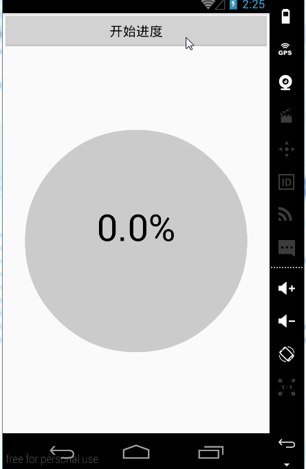
形式一
效果:
控件的定义
1. 定义一个MyProgressCircle的类继承View类。
2. 定义一个MyProgressCircle(Context context, AttributeSet attrs)的构造器。
3. 重写其onMesure和onDraw方法。
4. 在onDraw方法中绘制进度条。
以上是自定义控件的基本步骤,我们先看代码,然后逐步讲解:
public class MyProgressCircle extends View {
    private int width;//设置高
    private int height;//设置高
    //设置画笔
    private Paint mPaintBackground;
    private Paint mPaintCurrent;
    private Paint mPaintText;

    //设置进度
    private int maxProgress=100;
    private int currentProgress=0;

    public int getMaxProgress() {
        return maxProgress;
    }
    public void setMaxProgress(int maxProgress) {
        this.maxProgress = maxProgress;
    }

    public int getCurrentProgress() {
        return currentProgress;
    }
    public void setCurrentProgress(int currentProgress) {
        this.currentProgress = currentProgress;
        invalidate();//实时更新进度
    }

    public MyProgressCircle(Context context, AttributeSet attrs) {
        super(context, attrs);
        //绘制未下载时背景圆的画笔
        mPaintBackground = new Paint();
        mPaintBackground.setAntiAlias(true);
        mPaintBackground.setColor(Color.LTGRAY);
        //绘制下载时显示进度圆的画笔
        mPaintCurrent = new Paint();
        mPaintCurrent.setAntiAlias(true);
        mPaintCurrent.setColor(Color.GRAY);
        //绘制显示下载进度文字的画笔
        mPaintText = new Paint();
        mPaintText.setAntiAlias(true);
        mPaintText.setColor(Color.BLACK);
        mPaintText.setTextAlign(Paint.Align.CENTER);
        mPaintText.setTextSize(100);
    }

    public MyProgressCircle(Context context) {
        super(context);
    }
    @Override
    protected void onMeasure(int widthMeasureSpec, int heightMeasureSpec) {
        super.onMeasure(widthMeasureSpec, heightMeasureSpec);
        super.onMeasure(widthMeasureSpec, heightMeasureSpec);
        width = getDefaultSize(getSuggestedMinimumWidth(), widthMeasureSpec);
        height = getDefaultSize(getSuggestedMinimumHeight(), heightMeasureSpec);
        setMeasuredDimension(width, height);//设置宽和高
    }
    @Override
    protected void onDraw(Canvas canvas) {
        super.onDraw(canvas);

        canvas.drawCircle(width / 2, height / 2, 300, mPaintBackground);
        canvas.drawCircle(width/2, height/2, currentProgress*300f/maxProgress, mPaintCurrent);
        canvas.drawText(currentProgress*100f/maxProgress+"%", width/2, height/2, mPaintText);
    }
}
这里就只是绘制了两个圆形,但是这两个圆形是有联系的。背景圆代表的进度的最大值,当前圆是代表的是当前的进度。当当前进度改变时,当前圆也是要变化的,我们从刚才的效果中可以看到当前圆变化的是半径,所以我们在绘制时,将其半径设置为:currentProgress*300f/maxProgress。这个应该是比较好理解的。
控件的使用
然后我们在Activity中使用一下,模拟下载。
1. 在布局中定义添加控件。
<LinearLayout xmlns:android="http://schemas.android.com/apk/res/android"
    xmlns:tools="http://schemas.android.com/tools"
    android:layout_width="match_parent"
    android:layout_height="match_parent"
    android:orientation="vertical"
    tools:context=".MainActivity">

    <Button
        android:id="@+id/button_start"
        android:layout_width="match_parent"
        android:layout_height="wrap_content"
        android:text="开始进度"/>
    <com.example.administrator.mywidgetdemo.widget.MyProgressCircle
        android:id="@+id/myprogress"
        android:layout_width="match_parent"
        android:layout_height="match_parent" />
</LinearLayout>- 在Activity使用通过点击按钮开始下载。
public class MainActivity extends Activity {
private MyProgressCircle myProgressCircle;
private Button mButtonStart;
private static final int PROGRESS_ONE = 0X0001;
//定义一个进度
private int progress;
private Handler handler = new Handler() {
@Override
public void handleMessage(Message msg) {
super.handleMessage(msg);
switch (msg.what) {
case PROGRESS_ONE:
progress++;
if(progress<=100){
myProgressCircle.setCurrentProgress(progress);
sendEmptyMessageDelayed(PROGRESS_ONE, 100);
}
break;
}
}
};
@Override
protected void onCreate(Bundle savedInstanceState) {
super.onCreate(savedInstanceState);
setContentView(R.layout.activity_main);
mButtonStart = (Button) findViewById(R.id.button_start);
//获取控件的对象
myProgressCircle = (MyProgressCircle) findViewById(R.id.myprogress);
mButtonStart.setOnClickListener(new View.OnClickListener() {
@Override
public void onClick(View v) {
handler.sendEmptyMessageDelayed(PROGRESS_ONE, 1000);
}
});
}
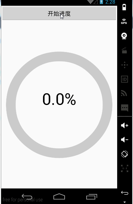
}形式二
效果:
控件的定义
1. 定义一个MyProgressCircle的类继承View类。
2. 定义一个MyProgressCircle(Context context, AttributeSet attrs)的构造器。
3. 重写其onMesure和onDraw方法。
4. 在onDraw方法中绘制进度条。
以上是自定义控件的基本步骤,我们先看代码,然后逐步讲解:
public class MyProgressArc extends View {
    private int width;//设置高
    private int height;//设置高
    //设置画笔
    private Paint mPaintBackground;
    private Paint mPaintCurrent;
    private Paint mPaintText;
    //设置进度
    private int maxProgress=100;
    private int currentProgress=0;

    public int getMaxProgress() {
        return maxProgress;
    }
    public void setMaxProgress(int maxProgress) {
        this.maxProgress = maxProgress;
    }

    public int getCurrentProgress() {
        return currentProgress;
    }
    public void setCurrentProgress(int currentProgress) {
        this.currentProgress = currentProgress;
        invalidate();//实时更新进度
    }

    public MyProgressArc(Context context) {
        super(context);
    }

    public MyProgressArc(Context context, AttributeSet attrs) {
        super(context, attrs);
        mPaintBackground = new Paint();
        mPaintBackground.setAntiAlias(true);
        mPaintBackground.setStyle(Paint.Style.STROKE);
        mPaintBackground.setColor(Color.LTGRAY);
        mPaintBackground.setStrokeWidth(60);

        mPaintCurrent = new Paint();
        mPaintCurrent.setAntiAlias(true);
        mPaintCurrent.setStyle(Paint.Style.STROKE);
        mPaintCurrent.setColor(Color.GRAY);
        mPaintCurrent.setStrokeWidth(60);

        mPaintText = new Paint();
        mPaintText.setAntiAlias(true);
        mPaintText.setColor(Color.BLACK);
        mPaintText.setTextAlign(Paint.Align.CENTER);
        mPaintText.setTextSize(100);
    }

    @Override
    protected void onMeasure(int widthMeasureSpec, int heightMeasureSpec) {
        super.onMeasure(widthMeasureSpec, heightMeasureSpec);
        width = getDefaultSize(getSuggestedMinimumWidth(), widthMeasureSpec);
        height = getDefaultSize(getSuggestedMinimumHeight(), heightMeasureSpec);
        setMeasuredDimension(width, height);//设置宽和高
    }

    @Override
    protected void onDraw(Canvas canvas) {
        super.onDraw(canvas);
        RectF rect = new RectF(width/2-300, height/2-300, width/2+300, height/2+300);
        canvas.drawArc(rect,currentProgress*360f/maxProgress,360f-currentProgress*360f/maxProgress, false,  mPaintBackground);
        canvas.drawArc(rect, 0,currentProgress*360f/maxProgress, false,  mPaintCurrent);
        canvas.drawText(currentProgress*100f/maxProgress+"%", width/2, height/2, mPaintText);
    }
}
这里就只是绘制了两个椭圆,但是这两个椭圆是有联系的。背景椭圆代表的进度的最大值,当前椭圆是代表的是当前的进度。当当前进度改变时,当前椭圆也是要变化的,我们从刚才的效果中可以看到椭圆变化的是旋转的角度。背景椭圆的角度在不断的减小,减小的数量是currentProgress*360f/maxProgress,基数是360度,当前椭圆角度在不断增大,增大的角度是currentProgress*360f/maxProgress,基数是0度。
控件的使用
然后我们在Activity中使用一下,模拟下载。
1. 在布局中定义添加控件。
<LinearLayout xmlns:android="http://schemas.android.com/apk/res/android"
    xmlns:tools="http://schemas.android.com/tools"
    android:layout_width="match_parent"
    android:layout_height="match_parent"
    android:orientation="vertical"
    tools:context=".MainActivity">

    <Button
        android:id="@+id/button_start"
        android:layout_width="match_parent"
        android:layout_height="wrap_content"
        android:text="开始进度"/>
    <com.example.administrator.mywidgetdemo.widget.MyProgressArc
        android:id="@+id/myprogress"
        android:layout_width="match_parent"
        android:layout_height="match_parent" />
</LinearLayout>- 在Activity使用通过点击按钮开始下载。
public class MainActivity extends Activity {
private MyProgressArc myProgressArc;
private Button mButtonStart;
private static final int PROGRESS_TWO = 0X0002;
//定义一个进度
private int progress;
private Handler handler = new Handler() {
@Override
public void handleMessage(Message msg) {
super.handleMessage(msg);
switch (msg.what) {
case PROGRESS_TWO:
progress++;
if(progress<=100){
myProgressArc.setCurrentProgress(progress);
sendEmptyMessageDelayed(PROGRESS_TWO, 100);
}
break;
}
}
};
@Override
protected void onCreate(Bundle savedInstanceState) {
super.onCreate(savedInstanceState);
setContentView(R.layout.activity_main);
mButtonStart = (Button) findViewById(R.id.button_start);
myProgressArc = (MyProgressArc) findViewById(R.id.myprogress);
mButtonStart.setOnClickListener(new View.OnClickListener() {
@Override
public void onClick(View v) {
handler.sendEmptyMessageDelayed(PROGRESS_TWO, 1000);
}
});
}
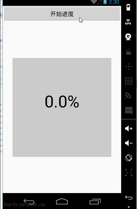
}形式三
效果:
控件的定义
1. 定义一个MyProgressCircle的类继承View类。
2. 定义一个MyProgressCircle(Context context, AttributeSet attrs)的构造器。
3. 重写其onMesure和onDraw方法。
4. 在onDraw方法中绘制进度条。
以上是自定义控件的基本步骤,我们先看代码,然后逐步讲解:
public class MyProgressRect extends View {
    private int width;//设置高
    private int height;//设置高
    //设置画笔
    private Paint mPaintBackground;
    private Paint mPaintCurrent;
    private Paint mPaintText;
    //设置进度
    private int maxProgress = 100;
    private int currentProgress = 0;
    private float currentProgressHeight;

    public int getMaxProgress() {
        return maxProgress;
    }

    public void setMaxProgress(int maxProgress) {
        this.maxProgress = maxProgress;
    }

    public int getCurrentProgress() {
        return currentProgress;
    }

    public void setCurrentProgress(int currentProgress) {
        this.currentProgress = currentProgress;
        invalidate();//实时更新进度
    }


    public MyProgressRect(Context context) {
        super(context);
    }

    public MyProgressRect(Context context, AttributeSet attrs) {
        super(context, attrs);
        mPaintBackground = new Paint();
        mPaintBackground.setAntiAlias(true);
        mPaintBackground.setStyle(Paint.Style.FILL);
        mPaintBackground.setColor(Color.LTGRAY);
        mPaintBackground.setStrokeWidth(60);

        mPaintCurrent = new Paint();
        mPaintCurrent.setAntiAlias(true);
        mPaintCurrent.setStyle(Paint.Style.FILL);
        mPaintCurrent.setColor(Color.GRAY);
        mPaintCurrent.setStrokeWidth(60);

        mPaintText = new Paint();
        mPaintText.setAntiAlias(true);
        mPaintText.setColor(Color.BLACK);
        mPaintText.setTextAlign(Paint.Align.CENTER);
        mPaintText.setTextSize(100);

    }

    @Override
    protected void onMeasure(int widthMeasureSpec, int heightMeasureSpec) {
        super.onMeasure(widthMeasureSpec, heightMeasureSpec);
        width = getDefaultSize(getSuggestedMinimumWidth(), widthMeasureSpec);
        height = getDefaultSize(getSuggestedMinimumHeight(), heightMeasureSpec);
        setMeasuredDimension(width, height);//设置宽和高
    }

    @Override
    protected void onDraw(Canvas canvas) {

        //定义水柱的高度。
        currentProgressHeight = currentProgress*600f/ maxProgress;

        super.onDraw(canvas);
        canvas.drawRect(width / 2 - 300, height / 2 - 300, width / 2 + 300,(height / 2 + 300) - (currentProgressHeight), mPaintBackground);

        canvas.drawRect(width / 2 - 300, (height / 2 + 300) - (currentProgressHeight), width / 2 + 300, height / 2 + 300, mPaintCurrent);

        canvas.drawText(currentProgress * 100f / maxProgress + "%", width / 2, height / 2, mPaintText);
    }
}
这里就只是绘制了两个矩形,但是这两个矩形是有联系的。背景矩形代表的进度的最大值,当前矩形是代表的是当前的进度。当当前进度改变时,当前矩形和背景矩形也要变化的,我们从刚才的效果中可以看到变化的是高度。背景矩形的高度在不断的减小,当前矩形的高度在不断地增大,变化数都是currentProgressHeight,值为currentProgress*600f/ maxProgress。
控件的使用
然后我们在Activity中使用一下,模拟下载。
1. 在布局中定义添加控件。
<LinearLayout xmlns:android="http://schemas.android.com/apk/res/android"
    xmlns:tools="http://schemas.android.com/tools"
    android:layout_width="match_parent"
    android:layout_height="match_parent"
    android:orientation="vertical"
    tools:context=".MainActivity">

    <Button
        android:id="@+id/button_start"
        android:layout_width="match_parent"
        android:layout_height="wrap_content"
        android:text="开始进度"/>
    <com.example.administrator.mywidgetdemo.widget.MyProgressRect
        android:id="@+id/myprogress"
        android:layout_width="match_parent"
        android:layout_height="match_parent" />
</LinearLayout>- 在Activity使用通过点击按钮开始下载。
public class MainActivity extends Activity {
    private MyProgressRect myProgressRect;
    private Button mButtonStart;
    private static final int PROGRESS_RECT = 0X0003;
    //定义一个进度
    private int progress;
    private Handler handler = new Handler() {
        @Override
        public void handleMessage(Message msg) {
            super.handleMessage(msg);
            switch (msg.what) {
                case PROGRESS_RECT:
                    progress++;
                    if (progress <= 100) {
                        myProgressRect.setCurrentProgress(progress);
                        sendEmptyMessageDelayed(PROGRESS_RECT, 100);
                    }
                    break;
            }
        }
    };

    @Override
    protected void onCreate(Bundle savedInstanceState) {
        super.onCreate(savedInstanceState);
        setContentView(R.layout.activity_main);
        mButtonStart = (Button) findViewById(R.id.button_start);
        myProgressRect = (MyProgressRect) findViewById(R.id.myprogress);
        mButtonStart.setOnClickListener(new View.OnClickListener() {
            @Override
            public void onClick(View v) {
                handler.sendEmptyMessageDelayed(PROGRESS_RECT, 1000);
            }
        });
    }
}


 扫一扫
扫一扫


 2191
2191

 被折叠的 条评论
为什么被折叠?
被折叠的 条评论
为什么被折叠?
 到【灌水乐园】发言


