


文章目录
一、线性布局
1.Column
-
Column中的主轴方向是垂直方向
-
mainAxisAlignment:MainAxisAlignment-主轴对齐方向
-
crossAxisAlignment:CrossAxisAlignment-交叉轴对齐方向
-
children:内容
2.Row
- Row中的主轴方向是水平方向(其他属性与cross一致)
3.代码
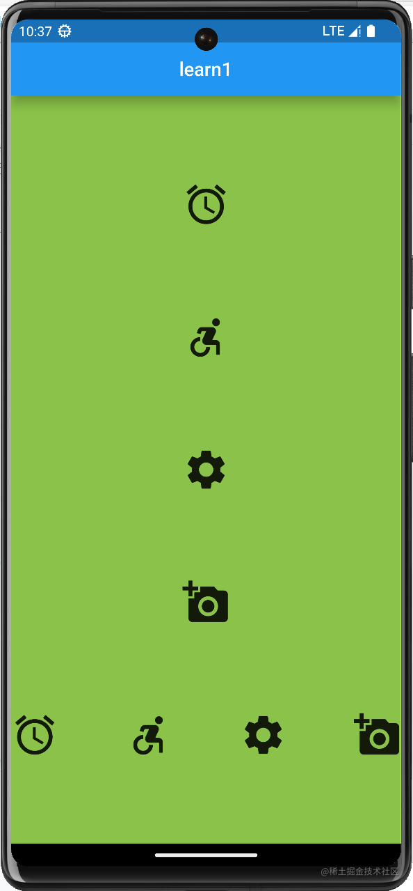
class ColumnRowDemo extends StatelessWidget {
  const ColumnRowDemo({Key? key}) : super(key: key);

  @override
  Widget build(BuildContext context) {
    return Container(
      color: Colors.lightGreen,
      width: double.infinity,
      child: Column(
        mainAxisAlignment: MainAxisAlignment.spaceEvenly,
        crossAxisAlignment: CrossAxisAlignment.center,
        children: [
          Icon(Icons.access_alarm,size: 50),
          Icon(Icons.accessible_forward,size: 50),
          Icon(Icons.settings,size: 50),
          Icon(Icons.add_a_photo,size: 50),
          Row(
            mainAxisAlignment: MainAxisAlignment.spaceBetween,
            children: [
              Icon(Icons.access_alarm,size: 50),
              Icon(Icons.accessible_forward,size: 50),
              Icon(Icons.settings,size: 50),
              Icon(Icons.add_a_photo,size: 50),
            ],
          )
        ],
      ),
    );
  }
}
4.效果
二、弹性布局
1.Flex
-
direction(声明主轴方向)
-
mainAxisAlignment(声明主轴对齐方向)
-
textDirection(声明水平方向的排列顺序)
-
crossAxisAlignment(声明交叉方向轴对齐方式)
-
verticalDirection(声明垂直方向的排列顺序)
-
children(声明子组件)
2.Expanded(可伸缩组件)
- flex(声明弹性布局所占比例)
- child(声明子组件)
3.代码
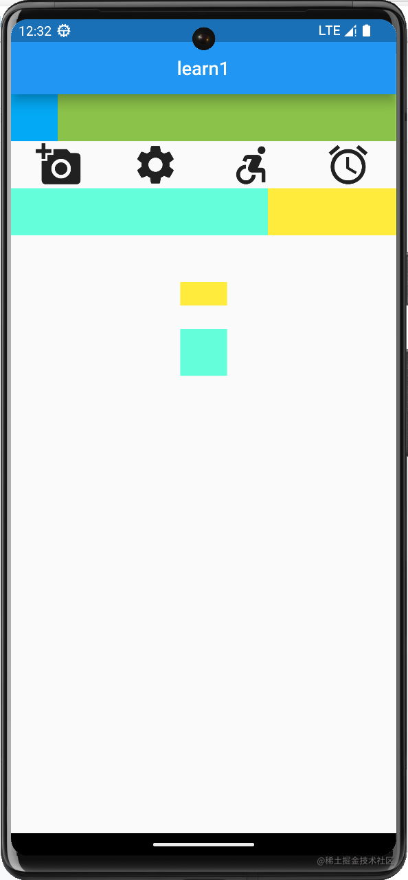
class FlexDemo extends StatelessWidget {
  const FlexDemo({Key? key}) : super(key: key);

  @override
  Widget build(BuildContext context) {
    return Column(
      children: [
        Row(
          children: [
            Container(
              color: Colors.lightBlue,
              height: 50,
              width: 50,
            ),
            Expanded(
              child: Container(
                color: Colors.lightGreen,
                height: 50,
              ),
            )
          ],
        ),
        Flex(
          direction: Axis.horizontal,
          mainAxisAlignment: MainAxisAlignment.spaceAround,
          textDirection: TextDirection.rtl,
          children: [
            Icon(Icons.access_alarm, size: 50),
            Icon(Icons.accessible_forward, size: 50),
            Icon(Icons.settings, size: 50),
            Icon(Icons.add_a_photo, size: 50),
          ],
        ),
        Flex(
          direction: Axis.horizontal,
          children: [
            Expanded(
              child: Container(
                color: Colors.tealAccent,
                height: 50,
                width: 50,
              ),
              flex: 2,
            ),
            Expanded(
              child: Container(
                color: Colors.yellow,
                height: 50,
                width: 50,
              ),
              flex: 1,
            )
          ],
        ),
        Container(
            height: 100,
            margin: EdgeInsets.all(50),
            child: Flex(
              direction: Axis.vertical,
              verticalDirection: VerticalDirection.up,
              children: [
                Expanded(
                  child: Container(
                    color: Colors.tealAccent,
                    height: 50,
                    width: 50,
                  ),
                  flex: 2,
                ),
                Spacer(
                  flex: 1,
                ),
                Expanded(
                  child: Container(
                    color: Colors.yellow,
                    height: 50,
                    width: 50,
                  ),
                  flex: 1,
                )
              ],
            ),
        )
      ],
    );
  }
}
4.效果
三、流式布局
1.Wrap(解决内容溢出问题)
-
spacing (主轴方向子组件的间距)
-
runSpacing (纵轴方向子组件的间距)
-
alignment (主轴方向子组件的对齐方式)
-
runAlignment (纵轴方向子组件的对齐方式)
2.Chip(标签)
3.CircleAvatar(圆形头像)
4.代码
class WrapDemo extends StatelessWidget {
  List<String> _list=[
    '曹操','司马懿','曹仁','曹洪','张辽','许褚'
  ];

  List<Widget> _weiGuo(){
    return _list.map((item) => Chip(
      avatar: CircleAvatar(
        backgroundColor: Colors.red,
        child: Text('魏'),
      ),
      label: Text(item),
    )).toList();
  }

  @override
  Widget build(BuildContext context) {
    return Column(
      mainAxisAlignment: MainAxisAlignment.spaceEvenly,
      children: [
        Wrap(
          children: _weiGuo(),
          spacing: 18.0,
          runSpacing: 100,
          alignment: WrapAlignment.spaceAround,
          runAlignment: WrapAlignment.spaceAround,
        ),
        Wrap(
          children: [
            Chip(
              avatar: CircleAvatar(
                backgroundColor: Colors.blue,
                child: Text('蜀'),
              ),
              label: Text('刘备'),
            ),
            Chip(
              avatar: CircleAvatar(
                backgroundColor: Colors.blue,
                child: Text('蜀'),
              ),
              label: Text('关羽'),
            ),
            Chip(
              avatar: CircleAvatar(
                backgroundColor: Colors.blue,
                child: Text('蜀'),
              ),
              label: Text('张飞'),
            ),
            Chip(
              avatar: CircleAvatar(
                backgroundColor: Colors.blue,
                child: Text('蜀'),
              ),
              label: Text('赵云'),
            ),
            Chip(
              avatar: CircleAvatar(
                backgroundColor: Colors.blue,
                child: Text('蜀'),
              ),
              label: Text('诸葛亮'),
            ),
            Chip(
              avatar: CircleAvatar(
                backgroundColor: Colors.blue,
                child: Text('蜀'),
              ),
              label: Text('黄忠'),
            ),
          ],
        )
      ],
    );
  }
}
5.效果
四、层叠布局
1.Stack(层叠组件)
- alignment(声明未定位子组件的对齐方式)
- textDirection(声明未定位子组件的排列顺序)
2.Positioned(绝对定位组件)
- child(声明子组件)
- left、top、right、bottom
- width、height
3.NetworkImage(网络图片组件)
- NetworkImage(‘图片地址’)
4.代码
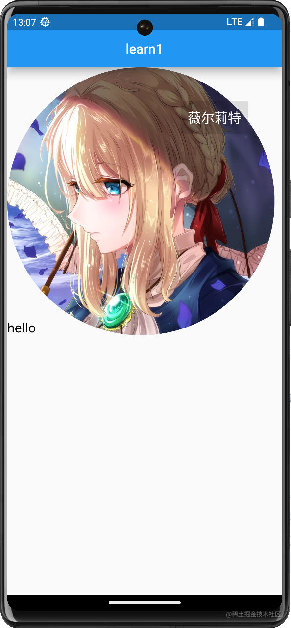
class Stackdemo extends StatelessWidget {
  const Stackdemo({Key? key}) : super(key: key);

  @override
  Widget build(BuildContext context) {
    return Container(
      child: Stack(
        textDirection: TextDirection.rtl,
        alignment: AlignmentDirectional.bottomEnd,
        children: [
          CircleAvatar(
            backgroundImage: NetworkImage('https://s1.ax1x.com/2022/10/31/xTY0Bt.jpg'),
            radius: 200,
          ),
          Positioned(
            child: Container(
              color: Colors.black12,
              padding: EdgeInsets.all(10),
              child: Text(
                '薇尔莉特',
                style: TextStyle(
                  color: Colors.white,
                  fontSize: 20
                ),
              ),
            ),
            top: 50,
            right: 40,
          ),
          Text(
            'hello',
            style: TextStyle(
                color: Colors.black,
                fontSize: 20
            ),
          ),
        ],
      ),
    );
  }
}
5.效果
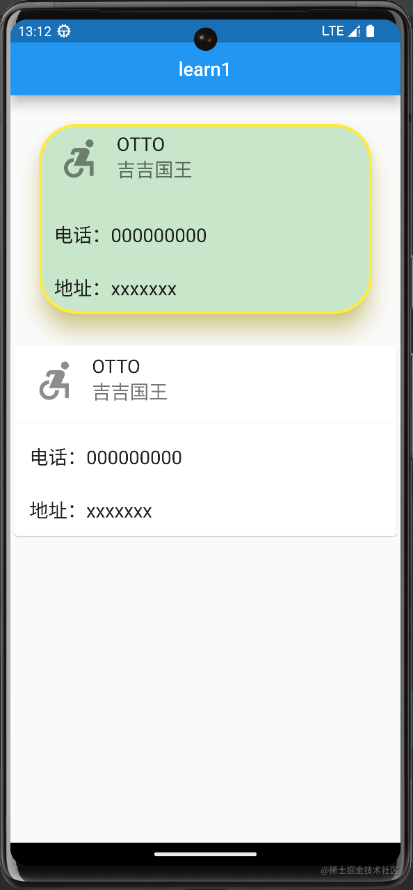
五、Card
1.Card(卡片)
- child(子组件)
- color(背景色)
- shadowColor(阴影色)
- elevation(阴影高度)
- shape(边框样式)
- margin(外边距)
2.ListTile(列表瓦片)
- leading(头部组件)
- title(标题)
- subtitle(子标题)
3.代码
class CartDemo extends StatelessWidget {
  const CartDemo({Key? key}) : super(key: key);

  @override
  Widget build(BuildContext context) {
    return Column(
      children: [
        Card(
          margin: EdgeInsets.all(30),
          color: Colors.green[100],
          shadowColor: Colors.yellow,
          elevation: 20,
          shape: RoundedRectangleBorder(
              borderRadius: BorderRadius.circular(40),
              side: BorderSide(
                color: Colors.yellow,
                width: 3,
              )
          ),
          child: Column(
            children: const [
              ListTile(
                leading: Icon(
                  Icons.accessible_forward_sharp,
                  size: 50,
                ),
                title: Text(
                  "OTTO",
                  style: TextStyle(fontSize: 20),
                ),
                subtitle: Text(
                  "吉吉国王",
                  style: TextStyle(fontSize: 20),
                ),
              ),
              Divider(),
              ListTile(
                title: Text(
                  "电话:000000000",
                  style: TextStyle(
                      fontSize: 20
                  ),
                ),
              ),
              ListTile(
                title: Text(
                  "地址:xxxxxxx",
                  style: TextStyle(
                      fontSize: 20
                  ),
                ),
              )
            ],
          ),
        ),
        Card(child: Column(
          children: const [
            ListTile(
              leading: Icon(
                Icons.accessible_forward_sharp,
                size: 50,
              ),
              title: Text(
                "OTTO",
                style: TextStyle(fontSize: 20),
              ),
              subtitle: Text(
                "吉吉国王",
                style: TextStyle(fontSize: 20),
              ),
            ),
            Divider(),
            ListTile(
              title: Text(
                "电话:000000000",
                style: TextStyle(
                    fontSize: 20
                ),
              ),
            ),
            ListTile(
              title: Text(
                "地址:xxxxxxx",
                style: TextStyle(
                    fontSize: 20
                ),
              ),
            )
          ],
        ),)
      ],
    );
  }
}
4.效果


 1156
1156


 被折叠的 条评论
为什么被折叠?
被折叠的 条评论
为什么被折叠?
 到【灌水乐园】发言


