一、Switch
1.Switch
- value(开关的值,一般与状态字段绑定)
- onChanged(开关状态变更时调用)
- activeColor(开关开启时的圆圈颜色)
- activeTrackColor(开关开启时的轨道颜色)
- inactiveThumbColor(开关关闭时的圆圈颜色)
- inactiveTrackColor(开关关闭时的轨道颜色)
2.CupertinoSwitch
- import’package:flutter/cupertino.dart’
3.代码
class SwitchDemo extends StatefulWidget {
const SwitchDemo({Key? key}) : super(key: key);
@override
State<SwitchDemo> createState() => _SwitchDemoState();
}
class _SwitchDemoState extends State<SwitchDemo> {
bool _switchValue = false;
@override
Widget build(BuildContext context) {
return Container(
child: ListView(
children: [
ListTile(
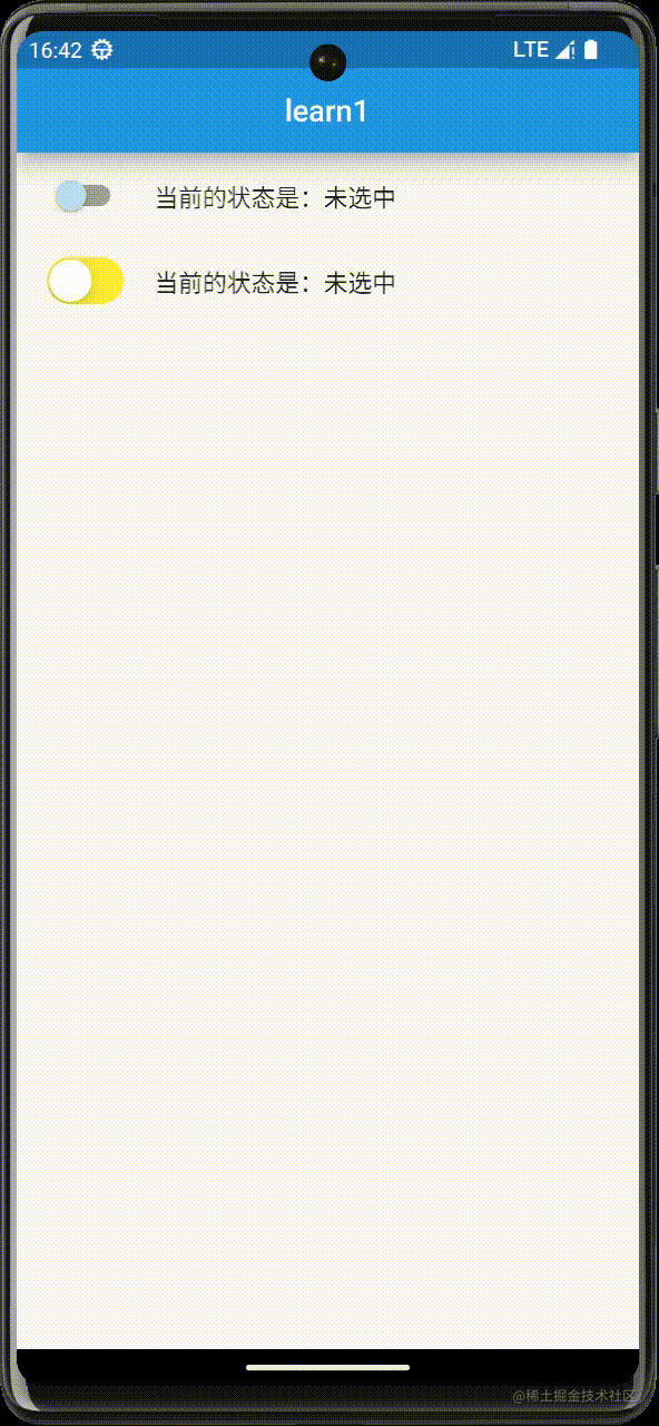
leading: Switch(
value: _switchValue,
onChanged: (bool val) {
setState(() {
_switchValue = val;
});
},
activeColor: Colors.orange,
activeTrackColor: Colors.pink,
inactiveTrackColor: Colors.grey,
inactiveThumbColor: Colors.blue[100],
),
title: Text('当前的状态是:${_switchValue == true ? "选中" : "未选中"}'),
),
ListTile(
leading: CupertinoSwitch(
value: _switchValue,
onChanged: (bool val) {
setState(() {
_switchValue = val;
});
},
activeColor: Colors.red,
trackColor: Colors.yellow,
),
title: Text('当前的状态是:${_switchValue == true ? "选中" : "未选中"}'),
)
],
),
);
}
}
4.效果
二、Checkbox
1.Checkbox
- value(复选框的值)
- onChanged(复选框状态更改时调用)
- activeColor(选中时,复选框背景的颜色)
- checkColor(选中时,复选框中对号的颜色)
2.CheckboxListTitle
3.代码
class CheckboxDemo extends StatefulWidget {
const CheckboxDemo({Key? key}) : super(key: key);
@override
State<CheckboxDemo> createState() => _CheckboxDemoState();
}
class _CheckboxDemoState extends State<CheckboxDemo> {
bool _male = true;
bool _female = false;
bool _val1 = true;
bool _val2 = false;
@override
Widget build(BuildContext context) {
return Column(
children: [
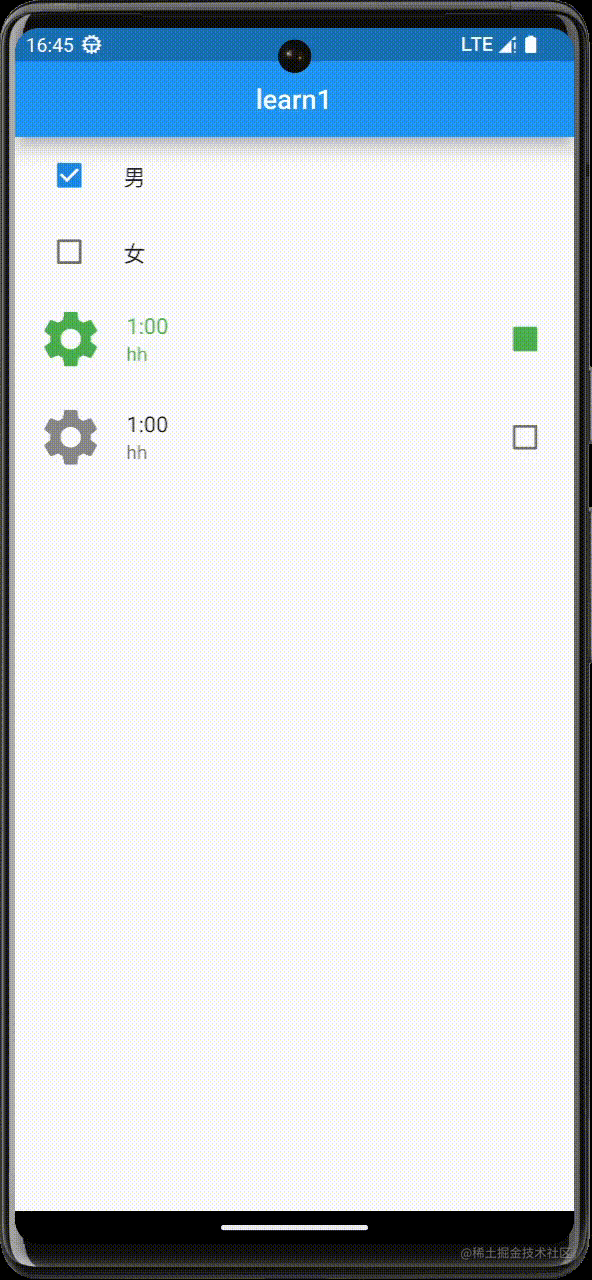
ListTile(
leading: Checkbox(
value: this._male,
onChanged: (bool? value) {
setState(() {
this._male = value!;
});
},
),
title: Text('男'),
),
ListTile(
leading: Checkbox(
value: this._female,
onChanged: (bool? value) {
setState(() {
this._female = value!;
});
},
),
title: Text('女'),
),
CheckboxListTile(
secondary: Icon(Icons.settings, size: 50),
value: this._val1,
onChanged: (bool? value) {
setState(() {
this._val1 = value!;
});
},
title: Text('1:00'),
subtitle: Text('hh'),
activeColor: Colors.green,
checkColor: Colors.green,
selected: this._val1,
),
CheckboxListTile(
secondary: Icon(Icons.settings, size: 50),
value: this._val2,
onChanged: (bool? value) {
setState(() {
this._val2 = value!;
});
},
title: Text('1:00'),
subtitle: Text('hh'),
)
],
);
}
}
4.效果
三、Radio
1.Radio(单选框)
- value(开关的值,一般与状态字段绑定)
- onChanged(开关状态变更时调用)
- groupValue(选择组的值)
2.RadioListTitle(单选列表)
- value(开关的值,一般与状态字段绑定)
- onChanged(开关状态变更时调用)
- groupValue(选择组的值)
3.代码
class RadioDemo extends StatefulWidget {
const RadioDemo({Key? key}) : super(key: key);
@override
State<RadioDemo> createState() => _RadioDemoState();
}
class _RadioDemoState extends State<RadioDemo> {
int gender = 1;
@override
Widget build(BuildContext context) {
return Container(
child: Column(
children: [
Row(
mainAxisAlignment: MainAxisAlignment.center,
children: [
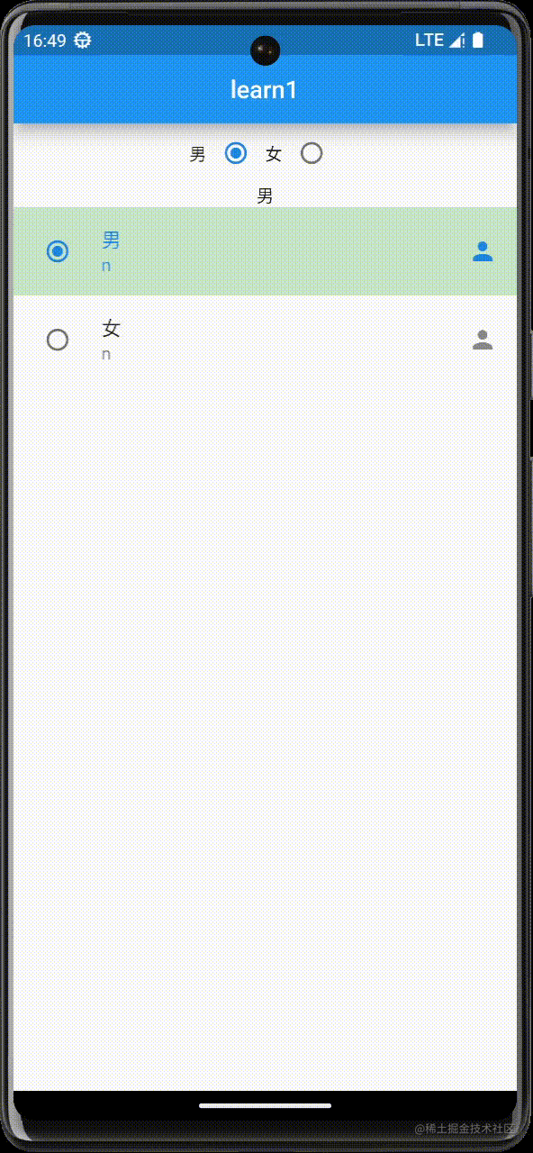
Text('男'),
Radio(
value: 1,
groupValue: gender,
onChanged: (value) {
setState(() {
this.gender = value!;
});
}),
Text('女'),
Radio(
value: 2,
groupValue: gender,
onChanged: (value) {
setState(() {
this.gender = value!;
});
})
],
),
Row(
mainAxisAlignment: MainAxisAlignment.center,
children: [
Text(this.gender == 1 ? '男' : '女'),
],
),
RadioListTile(
value: 1,
groupValue: this.gender,
onChanged: (value) {
setState(() {
this.gender = value!;
});
},
title: Text('男'),
subtitle: Text('n'),
secondary: Icon(Icons.person),
selected: this.gender == 1,
selectedTileColor: Colors.green[100],
),
RadioListTile(
value: 2,
groupValue: this.gender,
onChanged: (value) {
setState(() {
this.gender = value!;
});
},
title: Text('女'),
subtitle: Text('n'),
secondary: Icon(Icons.person),
selected: this.gender == 2,
selectedTileColor: Colors.green[100],
)
],
),
);
}
}
4.效果
四、TextField
1.TextField
- autofocus(是否获取焦点)
- keyboardType(键盘类型)
- obscureText(设置为密码框)
- decoration(样式修饰)
- onChanged(内容更改时自动调用-value)
- labelText(标题)
- hintText(提示文字-placeholder)
- maxlines(显示行数-文本域)
2.代码
class TextFieldDemo extends StatefulWidget {
const TextFieldDemo({Key? key}) : super(key: key);
@override
State<TextFieldDemo> createState() => _TextFieldDemoState();
}
class _TextFieldDemoState extends State<TextFieldDemo> {
late String phone;
late String password;
late String description;
_register() {
print(phone);
print(password);
print(description);
}
@override
Widget build(BuildContext context) {
return Container(
padding: EdgeInsets.all(20),
child: Column(
children: [
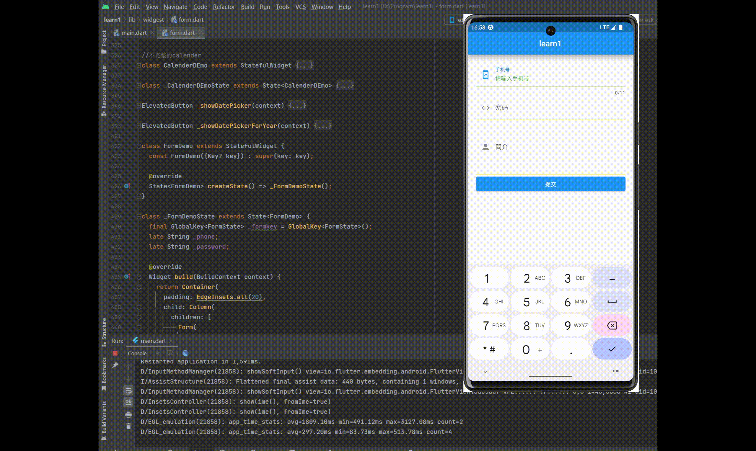
TextField(
autofocus: true,
keyboardType: TextInputType.phone,
decoration: InputDecoration(
prefixIcon: Icon(Icons.mobile_screen_share),
focusedBorder: UnderlineInputBorder(
borderSide: BorderSide(
color: Colors.green,
)),
enabledBorder: UnderlineInputBorder(
borderSide: BorderSide(
color: Colors.yellow,
)),
labelText: '手机号',
hintText: '请输入手机号',
hintStyle: TextStyle(
color: Colors.green,
fontSize: 14,
)),
maxLength: 11,
onChanged: (value) {
setState(() {
phone = value;
});
},
),
TextField(
obscureText: true,
keyboardType: TextInputType.text,
decoration: InputDecoration(
prefixIcon: Icon(Icons.code_outlined),
focusedBorder: UnderlineInputBorder(
borderSide: BorderSide(
color: Colors.green,
)),
enabledBorder: UnderlineInputBorder(
borderSide: BorderSide(
color: Colors.yellow,
)),
labelText: '密码',
hintText: '请输入密码',
hintStyle: TextStyle(
color: Colors.green,
fontSize: 14,
)),
onChanged: (value) {
setState(() {
password = value;
});
},
),
TextField(
maxLines: 5,
keyboardType: TextInputType.text,
decoration: InputDecoration(
prefixIcon: Icon(Icons.person),
focusedBorder: UnderlineInputBorder(
borderSide: BorderSide(
color: Colors.green,
)),
enabledBorder: UnderlineInputBorder(
borderSide: BorderSide(
color: Colors.yellow,
)),
labelText: '简介',
hintText: '请介绍一下自己',
hintStyle: TextStyle(
color: Colors.green,
fontSize: 14,
)),
onChanged: (value) {
setState(() {
description = value;
});
},
),
Container(
width: double.infinity,
child: ElevatedButton(
onPressed: () {
_register();
},
child: Text('提交'),
),
)
],
),
);
}
}
3.效果
五、Form
1.使用步骤
- 创建表单Form,并以GlobalKey作为唯一性标识
- 添加带验证逻辑的TextFormField到Form中
- 创建按钮以验证和提交表单
2.Form(表单容器)
3.TextFormField
- 与TextField的区别:必须在Form内使用&带有验证器
- validator(验证器)
4.代码
class FormDemo extends StatefulWidget {
const FormDemo({Key? key}) : super(key: key);
@override
State<FormDemo> createState() => _FormDemoState();
}
class _FormDemoState extends State<FormDemo> {
final GlobalKey<FormState> _formkey = GlobalKey<FormState>();
late String _phone;
late String _password;
@override
Widget build(BuildContext context) {
return Container(
padding: EdgeInsets.all(20),
child: Column(
children: [
Form(
key: _formkey,
child: Column(
children: [
TextFormField(
decoration: InputDecoration(hintText: '手机号'),
validator: (value) {
RegExp reg = new RegExp(r'^\d{11}$');
if (!reg.hasMatch(value!)) {
return '手机号非法';
}
return null;
},
onSaved: (value) {
print('_phone onSaved');
_phone = value!;
},
),
TextFormField(
obscureText: true,
decoration: InputDecoration(hintText: '密码'),
validator: (value) {
return value!.length < 6 ? '密码长度不够' : null;
},
onSaved: (value) {
print('_password onSaved');
_password = value!;
},
)
],
)),
Row(
children: [
Expanded(
child: ElevatedButton(
onPressed: () {
if (_formkey.currentState!.validate()) {
print('提交成功');
print('_formkey.currentState!.save() - Before');
_formkey.currentState!.save();
print('_formkey.currentState!.save() - After');
print(_phone);
print(_password);
}
},
child: Text('提交'),
)),
SizedBox(
width: 20,
),
Expanded(
child: ElevatedButton(
onPressed: () {
_formkey.currentState!.reset();
},
child: Text('重置'),
))
],
)
],
),
);
}
}
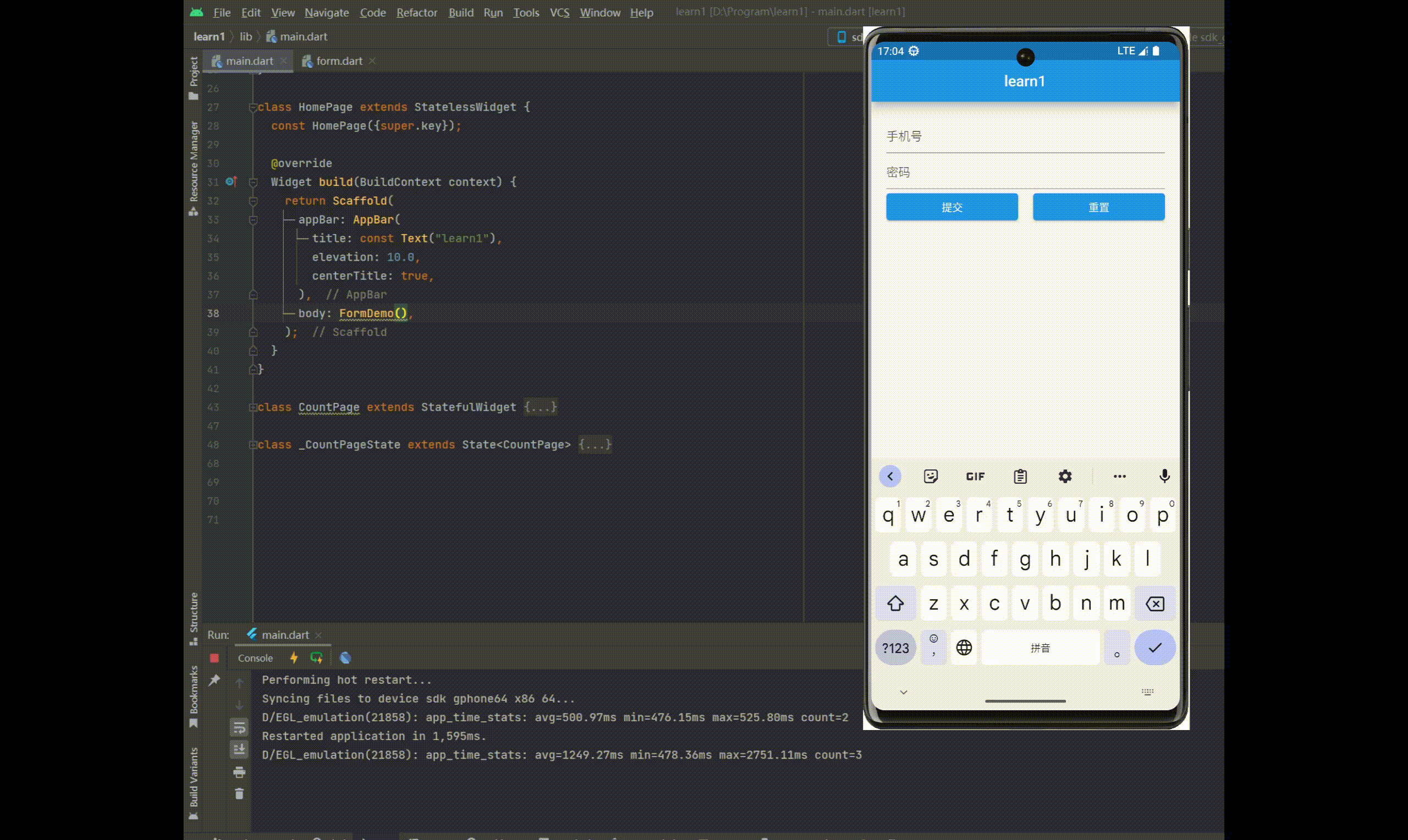
5.效果


 1119
1119

 被折叠的 条评论
为什么被折叠?
被折叠的 条评论
为什么被折叠?
 到【灌水乐园】发言


