


小黑子的HTML5+CSS3入土复习过程第三章
HTML5+CSS3第三章
3.1 外边距特性
3.1.1 父子关系,给子加外边距,但作用于父身上了怎么解决
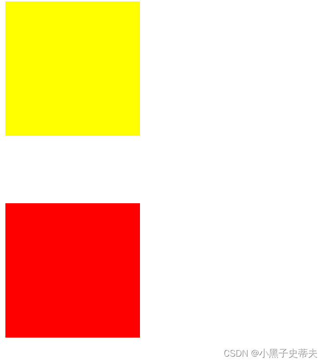
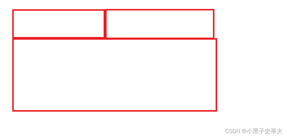
嵌套盒子之间的位置问题:
– 嵌套盒子例子
	<style>
		.box1{
			width: 300px;
			height: 300px;
			background-color: yellow;
		}
		.box2{
			width: 100px;
			height: 100px;
			background-color: red;

		}
	</style>
	<div class="box1">
		<div class="box2">
		</div>
	</div>
—>
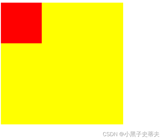
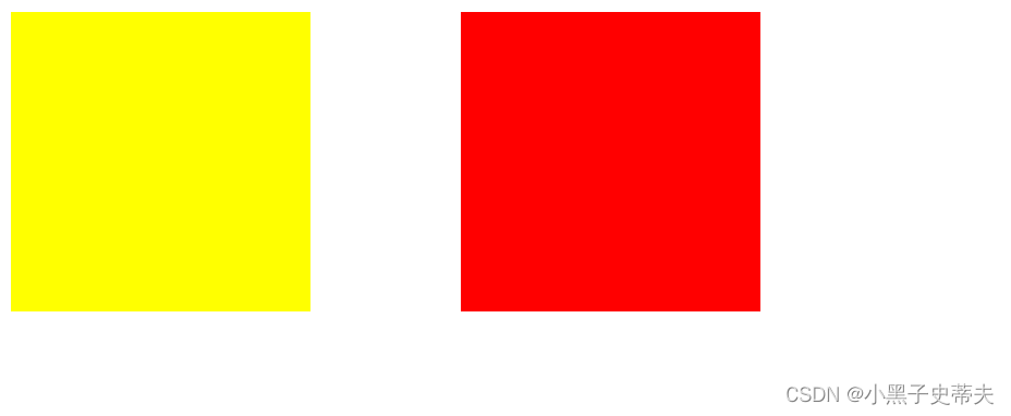
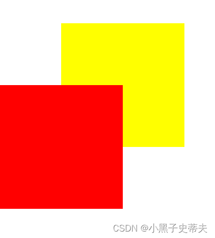
当想要移动子盒子相对父盒子时,例如移动图中红色盒子向下,对它margin-top:100px的效果:
—>
可见并不能达到效果,给谁加效果都一样。
有2种解决方案
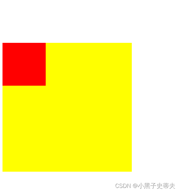
一、给父盒子加padding,但注意高度
给父盒子加了padding-top:100px效果:
但是有个问题,父盒子的高度却加了100px,要自行调节
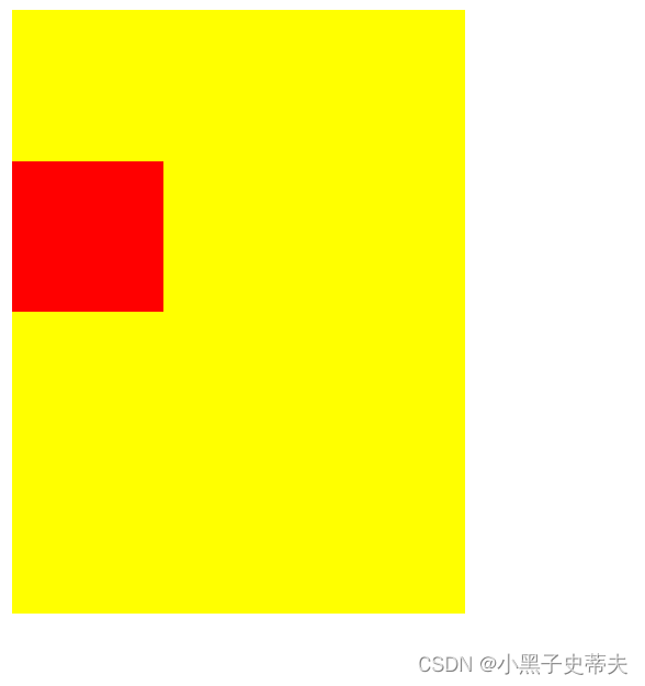
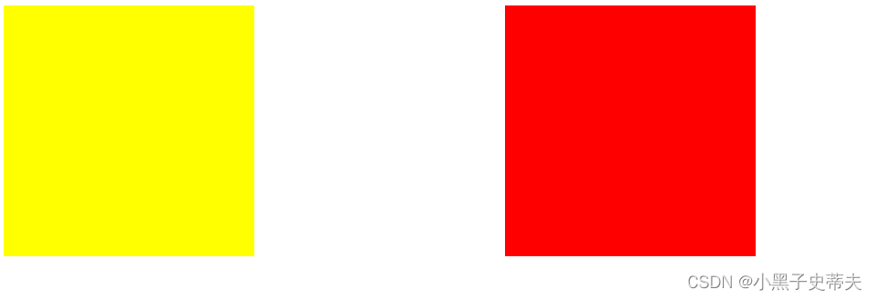
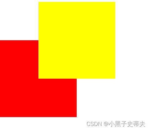
二、给父盒子设置边框,再给子盒子加margin
如下:
– 给父盒子border: 1px solid transparent(透明);
–子盒子margin-top: 100px;
但是加的边框有像素1px,父元素高加多了2px,可以手动调节或者忽略不计
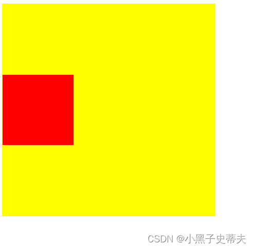
三、给父盒子加浮动 float
给父盒子加浮动 float,给子盒子加margin-top:100px
效果如此
缺点:父盒子脱离文档流,对后面的调节可能会有影响
四、给父盒子overflo:hidden
给加给父盒子overflo:hidden,给子盒子加个margin-top:100px
优点:父盒子高不受影响
3.1.2 兄弟盒子,垂直外边距与水平外边距问题
一、垂直方向,外边距取最大值
	<style>
		.box1{
			width: 200px;
			height: 200px;
			background-color: yellow;
			margin-bottom: 100px;
		}
		.box2{
			width: 200px;
			height: 200px;
			background-color: red;
		}
	</style>

</head>
<body>
	<div class="box1"></div>
	<div class="box2">
	</div>
原效果:
给box2加给margin-top:100px{当小于box1的px的值时}则不会发生变化,反之大于时,便可以
二、水平方向,外边距会进行合并处理.
	<style>
		.box1{
			width: 200px;
			height: 200px;
			background-color: yellow;
			float: left;
			margin-right: 100px;
		}
		.box2{
			width: 200px;
			height: 200px;
			background-color: red;
			float: left;
			margin-right: 100px;
		}

	</style>
	<div class="box1"></div>
	<div class="box2"></div>
原效果:
给box2加上margin-left:100px后,间距叠加了
3.2 溢出属性overflow
1、溢出属性(容器的)
说明:
overflow:visible/hidden(隐藏)/scroll/auto(自动)/inherit;
3.2.1 visible:默认值,溢出内容会显示在元素之外
3.2.2 hidden:溢出内容隐藏
3.2.3 scroll:滚动,溢出内容以滚动方式显示
3.2.4 auto:如果有溢出会添加滚动条,没有溢出正常显示
3.2.5 inherit:规定应该遵从父元素继承overflow属性的值
3.2.6 overflow-x:X轴溢出
3.2.7 overflow-y:Y轴溢出
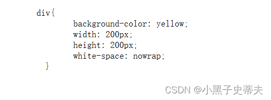
3.3 pre标签:预格式化文本-保留空格,tab,回车
例如:
   <pre>
	div{
		background-color: yellow;
		width: 200px;
		height: 200px;
		white-space: nowrap;
	  }
   </pre>
—>
3.4 溢出省略号
溢出省略号:指文本过多,出现"…"的样式
3.4.1 white-space:设置如何处理元素内的空白
一、空余空间
说明:
white-space: normal/nowrap/pre/pre-wrap /pre-line /
           inherit该属性用来设置如何处理元素内的空白;

normal:默认值,空白会被浏览器忽略,

nowrap:文本不会换行,文本会在同一行上继续,直到遇到
       <br/>标签为止;
pre:保留空格,tab,回车,不换行

pre-wrap:保留空格,tab,回车,会折行

pre-wrap:换行符合会留下来,但是空格不会
例子:
nowrap
<style>
div{
background-color: yellow;
width: 200px;
height: 200px;
white-space: nowrap;
}
</style>
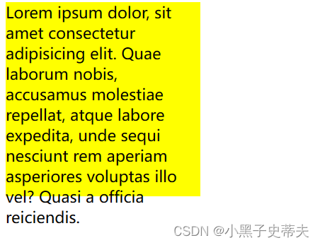
<div>
Lorem ipsum dolor, sit amet consectetur adipisicing
elit. Quae laborum nobis, accusamus molestiae r
epellat, atque labore expedita, unde sequi nesciunt
rem aperiam asperiores voluptas illo vel? Quasi
a officia reiciendis.
</div>
—>
二、省略号显示
说明:
text-overflow:clip/ellipsis ;
clip:默认值,不显示省略号…) ;
ellipsis:显示省略标记;
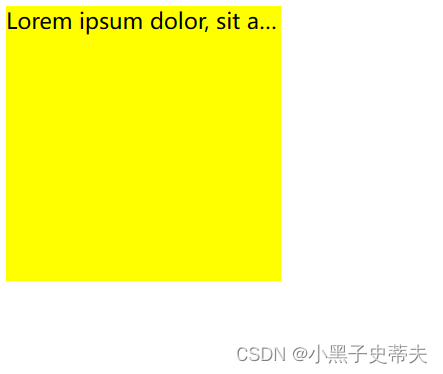
当单行文本溢出显示省略号需要同时设置以下声明:
第1、容器宽度: width: 200px;
第2、强制文本在一-行内显示:white-space: nowrap;
第3、溢出内容为隐藏: overflow: hidden;
第4、溢出文本显示省略号: text overflow: ellipsis;
例子:
<style>
div{
background-color: yellow;
width: 200px;
height: 200px;
white-space: nowrap;
overflow: hidden;
text-overflow: ellipsis;
}
</style>
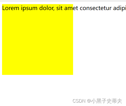
<div>
Lorem ipsum dolor, sit amet consectetur adipisicing elit. Quae laborum nobis, accusamus molestiae repellat, atque labore expedita, unde sequi nesciunt rem aperiam asperiores voluptas illo vel? Quasi a officia reiciendis.
</div>
—>
3.5 元素显示类型
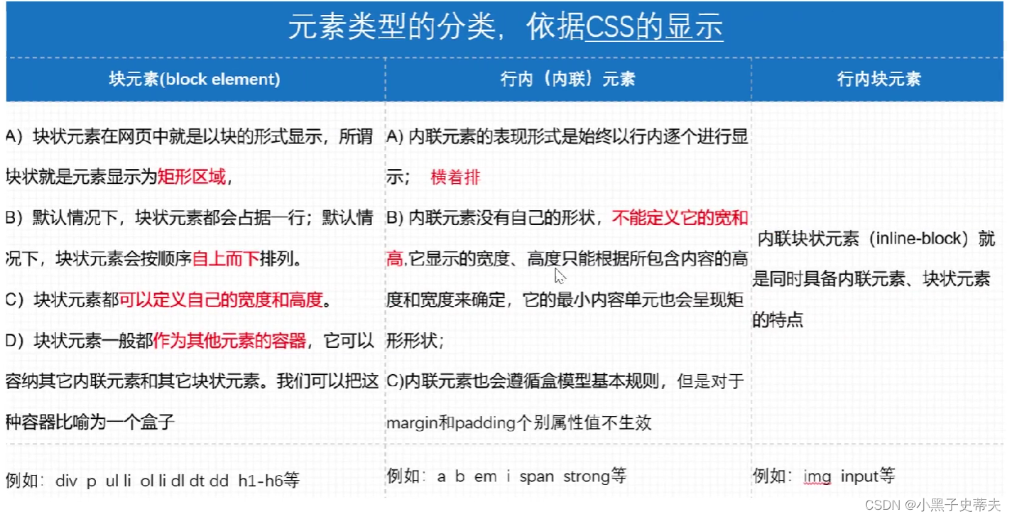
3.5.1 块元素
A)块状元素在网页中就是以块的形式显示,所谓
块状就是元素显示为矩形区域。
B)默认情况下,块状元素都会占据一行;默认情
况下,块状元素会按顺序自上而下排列。
C)块状元素都可以定义自己的宽度和高度。
D)块状元素一般都作为其他元素的容器,它可以
容纳其它内联元素和其它块状元素。我们可以把这
种容器比喻为一个盒子
块元素的标志:
     display:block 像div,p,h1/h2等
     display:list-item 让元素显示列表类型 像 ul/ol的li

注意:p标签放文本可以,不能嵌套块级元素
3.5.2 行内元素(内联元素)
A) 内联元素的表现形式是始终以行内逐个进行显
示;横着排
B) 内联元素没有自己的形状,不能定义它的宽和
高,它显示的宽度、高度只能根据所包含内容的高
度和宽度来确定,它的最小内容单元也会呈现矩
形形状;
C) 内联元素也会遵循盒模型基本规则,但是对于
margin和padding个别属性值不生效
例如: a b em i span strong等
行内元素:
              display:inline 像b,em,span,strong ,a等标签
注意:
span等行内元素只能设置边距的左右边距,不能设置上下边距.
将内联元素变成块元素的方法
一、加display:block
二、加float:left/right
三、加position:absolute
3.5.3 行内块元素
内联块状元素(inline-block) 就是同时具备内联元素、块状元素的特点
行内块元素:
        display:inline-block 像 img input
3.5.4 display:none不显示任何元素,达到隐藏效果
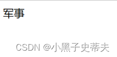
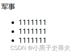
3.6 鼠标悬停出现菜单案例
简单原理:
	<style>
		.hide{
		  display: none;
		}

		.box:hover .hide{
		  display: block;
		}
	  </style>
  <div class="box">
	军事
	<ul class="hide">
		<li>1111111</li>
		<li>1111111</li>
		<li>1111111</li>
	</ul>
  </div>
由
—>当鼠标悬停时出现
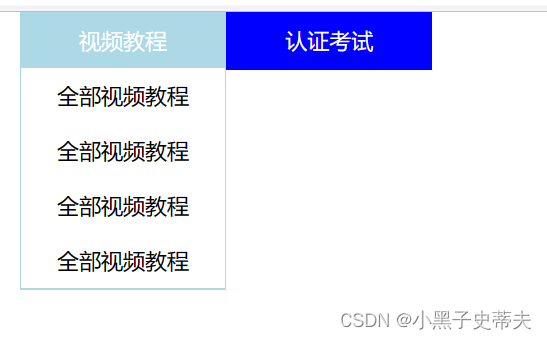
3.6.1 鼠标悬停父子选择器运用小案例:
	<style>
      *{
		margin: 0;
		padding: 0;
		list-style: none;
	  }

      .box{
		width: 300px;
		margin: 0 auto;
	  }

	  .box>li{
		float: left;
		width: 148px; /*原来设置150px(box宽的一半,但是由于加了border1px,所以要减1px*2,否则超出box的一半宽度li会排成一排居中)*/
		text-align: center;
		border: 1px solid transparent;
		background-color: blue;
		color: white;
		line-height: 40px;
	  }

	  .box>li:hover{
		background-color: lightblue;
	  }

      .box>li>ul{
		display: none;
		background-color: white;
		color: black;
	  }
	  .box>li:hover ul{
		display: block;
	  }   /*实现鼠标悬停出现下表的效果*/

	  .box>li li:hover{
		color: blue;
	  }

	</style>
    <ul class="box">
		<li><!--.box>li子代选择器作用点-->
			视频教程
			<ul><!--.box>li>ul子代选择器作用点-->
				<li>全部视频教程</li>
				<li>全部视频教程</li>
				<li>全部视频教程</li>
				<li>全部视频教程</li>
			</ul>
		</li>

		<li><!--.box>li子代选择器作用点-->
			认证考试
			<ul><!--.box>li>ul子代选择器作用点-->
				<li>全部视频教程</li>
				<li>全部视频教程</li>
			</ul>
		</li>
	</ul>
由
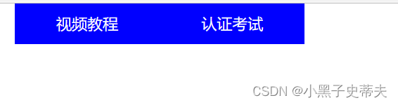
—>
3.7 设计网页基础
3.7.1. 版心 container
版心 container指的是设置有宽高限制的块
3.7.2 通栏 banner
通栏 banner指的是设置充满网页的块
3.7.3 导航栏 nav
3.8 position:定位的属性
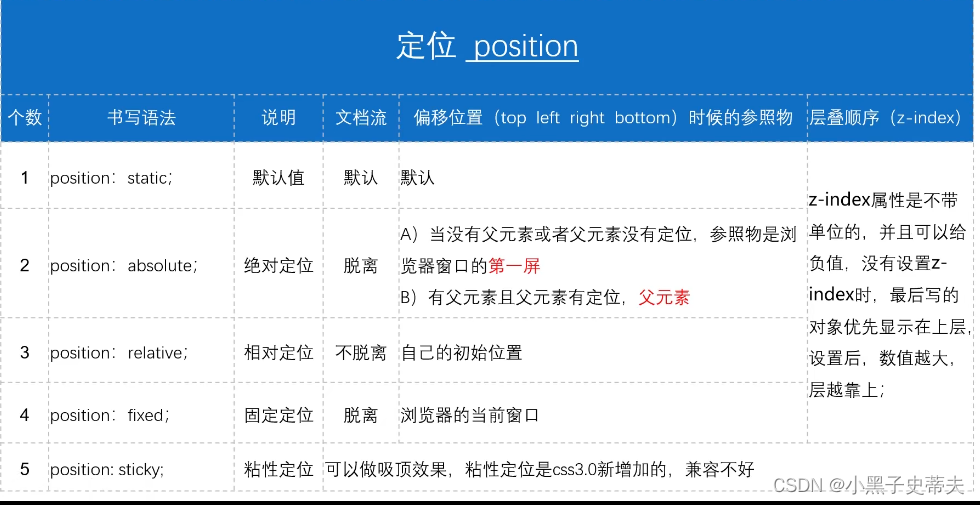
3.8.1 relative 相对定位
pcsition: relative; 相对定位 不脱离自己的初始位置
例子:
	<style>
     .box1{
		width: 200px;
		height: 200px;
		background: red;
	 }
     .box2{
		width: 200px;
		height: 200px;
		background: yellow;
		position: relative;
		top: 100px;
		left: 100px;
	 }
     .box3{
		width: 200px;
		height: 200px;
		background: blue;
	 }

	</style>
    <div class="box1"></div>
    <div class="box2"></div>
    <div class="box3"></div>
box2由原来位置
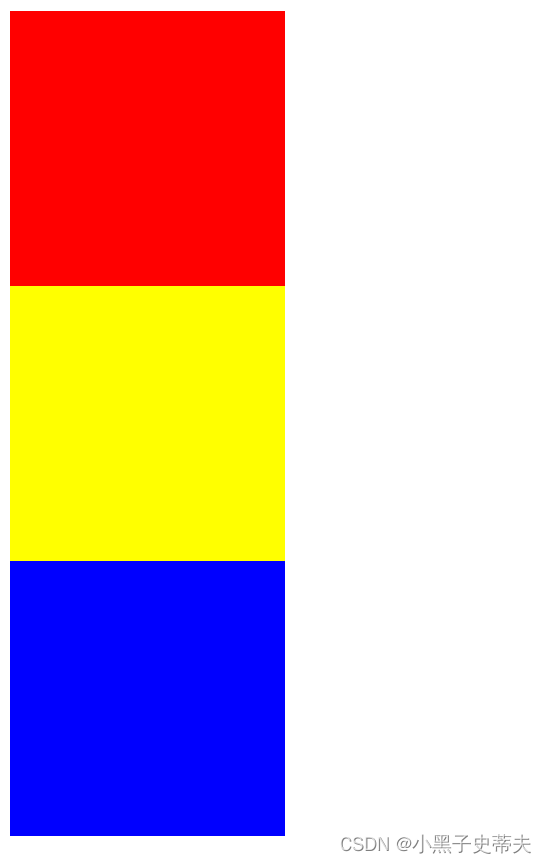
—>其他兄弟盒子不受影响
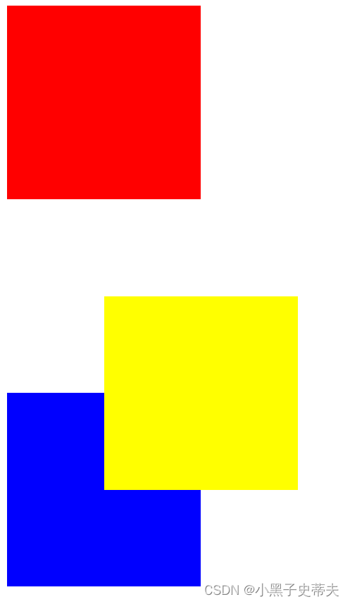
3.8.2 absolute 绝对定位
position: absolute; 绝对定位 指脱离文档流
A)当没有父元素或者父元素没有定位,参照物是浏浏览器窗口的第一屏
B)有父元素且父元素有定位时,子盒子相对父盒子移动
position:absolute绝对定位与float浮动的区别
float:半脱离,可以实现文字环绕
absolute:全脱离,不会出现文字环绕效果
例如:
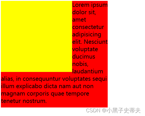
一. 给兄弟盒子一个绝对定位
	<style>

     .box1{
		width: 200px;
		height: 200px;
		background: yellow;
		position: absolute;

	 }
     .box2{
		width: 300px;
		height: 300px;
		background: red;
	 }

	</style>
    <div class="box1"></div>
    <div class="box2">
		Lorem ipsum dolor sit, amet consectetur adipisicing elit. Nesciunt voluptate ducimus nobis, laudantium alias, in consequuntur voluptates sequi illum explicabo dicta nam aut non magnam corporis quae tempore tenetur nostrum.
	</div>
—>
二. 给改成浮动float:left
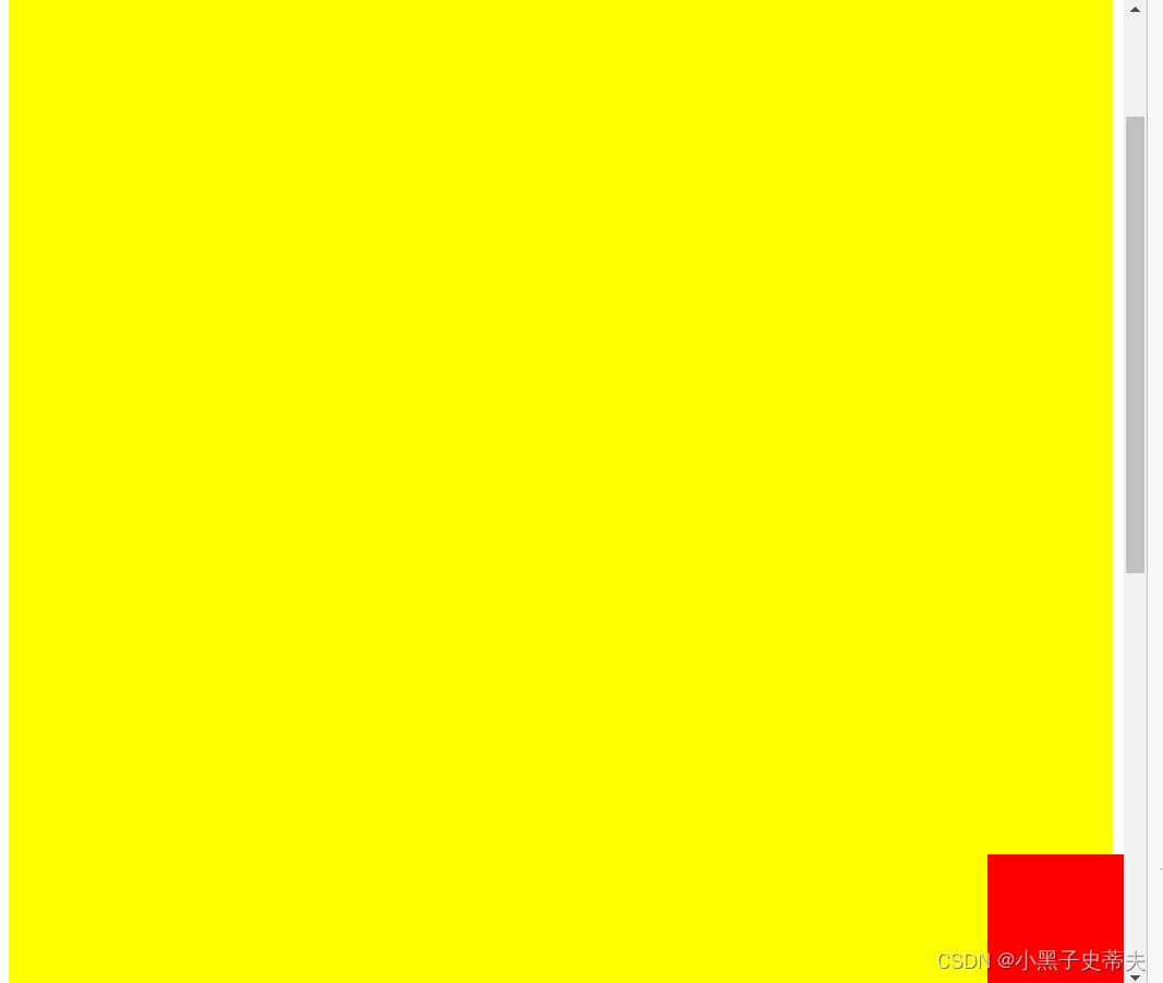
3.8.3 fixed 固定定位
position: fixed; 固定定位 脱离浏览器的当前窗口
一、底部块固定实现原理
例子:
	<style>
     .box1{
		width: 100%;
		height: 1500px;
		background: yellow;
	 }
     .box2{
		width: 100px;
		height: 100px;
		background: red;
		position: fixed;
		right: 0;
		bottom: 0;
	 }

	</style>
    <div class="box1">
		<div class="box2"></div>
	</div>
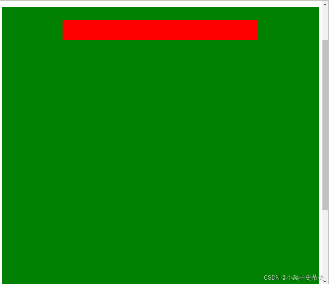
3.8.4 sticky 粘性定位
position:sticky;一般用于鼠标滑动时有元素吸顶,随着滑动而位置不变
	<style>
     .header{
		background: yellow;
		width: 100%;
		height: 100px;
	 }

	 .nav{
		background: red;
		width: 500px;
		height: 50px;
		margin: 0 auto;
		position: sticky;
		top: 50px;/*设置吸顶距离*/
	 }

	 .body{
		height: 1000px;
		background: green;
	 }


	</style>
    <div class="header"></div>
    <div class="nav"></div>
    <div class="body"></div>
—>
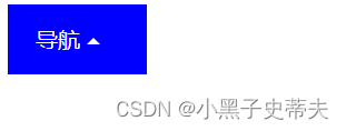
3.9 下拉列表三角形原理
	<style>
     .box{
		width: 100px;
		height: 50px;
		line-height: 50px;
		background: blue;
		color: white;
		text-indent: 20px; /*首行文本的缩进*/
	 }

     span{
		width: 0;
		height: 0;
		display: inline-block;
		border: 5px solid transparent;
		border-top: 5px solid white;
		position: relative;
		top: 2.5px;
	 }

	 .box:hover span{
		 border: 5px solid transparent;
		 border-bottom: 5px solid white;
		 position: relative;
		 top: -2.5px;
	 }

	</style>
    <div class="box">
		导航
		<span></span>
	</div>
—>
3.10 z-index 定位层级优先属性
z- index值越大,层级越大, 越靠上显示,一般用于移动覆盖
例子:
	<style>
	div{
		width: 200px;
		height: 200px;
	}
     .box1{
		background: yellow;
		position: relative;
		top: 100px;
		left: 100px;
		z-index: 2;
	 }
     .box2{
		background: red;
		position: relative;

	 }

	</style>
    <div class="box1"></div>
    <div class="box2"></div>
由
—>
3.11 父子盒子定位控制元素水平垂直居中
当盒子是父子关系时,可以给父盒子加相对定位,
给子盒子加绝对定位同时调节top、left:50%和margin-left、margin-top:负的子盒子自身宽度一半
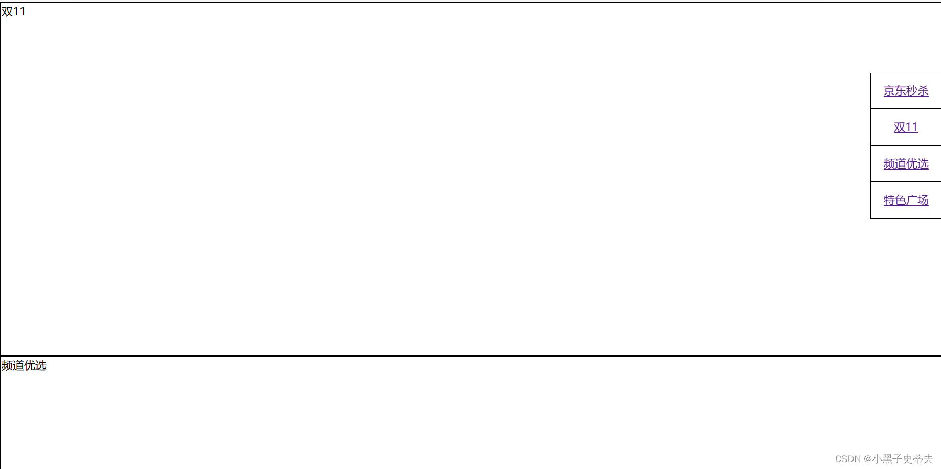
3.12 锚点跳转
锚点作用:页面不同区域的跳转,使用a链接。
		<a href="#锚点名字"></a>
		<div id="锚点名字"></div>
实现原理:
	<style>
	*{
		margin: 0;
		padding: 0;
		list-style: none;
	}

    ul{
		position: fixed;
		right: 0px;
		top: 100px;

	}

	li{
        width: 100px;
		height: 50px;
		line-height: 50px;
		text-align: center;
		border: 1px solid black;
	}

     div{
		height: 500px;
		border: 2px solid black;
	 }

	</style>
    <ul>
		<li><a href="#a">京东秒杀</a></li>
		<li><a href="#b">双11</a></li>
		<li><a href="#c">频道优选</a></li>
		<li><a href="#d">特色广场</a></li>
	</ul>
	<div id="a">京东秒杀</div>
	<div id="b">双11</div>
	<div id="c">频道优选</div>
	<div id="d">特色广场</div>
3.13 宽高自适应
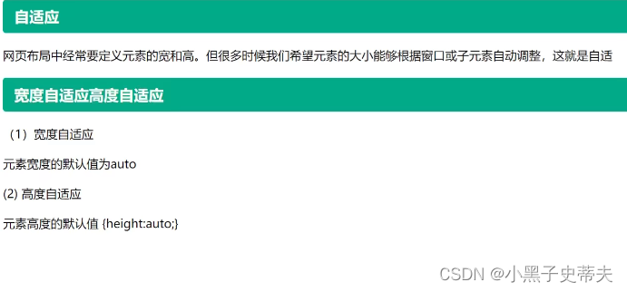
3.13.1浮动元素高度自适应
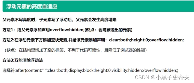
3.14 伪元素
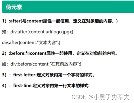
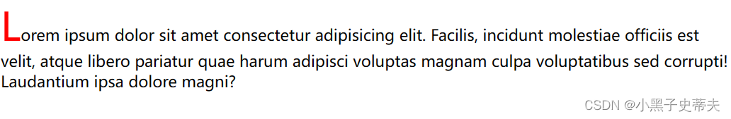
3.14.1 :first-letter 定义第一个字符
案例:
	<style>
	div::first-letter{
		font-size: 40px;
		color: red;
	}

	</style>
    <div>
		Lorem ipsum dolor sit amet consectetur adipisicing elit. Facilis, incidunt molestiae officiis est velit, atque libero pariatur quae harum adipisci voluptas magnam culpa voluptatibus sed corrupti! Laudantium ipsa dolore magni?
	</div>
—>
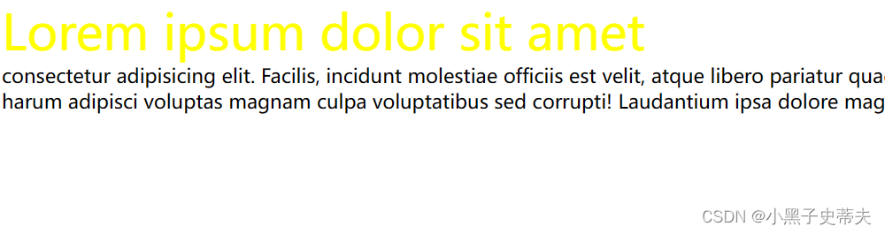
3.14.2 :first-line 定义第一行文本
上方代码修改style的部分
	<style>
	div::first-line{
		font-size: 40px;
		color: yellow;
	}
	</style>
—>
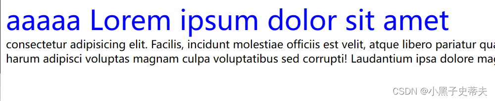
3.14.3 :before 定义对象前的内容
一、:before{content:“文本内容”;}
	<style>
	div::first-line{
		font-size: 40px;
		color: blue;
	}

	div::before{
		content: "aaaaa";
	}

	</style>
    <div>
		Lorem ipsum dolor sit amet consectetur adipisicing elit. Facilis, incidunt molestiae officiis est velit, atque libero pariatur quae harum adipisci voluptas magnam culpa voluptatibus sed corrupti! Laudantium ipsa dolore magni?
	</div>
—>
二、:before{content:url(图片地址);} 用于加图片
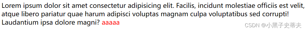
3.14.4 :after 定义对象后的内容
一、:after{content:“文本内容”;}
	<style>

	div::after{
		content: "aaaaa";
		color: red;
	}

	</style>
    <div>
		Lorem ipsum dolor sit amet consectetur adipisicing elit. Facilis, incidunt molestiae officiis est velit, atque libero pariatur quae harum adipisci voluptas magnam culpa voluptatibus sed corrupti! Laudantium ipsa dolore magni?
	</div>
—>
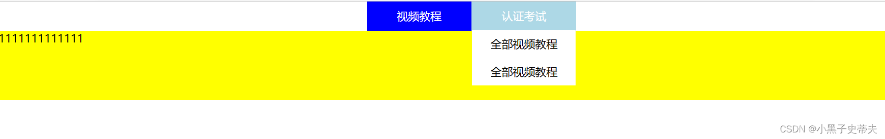
3.14.5 伪元素万能解决浮动高度塌陷的问题
想要浮动块实现的效果:
	<style>
		*{
		  margin: 0;
		  padding: 0;
		  list-style: none;
		}

		.box{
		  width: 300px;
		  margin: 0 auto;
		}

		.box>li{
		  float: left;
		  width: 148px; /*原来设置150px(box宽的一半,但是由于加了border1px,所以要减1px*2,否则超出box的一半宽度li会排成一排居中)*/
		  text-align: center;
		  border: 1px solid transparent;
		  background-color: blue;
		  color: white;
		  line-height: 40px;
		  position: relative;
		}

		.box>li:hover{
		  background-color: lightblue;
		}

		.box>li>ul{
		  display: none;
		  background-color: white;
		  color: black;
		  position: absolute;/*与.box>li的相对定位一起实现下拉列表不影响下方块元素*/
		  left: 0;
		  width: 148px;/*调节定位后的ul大小使其相贴合*/
		}
		.box>li:hover ul{
		  display: block;
		}   /*实现鼠标悬停出现下表的效果*/

		.box>li li:hover{
		  color: blue;
		}

		.content{
			background: yellow;
			height: 100px;
		}

		.box::after{
			content: "";
			clear: both;
			display: block;
		}
	  </style>
	  <ul class="box">
		  <li><!--.box>li子代选择器作用点-->
			  视频教程
			  <ul><!--.box>li>ul子代选择器作用点-->
				  <li>全部视频教程</li>
				  <li>全部视频教程</li>
				  <li>全部视频教程</li>
				  <li>全部视频教程</li>
			  </ul>
		  </li>

		  <li><!--.box>li子代选择器作用点-->
			  认证考试
			  <ul><!--.box>li>ul子代选择器作用点-->
				  <li>全部视频教程</li>
				  <li>全部视频教程</li>
			  </ul>
		  </li>

	  </ul>
	  <div class="content">1111111111111</div>
—>


 487
487


 被折叠的 条评论
为什么被折叠?
被折叠的 条评论
为什么被折叠?
 到【灌水乐园】发言


