


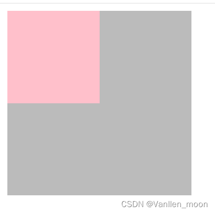
页面初始代码(使用两个盒子来演示):
    <div class="father">
        <div class="son"></div>
    </div>
        .father{
            width: 200px;
            height: 200px;
            background-color: #bbb;
        }
        .son {
            width: 100px;
            height: 100px;
            background-color: pink;
        }
页面初始效果:
1.使用定位+margin
        .father{
            position: relative;
            width: 200px;
            height: 200px;
            background-color: #bbb;
        }
        .son {
            position: absolute;
            top: 0;
            right: 0;
            bottom: 0;
            left: 0;
            margin: auto;
            width: 100px;
            height: 100px;
            background-color: pink;
        }
2.使用定位+偏移
    .father{
        position: relative;
        width: 200px;
        height: 200px;
        background-color: #bbb;
    }
    .son {
        position: absolute;
        left: 50%;
        top: 50%;
        transform: translate(-50%,-50%);
        width: 100px;
        height: 100px;
        background-color: pink;
    }
3.使用flex布局
        .father{
            display: flex;
            align-items: center;
            justify-content: center;
            width: 200px;
            height: 200px;
            background-color: #bbb;
        }
        .son {
            width: 100px;
            height: 100px;
            background-color: pink;
        }
4.使用flex布局+margin
        .father{
            display: flex;
            width: 200px;
            height: 200px;
            background-color: #bbb;
        }
        .son {
            width: 100px;
            height: 100px;
            background-color: pink;
            margin: auto;
        }
5.使用grid布局
        .father{
            display: grid;
            align-items: center;
            justify-items: center;
            width: 200px;
            height: 200px;
            background-color: #bbb;
        }
        .son {
            width: 100px;
            height: 100px;
            background-color: pink;
        }
或者justify-items替换为justify-content:
        .father{
            display: grid;
            align-items: center;
            justify-content: center;
            width: 200px;
            height: 200px;
            background-color: #bbb;
        }
        .son {
            width: 100px;
            height: 100px;
            background-color: pink;
        }
6.使用grid布局+margin
        .father{
            display: grid;
            width: 200px;
            height: 200px;
            background-color: #bbb;
        }
        .son {
            width: 100px;
            height: 100px;
            background-color: pink;
            margin: auto;
        }
7.将子元素设为行内块元素,结合table-cell
        .father{
            display: table-cell;
            vertical-align: middle;
            text-align: center;
            width: 200px;
            height: 200px;
            background-color: #bbb;
        }
        .son {
            display: inline-block;
            width: 100px;
            height: 100px;
            background-color: pink;
        }
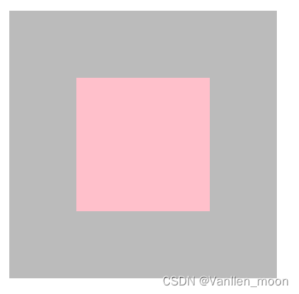
以上代码运行效果一致,皆如下图:


 280
280


 被折叠的 条评论
为什么被折叠?
被折叠的 条评论
为什么被折叠?
 到【灌水乐园】发言


