


 本文详细介绍了如何使用CSS实现单个和多个盒子的各种对齐方式,包括左对齐、右对齐、居中对齐、水平垂直居中、底部对齐等。通过示例代码展示了如何利用`display:flex`和`justify-content`、`align-items`属性来调整元素的位置,适用于前端开发者提升布局能力。
一、单个盒子
页面主体HTML代码如下,此处用两个盒子示例:
    <div class="father">
        <div class="son"></div>
    </div>
为方便展示,定义CSS基础样式如下:
        .father {
            width: 300px;
            height: 300px;
            background-color: bisque;
        }

        .son {
            width: 100px;
            height: 100px;
            background-color: black;
        }
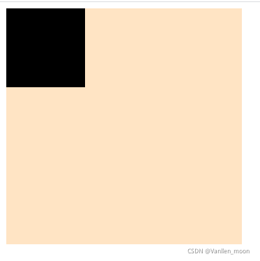
1、左对齐
为父盒子添加以下代码
display: flex;
justify-content: flex-start;
        .father {
            width: 300px;
            height: 300px;
            background-color: bisque;
            display: flex;
            justify-content: flex-start;
        }
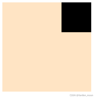
2、右对齐
为父盒子添加以下代码
display: flex;
justify-content: flex-end;
        .father {
            width: 300px;
            height: 300px;
            background-color: bisque;
            display: flex;
            justify-content: flex-end;
        }
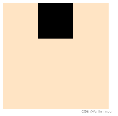
3、居中对齐
为父盒子添加以下代码
display: flex;
justify-content: center;
        .father {
            width: 300px;
            height: 300px;
            background-color: bisque;
            display: flex;
            justify-content: center;
        }
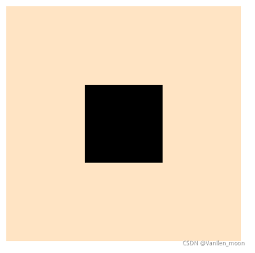
4、水平垂直居中
为父盒子添加以下代码
display: flex;
justify-content: center;
align-items: center;
        .father {
            width: 300px;
            height: 300px;
            background-color: bisque;
            display: flex;
            justify-content: center;
            align-items: center;
        }
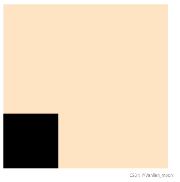
5、底部左对齐
为父盒子添加以下代码
display: flex;
justify-content: flex-start;
align-items: flex-end;
        .father {
            width: 300px;
            height: 300px;
            background-color: bisque;
            display: flex;
            justify-content: flex-start;
            align-items: flex-end;
        }
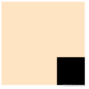
6、底部右对齐
为父盒子添加以下代码
display: flex;
justify-content: flex-end;
align-items: flex-end;
        .father {
            width: 300px;
            height: 300px;
            background-color: bisque;
            display: flex;
            justify-content: flex-end;
            align-items: flex-end;
        }
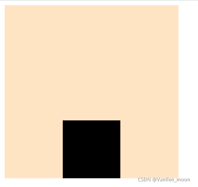
7、底部居中对齐
为父盒子添加以下代码
display: flex;
justify-content: center;
align-items: flex-end;
        .father {
            width: 300px;
            height: 300px;
            background-color: bisque;
            display: flex;
            justify-content: center;
            align-items: flex-end;
        }
二、两个盒子
页面主体HTML代码如下,此处用三个盒子示例:
    <div class="father">
        <div class="son1"></div>
        <div class="son2"></div>
    </div>
为方便展示,定义CSS基础样式如下:
.father {
  width: 300px;
  height: 300px;
  background-color: bisque;
}

.son1,
.son2 {
  width: 100px;
  height: 100px;
  background-color: black;
}
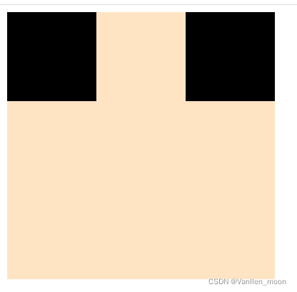
1、左右两端对齐
为父盒子添加以下代码
display: flex;
justify-content: space-between;
.father {
  width: 300px;
  height: 300px;
  background-color: bisque;
  display: flex;
  justify-content: space-between;
}
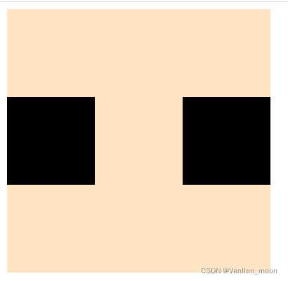
2、左右两端中间对齐
为父盒子添加以下代码
display: flex;
justify-content: space-between;
align-items: center;
.father {
  width: 300px;
  height: 300px;
  background-color: bisque;
  display: flex;
  justify-content: space-between;
  align-items: center;
}
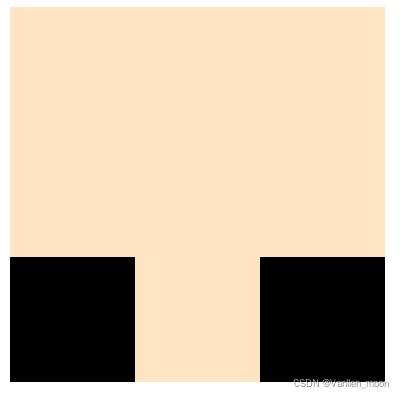
3、左右两端底部对齐
为父盒子添加以下代码
display: flex;
justify-content: space-between;
align-items: flex-end;
.father {
  width: 300px;
  height: 300px;
  background-color: bisque;
  display: flex;
  justify-content: space-between;
  align-items: flex-end;
}


 扫一扫
扫一扫


 3785
3785

 被折叠的 条评论
为什么被折叠?
被折叠的 条评论
为什么被折叠?
 到【灌水乐园】发言


