


前端研习录(10)——CSS相对定位、绝对定位、固定定位以及Z-index属性、opacity属性讲解及示例说明
版权声明
- 本文原创作者:清风不渡
- 博客地址:https://blog.csdn.net/WXKKang
一、定位
重拾前端记忆,记录学习笔记,现在进入CSS定位部分,定位即是指定了元素在文档中的位置,下面来详细的看一下
1、定义
position属性指定了元素的定位类型:
- relative 相对定位
- absolute 绝对定位
- fixed 固定定位
注意:绝对定位和固定定位会使元素脱离文档流
设置定位之后可以对四个方向进行元素位置的调整:left、top、right、bottom
2、相对定位
相对定位是相对于元素在文档中原本的位置进行定位,元素不脱离文档流
将position属性设置为relative后可声明该元素为相对定位,举例如下:
<!DOCTYPE html>
<html lang="en">
<head>
    <meta charset="UTF-8">
    <meta http-equiv="X-UA-Compatible" content="IE=edge">
    <meta name="viewport" content="width=device-width, initial-scale=1.0">
    <title>清风不渡</title>

    <style>
        .box1{
            width: 200px;
            height: 200px;
            background-color: green;
        }
        .box2{
            width: 200px;
            height: 200px;
            background-color: yellow;
        }
    </style>
</head>
<body>
    <div class="box1"></div>
    <p>-----------------------------</p>
    <div class="box2"></div>
</body>
</html>
效果如下:
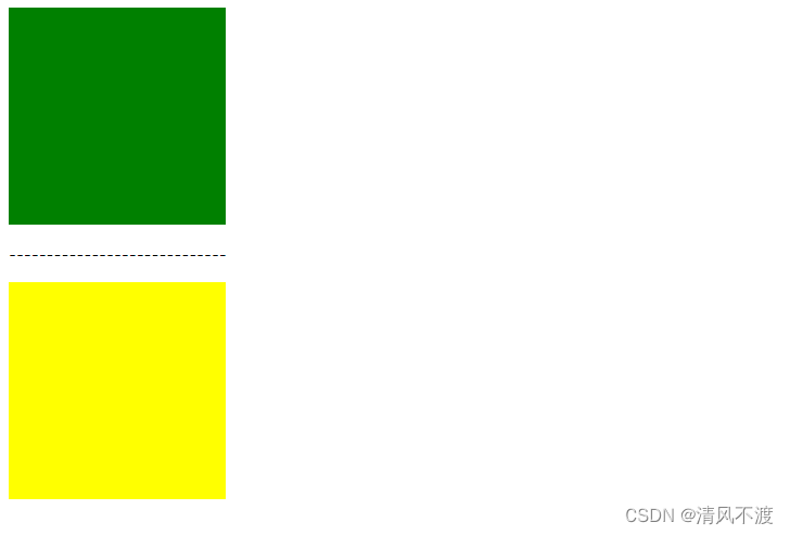
可以看到,由于div属于块级元素,所以由上而下进行排列,且box1与box2中有p标签进行分割,下面我们将box属性增加相对定位,并相对于上左各偏移100px,代码如下:
<!DOCTYPE html>
<html lang="en">
<head>
    <meta charset="UTF-8">
    <meta http-equiv="X-UA-Compatible" content="IE=edge">
    <meta name="viewport" content="width=device-width, initial-scale=1.0">
    <title>清风不渡</title>

    <style>
        .box{
            width: 200px;
            height: 200px;
            background-color: green;
            position: relative;
            left: 100px;
            top: 100px;
        }
        .box1{
            width: 200px;
            height: 200px;
            background-color: yellow;
        }
    </style>
</head>
<body>
    <div class="box"></div>
    <p>-----------------------------</p>
    <div class="box1"></div>
</body>
</html>
效果如下:
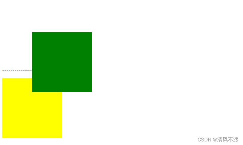
可以看到,box1向左上方向各偏移了100px,并且由于未脱离文档流,p标签及box2位置不变,这就是相对定位
2、绝对定位
绝对定位是相对于具有定位的父元素进行位置调整(如果父元素没有定位则一直向上逐级寻找直至顶层文档),元素脱离文档流
将position属性设置为absolute后可声明该元素为相对定位,举例如下:
<!DOCTYPE html>
<html lang="en">
<head>
    <meta charset="UTF-8">
    <meta http-equiv="X-UA-Compatible" content="IE=edge">
    <meta name="viewport" content="width=device-width, initial-scale=1.0">
    <title>清风不渡</title>

    <style>
        .box{
            width: 200px;
            height: 200px;
            background-color: green;
            position: absolute;
            left: 100px;
            top: 100px;
        }
        .box1{
            width: 200px;
            height: 200px;
            background-color: yellow;
        }
    </style>
</head>
<body>
    <div class="box"></div>
    <p>-----------------------------</p>
    <div class="box1"></div>
</body>
</html>
效果如下:
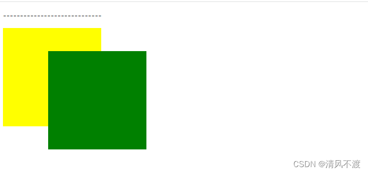
可以看出,box1向左上各偏移了100px,并且由于脱离了文档流,p标签与box2的位置也受到了影响
2、固定定位
固定定位是相对于浏览器窗口进行定位,元素脱离文档流,并且不会随着滚动条的滚动进行位置移动
将position属性设置为fixed后可声明该元素为相对定位,举例如下:
<!DOCTYPE html>
<html lang="en">
<head>
    <meta charset="UTF-8">
    <meta http-equiv="X-UA-Compatible" content="IE=edge">
    <meta name="viewport" content="width=device-width, initial-scale=1.0">
    <title>清风不渡</title>

    <style>
        .box{
            width: 200px;
            height: 200px;
            background-color: green;
            position: fixed;
            right: 100px;
            bottom: 100px;
        }
        .box1{
            width: 200px;
            height: 500px;
            background-color: yellow;
        }
    </style>
</head>
<body>
    <div class="box"></div>
    <p>-----------------------------</p>
    <div class="box1"></div>
    <p>-----------------------------</p>
    <div class="box1"></div>
    <p>-----------------------------</p>
    <div class="box1"></div>
    <p>-----------------------------</p>
    <div class="box1"></div>
</body>
</html>
效果如下:
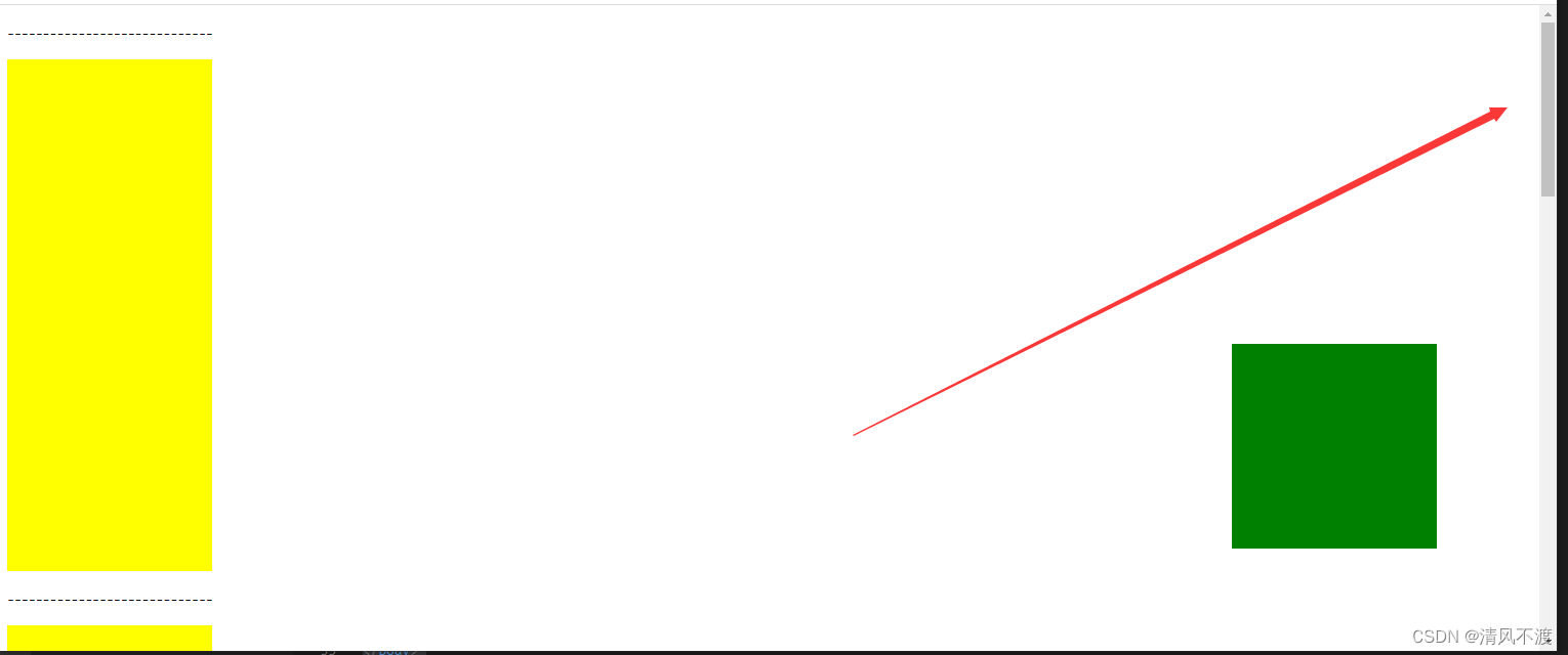
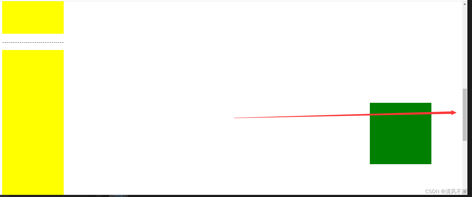
可以看出,随着滚动条的变化,固定定位的元素位置并不会发生改变,这就是固定定位
二、Z-index属性
Z-index属性设置元素的堆叠顺序,值较大的元素会覆盖值较小的元素,举例如下:
<!DOCTYPE html>
<html lang="en">
<head>
    <meta charset="UTF-8">
    <meta http-equiv="X-UA-Compatible" content="IE=edge">
    <meta name="viewport" content="width=device-width, initial-scale=1.0">
    <title>清风不渡</title>

    <style>
        .box1{
            width: 200px;
            height: 200px;
            background-color: green;
            position: absolute;
        }
        .box2{
            width: 200px;
            height: 200px;
            background-color: yellow;
            position: absolute;
            top: 100px;
            left: 100px;
        }
    </style>
</head>
<body>
    <div class="box1"></div>
    <div class="box2"></div>
</body>
</html>
效果如下:
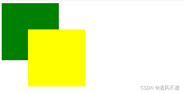
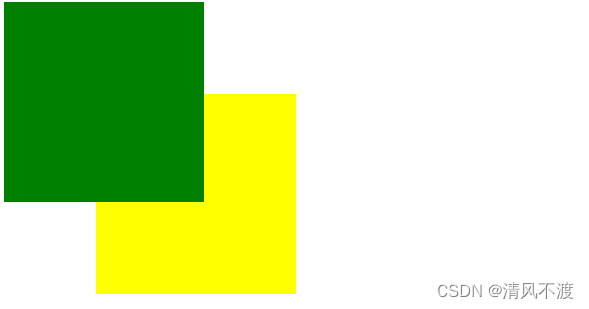
由于代码是自上而下进行执行,所以box2是覆盖掉了box1,如果需要实现box1覆盖box2,则需要使用到Z-index属性,代码如下:
<!DOCTYPE html>
<html lang="en">
<head>
    <meta charset="UTF-8">
    <meta http-equiv="X-UA-Compatible" content="IE=edge">
    <meta name="viewport" content="width=device-width, initial-scale=1.0">
    <title>清风不渡</title>

    <style>
        .box1{
            width: 200px;
            height: 200px;
            background-color: green;
            position: absolute;
            z-index: 2;
        }
        .box2{
            width: 200px;
            height: 200px;
            background-color: yellow;
            position: absolute;
            top: 100px;
            left: 100px;
            z-index: 1;
        }
    </style>
</head>
<body>
    <div class="box1"></div>
    <div class="box2"></div>
</body>
</html>
效果如下:
三、opacity属性
opacity属性用于设置元素的透明度,0为完全透明,0.5为半透明,1为完全不透明,代码如下:
<!DOCTYPE html>
<html lang="en">
<head>
    <meta charset="UTF-8">
    <meta http-equiv="X-UA-Compatible" content="IE=edge">
    <meta name="viewport" content="width=device-width, initial-scale=1.0">
    <title>清风不渡</title>

    <style>
        .box1{
            width: 200px;
            height: 200px;
            background-color: green;
            position: absolute;
            z-index: 2;
            opacity: 0.5;
        }
        .box2{
            width: 200px;
            height: 200px;
            background-color: yellow;
            position: absolute;
            top: 100px;
            left: 100px;
            z-index: 1;
        }
    </style>
</head>
<body>
    <div class="box1"></div>
    <div class="box2"></div>
</body>
</html>
效果如下:
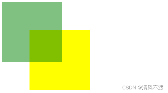
可以看出,此时box1变为了半透明
注意:此属性仅支持IE8以上浏览器,IE8以下浏览器则需要使用alpha(opacity=透明度)进行处理,透明度为0-100之间,0为完全透明,50为半透明,100为完全不透明,代码如下:
<!DOCTYPE html>
<html lang="en">
<head>
    <meta charset="UTF-8">
    <meta http-equiv="X-UA-Compatible" content="IE=edge">
    <meta name="viewport" content="width=device-width, initial-scale=1.0">
    <title>清风不渡</title>

    <style>
        .box1{
            width: 200px;
            height: 200px;
            background-color: green;
            position: absolute;
            z-index: 2;
            filter: alpha(opacity=50);
        }
        .box2{
            width: 200px;
            height: 200px;
            background-color: yellow;
            position: absolute;
            top: 100px;
            left: 100px;
            z-index: 1;
        }
    </style>
</head>
<body>
    <div class="box1"></div>
    <div class="box2"></div>
</body>
</html>


 5340
5340


 被折叠的 条评论
为什么被折叠?
被折叠的 条评论
为什么被折叠?
 到【灌水乐园】发言


