


版权声明
- 本文原创作者:清风不渡
- 博客地址:https://blog.csdn.net/WXKKang
一、CSS3新特性
重拾前端记忆,记录学习笔记,现在进入CSS3新特性——圆角及阴影部分,下面进行说明
二、圆角
使用border-radius属性可以给任何元素增加“圆角”样式,有以下四种定义值的方式:
一个值:四个角值相同
两个值:第一个值为左上、右下角;第二个值为右上、左下角
三个值:第一个值为左上角;第二个值为右上、左下角;第三个值为右下角
四个值:第一个值为左上角;第二个值为右上角;第三个值为右下角;第四个值为左下角
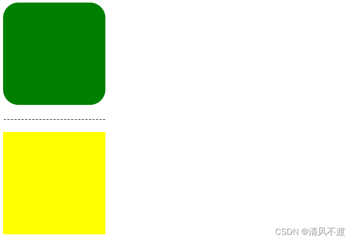
示例如下:
<!DOCTYPE html>
<html lang="en">
<head>
    <meta charset="UTF-8">
    <meta http-equiv="X-UA-Compatible" content="IE=edge">
    <meta name="viewport" content="width=device-width, initial-scale=1.0">
    <title>清风不渡</title>

    <style>
        .box1{
            width: 200px;
            height: 200px;
            background-color: green;
            border-radius: 30px;
        }
        .box2{
            width: 200px;
            height: 200px;
            background-color: yellow;
        }
    </style>
</head>
<body>
    <div class="box1"></div>
    <p>-----------------------------</p>
    <div class="box2"></div>
</body>
</html>
效果如下:
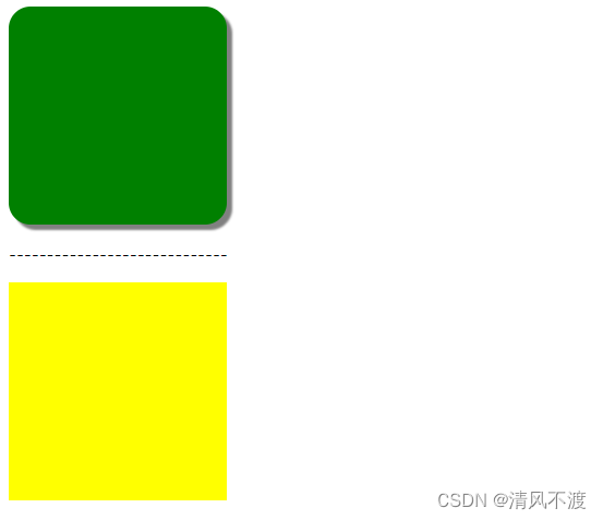
三、阴影
通过box-shadow属性可设置元素的阴影样式,语法如下:
box-shadow : h-shadow v-shadow blur color
- h-shadow 必填,水平阴影位置(正值在右负值在左)
- v-shadow 必填,垂直阴影位置(正值在下负值在上)
- blur 非必填,模糊距离
- color 非必填,阴影的颜色(默认黑色)
举例如下:
<!DOCTYPE html>
<html lang="en">
<head>
    <meta charset="UTF-8">
    <meta http-equiv="X-UA-Compatible" content="IE=edge">
    <meta name="viewport" content="width=device-width, initial-scale=1.0">
    <title>清风不渡</title>

    <style>
        .box1{
            width: 200px;
            height: 200px;
            background-color: green;
            border-radius: 20px;
            box-shadow: 5px 5px 2px gray;
        }
        .box2{
            width: 200px;
            height: 200px;
            background-color: yellow;
        }
    </style>
</head>
<body>
    <div class="box1"></div>
    <p>-----------------------------</p>
    <div class="box2"></div>
</body>
</html>
效果如下:


 1166
1166


 被折叠的 条评论
为什么被折叠?
被折叠的 条评论
为什么被折叠?
 到【灌水乐园】发言


