


项目搭建
本文主要讲解vue3移动端项目如何搭建,在构建项目前请确保已安装node、npm工具,此项目构建主要集成:axios、vant、typescript、vite和vue3,其中还会介绍到如何动态适配尺寸等功能
初始化项目
- cmd打开终端工具,运行:
npm create vite; - 输入项目名称,键盘方向键选择vue;
- 键盘方向键选择 typescript;
- 项目创建成功;
vant
Vant 是一个轻量、高效的移动端组件库。提供了一整套 UI 基础组件和业务组件。通过 Vant,可以快速搭建出风格统一的页面,提升开发效率。
- 终端运行:
npm install vant,安装vant; - 引入vant样式,注册组件;
sass
- npm install sass
- 在assets中新建styles>global.scss,global.scss用于通用的样式
配置路由
- 安装vue-router:
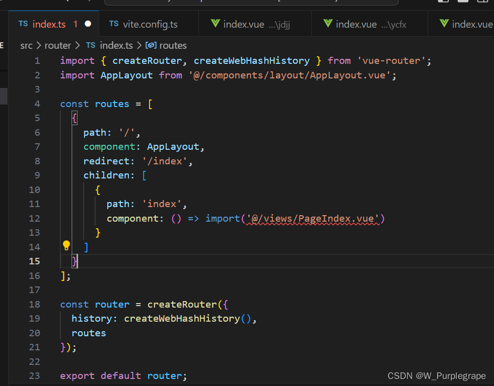
npm install vue-router - 在src下新建router.ts,配置页面路由
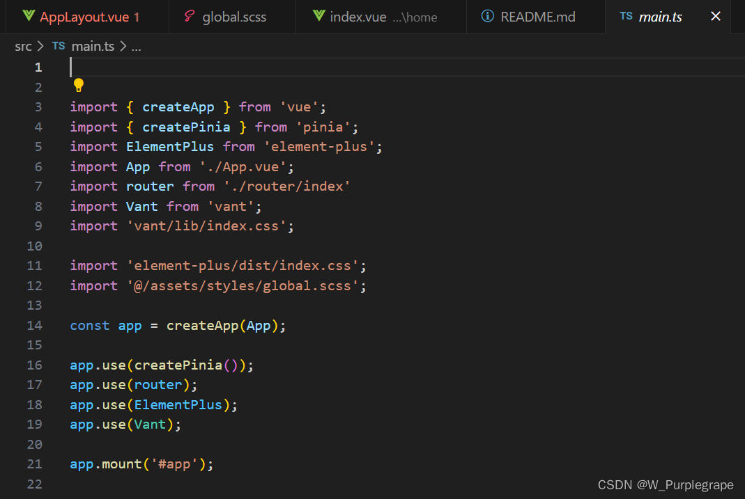
并在main.ts中引入
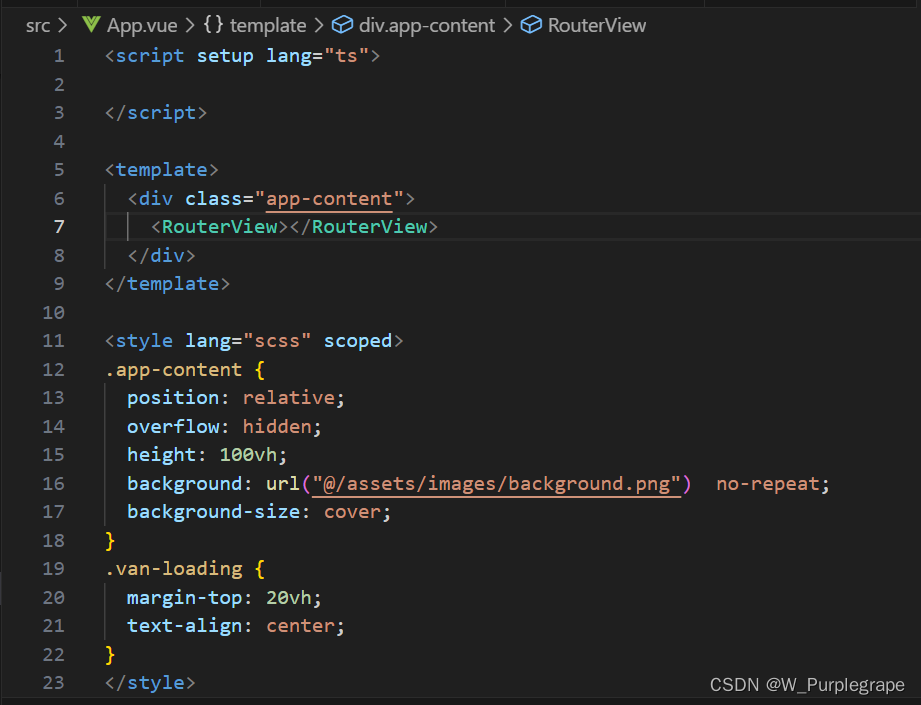
- 修改App.vue,页面显示正常,说明路由配置成功,router-view渲染路由页面
布局适配
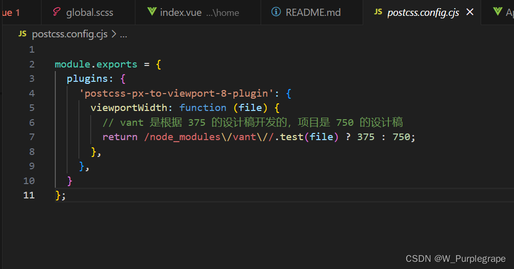
由于 vant 是根据 375 的设计稿开发的,postcss-px-to-viewport 不支持动态配置 viewportWidth,改为使用 postcss-px-to-viewport-8-plugin
- 终端运行:
npm install postcss-px-to-viewport-8-plugin,安装postcss-px-to-viewport-8-plugin - 在根目录上新建postcss.config.js,用于配置 PostCSS 插件postcss-px-to-viewport-8-plugin,将项目中的 CSS 文件中的 px 单位转换为 vw 单位,从而实现移动端的适配。
注意事项:只使用postcss.config.js是无法转换内联样式中的像素,代码中需尽量避免内联样式的使用
pinia
pinia 是一个轻量级且强大的状态管理库,用于 Vue.js 应用程序中管理应用的全局状态。
- 安装 pinia:
npm install pinia - 创建 Pinia 实例:在main.ts中,创建并导出一个 pinia 实例

- 创建并注册模块:在需要使用全局状态管理的地方,可以创建一个模块,定义状态、操作。在 stores 目录下 index.ts 文件中创建 pinia 实例,例如:
import { defineStore } from 'pinia'

interface State {
  dataUpdateTime: DataUpdateTime | null
}

interface DataUpdateTime {
  year: number;
  month: number;
}

export const useStore = defineStore({
  id: 'main',
  state: ():State => ({
    dataUpdateTime: null
  }),
  actions: {
    setDataUpdateTime(payload:DataUpdateTime) {
      this.dataUpdateTime = payload
    }
  }
})
- 在组件中使用全局状态:在组件中通过 useStore 函数获取 pinia 实例,并使用 useStore 模块提供的状态、操作
axios
axios 是一个强大且易用的HTTP请求库
- 安装axios:
npm install axios - 在utils文件夹中创建 axios 实例,实现在项目中统一配置和管理 axios 实例,以便在整个应用程序中重复使用相同的配置和默认设置。
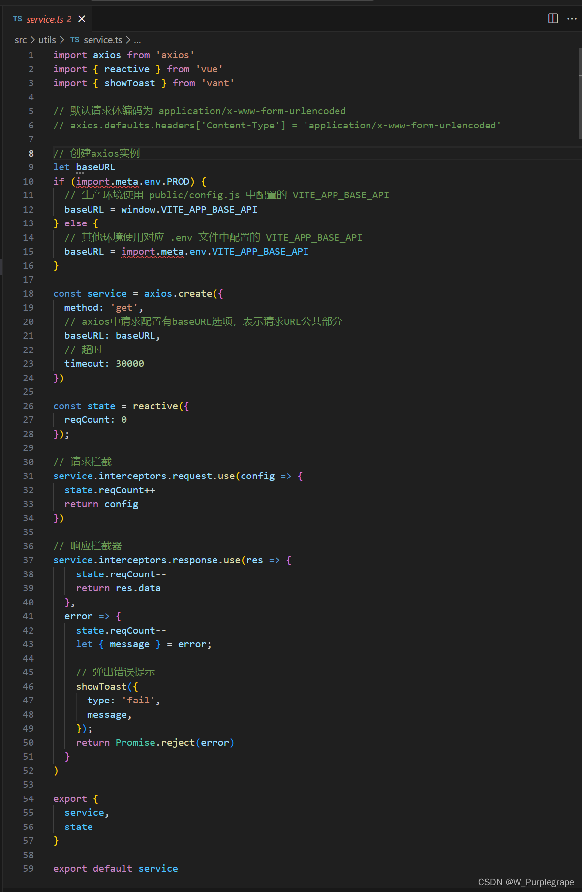 在上面的示例中,我们创建了一个名为 service的 axios 实例,并配置了 baseURL、timeout、headers 等参数。同时,我们也添加了请求拦截器和响应拦截器,用于在请求发送前和响应返回后进行一些处理。
开发环境
.env.development 文件用于定义开发环境的环境变量
环境变量:https://vitejs.cn/vite3-cn/guide/env-and-mode.html#env-variables
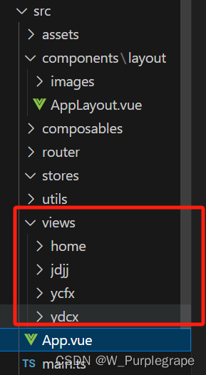
实例页面
在 components 目录下新建一个 layout 目录,用来存放布局组件
例如下面是底部有切换栏,顶部固定标题的页面布局
<script setup lang="ts">
import { ref } from 'vue';
import { useScroll } from '@vueuse/core';

const active = ref<string>('home');

const tabbarItems = ref([
  { name: 'home', title: '栏目1', path: '/index' },
  { name: 'jdjj', title: '栏目2', path: '/jdjj' },
  { name: 'ydcx', title: '栏目3', path: '/ydcx' },
  { name: 'ycfx', title: '栏目4', path: '/ycfx' }
])
</script>

<template>
  <div class="app-layout">
    <div class="app-header">
      <div class="header-title"><span>顶部标题</span></div>
    </div>
    <div class="app-body p-4" ref="bodyRef">
      <RouterView #default="{Component, route}">
        <KeepAlive>
          <component v-if="route.meta?.keepAlive" :is="Component" :key="route.path" />
        </KeepAlive>
        <component v-if="!route.meta?.keepAlive" :is="Component" :key="route.path" />
      </RouterView>
    </div>
    <div class="app-footer">
      <van-tabbar v-model="active" route>
        <van-tabbar-item v-for="item in tabbarItems" :key="item.name" :name="item.name" :to="item.path">
          <span>{{ item.title }}</span>
        </van-tabbar-item>
      </van-tabbar>
    </div>

  </div>
</template>
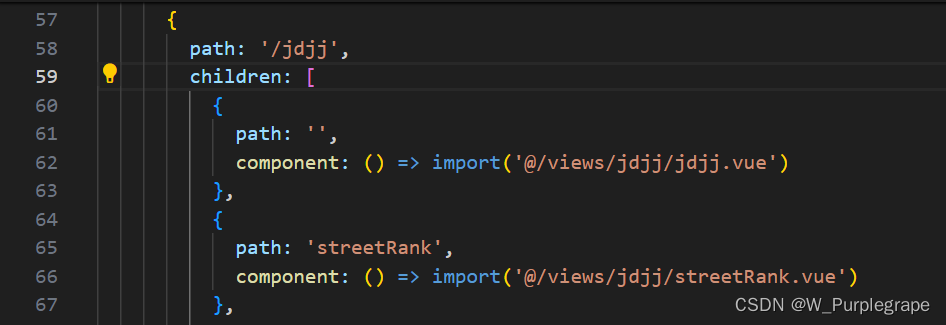
在views创建vue文件,用于存放页面级别的组件,这些组件代表着应用程序中的不同页面或路由,用于组织和渲染特定页面的内容。并将页面路由更新到router下index.ts中
注意事项
移动端适配:echarts字体大小适配需要单独写字体随尺寸动态变化的方法
尽量避免内联样式,postcss-px-to-viewport 无法转换内联样式中的单位
在单个模块菜单中跳转保持选中高亮,跳转详情在当前菜单路由下使用children
遇到问题及解决方法
echarts字体大小适配问题:
用postcss-px-to-viewport-8-plugin可以让项目中其他的内容尺寸随屏幕变化而动态变化,但是项目中很大概率会用到echarts图表,而这个适配方法不能让echarts图表中的字体大小随屏幕尺寸变化,比较影响效果,所以这个时候我们就要单独对echarts图表的字体进行适配操作。
下面用到的方法只是其中之一,可能不是什么很好的方法,就在这里简单写一下:
const screenWidth = ref(window.innerWidth);
// 根据屏幕宽度计算字体大小
let fontSize = screenWidth.value * (3 / 100);
window.addEventListener('resize', function() {
  // 在这里执行屏幕尺寸变化时的操作
  fontSize = window.innerWidth * (3 / 100);
  // 举例修改配置项中某个字体大小属性
  option.value.legend.textStyle.rich.a.fontSize = fontSize
});
上面代码中创建一个响应式数据 screenWidth,并当窗口宽度变化时更新 fontSize。在 window 的 resize 事件监听器中更新了 fontSize 的值以及 echarts图表的配置option.value.legend.textStyle.rich.a.fontSize 的值。(要注意的是使用这个方法需要保证配置项option是响应式数据)


 912
912


 被折叠的 条评论
为什么被折叠?
被折叠的 条评论
为什么被折叠?
 到【灌水乐园】发言


