


个人开发过程中最常用的布局方式-flex,能够解决大部分页面布局。接下来的所有标签都只会是<div>,也只用到flex,虽然看起来会复杂点,但能够帮助你掌握flex的基本用法,并适用于将来的大部分开发中。
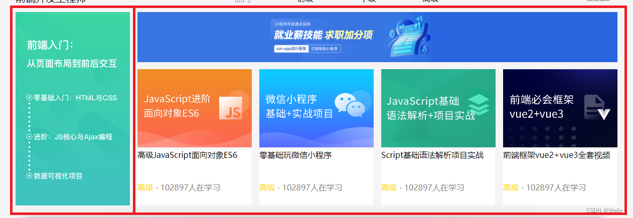
这是一个标准的静态网页排版

首先看到这个页面,第一时间就要对其进行分块
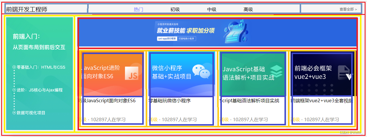
我们根据分块,一步步进行布局
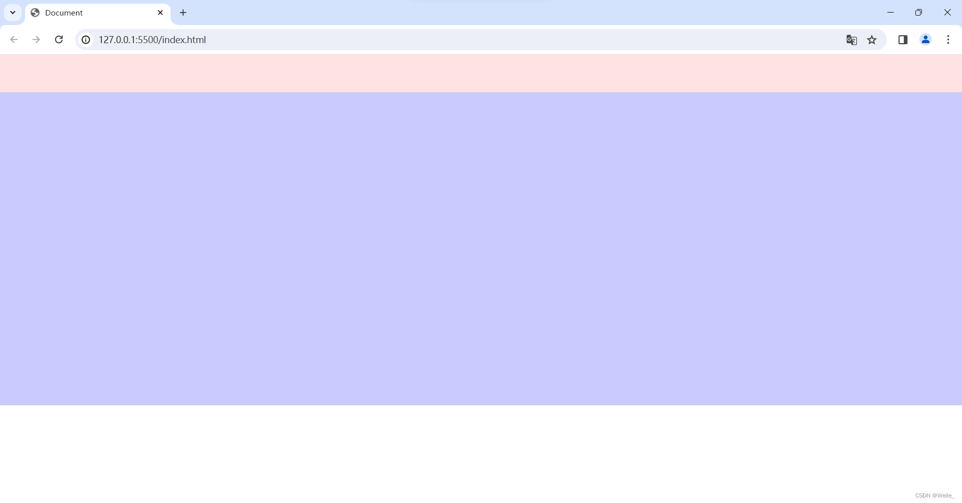
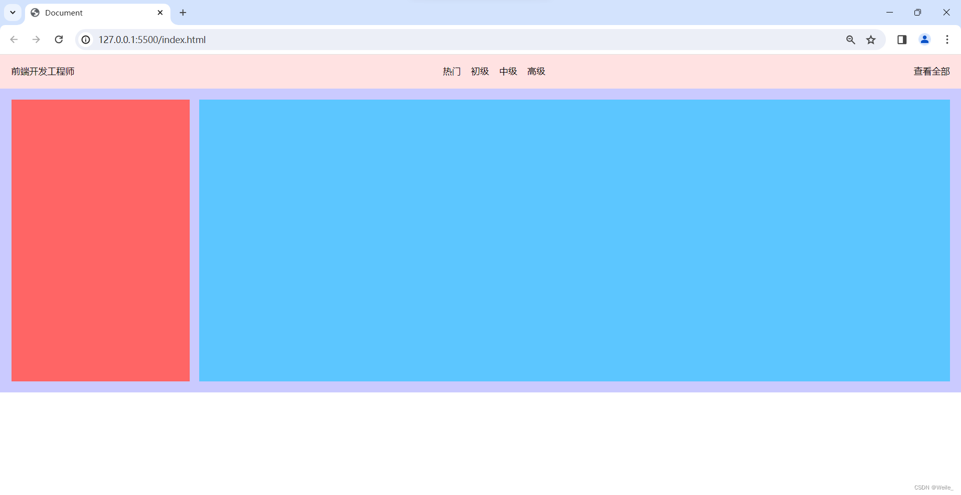
(1)
    <div class="box">
        <div class="Top"></div>
        <div class="Bottom"></div>
    </div>
body{
margin: 0;
padding: 0;
}
.box{
display: flex;
flex-direction: column;
}
.Top{
background-color: rgb(255, 226, 226);
height: 60px;
}
.Bottom{
background-color: rgb(202, 202, 255);
height: 500px;
}效果:
(2)

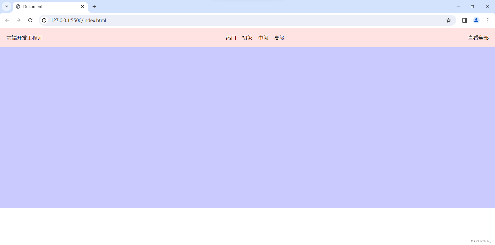
    <div class="Top">
        <div>前端开发工程师</div>
            <div class="ul">
                <div>热门</div>
                <div>初级</div>
                <div>中级</div>
                <div>高级</div>
            </div>
            <div>查看全部</div>
        </div>
    </div>
.Top{
background-color: rgb(255, 226, 226);
height: 60px;
display: flex;
/* justify-content: space-between 两端对齐*/
justify-content: space-between;
line-height: 60px;
padding: 0 20px ;
}
.ul{
width: 200px;
/* 同样用flex让列表水平排列 */
display: flex;
/* justify-content: space-around 均匀分布*/
justify-content: space-around;
}效果:
(3)
        <div class="Bottom">
            <div class="Bottom-left"></div>
            <div class="Bottom-right"></div>
        </div>
.Bottom{
background-color: rgb(202, 202, 255);
height: 500px;
display: flex;
justify-content: space-between;
padding: 20px;
}
.Bottom-left{
width: 19%;
background-color: #ff6565;
}
.Bottom-right{
width: 80%;
background-color: #5cc6ff;
}效果:
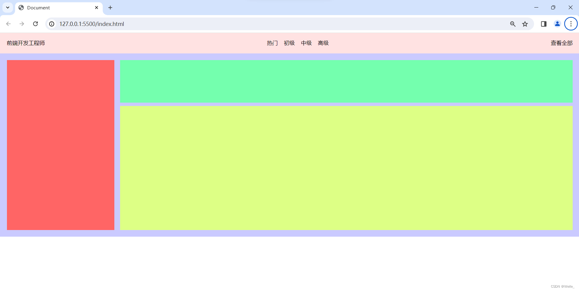
(4)

            <div class="Bottom-right">
                <div class="Bottom-right-top"></div>
                <div class="Bottom-right-bottom"></div>
            </div>
.Bottom-right{
width: 80%;
display: flex;
flex-direction: column;
justify-content: space-between;
}
.Bottom-right-top{
background-color: #74ffae;
height: 25%;
}
.Bottom-right-bottom{
background-color: #ddff85;
height: 73%;
}效果:
(5)
                <div class="Bottom-right-bottom">
                    <div></div>
                    <div></div>
                    <div></div>
                    <div></div>
                </div>
.Bottom-right-bottom{
height: 73%;
display: flex;
justify-content: space-between;
}
.Bottom-right-bottom>div{
background-color: #ddff85;
/* 控制好4个的宽度,留1%作为间距 */
width: 24%;
}效果:
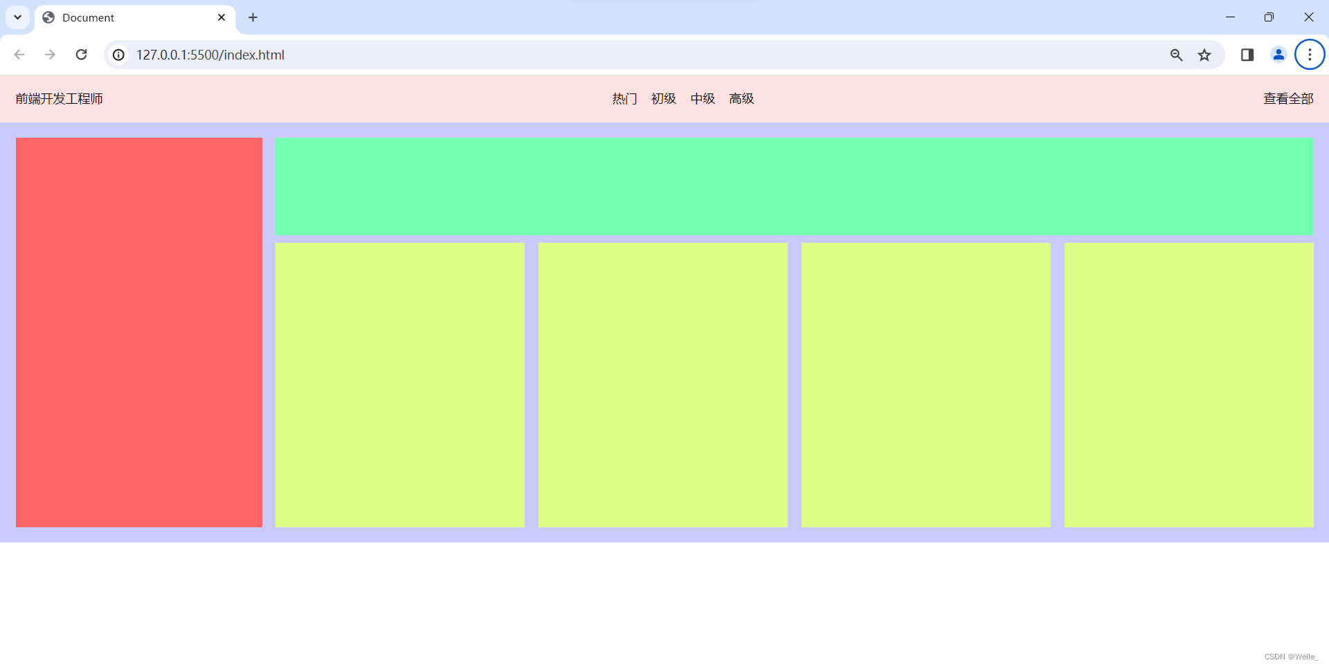
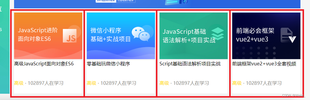
(5)
                <div class="Bottom-right-bottom">
                    <div>
                        <div class="item-top"></div>
                        <div class="item-bottom"></div>
                    </div>
                    <div>
                        <div class="item-top"></div>
                        <div class="item-bottom"></div>
                    </div>
                    <div>
                        <div class="item-top"></div>
                        <div class="item-bottom"></div>
                    </div>
                    <div>
                        <div class="item-top"></div>
                        <div class="item-bottom"></div>
                    </div>
                </div>
.Bottom-right-bottom>div{
/* 控制好4个的宽度,留1%作为间距 */
width: 24%;
display: flex;
flex-direction: column;
}
.item-top{
background-color: #a2ff85;
height: 50%;
}
.item-bottom{
background-color: #ffe0aa;
height: 50%;
}效果:

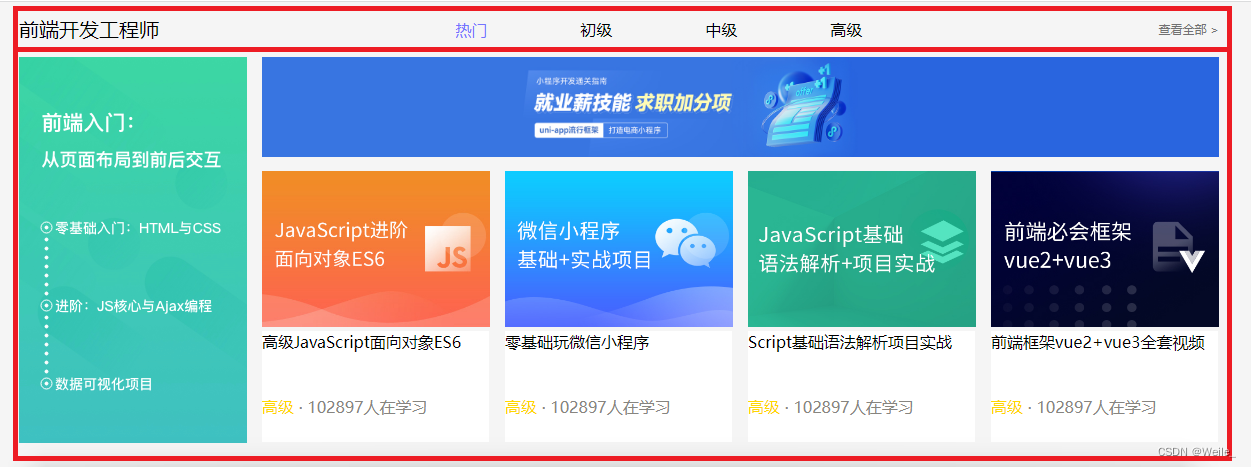
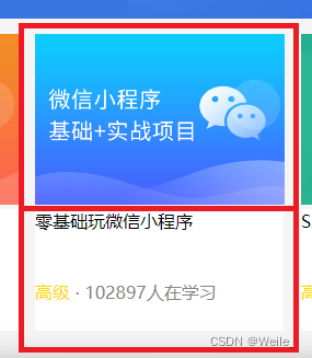
后面就剩加入文字、图片,一些css效果了。
上完整代码:
<!DOCTYPE html>
<html lang="en">
<head>
<meta charset="UTF-8">
<meta name="viewport" content="width=device-width, initial-scale=1.0">
<title>Document</title>
<style>
body{
margin: 0;
padding: 0;
}
.box{
display: flex;
flex-direction: column;
}
.Top{
background-color: rgb(255, 226, 226);
height: 60px;
display: flex;
/* justify-content: space-between 两端对齐*/
justify-content: space-between;
line-height: 60px;
padding: 0 20px ;
}
.Bottom{
background-color: rgb(202, 202, 255);
height: 500px;
display: flex;
justify-content: space-between;
padding: 20px;
}
.Bottom-left{
width: 19%;
background-color: #ff6565;
}
.Bottom-right{
width: 80%;
display: flex;
flex-direction: column;
justify-content: space-between;
}
.Bottom-right-top{
background-color: #74ffae;
height: 25%;
}
.Bottom-right-bottom{
height: 73%;
display: flex;
justify-content: space-between;
}
        .Bottom-right-bottom>div{
            /* 控制好4个的宽度,留1%作为间距 */
            width: 24%;
            display: flex;
            flex-direction: column;
        }
        .item-top{
            background-color: #a2ff85;
            height: 50%;
        }
        .item-bottom{
            background-color: #ffe0aa;
            height: 50%;
        }
.ul{
width: 200px;
/* 同样用flex让列表水平排列 */
display: flex;
/* justify-content: space-around 均匀分布*/
justify-content: space-around;
}
</style>
</head>
<body>
<!-- 上下两块,垂直布局,并设置大小 -->
<div class="box">
<div class="Top">
<div>前端开发工程师</div>
<div class="ul">
<div>热门</div>
<div>初级</div>
<div>中级</div>
<div>高级</div>
</div>
<div>查看全部</div>
</div>
<div class="Bottom">
<div class="Bottom-left"></div>
<div class="Bottom-right">
<div class="Bottom-right-top"></div>
<div class="Bottom-right-bottom">
<div>
<div class="item-top"></div>
<div class="item-bottom"></div>
</div>
<div>
<div class="item-top"></div>
<div class="item-bottom"></div>
</div>
<div>
<div class="item-top"></div>
<div class="item-bottom"></div>
</div>
<div>
<div class="item-top"></div>
<div class="item-bottom"></div>
</div>
</div>
</div>
</div>
</div>
</body>
</html>


 6194
6194


 被折叠的 条评论
为什么被折叠?
被折叠的 条评论
为什么被折叠?
 到【灌水乐园】发言


