


一、弹性布局 和 开启弹性空间
弹性布局(伸缩布局 / 弹性盒子 / flex布局),弹性布局是父元素和子元素之间的关系
- 父元素:弹性空间,父元素还具备之前的显示模式特征。
- 子元素:弹性元素(弹性项),不在具备之前的显示模式特征,默认当父元素盛不下时会进行压缩。
开启弹性空间:给需要开启弹性的元素的父元素设置属性display:flex
html
<body>
		<div class="box1">
			<div>1</div>
			<div>2</div>
			<div>3</div>
			<div>4</div>
			<div>5</div>
			<div>6</div>
			<div>7</div>
			<div>8</div>
			<div>9</div>
			<div>10</div>
		</div>
	</body>
css
.box1{
	border: 5px solid red;
	/* 开启弹性空间 */
	display: flex;
}
.box1>div{
	width: 100px;
	height: 100px;
}
.box1>div:nth-of-type(1){
	background: blue;
}
.box1>div:nth-of-type(2){
	background: yellow;
}
.box1>div:nth-of-type(3){
	background: greenyellow;
}
.box1>div:nth-of-type(4){
	background: purple;
}
.box1>div:nth-of-type(5){
	background: red;
}
.box1>div:nth-of-type(6){
	background: brown;
}
.box1>div:nth-of-type(7){
	background: skyblue;
}
.box1>div:nth-of-type(8){
	background: fuchsia;
}
.box1>div:nth-of-type(9){
	background: orangered;
}
.box1>div:nth-of-type(10){
	background: goldenrod;
}
运行截图:
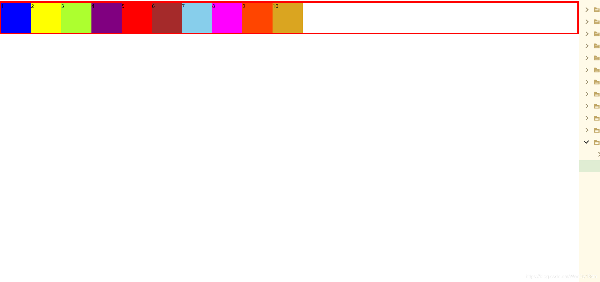
可见box1中的所有div都失去了原来块元素的特征,不再独占一行,而是以窗口左边开始,一直排到右边结束。
二、弹性元素在主轴的方向和顺序
主轴: 弹性元素是沿着主轴方向进行排列,默认主轴是水平方向,左边是开始,右边是结束
侧轴(交叉轴,垂轴,辅轴): 弹性元素沿着侧轴换行,默认侧轴是垂直方向,上边是开始,下边是结束
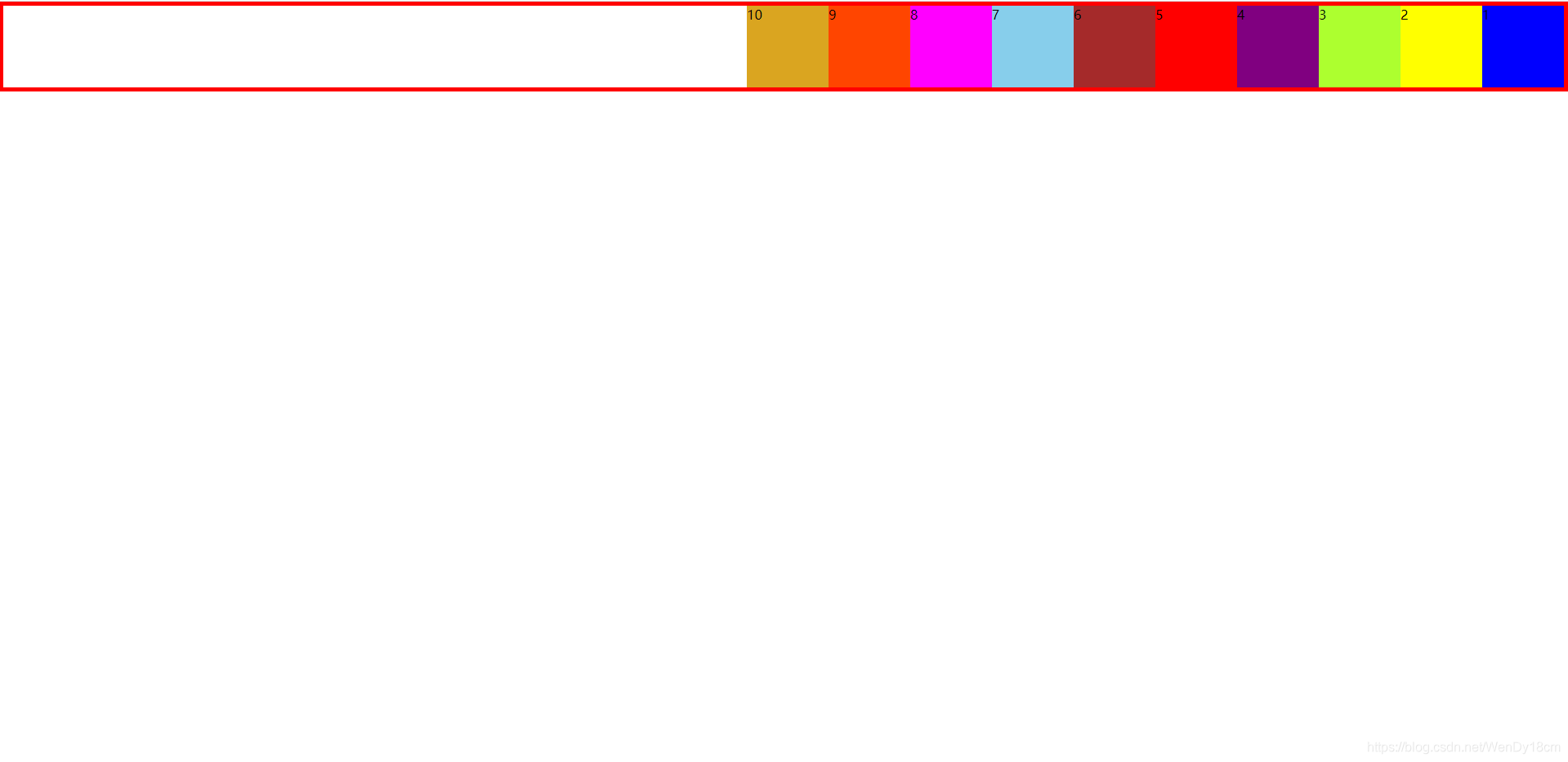
弹性元素在主轴的方向和顺序:
- row(默认值):主轴是水平方向,左边是开始,右边是结束,侧轴是垂直方向,上边是开始,下边是结束
- row-reverse:主轴是水平方向,左边是结束,右边是开始,侧轴是垂直方向,上边是开始,下边是结束
.box1 {
	border: 5px solid red;
	/* 开启弹性空间 */
	display: flex;
	flex-direction: row-reverse;
}
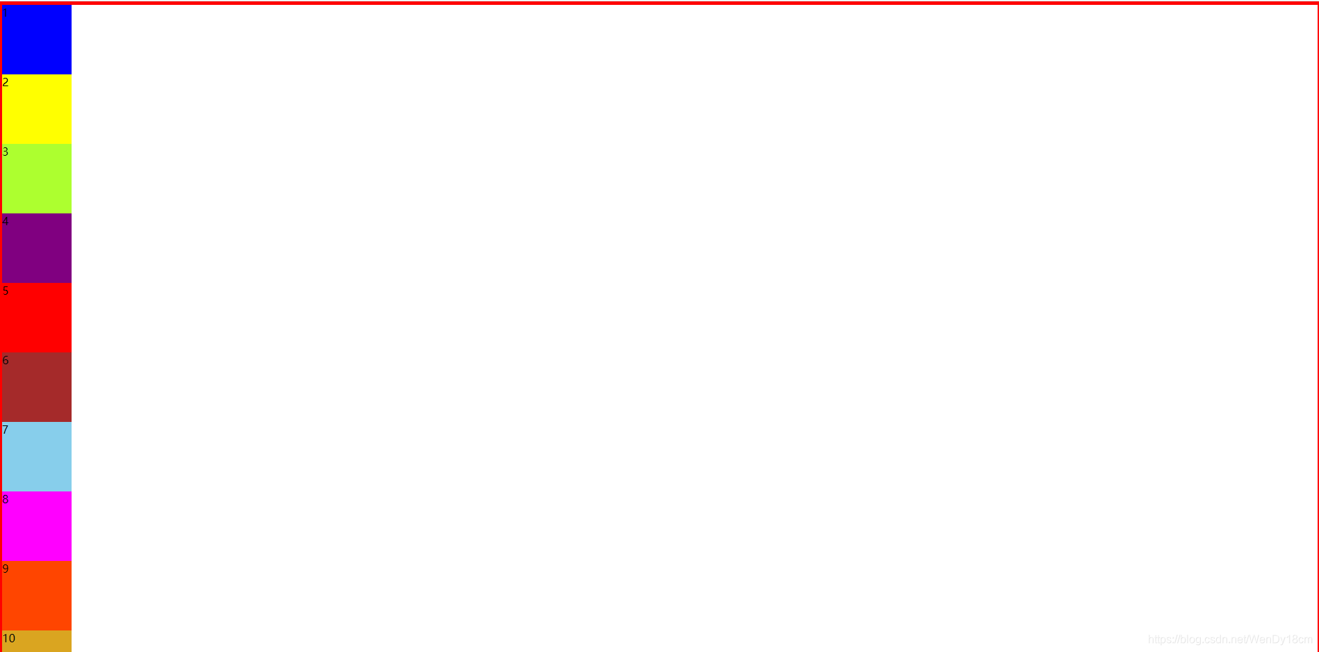
3.column:主轴是垂直方向,上边是开始,下边是结束,侧轴是水平方向,左边是开始,右边是结束
.box1 {
	border: 5px solid red;
	/* 开启弹性空间 */
	display: flex;
	flex-direction: column;
}
4.column-reverse: 主轴是垂直方向,上边是结束,下边是开始,侧轴是水平方向,左边是开始,右边是结束
.box1 {
	border: 5px solid red;
	height: 1500px;
	/* 开启弹性空间 */
	display: flex;
	flex-direction: column-reverse;
}
希望朋友们可以多多练习,搞清弹性布局的主轴和侧轴,弹性元素在主轴上的排序方向,大家有问题可以在评论区留言讨论。


 9546
9546


 被折叠的 条评论
为什么被折叠?
被折叠的 条评论
为什么被折叠?
 到【灌水乐园】发言


