<div class="buttons">
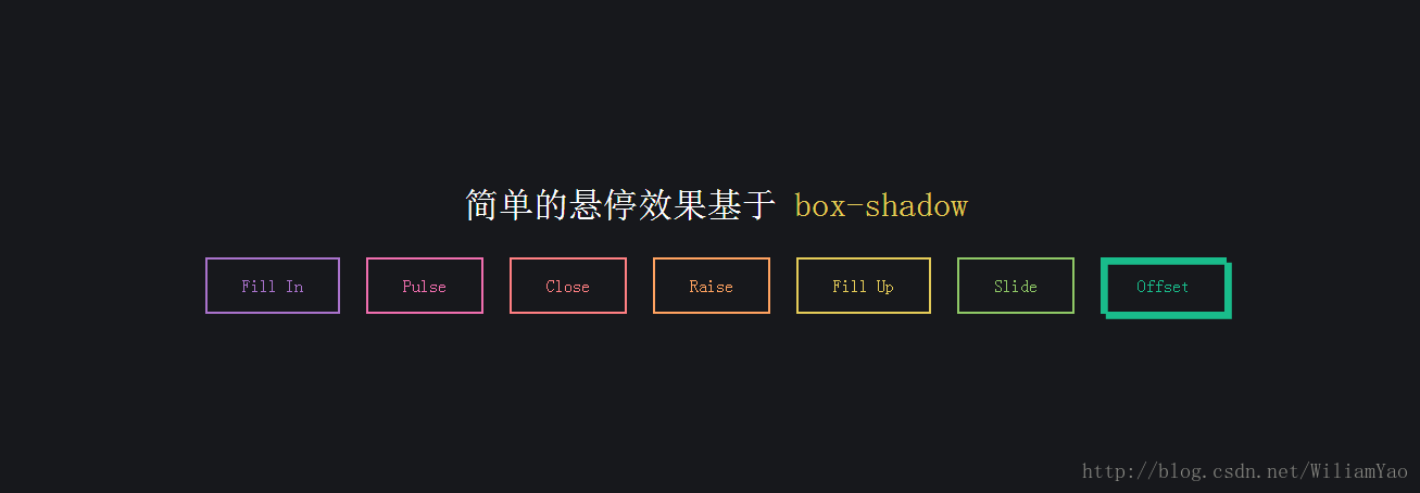
<h1>简单的悬停效果基于 <code>box-shadow</code></h1>
<button class="fill">Fill In</button>
<button class="pulse">Pulse</button>
<button class="close">Close</button>
<button class="raise">Raise</button>
<button class="up">Fill Up</button>
<button class="slide">Slide</button>
<button class="offset">Offset</button>
</div>
<style>
    .fill:hover,
    .fill:focus {
      box-shadow: inset 0 0 0 2em var(--hover);
    }

    .pulse:hover,
    .pulse:focus {
      -webkit-animation: pulse 1s;
              animation: pulse 1s;
      box-shadow: 0 0 0 2em rgba(255, 255, 255, 0);
    }

    @-webkit-keyframes pulse {
      0% {
        box-shadow: 0 0 0 0 var(--hover);
      }
    }

    @keyframes pulse {
      0% {
        box-shadow: 0 0 0 0 var(--hover);
      }
    }
    .close:hover,
    .close:focus {
      box-shadow: inset -3.5em 0 0 0 var(--hover), inset 3.5em 0 0 0 var(--hover);
    }

    .raise:hover,
    .raise:focus {
      box-shadow: 0 0.5em 0.5em -0.4em var(--hover);
      -webkit-transform: translateY(-0.25em);
              transform: translateY(-0.25em);
    }

    .up:hover,
    .up:focus {
      box-shadow: inset 0 -3.25em 0 0 var(--hover);
    }

    .slide:hover,
    .slide:focus {
      box-shadow: inset 6.5em 0 0 0 var(--hover);
    }

    .offset {
      box-shadow: 0.3em 0.3em 0 0 var(--color), inset 0.3em 0.3em 0 0 var(--color);
    }
    .offset:hover, .offset:focus {
      box-shadow: 0 0 0 0 var(--hover), inset 6em 3.5em 0 0 var(--hover);
    }

    .fill {
      --color: #a972cb;
      --hover: #cb72aa;
    }

    .pulse {
      --color: #ef6eae;
      --hover: #ef8f6e;
    }

    .close {
      --color: #ff7f82;
      --hover: #ffdc7f;
    }

    .raise {
      --color: #ffa260;
      --hover: #e5ff60;
    }

    .up {
      --color: #e4cb58;
      --hover: #94e458;
    }

    .slide {
      --color: #8fc866;
      --hover: #66c887;
    }

    .offset {
      --color: #19bc8b;
      --hover: #1973bc;
    }

    button {
      color: var(--color);
      -webkit-transition: 0.25s;
      transition: 0.25s;
    }
    button:hover, button:focus {
      border-color: var(--hover);
      color: #fff;
    }

    body {
      color: #fff;
      background: #17181c;
      font: 300 1em 'Fira Sans', sans-serif;
      -webkit-box-pack: center;
      -ms-flex-pack: center;
      justify-content: center;
      -ms-flex-line-pack: center;
      align-content: center;
      -webkit-box-align: center;
      -ms-flex-align: center;
      align-items: center;
      text-align: center;
      min-height: 100vh;
      display: -webkit-box;
      display: -ms-flexbox;
      display: flex;
    }

    button {
      background: none;
      border: 2px solid;
      font: inherit;
      line-height: 1;
      margin: 0.5em;
      padding: 1em 2em;
    }

    h1 {
      font-weight: 400;
    }

    code {
      color: #e4cb58;
      font: inherit;
    }

</style>


 326
326


 被折叠的 条评论
为什么被折叠?
被折叠的 条评论
为什么被折叠?
 到【灌水乐园】发言


