


实现思路:结合盒子模型的样式进行修改。
第一步:做一个盒子模型

代码如下:
<!DOCTYPE html>
<html lang="en">
<head>
    <meta charset="UTF-8">
    <meta http-equiv="X-UA-Compatible" content="IE=edge">
    <meta name="viewport" content="width=device-width, initial-scale=1.0">
    <title>Document</title>
    <style>
        .box{
            width:100px;
            height:100px;
            border-width: 10px 10px 10px 10px;
            border-color:green red blue black; /* 其他颜色的透明度为0 */
            border-style: solid solid solid solid;
        }
    </style>
</head>
<body>
    <div class="box"></div>
</body>
</html>
第二步:当宽度和高度为0时,四个边框就会合在一起。

代码如下:
<!DOCTYPE html>
<html lang="en">
<head>
    <meta charset="UTF-8">
    <meta http-equiv="X-UA-Compatible" content="IE=edge">
    <meta name="viewport" content="width=device-width, initial-scale=1.0">
    <title>Document</title>
    <style>
        .box{
            width:0px;
            height:0px;
            border-width: 10px 10px 10px 10px;
            border-color:green red blue black; /* 其他颜色的透明度为0 */
            border-style: solid solid solid solid;
        }
    </style>
</head>
<body>
    <div class="box"></div>
</body>
</html>
第三步:把另外三个边框颜色的透明度设置成透明,就能出现三角形了。
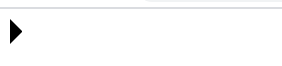
代码如下:
<!DOCTYPE html>
<html lang="en">
<head>
    <meta charset="UTF-8">
    <meta http-equiv="X-UA-Compatible" content="IE=edge">
    <meta name="viewport" content="width=device-width, initial-scale=1.0">
    <title>Document</title>
    <style>
        .box{
            width: 0px;
            height:0px;
            border-width: 10px 10px 10px 10px;
            border-color:transparent transparent transparent black; /* 其他颜色的透明度为0 */
            border-style: solid solid solid solid;
        }
    </style>
</head>
<body>
    <div class="box"></div>
</body>
</html>


 3万+
3万+


 被折叠的 条评论
为什么被折叠?
被折叠的 条评论
为什么被折叠?
 到【灌水乐园】发言


