


最近在学习多智能体相关的算法,但是PyMarl只输出文字结果,不是很直观,想找一个可视化的代码没有找到,就写了一个供小伙伴们借鉴啦
1.找到‘pymarl-master/results/sacred’文件夹
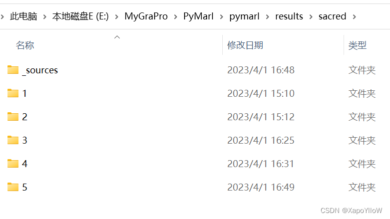
我的改了名字所以是"E:\MyGraPro\PyMarl\pymarl\results\sacred",其中’1 2 3...'是框架为你每次运行结果编的号
2.点击进入想生成可视化图片的实验编号文件中,找到'info.json'文件
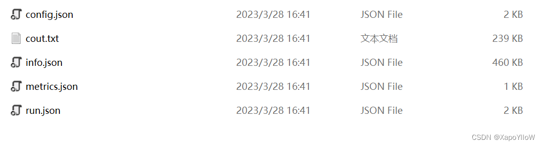 3.将'info.json'文件复制并放到和下列代码同一项目文件中

import json
import matplotlib.pyplot as plt
from matplotlib.ticker import MultipleLocator
import matplotlib.gridspec as gridspec
# Load the data from the JSON file
with open('info.json', 'r') as f:
data = json.load(f)
# Extract the x and y values for 'battle_won_mean', 'test_battle_won_mean', and 'loss'
battle_won_mean = []
test_battle_won_mean = []
loss = []
return_mean = []
for i, val in enumerate(data['battle_won_mean']):
battle_won_mean.append([i+1, val])
for i, val in enumerate(data['test_battle_won_mean']):
test_battle_won_mean.append([i+1, val])
for i, val in enumerate(data['loss']):
loss.append([i+1, val])
for rm in data['return_mean']:
return_mean.append(rm['value'])
# Set up the layout of the subplots
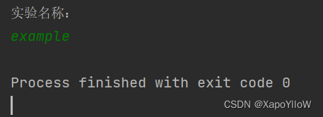
til = input("实验名称:\n") #输入本次实验的编号或者名称
fig = plt.figure(figsize=(10, 8))
gs = gridspec.GridSpec(nrows=3, ncols=1, height_ratios=[1, 1, 1.2])
gs.update(hspace=0.5, wspace=0.5)
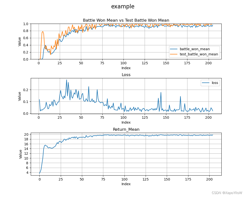
fig.suptitle(til, fontsize=16)
# Create the plot for battle_won_mean and test_battle_won_mean
ax1 = plt.subplot(gs[0])
ax1.plot(*zip(*battle_won_mean), label='battle_won_mean')
ax1.plot(*zip(*test_battle_won_mean), label='test_battle_won_mean')
ax1.grid()
ax1.set_ylim(0, 1.0)
# Add labels and title to the plot
ax1.set_xlabel('Index')
ax1.set_ylabel('Value')
ax1.set_title('Battle Won Mean vs Test Battle Won Mean')
# Add legend to the plot
ax1.legend()
# Set y-axis tick interval to 0.2
ax1.xaxis.set_major_locator(MultipleLocator(25))
ax1.yaxis.set_major_locator(MultipleLocator(0.2))
# Create the plot for loss
ax2 = plt.subplot(gs[1])
ax2.plot(*zip(*loss), label='loss')
# Add labels and title to the plot
ax2.set_xlabel('Index')
ax2.set_ylabel('Value')
ax2.set_title('Loss')
# Add legend to the plot
ax2.legend()
# Set x-axis tick interval to 25
ax2.xaxis.set_major_locator(MultipleLocator(25))
# Add grid lines to both plots
ax2.grid()
# Create the plot for return_mean
ax3 = plt.subplot(gs[2])
ax3.plot(return_mean)
ax3.grid()
# Add labels and title to the plot
ax3.set_xlabel('Index')
ax3.set_ylabel('Value')
ax3.set_title('Return_Mean')
# Set x-axis tick interval to 25
ax3.xaxis.set_major_locator(MultipleLocator(25))
ax3.yaxis.set_major_locator(MultipleLocator(2))
# Save the plot to the output directory
plt.savefig("存放图像的地址"+til+'.png')
# display the picture
plt.show()
点击运行就能生成可视化图片了
以PyMarl测试命令为例:
python3 src/main.py --config=qmix --env-config=sc2 with env_args.map_name=2s3z


 3621
3621


 被折叠的 条评论
为什么被折叠?
被折叠的 条评论
为什么被折叠?
 到【灌水乐园】发言


