


为登陆框添加一个边角弧度
<style>
.className{
    /*设置div边边框角的弧度*/
    border-radius: 10px;
}
</style>
<el–input>标签常用属性
<!--使用prefix属性添加一个前缀图标-->
<el-input prefix-icon="el-icon-user-solid"></el-input>

<!--使用suffix-icon属性添加一个后缀图标-->
<el-input suffix-icon="el-icon-s-tools"><el-input>

<!--使用placeholder为输入框添加一个提示输入语
	show-password属性可以在密码框右边有一个查看密码的图标
-->
<el-input placeholder="用户名"></el-input>
<el-input placeholder="密码" show-password></el-input>

<!--使用clearable使输入框右边有一个可清空的图标-->
<el-input clearable></el-input>
设置按钮样式
<!--使用style="width:100%"将按钮框与input框一样长,
type="primary"属性设置按钮为蓝色,emsp;是一个中文宽度
-->
<el-button style="width:100%"
type="primary"
v-on:click="loginHandle" >
登  陆
</el-button>
登陆表单样例
<div class="login-page">
<div class="login-form">
<el-form ref="loginForm" v-bind:model="dataForm" :rules="rules" class="el-fo">
<h2>请登录</h2>
<el-form-item prop="username">
<el-input v-model="dataForm.username" placeholder="用户名" prefix-icon="el-icon-user" clearable></el-input>
</el-form-item>
<el-form-item prop="password">
<el-input v-model="dataForm.password" placeholder="密码" show-password prefix-icon="el-icon-lock" clearable></el-input>
</el-form-item>
<el-button type="primary" v-on:click="loginHandle">登  陆</el-button>
</el-form>
</div>
</div>
<style scoped>
/**
样式默认是所有组件共享(在所有页面都可以使用)
如果样式需要私有化(仅能在当前页使用),在<style>上加一个属性scoped
*/
.login-page{
position: absolute;
left: 0;
right: 0;
top: 0;
bottom: 0;
/*添加背景图*/
background-image: url(~@/assets/bg.jpg);
background-size: cover;
}
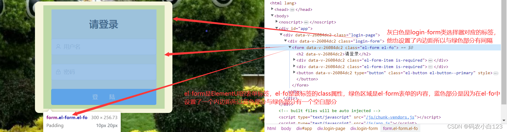
.login-form{/*对应下图的灰白色部分*/
width:300px;
background-color: beige;
text-align: center;
/*设置div边边的外边距*/
margin: 100px auto;
/*设置div边边的内边距*/
padding: 10px 20px;
/*设置div边边框角的弧度*/
border-radius: 10px;
}
.el-fo{/*对应下图的绿色部分*/
/*设置真实表单框的内边距*/
padding: 10px 20px;
}
/*在ElementUI中每个标签也都有它自己的样式,样式类名为组件名称*/
.el-button{ /*按钮变宽*/
width: 100%;
}
</style>


 5503
5503


 被折叠的 条评论
为什么被折叠?
被折叠的 条评论
为什么被折叠?
 到【灌水乐园】发言


