


作者:贾胜杰,硕士,退役军人,电气工程专业,现成功转行K12领域数据挖掘工程师,不仅在数据清理、分析和预测方向,而且在自制力和高效学习方面都有丰富经验。
编辑:王老湿
Hi,各位同学,专栏关于修炼技法的部分已经发布了六篇:
本周内容
Matplotlib简介
Matplotlib中的基本概念
从整体到细节的详尽参数介绍
常用可视化图像
Matplotlib简介
matplotlib是Python泰斗级别的绘图库,因受到Matlab的启发构建而成,所以你会觉得它的命令API,还有那九十年代感强烈的可视化图像跟matlab很相似。它非常适合在jupyter notebook中交互式作图,这个库“功能非常强大”,但也“非常复杂”,所以这里只能介绍matplotlib的一些基础和常用的方法,想了解更多就需要你自主探索啦!
导入matplotlib
import matplotlib.pyplot as plt
在notebook中使用
#想在Jupyter Notebook中顺利显示出可视化图像,你需要添加如下代码
%matplotlib inline
官方链接
你可以点击matplotlib.pyplot搜索查看一些函数的说明和用法;或者你可以点击Pyplot Gallery查看一些代码实例,找到灵感。
matplotlib.pyplot:
Pyplot Gallery:
基本概念
在使用matplotlib生成图像时,整个图像为一个Figure对象。在Figure对象中可以包含一个,或者多个Axes对象。每个Axes对象都是一个拥有自己坐标系统的绘图区域。其逻辑关系如下:
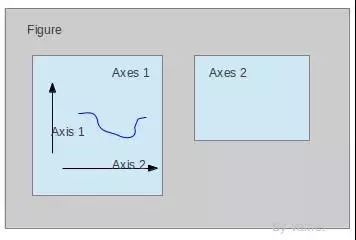
(图像来源:https://www.cnblogs.com/vamei/)
你可以把它类比为在纸上画画,纸对应于Figure对象,而我们在纸上画的一幅幅图像就对应于Axes对象
在如下的单图fig中,我们给出了我们的绘图中只有一个坐标系区域(也就是ax),此外还有以下对象:
Data: 数据区,包括数据点、描绘形状
Axis: 坐标轴,包括 X 轴、 Y 轴及其标签、刻度尺及其标签
Title: 标题,数据图的描述
Legend: 图例,区分图中包含的多种曲线或不同分类的数据
其他的还有图形文本 (Text)、注解 (Annotate)等其他描述
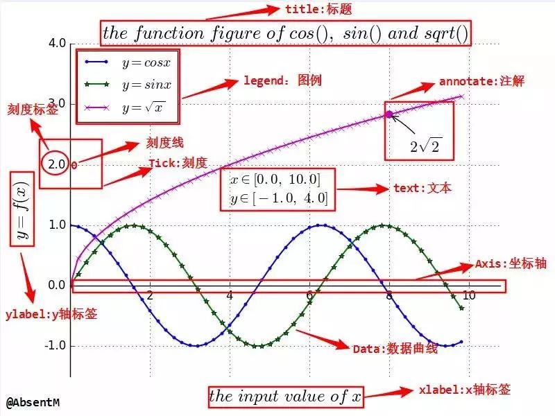
(图像来源:https://absentm.github.io/)

(图像来源:https://www.cnblogs.com/vamei/)
常用参数设置
开始绘图
在绘图前,首先需要设置的就是fig(画布)和ax(图),我们主要通过plt.subplots()函数来定义。
#绘制单图
fig, ax = plt.subplots()
#绘制多图,subplots的第一个参数为行数,第二个参数为列数
fig,(ax1,ax2) = plt.subplots(1,2,sharey = True)#设置共享y轴
#绘制多图时,注意前面的变量为一个矩阵的形式,如下前面为2x2矩阵,则后面subplots的行列参数也应该都为2
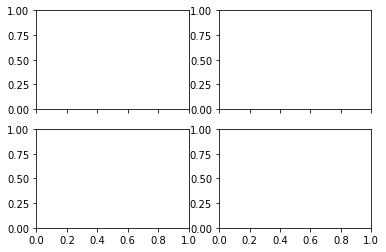
fig,((ax1,ax2),(ax3,ax4)) = plt.subplots(2,2,sharex = True)#设置共享x轴
另一种添加子图的方法
绘制子图主要使用的函数为:add_subplot(abc),调用该函数会生成一个包含axb个子图的画布,而c则表示位置,按照从左至右,从上至下的顺序依次排列。
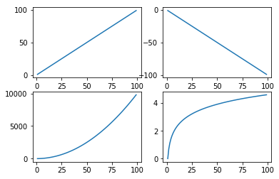
x = np.arange(1,100)

fig = plt.figure() #定义画布
ax1 = fig.add_subplot(221) # 定义2*2个子图(1表示左一)
ax1.plot(x,x) # 绘制左一折线图

ax2 = fig.add_subplot(222)
ax2.plot(x,-x) # 绘制右一折线图(右一)

ax3 = fig.add_subplot(223)
ax3.plot(x,x*x) # 绘制左二折线图(左二)

ax4 = fig.add_subplot(224)
ax4.plot(x,np.log(x)); # 绘制右二折线图(右二),添加分号可以只显示图像
坐标轴设置
调整范围
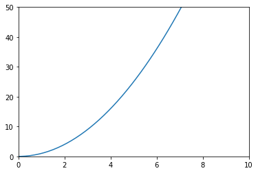
主要是用来利用调整坐标轴范围进行图像的截取,可以使用ax.axis()函数,也可使用plt.xlim()或者plt.ylim()函数,具体用法如下:
#ax.axis([0,10,0,50]) [x左,x右,y下,y上]
x = np.arange(-10,10,0.1)
fig = plt.figure()
ax = fig.add_subplot(111)
ax.plot(x,x**2)
ax.axis([0,10,0,50])

#plt.xlim([0,10]) ,调整x轴坐标范围
#plt.ylim([0,50]) ,调整y轴坐标范围
fig1 = plt.figure()
ax1 = fig1.add_subplot(111)
ax1.plot(x,x**2)
plt.xlim([0,10])
plt.ylim([0,50]);
坐标轴刻度调整
#利用ax.locator_params()设置刻度间隔

x = np.arange(0,11,0.1)
fig1 = plt.figure()
ax1  = fig1.add_subplot(111)
ax1.plot(x,x)
#ax1.locator_params(nbins=20) #同时调整x轴与y轴
#ax1.locator_params('x',nbins=20) #只调整x轴
ax1.locator_params('y',nbins=20) #只调整y轴
plt.axis([0,10,0,10]);

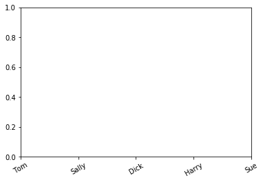
#利用plt.xticks()设置x轴刻度顺序/旋转角度
plt.xticks([0,2,3,1,4], ['Tom', 'Dick', 'Harry', 'Sally', 'Sue'],  rotation=30);
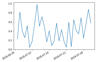
#时间刻度调整
import datetime
import matplotlib as mpl

start = datetime.datetime(2018,7,1)
stop  = datetime.datetime(2018,8,1)
delta = datetime.timedelta(days=1)

dates = mpl.dates.drange(start,stop,delta)
y = np.random.rand(len(dates))

fig2 = plt.figure()
ax2  = fig2.add_subplot(111)
ax2.plot_date(dates,y,linestyle='-',marker='')

#日期格式调整,关键代码
date_format= mpl.dates.DateFormatter('%Y-%m-%d')
ax2.xaxis.set_major_formatter(date_format)
fig2.autofmt_xdate();#防止刻度重叠
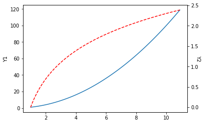
双轴
有时候想要在同一张图中显示两种不同范围的变量,这时候就要设置双轴。双轴的关键代码为twinx()函数(也就是双胞胎x轴?)
x = np.arange(1,11,0.1)
y1 = x*x
y2 = np.log(x)

fig1 = plt.figure()
ax1 = fig1.add_subplot(111)
plt.ylabel('Y1')
ax2 = ax1.twinx()#关键代码
plt.ylabel('Y2',rotation=270)#注意添加ylabel的顺序不能错,旋转显示

ax1.plot(x,y1)
ax2.plot(x,y2,'--r');
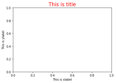
标题与轴标题
标题与轴标题都是一幅可视化图像中的必须要素。你可以参考如下示例来设置你的标题与轴标题。示例:
plt.title('This is title',color = 'r',fontsize = 17)
plt.xlabel('This is xlabel')
plt.ylabel('This is ylabel');

##其等效于:
# fig,ax = plt.subplots()
# ax.set_title('This is title',color = 'r',fontsize = 17)
# ax.set_xlabel('This is xlabel')
# ax.set_ylabel('This is xlabel');
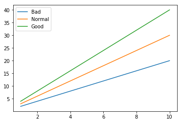
图例
图例在进行多变量比较的可视化中必不可少。你可以通过在plot()函数中添加参数'label'来对所绘曲线设置图例
x = np.arange(1,11,1)
fig = plt.figure()
ax = fig.add_subplot(111)
line1 = ax.plot(x,x*2,label='Bad')
line2 = ax.plot(x,x*3,label='Normal')
line3 = ax.plot(x,x*4,label='Good')
plt.legend(loc='best');
也可以通过调用plt.legend()函数对图例进行设置。
x = np.arange(1,11,1)
fig = plt.figure()
ax = fig.add_subplot(111)
line1, = ax.plot(x,x*2) #注意line1后面的逗号,不可缺少
line2, = ax.plot(x,x*3)
line3, = ax.plot(x,x*4)

plt.legend(handles = [line1, line2, line3],labels = ['Bad', 'Normal', 'Good'],loc = 'best');
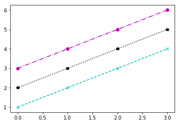
颜色与样式
调用matplotlib.pyplot.plot函数即可设置所画图像的颜色与样式,设置方法如下:
plt.plot(x,y,'[color][marker][line]')
常用颜色

常用线条样式

线条标记

示例:
fig,ax = plt.subplots()

y=np.arange(1,5)
ax.plot(y,'cx--')
ax.plot(y+1,'kp:')
ax.plot(y+2,'mo-.');
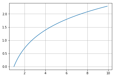
网格
也就是可视化图像中的网格,可以方便读者快速估取某点的横纵坐标。我们通过调用plt.grid()函数来对启用网格。一般情况下,使用该函数的默认参数即可
#采用默认参数
x= np.arange(1,10,0.1)
fig1 = plt.figure()
ax1 = fig1.add_subplot(111)
ax1.grid()
ax1.plot(x,np.log(x))
plt.show()
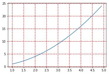
但你也可以通过如下方式进行设置。
y = np.arange(1,5,0.1)
plt.plot(y,y**2)
plt.grid(color='r',linestyle=':',linewidth='2')
# color 设置网格的颜色(颜色与样式中的均可用)
# linestyle 设置线显示的类型(一共四种即'-','--','-.',':')
# linewidth 设置网格线宽
plt.show()
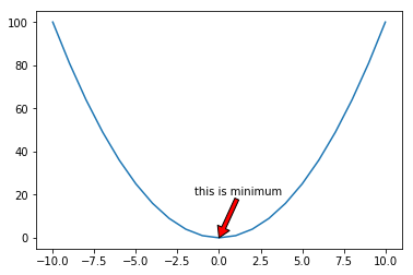
添加图中注释
有时候你需要为可视化图中的某个关键点做出注释,方便读者能一眼看出,这时候你就需要调用plt.annote()函数来实现你的目的了。
str:一个字符串,来写出你想要标注的内容;
xy:标注点的坐标
xytext:标注内容起始位置的坐标(也就是从该点开始显示你的注释内容)
arrowprops:设置注释指向标注点的箭头
你也可以去搜索该函数,获取更多参数的设置方法。
示例:
x =np.arange(-10,11,1)
y = x*x

fig1 = plt.figure()
ax1 = fig1.add_subplot(111)
ax1.plot(x,y)
ax1.annotate('this is minimum',xy=(0,0),xytext=(-1.5,20),
             arrowprops=dict(facecolor='r',headlength=10));
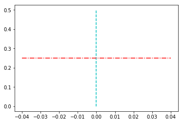
添加平行于坐标轴的线
你可能需要添加一条平行于x轴或者是y轴的线,在图像中分割不同区域。这时候,你就需要调用vlines(x, ymin, ymax)函数或者是hlines(y, xmin, xmax)函数,除了括号内的参数之外,你还可以设置颜色(color)参数和线型(linestyles)参数。(设置方法参考颜色与样式章节)
示例:
plt.vlines(0, 0, 0.5, colors = "c", linestyles = "--");
plt.hlines(0.25, -0.04, 0.04, colors = "r", linestyles = "-.");
常用图形
可视化图形参考
如何能选择最适合的图形来表示你想分析的结果呢?这里提供一个简单的参考~

(图像来源:http://blog.sina.com.cn/xiandengyuan)
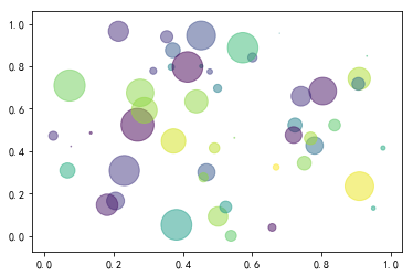
散点图(scatter)
np.random.seed(7)#设置随机种子,可以保证每次的随机数是一致的

N = 50
x = np.random.rand(N)#生成50个0到1的随机数
y = np.random.rand(N)
colors = np.random.rand(N)
area = (30 * np.random.rand(N))**2  #随便设置的一个计算值,来表示大小

plt.scatter(x, y, s=area, c=colors, alpha=0.5);#用s设置大小区分,用c设置颜色区分
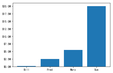
条形图(bar)
例1 函数使用包
from matplotlib.ticker import FuncFormatter

x = np.arange(4)
money = [1.5e5, 2.5e6, 5.5e6, 2.0e7]

def millions(x, pos):
  '''定义一个函数,将科学记数法转为以million为单位,保留一位小数,并添加美元$和单位M;
    两个参数分别表示导入的值和位置。'''
    return '$%.1fM' % (x * 1e-6)


formatter = FuncFormatter(millions)#调用函数,将millions函数作为模块化函数

fig, ax = plt.subplots()
ax.yaxis.set_major_formatter(formatter)#设置y轴按函数模块化
plt.bar(x, money)
plt.xticks(x, ('Bill', 'Fred', 'Mary', 'Sue'));
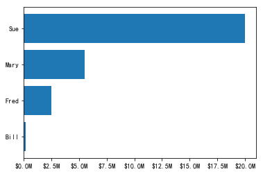
例2 横向柱形图
x = np.arange(4)
money = [1.5e5, 2.5e6, 5.5e6, 2.0e7]

def millions(x, pos):
  '''定义一个函数,将科学记数法转为以million为单位,保留一位小数,并添加美元$和单位M;
    两个参数分别表示导入的值和位置。'''
    return '$%.1fM' % (x * 1e-6)


formatter = FuncFormatter(millions)#调用函数,将millions函数作为模块化函数

fig, ax = plt.subplots()
ax.xaxis.set_major_formatter(formatter)
plt.barh(x, money)#关键代码:barh
plt.yticks(x, ('Bill', 'Fred', 'Mary', 'Sue'));
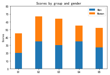
例3 拼接柱状图
N = 5
menMeans = (20, 35, 30, 35, 27)
womenMeans = (25, 32, 34, 20, 25)
ind = np.arange(N)    # 等效于[0,1,2,3,4]
width = 0.35       # 柱的宽度

p1 = plt.bar(ind, menMeans, width)
p2 = plt.bar(ind, womenMeans, width,bottom=menMeans) #关键代码:bottom

plt.ylabel('Scores')
plt.title('Scores by group and gender')
plt.xticks(ind, ('G1', 'G2', 'G3', 'G4', 'G5'))
plt.yticks(np.arange(0, 81, 10))
plt.legend((p1, p2), ('Men', 'Women'));
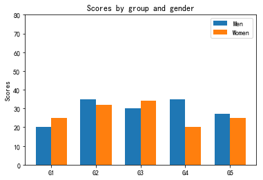
例4 并列柱状图
N = 5
menMeans = (20, 35, 30, 35, 27)
womenMeans = (25, 32, 34, 20, 25)
ind = np.arange(N)
width = 0.35

p1 = plt.bar(ind-width/2, menMeans, width) #关键代码 -width/2,也就是将柱子向左移动了width/2
p2 = plt.bar(ind+width/2, womenMeans, width) #关键代码 +width/2

plt.ylabel('Scores')
plt.title('Scores by group and gender')
plt.xticks(ind, ('G1', 'G2', 'G3', 'G4', 'G5'))
plt.yticks(np.arange(0, 81, 10))
plt.legend((p1[0], p2[0]), ('Men', 'Women'));
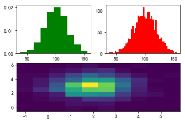
直方图(hist)
fig = plt.figure()
ax1 = fig.add_subplot(221)
ax2 = fig.add_subplot(222)
ax3 = fig.add_subplot(212)

mu = 100 #定义均值
sigma = 20 #定义标准差
x = mu +sigma * np.random.randn(2000) #生成一个标准正态分布函数

ax1.hist(x,bins=10,color='green',normed=True) #输入数据,bins=总共有几条条状图,color=颜色,normed=True:图形面积之和为1

ax2.hist(x,bins=50,color='red',normed=False) #normed=False:纵坐标显示实际值


x = np.random.randn(1000)+2
y = np.random.randn(1000)+3

ax3.hist2d(x,y,bins=10); #二维直方图
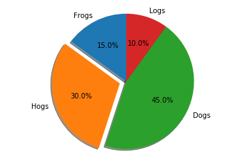
饼状图(pie)
labels = 'Frogs', 'Hogs', 'Dogs', 'Logs'
sizes = [15, 30, 45, 10] #占比
explode = (0, 0.1, 0, 0)  #设置第二位也就是‘Hogs’凸显,间距为0.1

fig1, ax1 = plt.subplots()
ax1.pie(sizes, explode=explode, labels=labels, autopct='%1.1f%%',shadow=True, startangle=90)#autopct对输出进行格式化,startangle为起始角度,一般设置为90比较好看
ax1.axis('equal');#保证为正圆
箱线图(box)
fig = plt.figure()
ax1 = fig.add_subplot(211)
ax2 = fig.add_subplot(212)

data = np.random.normal(size=1000, loc=0.0, scale=1.0)

ax1.boxplot(data,sym='o',whis=1.5)
# plt.boxplot(x, notch=None, sym=None, vert=None, whis=None, positions=None, widths=None, patch_artist=None, meanline=None, showmeans=None, showcaps=None, showbox=None, showfliers=None, boxprops=None, labels=None, flierprops=None, medianprops=None, meanprops=None, capprops=None, whiskerprops=None)
# x:指定要绘制箱线图的数据;
# notch:是否是凹口的形式展现箱线图,默认非凹口;
# sym:指定异常点的形状,默认为+号显示;
# vert:是否需要将箱线图垂直摆放,默认垂直摆放;
# whis:指定上下须与上下四分位的距离,默认为1.5倍的四分位差;
# positions:指定箱线图的位置,默认为[0,1,2…];
# widths:指定箱线图的宽度,默认为0.5;
# patch_artist:是否填充箱体的颜色;
# meanline:是否用线的形式表示均值,默认用点来表示;
# showmeans:是否显示均值,默认不显示;
# showcaps:是否显示箱线图顶端和末端的两条线,默认显示;
# showbox:是否显示箱线图的箱体,默认显示;
# showfliers:是否显示异常值,默认显示;
# boxprops:设置箱体的属性,如边框色,填充色等;
# labels:为箱线图添加标签,类似于图例的作用;
# filerprops:设置异常值的属性,如异常点的形状、大小、填充色等;
# medianprops:设置中位数的属性,如线的类型、粗细等;
# meanprops:设置均值的属性,如点的大小、颜色等;
# capprops:设置箱线图顶端和末端线条的属性,如颜色、粗细等;
# whiskerprops:设置须的属性,如颜色、粗细、线的类型等;
data = np.random.normal(size=(100, 4), loc=0.0, scale=1.0)

labels = ['A','B','C','D']

ax2.boxplot(data, labels=labels);

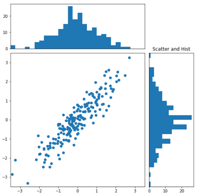
散点直方图(scatter hist)
x = np.random.randn(200)
y = x + np.random.randn(200)*0.5

#定义坐标轴参数
margin_border = 0.1
width = 0.6
margin_between = 0.02
height = 0.2

#散点图参数
left_s = margin_border #距左边框距离
bottom_s = margin_border #距底部距离
height_s = width #散点图高度
width_s = width #散点图宽度

#顶部直方图参数
left_x = margin_border #距左边框距离
bottom_x = margin_border+width+margin_between #距底部距离 = 散点图距底部距离+散点图高度+散点图与直方图的间距
height_x = height #直方图高度
width_x = width #直方图宽度

left_y = margin_border+width+margin_between
bottom_y = margin_border
height_y = width
width_y = height

plt.figure(1,figsize=(8,8))
rect_s = [left_s,bottom_s,width_s,height_s]
rect_x = [left_x,bottom_x,width_x,height_x]
rect_y = [left_y,bottom_y,width_y,height_y]

# 开始按照定义的尺寸绘图
axScatter = plt.axes(rect_s)
axHisX = plt.axes(rect_x)
axHisY = plt.axes(rect_y)
axHisX.set_xticks([])#取消顶部直方图的x轴刻度显示
axHisY.set_yticks([])#取消右侧直方图的y轴刻度显示

#绘制散点图
axScatter.scatter(x,y)

#设定边界
bin_width = 0.25
xymax = np.max([np.max(np.fabs(x)),np.max(np.fabs(y))])#取出x与y中最大的绝对值
lim =int(xymax/bin_width+1) * bin_width
axScatter.set_xlim(-lim,lim)
axScatter.set_ylim(-lim,lim)

bins = np.arange(-lim,lim+bin_width,bin_width)

axHisX.hist(x,bins=bins)
axHisY.hist(y,bins=bins,orientation='horizontal')#水平作图

axHisX.set_xlim(axScatter.get_xlim())
axHisY.set_ylim(axScatter.get_ylim());
其他
保存图像到本地
参考如下代码:
#保存至当下路径
fig.savefig('test.jpg');
#保存至其他路径
fig.savefig('E:/DAND/DAND_VIP/test.jpg');
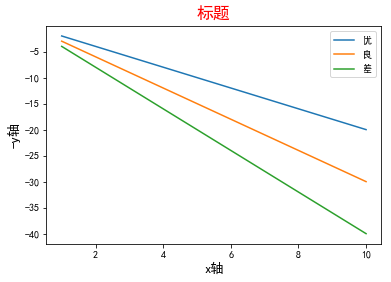
显示中文
使用matplotlib做可视化不能显示中文,根本原因是因为官方配置中没有中文字体,所以,我们把中文字体添加进去就ok啦。具体方法如下:
#coding:utf-8
plt.rcParams['font.sans-serif']=['simhei']#simhei为‘黑体’
示例:
x = np.arange(1,11,1)

fig = plt.figure()
ax = fig.add_subplot(111)
line1 = ax.plot(x,-x*2,label='优')
line2 = ax.plot(x,-x*3,label='良')
line3 = ax.plot(x,-x*4,label='差')

plt.legend(loc='best')
plt.title('标题',color = 'r',fontsize = 17)
plt.xlabel('x轴',fontsize = 13)
plt.ylabel('-y轴',fontsize = 13);
坐标轴显示负号
有可能你做得可视化图像中,坐标轴的符号显示一个框框,这时候你添加如下设置即可。
plt.rcParams['axes.unicode_minus']=False
Pandas Plot
pandas plot函数是基于matplotlib的一个在pandas中快速绘图的方法,用法简单,而且兼容所有matplotlib属性设置的函数,所以,你在做EDA的时候,可以使用Pandas plot进行快速绘图,查看变量分布,获取更直观的信息,但是在进行最终结果展示的时候,需要添加更多的matplotlib参数,对可视化图像进行美化,达到你心中的预期。
官方链接
pandas.DataFrame.plot:
https://pandas.pydata.org/pandas-docs/stable/reference/frame.html#plotting
常用参数设置
data:你可以直接调取DataFrame作为参数输入
其余参数与matplotlib的参数设置类似,这里不再赘述。
最后
matplotlib是python可视化的鼻祖,绘图全面,多功能是他的优点,几乎没有他不能完成的可视化任务;但是,他的缺点也很明显,比如:可视化图形配色丑;参数太多,设置琐碎;没有交互式。。。
所以针对这些问题,后人们又开发了许多python的可视化包,比如说:以美观、简洁著称的seaborn(https://seaborn.pydata.org/)、做交互式的有国外的plotly(https://plot.ly/python/)以及国内的pyecharts等等,其中pyecharts(http://pyecharts.org/)要着重安利给大家,它使用便捷,更新迅速,官方文档清晰,是做报告写博客的可视化利器!
致敬
细心的同学可以发现文中引用了Vamei所做的图片,说到Vamei,他是一位非常有才华的Python技术博主,他的数据科学系列是我添加的第一个技术博客书签,从他的博客里我也学到了很多,在这里我要向他表示崇高的敬意和由衷的感谢。不过让人惋惜的事情是,今年(2019年)3月份的他因为抑郁症离开了我们,本身我们所在的这个行业就是一个高压行业,再加上平时生活中的一些事情,很可能会造成一个人的精神崩溃甚至抑郁,在这里要告诉大家:代码和工作不是我们生活的全部!!!希望大家能多发现生活的美好,周末约朋友去骑骑车,爬爬山,遇到问题多找朋友,不要自己扛,学会排解压力,没有什么槛是跨不过去的,加油!

近期专栏推荐
1.
2.
3.
4.

点下「在看」,给文章盖个戳吧!?


 2万+
2万+

 被折叠的 条评论
为什么被折叠?
被折叠的 条评论
为什么被折叠?
 到【灌水乐园】发言


