


在项目需求中,需要设置以下按钮样式需求:
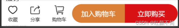
原本想法是在外边裹一层盒子,里边分成两个盒子各自设置不同的背景颜色,结果效果很没有我预期的一样,大家可以试试是怎样的,但是我就不展示(失败品)了。
然后后边想了想,时不时可以各四个角单独设置border-radius呢?
所以它是可以的:
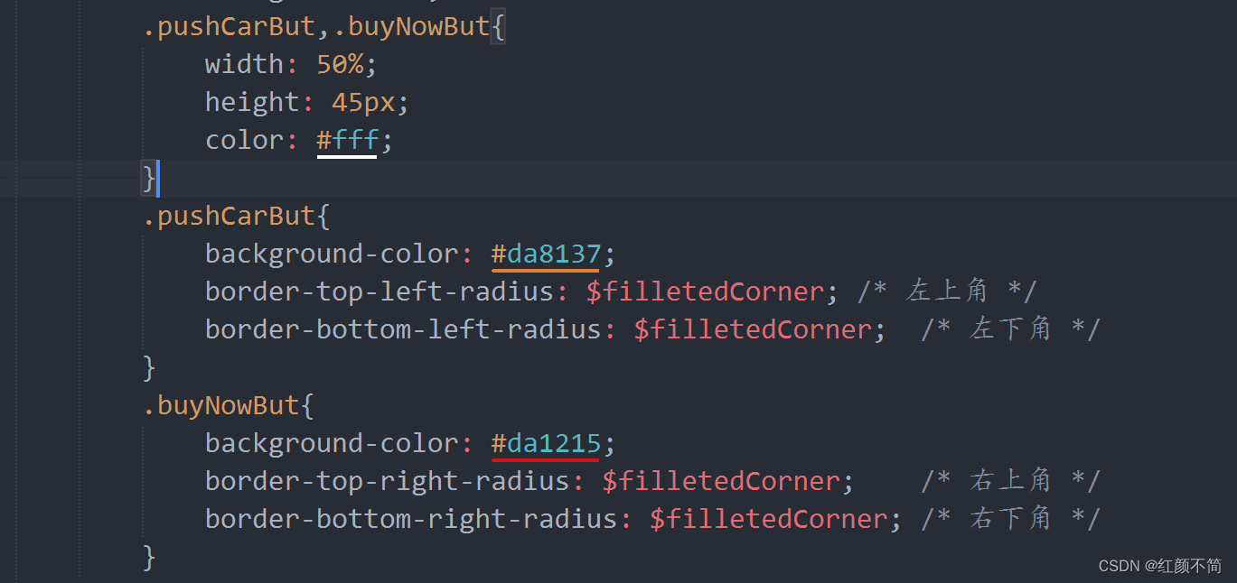
我这里给他们定义了一个变量,以为我们只需要修改外层的四个角嘛。
当前需求是uniapp项目,盒子布局在下边:
<!-- 底部的按钮区 -->
	<view class="bottomButtonAreBox">
		<view class="leftBox">
			<view class="smallButton">
				<image src="../../static/commodityList-icon/爱心.png" mode=""></image>
				<view>收藏</view>
			</view>
			<view class="smallButton">
				<image src="../../static/commodityList-icon/分享-.png" mode=""></image>
				<view>分享</view>
			</view>
			<view class="smallButton">
				<image src="../../static/commodityList-icon/购物车.png" mode=""></image>
				<view>购物车</view>
			</view>
		</view>
		<view class="smallButton bigButton">
			<view class="pushCarBut">
				加入购物车
				</view>
			<view class="buyNowBut">
				立即购买
			</view>
		</view>
	</view>
css样式设置如下:
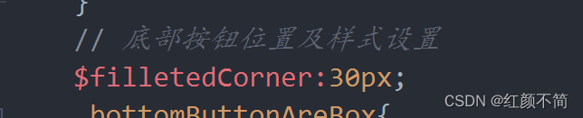
// 底部按钮位置及样式设置
	$filletedCorner:30px;
	.bottomButtonAreBox{
		position: fixed;
		z-index: 10;
		bottom: 0;
		width: 100%;
		height: 60px;
		background-color: #fff;
		display: flex;
		justify-content: space-around;
		align-items: center;
		image{
			width: 25px;
			height: 25px;
		}
		.leftBox{
			width: 40%;
			display: flex;
			justify-content: space-around;
			align-items: center;
		}
		.smallButton{
			font-size: 11px;
			text-align: center;
		}
		.bigButton{
			width: 60%;
			height: 45px;
			line-height: 45px;
			font-size: 16px;
			display: flex;
			justify-content: flex-start;
			align-items: center;
			text-align: center;
			.pushCarBut,.buyNowBut{
				width: 50%;
				height: 45px;
				color: #fff;
			}
			.pushCarBut{
				background-color: #da8137;
				border-top-left-radius: $filletedCorner; /* 左上角 */
				border-bottom-left-radius: $filletedCorner;  /* 左下角 */
			}
			.buyNowBut{
				background-color: #da1215;
				border-top-right-radius: $filletedCorner;    /* 右上角 */
				border-bottom-right-radius: $filletedCorner; /* 右下角 */
			}
		}
	}
本期内容到此结束!
感谢观看!


 3134
3134


 被折叠的 条评论
为什么被折叠?
被折叠的 条评论
为什么被折叠?
 到【灌水乐园】发言


